A New Era for Angular
The wait is over — the stable release of Angular 17 is here. The team behind the framework appears committed to surprising us with each new iteration, and this version continues that tradition. Fresh capabilities and refinements are part of the package.
A quick look at what’s on offer reveals that optimization took center stage, particularly regarding the initial bundle size. A novel control flow syntax has also arrived, laying the groundwork for signals to become a core part of the framework in the versions ahead.
Let’s explore the highlights of Angular 17 and the advantages these updates bring to developers.
Thinking about an upgrade or just keeping pace with the ecosystem? We’ve put together a detailed walkthrough from Angular 14 through the newest version, designed to help developers and technical leads grasp the shifts and their implications. Grab your free copy of “The Ultimate Guide to Angular Evolution”.

A Fresh Look and Feel
Right before the launch of v17, the Angular Renaissance kicked off—an event dedicated to unveiling the framework’s new branding. It marks the first occasion of its kind since Angular first came onto the scene.
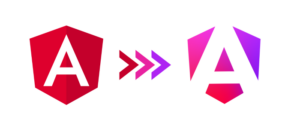
The entire color scheme has been overhauled. The familiar red logo has gotten a modern update, shedding its old appearance while retaining the shield motif that has been a constant since the AngularJS days. This refresh signals the forward-thinking direction Angular is taking.
In addition, there’s a revamped home online at https://angular.dev/. Visitors will find refreshed documentation with examples built around the standalone API, alongside modern guides and tutorials. A handy playground feature lets you experiment with the framework directly in your browser.
Streamlined Control Flow
The most significant change you’ll notice is the redesigned control flow for templates. This represents the initial move away from built-in structural directives, whose existing architecture proves incompatible with zoneless applications.
This new syntax is built around the concept of a `block`. Visually, it is a departure from what we’ve been used to seeing in templates. Each block is initiated with an @ prefix, followed by syntax that closely mirrors familiar JavaScript constructs.
This overhaul touches the three structural directives used most frequently: ngIf, ngSwitch, and ngFor. As of now, there are no plans to introduce support for custom blocks.
Conditional Rendering with If
@if (time < 12) {
  Good morning!
} @else if (time < 17) {
  Good afternoon!
} @else {
  Good evening!
}
Conditional Rendering with Switch
@switch (fruit) {
  @case 'apple' {
     <apple-cmp />
  }
  @case 'banana' {
     <banana-cmp />
  }
  @default {
     <unknown-fruit-cmp />
  }
}- Unlike standard JavaScript, there is no need for a break statement within these switch blocks.
Iteration with Loops
<ul>
  @for (item of items; track item.id) {
  	<li>{{ item.name }}</li>
  } @empty {
  	<li>No items...</li>
  }
</ul>
The loop structure receives the most substantial set of enhancements:
- An `@empty` block lets you define what gets rendered when the list being iterated over has no items.
- The days of writing a specialized
trackByfunction are over. Now, you simply point to the unique property of the object you want to track. The `@for` block mandates the use of this track feature, which greatly enhances list rendering efficiency and change management with minimal developer effort.
With two distinct methods for handling control flow, a natural question emerges: where do the established directives stand? In version 17, they continue to function without alteration. However, as future versions roll out and the new control flow exits its developer preview phase, these directives are slated for deprecation.
There’s no need for concern regarding migration. A Schematic has been provided by the Angular team to handle the conversion automatically. In most scenarios, this schematic handles the entire transformation process without requiring manual intervention. To initiate the change, just run this command:
ng generate @angular/core:control-flowInterested in the rationale behind the chosen syntax or why patching the existing directives wasn’t an option? Mateusz addresses these topics in detail in our companion article.
Loading on Demand with Defer
A powerful lazy-loading primitive, known as defer, takes center stage as another key feature. Built upon the syntax introduced with the new control flow, this mechanism offers a precise way to postpone the loading of specific page sections. This is a big win for performance—by strategically using `defer`, the initial bundle can be slimmer, which in turn accelerates load times, an especially critical factor for users on slower connections.
To dictate the timing of the content loading, you have two primary tools at your disposal: when and on. They can be used separately or in tandem, depending on the exact moment you want the content to become available.
The When Condition
When takes a logical expression. The block’s contents are loaded when this expression evaluates to true.
@defer (when condition) {
  <deferred-cmp />
}
Keep in mind this is a one-directional operation. Once the asynchronous content is loaded, the process can’t be reversed. If your goal is to hide it again, you would need to nest the @defer block within an @if block.
The On Trigger
The various predefined triggers available through key trigger the loading process.
Here are the triggers you can choose from:
- Idle – This is the default. Content loads when the browser’s main thread is free. The requestIdleCallback function determines when this moment occurs.
- Interaction – Loading is initiated upon various user actions, including clicks, focus changes, touches, and input events like keydown or blur.
- Immediate – Loading starts as soon as the rendering of the page completes.
- Timer(x) – A specific delay, measured in milliseconds, before the content is fetched.
- Hover – The loading begins when the user’s mouse hovers over a specified zone—either the placeholder area or a referenced element.
- Viewport – Content loads when a particular item scrolls into the user’s visual range. This check relies on The Intersection Observer API.
@defer (on interaction) {
  <deferred-cmp />
}
You also have the flexibility to mix these conditions and triggers together:
@defer (when cond; on interaction, timer(5s)) {
  <deferred-cmp />
}
Just like with when, this type of content loading also occurs only once.
Prefetching for Snappier UX
Sometimes, it makes sense to download the resources for a block separately from showing them. The prefetch option is made for this. It lets you set a point (using the triggers mentioned earlier) for wthe needed dependencies to be fetched. This decoupling means that by the time a user actually engages with the content, it’s ready to go, resulting in quicker interactions and a better overall feel.
@defer (on interaction; prefetch on idle) {
  <deferred-cmp />
}
Inside the `@defer` block, there are three optional companion blocks that prove quite handy in practice.
@placeholder– Defines what users see initially, before the asynchronously loaded content becomes available. Here’s how you might use it:
@defer (when condition) {
  <deferred-cmp />
}
@placeholder (minimum 2s) {
  <span>There will be deferred content.</span>
}
The minimum parameter sets a floor for how long the placeholder content must remain visible before being replaced. So, even if your loading condition is met right away, a minimum of 2 seconds would delay the swap (to be specific).
-
<strong>@loading</strong>– This block shows its contents while the necessary parts of the page are being fetched. For example:
@defer {
  <deferred-cmp />
}
@loading (after 100ms; minimum 1s) {
  <span>Content is loading...</span>
}
The same minimum option is available here, functioning just like in the @placeholder. It sets the shortest period that the loading indicator will be displayed. Another option, after, specifies a delay before the loading indicator even appears. For instance, if loading completes in under 100ms, the loading indicator stays hidden, and `<deferred-cmp />` shows up instantly.
<strong>@error</strong>– This block handles the what-ifs, displaying content in case the deferred loading encounters an issue. A basic setup looks like this:
@defer (timeout 1s) {
  <deferred-cmp />
}
@error {
  <p>Failed to load the deferred component</p>
  <p>Error: {{ $error.message }}</p>
}
Teaming up the @error with defer enables a unique timeout condition. This sets an upper limit on the loading time. If the dependencies aren’t ready by the end of that period, the content specified in the @error block is shown. Developers working within this block can also access the $error variable, which holds details on the specific error that occurred.
The Signals Story
Signals entered the scene during the v16 developer preview. If you haven’t yet explored them, Miłosz’s write-up offers a thorough walkthrough of their mechanics.
With Angular 17, signals have officially reached stable status — save for the effect() function, which remains in developer preview. This makes them safe for production use. The end of the preview period also brought a handful of notable refinements.
Change Detection Scoped to the Component
Arguably the most consequential addition in this release — and a meaningful stride toward signal-based components.
We now have the ability to trigger Change Detection for one specific component rather than the entire tree. This is a powerful optimization lever with clear performance upside.
But to make per-component CD work, two conditions must hold:
- The dirty check must be initiated by a signal
- Every component in the application must adopt the OnPush strategy
Why must the signal be the trigger?
The rationale sits in Angular's ability to track which signals a view references. That knowledge lets the framework pinpoint exactly which components need re-rendering. Based on this, the logic for marking components as dirty when a signal changes has been reworked.
Back in v16, updating a signal used within a template behaved like the AsyncPipe: both the affected component and its ancestors were marked as dirty. This meant on the next CD pass, all of them were re-evaluated. The dirty marking was handled via the markViewDirty() method — the same operation that backs the markForCheck() method exposed by the ChangeDetectorRef object.
In v17, when a signal's value shifts, the framework turns to markAncestorsForTraversal() in place of markViewDirty(). This method flags only the component directly tied to the change as dirty, so the CD pass skips upward and renders just the relevant view.
Why is OnPush mandatory across the app?
The traversal of the component tree hasn't changed — it still begins at the root and cascades downward. Consequently, if even a single component uses the default strategy, it will always be re-rendered, which defeats the optimization.
Changes to defaultEquals
The default equality check for signal values has been revised.
Under v16, defaultEquals treated any two distinct object references as unequal. So even resending the same object would notify all dependent signals of a change.
Implementation of defaultEquals in v16
export function defaultEquals<T>(a: T, b: T) {
  return (a === null || typeof a !== 'object') && Object.is(a, b);
}
With v17, defaultEquals now leans entirely on Object.is(). In practice, mutating an object via update() while keeping its reference means downstream signals will no longer get notified of the change.
Implementation of defaultEquals in v17
export function defaultEquals<T>(a: T, b: T) {
  return Object.is(a, b);
}
At first glance this may seem counterintuitive. Yet the adjustment can yield performance benefits. To guarantee that a signal broadcasts a change, either provide a fresh object instance (the spread operator works well here) or supply a custom equality function through the signal options.
The demise of the mutate method
The Angular team has retired the mutate function, which previously allowed in-place modification of a signal's value. That method deliberately bypassed equality checks, since its entire purpose was to change the value regardless. Going forward, update is the sole recommended path.
This is a welcome shift — it brings a consistent and predictable approach to modifying signals, which tends to improve code clarity and quality.
Server-side rendering
SSR continues to be a major focus for the Angular team, and that trajectory looks set to persist. When running `ng new`, the CLI now prompts whether you'd like SSR enabled for the new project.

In v17, No remains the default answer. The anticipation, however, is that starting with v18+, SSR will be added by default at generation time.
Non-destructive hydration graduates
Version 16 introduced non-destructive hydration. This mechanism renders the app on the server, sends it to the client for display, and then elevates it into a full SPA — but without tearing down the existing DOM.
Previous approaches often replaced the server-rendered tree entirely, which was less efficient. The non-destructive variant preserves what was already drawn and repurposes it. In version 17, this feature has left the developer preview and is now ready for production workloads.
SSR meets deferred loading
For SSR, @defer renders only the content of the @placeholder block server-side. If no @placeholder block is present, then @defer sections remain blank on the server output and get populated on the client when the configured triggers fire.
The road ahead, as outlined in the Angular roadmap, includes extending hydration to support `Partial Hydration`. In that model, only selective components or portions of the page are rendered on the server and shipped to the client; the rest is built client-side. This would unlock the full potential of deferred loading when paired with SSR.
Application builder gets stronger
The esbuild-based builder has seen notable upgrades. Previously, its experimental status limited it to building browser artifacts without SSR. Now, with v17, it can also produce SSR and prerendered builds. All three scenarios passing through one unified pipeline should eliminate inconsistencies that crop up when different bundlers are involved.
Animations load on demand
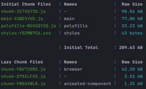
Earlier, animation code was fetched during app bootstrap, even though interaction-triggered animations typically take place later. The new release tackles this by making it possible to load animation-related code asynchronously — potentially cutting up to 60 kB off the main bundle.
To activate lazy-loaded animations, simply swap provideAnimations() for provideAnimationsAsync() in your application's providers.
import { provideAnimationsAsync } from "@angular/platform-browser/animations/async";


bootstrapApplication(AppComponent, {
 providers: [
   provideAnimationsAsync(),
   provideRouter(routes)
 ]
});
That's all there is to it. Just be sure that any imports from the @angular/animations module happen exclusively in components loaded on demand.
While managing your own import graph is straightforward, the same can't always be said for external libraries. Take @angular/material: it depends heavily on @angular/animations, making it highly likely that the animations module anyway finds its way into the initial payload.
To check whether the animations are indeed loaded asynchronously, run a build with the --named-chunks flag. In the output, look for @angular/animations and @angular/animations/browser appearing under the Lazy Chunk Files section.
Build output with animations deferred
Build output with standard loading
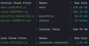
To illustrate the difference, a minimal demo app shows a significantly smaller initial bundle when animations are loaded on demand.
View Transition API integration
Another headline feature is support for the View Transition API. This relatively fresh browser API makes it possible to build smooth, interactive transitions between page states. It also lets you tweak the DOM mid-animation, during the switch from one view to another.
Getting set up is straightforward.
First, at your application’s bootstrap, import the withViewTransitions function.
import { provideRouter, withViewTransitions } from '@angular/router';Then register it inside the provideRouter configuration.
bootstrapApplication(AppComponent, {
 providers: [
   provideRouter(routes, withViewTransitions())
 ]
})
That single addition gives you a subtle fade on route changes (input and output). Naturally, custom animations are also possible. In the following snippet, the transition is stretched to last two seconds via prepared pseudo-elements in `styles.css`.
::view-transition-old(root), /* Screenshot of the view of the page we are leaving */
::view-transition-new(root) /* Representation of the new page view */ {
 animation-duration: 2s;
}
The linked live example covers just a sliver of what this API can do. For those curious about deeper usage, the official Chrome documentation is a solid next step.
One word of caution: the View Transition API is new and still experimental, so browser support varies. Check current compatibility levels on caniuse.
Additional modifications worth highlighting in Angular 17
- New projects scaffolded with Angular 17 now come set up for standalone components out of the box, and the default build pipeline leverages esbuild via Vite.
- Node.js 16 is no longer supported. The minimum required version moving forward is Node 18.13.
- TypeScript support begins at version 5.2 for this release.
- A community-driven convenience arrives in the form of a
styleUrlproperty inside the @Component decorator, letting you pass a string containing just one path to your stylesheet. - Angular DevTools now include a notable new capability: a visual representation of the injector hierarchy within your app, which should ease the debugging experience significantly.
Wrapping up
This release brings changes of considerable weight, and they're set to reshape how we approach Angular development going forward. Adopting the new control flow will likely become mandatory as signal-based components gain traction. Meanwhile, server-side rendering seems poised to solidify its role as a core part of the Angular experience. This version also puts a spotlight on reducing initial loading overhead through several new mechanisms.
How do you feel about Angular's current trajectory? Are the updates and the rebranding in line with your expectations? We'd love to hear your thoughts in the comments!