
Setting the Stage
Accessibility is often overlooked in web development, yet it provides benefits that extend far beyond a small audience. This case study looks at a common tile-based variant selector — initially built using the most straightforward approach — identifies its flaws, and walks through a step-by-step upgrade that makes the component accessible to everyone.
Why semantic HTML matters
Accessible interfaces depend heavily on choosing the right semantic HTML tags. At first glance, this might seem trivial, especially because Angular’s event binding works with any element and CSS can be used to achieve any visual style. But the implications of semantic HTML go much deeper.
<div class="primary-button" (click)="onClick()">Click me!</div>Using a non-semantic clickable element introduces multiple issues:
- Poor developer experience: Code becomes harder to read, and the intent of the element is not immediately obvious.
- Lower SEO performance: Search engines may not index the content or understand its purpose.
- Difficult navigation: Users depending on assistive tools face obstacles when trying to traverse the page.
- No built-in interactivity: Elements like
<div>do not support native interactive behaviors.
Although it is possible to force a div to act like a button, doing so results in verbose, fragile code:
<div
 class="primary-button"
 role="button"
 tabindex="0"
 style="cursor: pointer"
 (click)="onClick()"
 (keydown.space)="onClick(); $event.preventDefault()"
 (keydown.enter)="onClick()"
>
 Click me!
</div>
To mimic the native behavior of a <button> using a <div>, you have to make several adjustments:
- Add
role="button"so that assistive technologies recognize the element’s purpose. - Set
tabindex="0"to make the element focusable via the TAB key. - Apply
cursor: pointer, which is the default style for native buttons. - In addition to the click handler, attach a keydown handler for the Space and Enter keys to emulate native button behavior.
- When handling the Space key, call
$event.preventDefault()to stop the browser’s default page scroll triggered by the spacebar.
This level of manual effort is far from ideal, especially when we consider the simplicity of the native alternative:
<button class="primary-button" (click)="onClick()">Click me!</button>
The case for accessibility
It’s fair to ask whether accessibility is worth the effort. While many users interact with the web effortlessly using a mouse, others cannot. Reasons range from physical limitations that make mouse use difficult to reliance on voice control software, which often simulates keyboard commands programmatically.
To see how keyboard-only navigation works in practice, examine the code below and experiment with the rendered result:
<fieldset>
 <legend>Choose your favorite fruit</legend>
 <div>
   <label for="apple">Apple</label>
   <input type="radio" name="fruit" value="apple" id="apple" />
 </div>
 <!-- Rest of fieldset elements... -->
</fieldset>


<fieldset>
 <legend>Choose your favorite vegetable</legend>
 <div>
   <label for="carrot">Carrot</label>
   <input type="radio" name="vegetable" value="carrot" id="carrot" />
 </div>
 <!-- Rest of fieldset elements... -->
</fieldset>- Press Tab to move forward through focusable elements until you reach the first radio button in the „Choose your favorite fruit” group.
- Use the Arrow keys (Up/Down or Left/Right) to move between options inside the same group.
- Press Tab again to advance to the next focusable area (for instance, the „Choose your favorite vegetable” group).
- Press Shift + Tab to jump back to the „Choose your favorite fruit” group.
- Note that only one radio button per group can be selected at a given time.
These behaviors are universally supported across modern browsers, meaning keyboard users get a seamless experience. Building components that work for everyone — not just mouse users — is a core responsibility.
Defining the problem
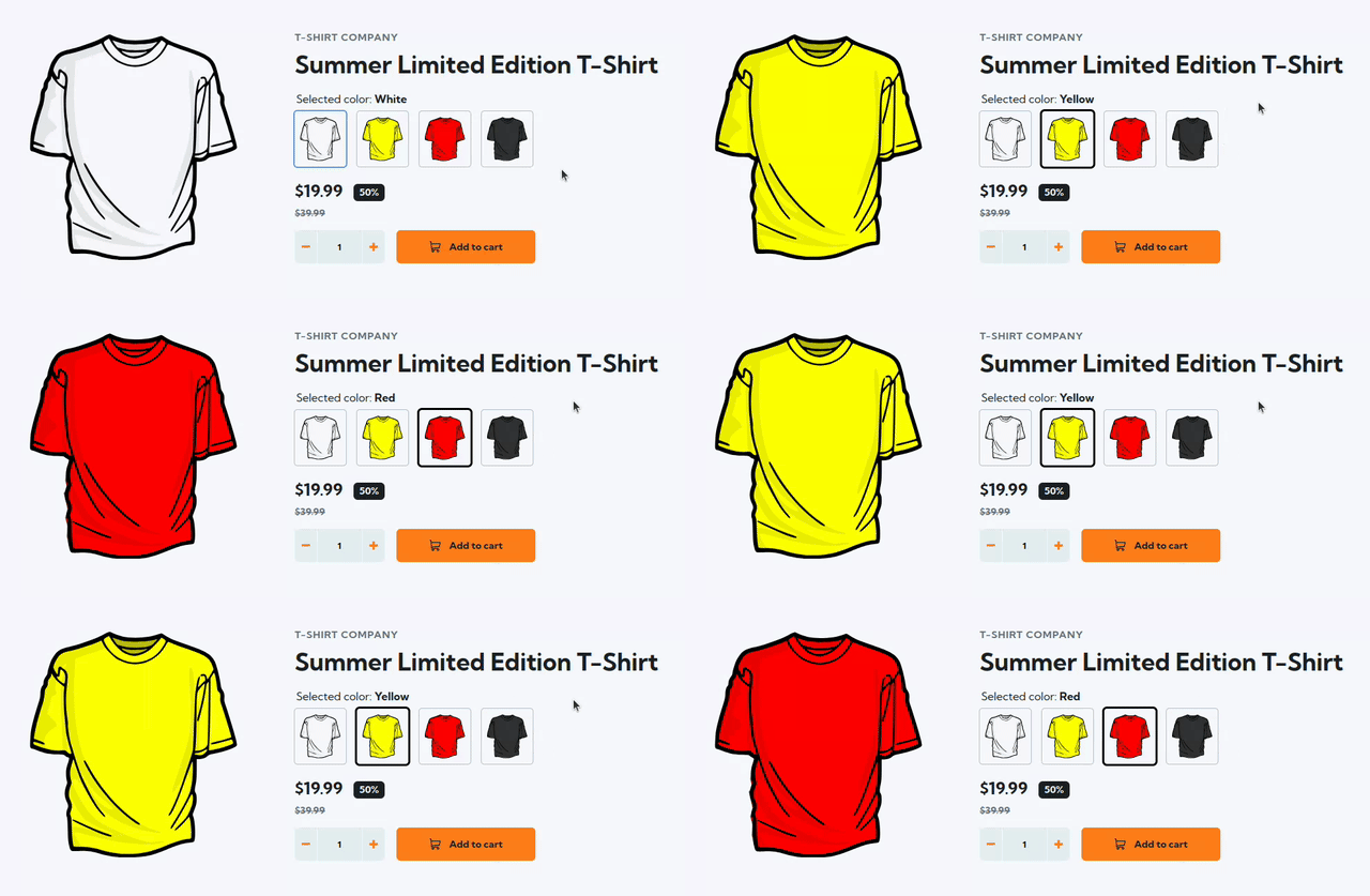
Let’s turn to the main subject: creating a tile-based selector for T-shirt variants. Keyboard navigation is a must here, not just a nice-to-have, since users may not use a mouse at all. The illustration above is telling — the cursor sits next to the variant list, indicating that selection happens without mouse input. Proper HTML structure is what makes this possible.
The problematic initial approach
When faced with a grid of image-based tiles, many developers jump to a layout made entirely of <img> tags, producing a template similar to this:
<div class="variant-selector__selected-color">
 Selected color: @if (activeVariant()?.name) {
 <strong>{{ activeVariant()!.name }}</strong>
 }
</div>
<div class="variant-selector__tiles-container">
 @for (variant of variants(); track variant.id) {
 <img
   class="variant-selector__image"
   [class.variant-selector__image--active]="variant.id === activeVariant()?.id"
   [ngSrc]="variant.thumbnailSrc"
   alt="{{ variant.name }} T-Shirt"
   width="74"
   height="80"
   (click)="variantSelected.emit(variant)"
 />
 }
</div>
At first glance, this looks reasonable, but it fails on accessibility. Images carry no semantic meaning for interaction, so the keyboard cannot focus or traverse them.
Rethinking the structure
If we step back, this pattern is essentially a standard radio group: multiple options where only one can be chosen at a time. With that in mind, we can revise the original markup:
<fieldset role="radiogroup">
 <legend class="variant-selector__selected-color">
   Selected color: @if (activeVariant()?.name) {
   <strong>{{ activeVariant()!.name }}</strong>
   }
 </legend>
 <div class="variant-selector__tiles-container">
   @for (variant of variants(); track variant.id) {
   <label>
     <input
       [attr.aria-label]="variant?.name"
       class="cdk-visually-hidden"
       type="radio"
       name="variant"
       [value]="variant.id"
       [checked]="variant.id === activeVariant()?.id"
       (change)="variantSelected.emit(variant)"
     />
     <img
       class="variant-selector__image"
       [ngSrc]="variant.thumbnailSrc"
       alt="{{ variant.name }} T-Shirt"
       width="74"
       height="74"
     />
   </label>
   }
 </div>
</fieldset>
What we changed and why
The key improvement was swapping out the image elements for <input type="radio"> elements that are visually hidden. This was accomplished by applying the cdk-visually-hidden class from Angular CDK, which masks the radio button circles without removing their focusability.
It’s worth asking: why not simply use visibility: hidden or display: none? The distinction matters — cdk-visually-hidden is specifically crafted to hide content visually while keeping it functional and exposed to assistive technologies.
With this change, users can now move through and select variants using the keyboard, just like the radio groups we explored earlier. If your project uses Tailwind CSS, the sr-only class offers the same utility.
We also wrapped the inputs in <fieldset> and <legend> for clearer semantic structure and accessible naming. On top of that, an aria-label was added to each input. Sighted users can tell a tile apart by its visuals (for instance, a particular shirt color), but screen reader users depend on what the software announces. With well-crafted aria-label values, those announcements become useful — like stating „Yellow T-shirt„.

Final thoughts
Accessibility is far from an esoteric concern that helps only a handful of people; its impact is wide-ranging.
- Users with disabilities are able to fully use the product.
- Developers get a better workflow, working with code that is cleaner and easier to test because it is grounded in native browser features.
- The business reduces legal exposure, improves search visibility, and meets its ethical obligations.
If you’d like to inspect the finished code, the repository is open for browsing. The commit history starts with the initial, subpar implementation and then follows each step described in this case study.
For those who prefer a visual walkthrough, I suggest watching my presentation from Angular Camp, hosted by angular.love. In that session, I code the entire transition from the inaccessible version to the accessible one live, and I also cover accessibility fundamentals.