
Why images matter for performance
Looking at the 2022 edition of the HTTP Archive's Web Almanac, the data paints a clear picture. The median page weight on mobile sits at 2019 KB, and images account for 881 KB of that total. In other words, images consume nearly half of the bandwidth a page requires.
The presence of images is virtually universal: 99.9% of websites make at least one image request. For most of those sites, that single image weighs at least 100 KB, and on 10% of pages, at least one image exceeds 1 MB. Given these numbers, it's hard to overstate the influence images have on overall site performance.
The correlation between images and render time is striking. On 70% of mobile pages and 80% of desktop pages, the image itself was the factor driving the website's render time, and thus the user's perception of how fast the page loaded. Breaking that down further, the element responsible for the Largest Contentful Paint (LCP) on those pages was, in nearly all cases, an image.
Understanding LCP
LCP stands for Largest Contentful Paint and is one of the core metrics introduced under the Web Vitals initiative by Google. Its purpose is to quantify the loading experience from a user's perspective, specifically measuring when the main content of a page has likely rendered. LCP has gained enough prominence that it's now part of the Core Web Vitals, a subset focusing on the most important user experience signals.
The scoring thresholds for LCP are clearly defined. A good result is anything under 2.5 seconds, while anything above 4 seconds is considered poor. Values in between signal that there's room for improvement.
Given that the metric only applies to the visible viewport, it's telling that in 80% of sites, the culprit behind a poor LCP score is an image element. This isn't unexpected — images are often heavy, frequently unoptimized, and present on virtually every page on the internet.
Browser support for image optimization has come a long way, and modern browsers offer a range of mechanisms to handle images more efficiently. Yet, adoption remains inconsistent. The Web Almanac notes that usage of the loading=lazy attribute jumped from 0% in 2020 to nearly 25% in 2022. Still, 10% of LCP images are served with the wrong loading attribute, and only 34% of pages take advantage of the srcset attribute. There is obviously a lot of untapped potential.
Why isn't this more widespread? Part of the answer is awareness, but another aspect is developer experience. Applying these optimizations manually can be cumbersome and error-prone, which is exactly where framework-level support can make a difference.
Improving LCP in Angular applications
Our approach will be incremental. We'll make a series of adjustments to the app, measuring the LCP after each step to see what works. I'll start with a quick breakdown of the test environment and the assumptions that drive our measurements.
Test setup
The setup aims to replicate a typical web application based on data from the Web Almanac reports from 2021 and 2022. The criteria are as follows:
- The page includes 15 images: one hero image at the top and 14 used as content illustrations.
- Images are high-resolution at 1920 pixels wide, weighing around 800 KB each. That's above the median, but it ensures good quality.
- Images are served from a separate server in JPG format to simulate a real-world connection between the app and its content delivery.
- Measurements are taken in two environments: the app deployed on Vercel and tested via WebPageTest, and a localhost version assessed through Lighthouse devtools.
- Each LCP value is the median from three separate runs.
You can find the project source on Github, with each optimization implemented on its own branch for easy comparison.
Baseline implementation
The test app is straightforward: a single Angular component containing 15 images with some filler text between them. The key here is that the top image should be the LCP element, which it is.
The screenshot below shows the mobile layout. A single image sits at the top, followed by text and more images down the page.

screenshot of the app
The component class is minimal, referencing static assets:
@Component({
  selector: 'app-root',
  templateUrl: './app.component.html',
})
export class AppComponent {
  readonly heroImage = 'external-source/pizza-hero.jpg';
  readonly images = [
    'external-source/pizza-1.jpg',
    'external-source/pizza-2.jpg',
		...
  ];
}
The template starts with the hero image and a header, followed by the content with images interspersed:
<img [src]="heroImage" />

<h1>Let's talk pizza!</h1>

<section>
	<article *ngFor="let image of images">
		<p>Lorem ipsum ...</p>
		<img [src]="image" />
	</article>
</section>
Notice how the images are declared. This is the most basic possible way of including them — each img element carries a single src attribute pointing to an external URL. At this stage, there's no lazy loading, no width or height attributes, and no responsive image markup.
Initial LCP measurements
Running a Lighthouse audit on localhost yields an LCP of 20.8 seconds. That number is inflated compared to a production environment, but it establishes a baseline trend for our comparison.
The WebPageTest run on the deployed app posts an LCP of 6.5 seconds. The Waterfall View in WebPageTest is particularly useful here, as it visualizes exactly when each resource is requested, downloaded, and processed. The waterfall for the baseline app looks like this:
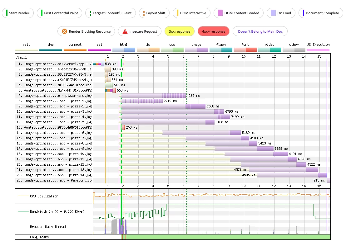
Waterfall View for the baseline implementation
Reading the waterfall reveals a lot about how the browser determines LCP. The green-dotted line marks the LCP moment, which sits between 6 and 7 seconds. Beyond the raw number, a few behaviors stand out:
- All images are fetched only after JavaScript, CSS, and font resources have been downloaded and processed.
- The element responsible for LCP is the
pizza-hero.jpgimage. - The browser waits about 2 seconds before it begins any image requests.
- Multiple images are downloaded concurrently. This is visible in the darker sections of the bars, indicating actual download time, while lighter sections show the period during which the request is pending.
- An image that isn't visible to the user,
pizza-1.jpg, is fetched and processed before the hero image. - The hero image takes more than 4 seconds just to download.
If you'd like to inspect the full test details yourself, the live result is available at this link: https://www.webpagetest.org/result/221204_AiDc1M_5JD/1/details
What we can learn
The waterfall makes it clear that there's a lot of room for improvement, and the hero image is the biggest lever. Tackling the following issues should move the needle:
- Start fetching images earlier in the page load sequence.
- Give the hero image priority so it's downloaded before the rest of the images.
- Request smaller or lighter image versions where possible to shorten download time.
Stage 1: Adding NgOptimizedImage and the Default Lazy-Loading Behavior
The initial implementation of the NgOptimizedImage directive is quite straightforward. You simply import NgOptimizedImage into your component or module setup. Given its standalone status, the import can be added directly to an ngModule or a standalone component.
To activate the directive, the standard src attribute on an image tag must be swapped for ngSrc — although the assigned URL remains unchanged. The resulting code looks like this:
<img [ngSrc]="heroImage" />

<article *ngFor="let the image of images">
	<p>Lorem ipsum ...</p>
	<img [ngSrc]="image" />
</article>
This concise syntax works because the directive's selector (img[ngSrc]) and its input property (ngSrc) both refer to the same HTML attribute.
Running this code immediately triggers an error, though. The directive enforces the inclusion of explicit width and height attributes to avoid layout shifts. These must be added:
<img [ngSrc]="heroImage" width="1920" height="1080" />

<article *ngFor="let the image of images">
	<p>Lorem ipsum ...</p>
	<img [ngSrc]="image" />
</article>
Let's hold off on further tweaks and first measure the LCP impact by using the base NgOptimizedImage as the sole modification. Before taking measurements, though, let's examine what has actually changed under the hood.
Deep Dive into the Generated Attributes
Using the browser's developer tools, we can inspect the rendered image elements to see what the directive has altered. Since none of our images are prioritized at this point, they are all treated equally, so we can examine any of them. Below is the rendered output of an image *without* the directive:
<img
	_ngcontent-hik-c1=""
	alt="main banner with image of pizza"
	src="<https://image-optimization-app.vercel.app/assets/pizza-hero.jpg>"
/>
And here is the same image *with* the NgOptimizedImage directive applied:
<img
	_ngcontent-rta-c2=""
	alt="main banner with image of pizza"
	width="1920"
	height="1080"
	loading="lazy"
	fetchpriority="auto"
	src="<https://image-optimization-app.vercel.app/assets/pizza-hero.jpg>"
/>
The difference is obvious: four new attributes have appeared. We added width and height manually, but the directive itself automatically injected the loading and fetchpriority attributes.
The loading attribute controls the browser's fetching behavior for the image and accepts two values:
eager– the default browser behavior, fetching the image instantly.lazy– defers fetching until the image is near the viewport.
As you can see, the directive automatically sets loading to lazy by default. This is a performance win for most pages where below-the-fold images don't need to be downloaded right away.
The fetchpriority attribute, on the other hand, helps the browser decide the order in which to download resources. It can be set to:
auto– lets the browser decide the priority.high– signals an important resource.low– signals a less important resource.
In this initial stage, the directive defaults fetchpriority to auto.
But wait—the directive's work goes far beyond just adding these attributes. In fact, it does a lot more behind the scenes.
It validates its own usage extensively, throwing errors if best practices aren't followed. When all checks pass, it generates HTML attributes, injects srcset for responsive images, and even creates preload link tags when working with server-side rendering.
For instance, the directive strictly requires either width and height attributes, or the fill attribute. The fill mode is an alternative to define the image's dimensions, allowing it to fill its parent container—a more flexible approach we'll explore later.
If these conditions aren't met, a descriptive error message is thrown. The directive is also smart enough to detect potential image distortion. If the provided width and height create an aspect ratio different from the actual image file, it logs a warning to help us correct it.
In total, NgOptimizedImage can trigger 13 distinct runtime errors for assertion failures and 6 warnings to nudge developers toward better implementation. This level of developer feedback is a significant part of what makes the directive feel so polished and production-ready.
Measuring the Initial LCP Impact
Now for the metrics. A local Lighthouse test reported an LCP of 23.1 seconds, which is actually 2.3 seconds *slower* than our baseline. To ensure this isn't a fluke, let's cross-reference it with WebPageTest.
WebPageTest shows an LCP of 6.3 seconds, also a slight regression of 0.1 seconds. Looking at the Waterfall graph provides the necessary context:
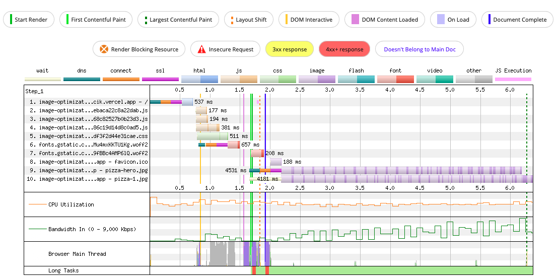
Waterfall View for Stage 1
The Waterfall chart clearly illustrates the problem. The pizza-hero.jpg and pizza-1.jpg images are being downloaded at the same time, and they aren't even the first resources requested—the favicon comes before them. The silver lining here is that the remaining, off-screen images are not fetched at all. This confirms the lazy-loading is working correctly, as those images are below the fold.
You can review the detailed test results yourself: https://www.webpagetest.org/result/221204_BiDcNN_5G9/2/details/
Key Takeaways
This stage confirms that the default lazy-loading is functioning as intended; we're only fetching the resources necessary for the current viewport.
Our goal is to maintain lazy-loading for non-critical images while making an exception for pizza-hero.jpg, our LCP element. We still need to address the core issues identified in the previous stage.
- Kick off the request for the hero image earlier.
- Prioritize the hero image's download, letting others fall in line after it.
- Utilize smaller or lighter image files for faster transfers.
Stage 2: Prioritizing the LCP Image
With the directive now in place, we can refine the configuration by simply following its suggestions and checking items off our list. Let's start with the priority. A general rule of thumb: if your LCP element is an image, it should be loaded with high priority.
In NgOptimizedImage, this is achieved by adding the priority attribute to the image's declaration.
<img [ngSrc]="heroImage" width="1920" height="1080" priority />

<article *ngFor="let the image of images">
	<p>Lorem ipsum ...</p>
	<img [ngSrc]="image" />
</article>
Note that this attribute is added exclusively to the first image—our designated LCP element.
Examining the priority Attribute
Let's inspect the runtime output to see what this change makes to the HTML, focusing only on the first image tag since the others have not changed. Here is the element from Stage 1:
<img
	_ngcontent-rta-c2=""
	alt="main banner with image of pizza"
	width="1920"
	height="1080"
	loading="lazy"
	fetchpriority="auto"
	src="<https://image-optimization-app.vercel.app/assets/pizza-hero.jpg>"
/>
And here is the same element in Stage 2:
<img
	_ngcontent-rxd-c2=""
	alt="main banner with image of pizza"
	width="1920"
	height="1080"
	priority=""
	loading="eager"
	fetchpriority="high"
	src="<https://image-optimization-app.vercel.app/assets/pizza-hero.jpg>"
/>
The priority attribute itself is only an internal input for the directive. The real changes are in the resulting HTML. The fetchpriority attribute's value has been updated from auto to high. This shift is the crucial part, and we expect it to impact our performance metrics positively.
No other attributes have been modified—the directive simply translates the priority input into the appropriate fetchpriority value. It also logs a warning if the necessary preconnect link is not detected for a high-priority image, which we'll address momentarily.
Metrics After Prioritization
After this change, the Lighthouse test on localhost shows an LCP of about 20.8 seconds, matching our original baseline. More importantly, WebPageTest reports a slightly improved LCP of 6.0 seconds—the best result so far. The Waterfall view explains this success:
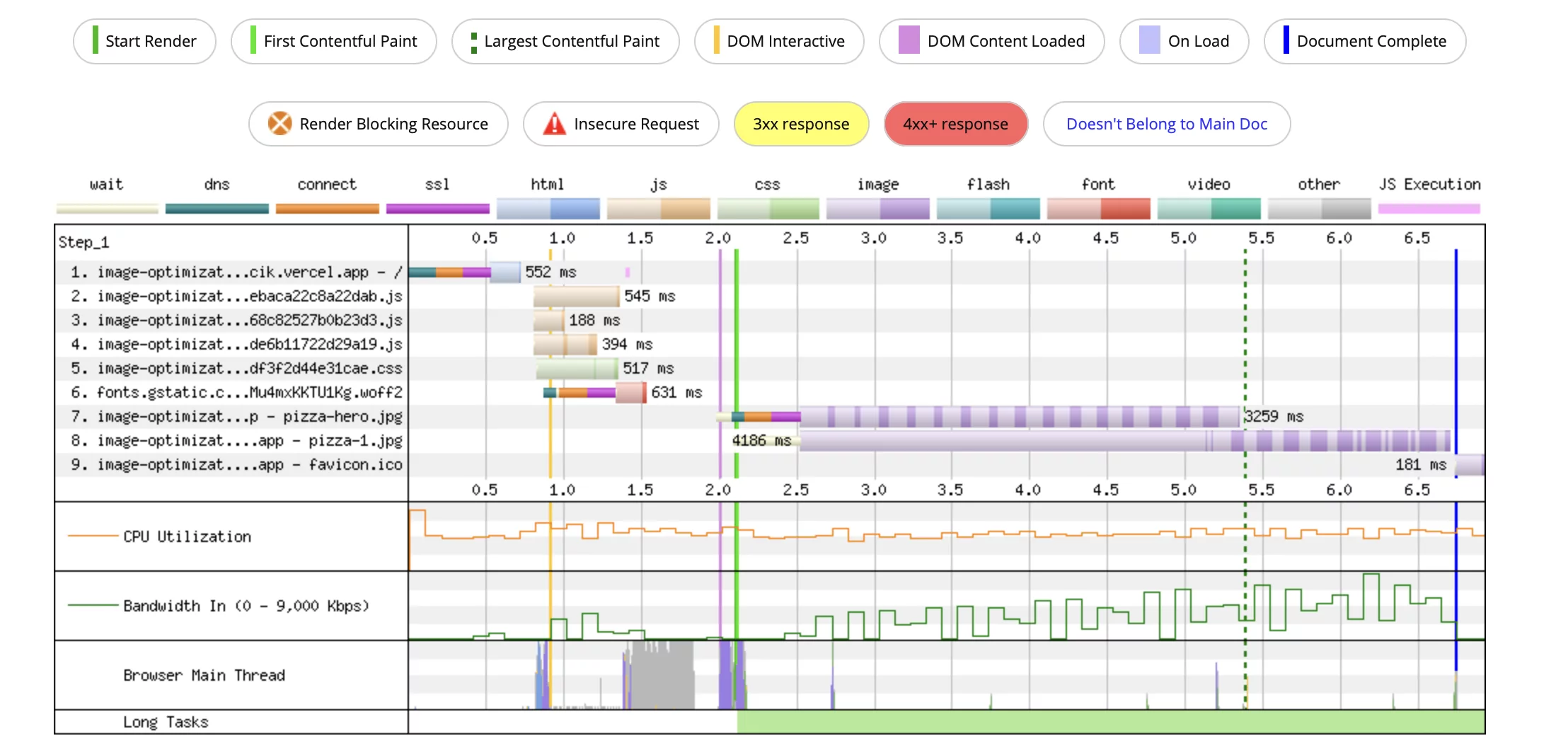
Waterfall View for Stage 2
The chart reveals two key improvements. First, the pizza-hero.jpg is now fetched completely before the pizza-1.jpg even begins. Second, the hero image has finally overtaken the favicon in the request order.
Here is the link to the test details if you want to check on your own: https://www.webpagetest.org/result/221205_AiDcCM_E6G/1/details/
Takeaways
A closer look at the Waterfall reveals a significant latency gap. The initial resource loading kicks off around the 1.5-second mark, but the hero image doesn't start downloading until the 2.5-second mark.
The slowdown between 2.0 and 2.5 seconds is occupied by DNS resolution, connection establishment, and SSL handshake. These steps merely set up the connection to the external server, they don't involve downloading the image data itself. While we can't make the JavaScript application determine its needs faster, we *can* tell the browser to initiate the connection earlier, perhaps while the JS is still being parsed.
This is precisely where the preconnect tag comes into play—and the directive has been warning us about its absence. Let's check our progress against our task list:
- ✅ Start fetching the hero image earlier.
- ✅ Ensure the hero image is the first resource fetched.
- Strong>Still pending: Request smaller image files.
We have one task left to complete, but first, let's implement the preconnect optimization.
Stage 3: Initiating an Early Connection with Preconnect
Web.dev has an excellent article detailing the mechanics of prefetching, but the core concept is straightforward: we can hint to the browser that we'll need to connect to a specific server imminently. This allows the DNS and TCP handshakes to happen in parallel with other loading tasks.
The implementation is simple—a single link tag in the page's <head>:
<link rel="preconnect" href="<https://example.com>" />
Simple, right? It's just a standard link element with a rel attribute of preconnect and the URL of the resource server. It's important to note that this should only be done once per server origin. There's no benefit to adding a preconnect tag for every single asset on the same server; a single tag per origin is sufficient.
So, that's our next step. Our images are hosted on Vercel, so we'll add a preconnect link pointing to that domain in the index.html file:
<link rel="preconnect" href="<https://image-optimization-app.vercel.app>" />
That does it for the setup.
What This Did (and Didn't) Do
There are no additional changes related to NgOptimizedImage here. The preconnect tag is a native browser mechanism, and the directive's only role is to nudge us toward using it.
It's also worth noting that not only does NgOptimizedImage warn you when a high-priority image lacks a preconnect, but it also generates the exact HTML code for the tag you need to insert. We just had to copy and paste it.
LCP Results After Preconnecting
Let's verify the performance. The Lighthouse result on localhost is identical to the previous step (20.8 seconds), which is puzzling. However, the WebPageTest tells a much better story. The LCP has dropped from 5.4 seconds to 4.5 seconds. It's a considerable improvement, though I can't pinpoint why the localhost test remained unchanged—potential caching or other environmental factors could be masking the effect here.
The WebPageTest Waterfall confirms the mechanism is working in a real-world scenario:
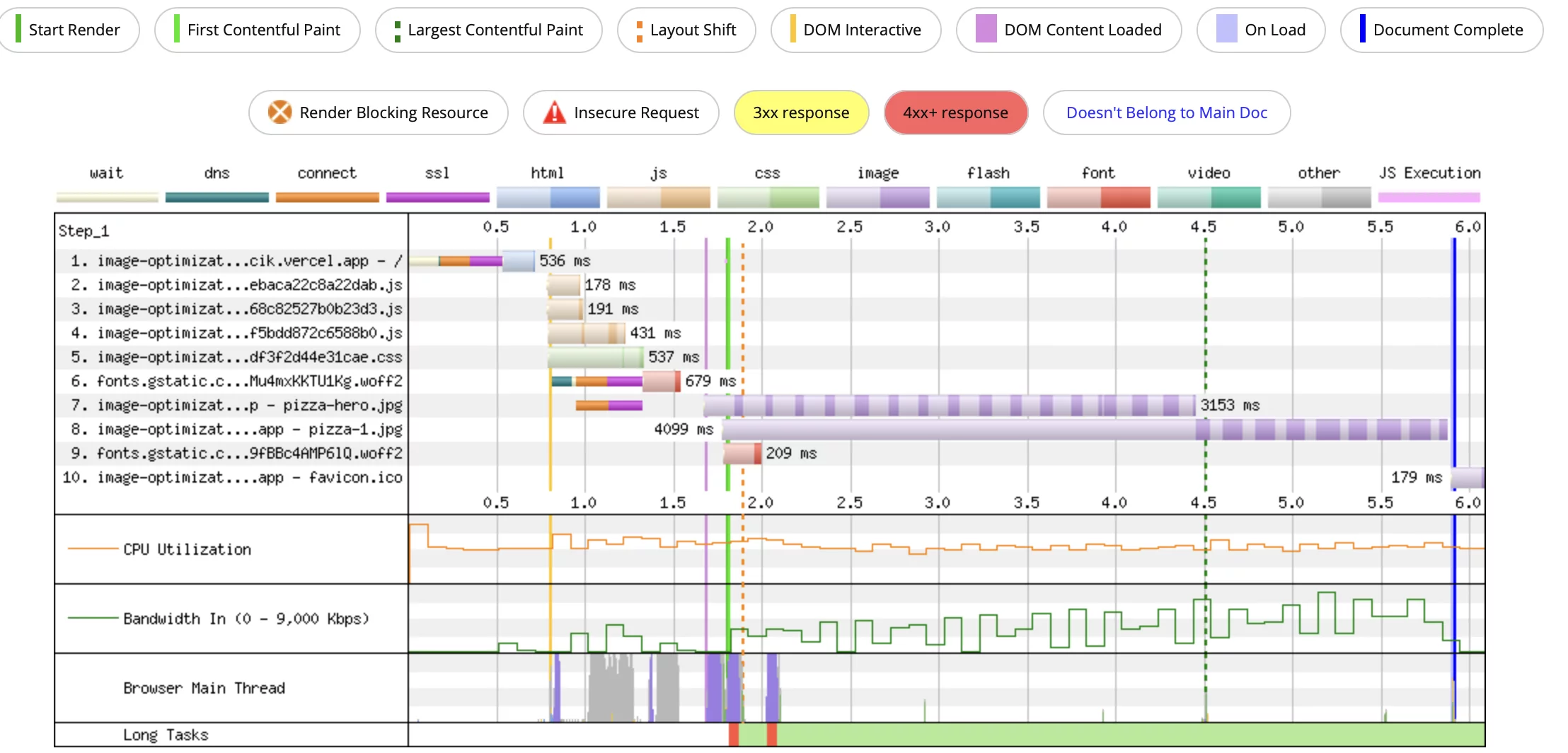
Waterfall View for Stage 3
The graph shows the DNS and connection tasks (including SSL) completing well before the image is actually requested. They are booked alongside the critical JavaScript file downloads, so we've essentially hidden this network setup time behind the application load.
Here is the link to the test details if you want to check on your own: https://www.webpagetest.org/result/221205_BiDcY8_E63/3/details/
Final Thoughts on Stage 3
Because the connection phase is now finished early, the image can begin downloading the very instant the app knows it's needed. There's no further speed to extract from the connection. The remaining bottleneck is the file size itself, which brings us to the final optimization in our series. The next step is making the hero image smaller and faster to download.
Step 4: Responsive Images
Serving a 4K image to a browser with a viewport of roughly 500px is pointless. The user won't notice the difference in quality, but they will experience a noticeably longer download time, particularly on slower mobile networks.
Conversely, we don't want to always deliver a low-resolution image. While it would load fast on mobile, it would appear blurry on desktop displays. When it comes to download speed and image sharpness, we ideally want the best of both worlds.
How can we deliver different images based on screen size? The img element supports the srcset attribute, which is thoroughly documented here. In essence, it lets you define multiple image sources along with conditions for when each should be used. There are two primary ways to define these conditions: by pixel density, or by specifying exact widths and providing a separate sizes attribute to describe the layout dimensions.
Fortunately, the directive simplifies this process by automatically generating the srcset for us. There are a few different strategies we can employ:
- Automatic
srcsetgeneration based onwidthandheightattributes. This is not suitable for responsive images as it doesn't account for varying viewport sizes, only pixel density. - Automatic
srcsetgeneration based on thesizesattribute. This is the correct approach for responsive images, as it dynamically adjusts thesrcsetto match different screen sizes using predefined breakpoints. Angular provides default breakpoints, but you can override them for specific requirements. - Manual
srcsetspecification. You can define thesrcsetyourself, but the directive still helps by generating the complete attribute based on the sizes you provide.
We'll implement fully responsive images that adapt to the screen size. Since the images in our application always span the full width of the screen, we need to account for this in our setup. We'll make two key modifications:
- Swap
widthandheightfor thefillattribute to occupy the full width. - Add a
sizesattribute set to100vw, which represents the full viewport width.
Applying these changes results in the following code:
<img [ngSrc]="heroImage" fill priority sizes="100vw" />

<article *ngFor="let the image of images">
	<p>Lorem ipsum ...</p>
	<img [ngSrc]="image" fill />
</article>
The reason we switched from fixed dimensions to the responsive fill attribute is that our images always occupy the entire screen width. This necessitates different image files depending on the viewport size — a mobile screen requires a lighter image than a large desktop monitor.
Regardless of the method we choose for generating the srcset, we still need to produce and host these various image resources, which can be a tedious process. To bypass this, we'll leverage Imgix. Imgix is a CDN platform that handles image optimization for us. CDNs use a specific URL structure to fetch resources for a given srcset, which you can read more about here. This means I don't have to manually create multiple versions of my pizza-hero.jpg; I just upload the original to Imgix and request specific sizes via the URL.
I opted for Imgix because it's one of the CDNs with a loader preconfigured in Angular, so I don't need to write any extra setup code. I'll discuss how to create custom loaders later, but for now, we'll use the simplest option.
To configure the CDN to work seamlessly with NgOptimizedImage and generate the srcset, we need to register the loader in the providers array of our module or standalone component:
providers: [provideImgixLoader("<https://my.base.url/>")];
My Imgix account hosts assets at https://maciejwojcik.imgix.net, so we can configure the loader like this:
@NgModule({
   ...
   providers: [
        provideImgixLoader("<https://maciejwojcik.imgix.net>")
   ]
})
To fetch an image, such as pizza-hero.jpg, I only need the resource from https://maciejwojcik.imgix.net/pizza-hero.jpg. Since the base URL is already defined in the loader, there's no need to repeat it in our component. This simplifies our asset declarations to just the file names:
@Component({
  selector: 'app-root',
  templateUrl: './app.component.html',
})
export class AppComponent {
  readonly heroImage = 'pizza-hero.jpg';
  readonly images = [
    'pizza-1.jpg',
    'pizza-2.jpg',
		...
  ];
}
Now, let's run the application and inspect the network tab in the devtools to see what resources are actually requested:
URL: <https://maciejwojcik.imgix.net/pizza-hero.jpg?auto=format&w=828>
The URL correctly points to our CDN with the right asset name. But that's not the only change — there are also query parameters automatically added by the NgOptimizedImage directive! This is a significant developer experience win, making it far easier to follow best practices. Just a few lines of code and we're now serving optimized images tailored to the user's screen!
Under the Hood
Let's once again examine the runtime output. Below is the result from our previous stages:
<img
	_ngcontent-rta-c2=""
	alt="main banner with image of pizza"
	width="1920"
	height="1080"
	loading="lazy"
	fetchpriority="auto"
	src="<https://image-optimization-app.vercel.app/assets/pizza-hero.jpg>"
/>
And here's the new output from Stage 4:
<img
_ngcontent-ttw-c2=""
alt="main banner with image of pizza"
fill=""
priority=""
sizes="100vw"
loading="eager"
fetchpriority="high"
src="<https://maciejwojcik.imgix.net/pizza-hero.jpg?auto=format>"
srcset="
<https://maciejwojcik.imgix.net/pizza-hero.jpg?auto=format&w=640> 640w,
<https://maciejwojcik.imgix.net/pizza-hero.jpg?auto=format&w=750> 750w,
<https://maciejwojcik.imgix.net/pizza-hero.jpg?auto=format&w=828> 828w,
<https://maciejwojcik.imgix.net/pizza-hero.jpg?auto=format&w=1080> 1080w,
<https://maciejwojcik.imgix.net/pizza-hero.jpg?auto=format&w=1200> 1200w,
<https://maciejwojcik.imgix.net/pizza-hero.jpg?auto=format&w=1920> 1920w,
<https://maciejwojcik.imgix.net/pizza-hero.jpg?auto=format&w=2048> 2048w,
<https://maciejwojcik.imgix.net/pizza-hero.jpg?auto=format&w=3840> 3840w
"
style="position: absolute; width: 100%; height: 100%; inset: 0px;"
/>
The new image element has significantly more going on! We've swapped width and height for fill and sizes, which is one change. We also have a new srcset attribute with multiple sources generated for various screens. Writing all those entries manually would be tedious, right? Finally, there's additional styling applied automatically for the fill mode.
The generation of srcset varies depending on the attributes you provide:
- When
widthandheightare set, it indicates a fixed size. However, different resources might still be needed based on pixel density. The directive generates asrcsetfor density values of1and2, appending the density and the multiplied width to the source list. - When
fillis used, it signals a responsive image, and you should provide asizesattribute (though it's optional, defaulting to100vw). The directive generates thesrcsetby mapping the relevant breakpoints (Angular's defaults or your custom ones) to the source list, after filtering them based on thesizesvalue. - When the
ngSrcsetattribute is provided, the directive generates thesrcsetbased on this value and thewidthattribute, unless the width is already included in thengSrcsetstring.
There's no magic here; the implementation is straightforward. What makes the directive special isn't complex code, but the superior developer experience it provides. It's designed to help you build high-performance websites with excellent user experience, enforcing best practices along the way.
Measuring LCP
We still need to verify whether fetching responsive images via a CDN actually makes a difference to our LCP. The Lighthouse test shows an LCP of 17.5s, a 3.3s improvement over the previous stage. WebPageTest shows a substantial drop to 2.7s! That's a decrease of 1.8 seconds, bringing us very close to the recommended LCP threshold of 2.5s.
I mentioned I'd use the median result from three tests, but if we were to take the best one, it clocks in at 2.5s, which is officially considered a good LCP score!
Let's look at what changed in the Waterfall graph:
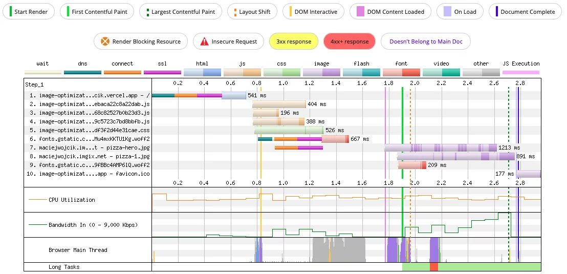
Waterfall View for Stage 4
Downloading the LCP resource now takes around 1 second, a significant improvement from the previous result of over 3 seconds. The image being fetched is smaller, and we're no longer wasting time downloading a file larger than necessary.
If you'd like to explore the test details yourself, here's the link: https://www.webpagetest.org/result/221204_AiDcTA_5QV/2/details/
Overall LCP Improvement
We successfully reduced LCP from 6.2s to 2.7s in the WebPageTest, and from 20.8s to 17.5s in the Lighthouse test on localhost. This is an excellent outcome, and as mentioned, we are very close to the target of 2.5s for a good LCP score.

A Decreasing Trend of LCP
Even though the localhost app was much slower than the one deployed on Vercel and tested with WebPageTest, the trends are similar. Both tests confirm the directive does exceptional work in optimizing LCP as soon as we focus on the LCP element. Interestingly, both tests also show a slight LCP increase when we used the default lazy-loading setting for all images.
Remember, throughout this experiment, we didn't rely on any advanced knowledge of LCP, performance optimization, or browser image APIs. We simply followed the guidance from NgOptimizedImage and went from a very poor LCP to a near-perfect score.
Additional Loaders
In our example, we used the Imgix loader, which is preconfigured by Angular, with the following syntax:
providers: [provideImgixLoader("<https://my.base.url/>")];
However, we're not restricted to Imgix. You can use any of the other preconfigured loaders, including:
Or, you can always build a custom one.
Creating a custom loader is quite simple. The loader is a function that returns the resource URL, using the provided config to put together the asset URL and the optional width parameter. For instance, if we wanted to register our own image provider, we could implement it like this:
providers: [
  {
     provide: IMAGE_LOADER,
     useValue: (config: ImageLoaderConfig) => {
       return `https://my-image-provider.com/${config.src}.jpg}`;
     }
  },
],
If our image provider supports serving different versions of an asset based on width, we can request that using the appropriate URL pattern. For example:
providers: [
  {
     provide: IMAGE_LOADER,
     useValue: (config: ImageLoaderConfig) => {
       return `https://my-image-provider.com/${config.src}?width="${config.width}"}`;
     }
  },
],
Then, in the template, we can use the simplified syntax:
<img ngSrc="pizza.jpg" fill>
Which results in the following generated src:
https://my-image-provider.com/pizza.jpg?width="720px"
Final Thoughts
This article was heavily inspired by the insightful talk at ng-conf by Kara Erickson. Full credit goes to her and the entire team. I'm thoroughly impressed by their efforts to enhance the web and user experience while creating an incredible developer experience. The design of NgOptimizedImage is truly excellent.
Working on this article taught me a great deal, and I'd like to share the most important takeaways.
We must focus on optimizing LCP elements. LCP significantly impacts the perceived load speed, and it should always be a priority. In our example, we improved LCP from 6.5 seconds to 2.7 seconds just by optimizing one element, and it only required a few lines of code. Even better, most of those lines were suggested by Angular itself.
The directive is incredibly user-friendly. It doesn't demand deep optimization knowledge from developers, and it enforces good practices by design. It does this through automatic code generation, helpful warnings, and errors that alert you when something isn't right.
I highly recommend trying NgOptimizedImage in your project. It handles all the amazing image-related tasks we need. It's well-tested, fully maintained, and more features are on the way.
My final advice is to regularly measure the Core Web Vitals in your applications and strive to improve them for the best possible user experience and a better web.
Thank you for reading!