Deciding Between the Two
Reactive forms offer flexibility—dynamic control creation and a wide range of validation methods, both synchronous and asynchronous. While template driven forms can achieve similar outcomes, they tend to demand more verbose and repetitive code.
Conversely, when the goal is simply adding a control like a checkbox that toggles component visibility, building an entire form with listeners is unnecessary. A plain ngModel with ngModelChange suffices.
The pragmatic approach is leveraging both. The nuances of TDF and RF are thoroughly covered in the official docs and on the wp.angular.love blog. Here, I’ll dive into combining the two techniques.
Template Driven Forms
Having worked with Angular since the early days (starting with Angular 1.3), template driven forms felt natural when I transitioned to Angular 2. They serve projects effectively when implemented thoughtfully.
But what does a thoughtful implementation look like? Suppose you need a form in app.component.html:
<div class="form-input">
  <label for="name">Name</label>
  <input type="text" id="name" [(ngModel)]="name">
</div>
That approach leaves much to be desired. Adding similar forms elsewhere would mean copying large chunks of code, creating maintenance headaches later.
A better strategy is to extract it into a reusable component.
Let’s set up the MyForms module containing an input-text component (note: this is simplified—in practice, you might create a separate library module first).
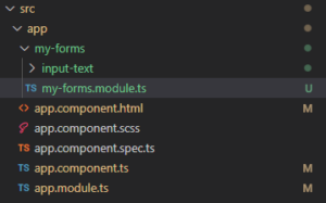
We can include this component in the module’s exports (currently just one, but more will follow).
const COMPONENTS = [
  InputTextComponent
]

@NgModule({
  declarations: [
    ...COMPONENTS
  ],
  exports: [
    ...COMPONENTS
  ],
  imports: [
    FormsModule,
    ReactiveFormsModule,
  ]
})
export class MyFormsModule { }
Now, let’s use it in app.component (be sure to import MyModule).
<app-input-text label="name" name="name" [(ngModel)]="name"></app-input-text>I’ve added the name attribute; it’ll come in handy when we embed this within a larger form.
At this point, you’ll only see the placeholder text: input-text works!
That’s expected since our component isn’t complete yet.
Let’s start with the TypeScript:
import { Component, forwardRef } from '@angular/core';
import { ControlValueAccessor, NG_VALUE_ACCESSOR } from '@angular/forms';

@Component({
  selector: 'app-input-text',
  templateUrl: './input-text.component.html',
  styleUrls: ['./input-text.component.scss'],
  providers: [
    {
      provide: NG_VALUE_ACCESSOR,
      useExisting: forwardRef(() => InputTextComponent),
      multi: true,
    },
  ],
})
export class InputTextComponent implements ControlValueAccessor {

  @Input() label: string = '';
  @Input() name: string = '';

  value: string = '';

  onChange: (_: any) => void = (_: any) => {};

  onTouched: () => void = () => {};

  constructor() {}

  updateChanges() {
    this.onChange(this.value);
  }

  writeValue(value: string): void {
    this.value = value;
    this.updateChanges();
  }

  registerOnChange(fn: any): void {
    this.onChange = fn;
  }

  registerOnTouched(fn: any): void {
    this.onTouched = fn;
  }
}
Now, add the provider and implement the necessary ControlValueAccessor.
Additionally, include the label and name input properties.
And here’s the HTML:
<div class="form-input">
  <label [for]="name">{{label}}</label>
  <input type="text" [name]="name" [id]="name" [(ngModel)]="value" (ngModelChange)="updateChanges()">
</div>
It performs flawlessly, and creating new fields is now straightforward.
<app-input-text label="name" name="name" [(ngModel)]="name"></app-input-text>
<app-input-text label="phone" name="phone" [(ngModel)]="name"></app-input-text>
Future changes to the appearance or functionality can be made in one location, affecting all instances globally.
Reactive Forms
The strength of reactive forms lies in defining dynamic forms directly in the TypeScript. Pairing that with inputs like these:
<div class="form-input">
  <label for="name">Name: </label>
  <input id="name" type="text" [formControl]="name">
</div>
isn’t optimal. A form generator is a worthwhile investment—whether you build one or utilize the excellent ngx-formly library.
Install and configure the library as instructed on https://formly.dev/guide/getting-started.
Note: Import FormlyModule but skip FormlyBootstrapModule.
We’ll create a new form-input-text component (our control for forms, based on the existing input-text) and a form-field wrapper. This wrapper will house all our controls—currently just the input, but likely more later. It handles consistent styling like margins and validation messages.
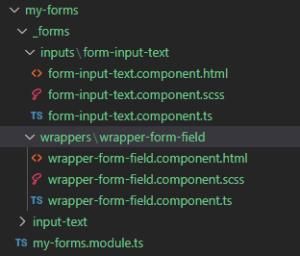
Register everything in the MyForms root module.
We’ll declare our wrapper and control, using the control with type "input" and applying the wrapper.
    FormlyModule.forRoot({
      wrappers: [{ name: 'form-field', component: WrapperFormFieldComponent }],
      types: [{ name: 'input', component: FormInputTextComponent, wrappers: ['form-field'] }],
    }),
Now, let’s look at the input and wrapper implementations.
Wrapper HTML:
<div class="form-input">
  <ng-template #fieldComponent></ng-template>
</div>
Simple for now—just one class and a reference #fieldComponent to render the controls. We’ll add error messages here later.
You can remove <div class = "form-input"> from input-text.component; the class lives in the wrapper. For now, the TS file simply extends FieldWrapper.
import { Component } from '@angular/core';
import { FieldWrapper } from '@ngx-formly/core';

@Component({
  selector: 'app-wrapper-form-field',
  templateUrl: './wrapper-form-field.component.html',
  styleUrls: ['./wrapper-form-field.component.scss']
})
export class WrapperFormFieldComponent extends FieldWrapper {
}
Similarly, the TS file for FormInputText does the same:
import { Component } from '@angular/core';
import { FieldType } from '@ngx-formly/core';

@Component({
  selector: 'app-form-input-text',
  templateUrl: './form-input-text.component.html',
  styleUrls: ['./form-input-text.component.scss']
})
export class FormInputTextComponent extends FieldType {

}
And in its HTML:
<app-input-text type="input" [formControl]="formControl" [formlyAttributes]="field"></app-input-text>If you’re on a newer Angular version, set strictTemplates to false in tsconfig.json.
We’re almost done. Just export FormlyModule from MyForms.
With that set, we can craft our first control and add it to app.component.
  model = {
    name: null
  }

  form = new FormGroup({});
  fields: FormlyFieldConfig[] = [
    {
      key: 'name',
      type: 'input',
      templateOptions: {
        label: 'Name',
      },
    },
  ];
The library is immensely capable. This example is minimal. The key property stores the value, type specifies the control, and templateOptions carries the label and other attributes.
Add this to the HTML:
<form [formGroup]="form">
  <formly-form [model]="model" [fields]="fields" [form]="form"></formly-form>
</form
These are reactive forms, so providing a model is optional but often useful.
The Payoff
Blending Template Driven and Reactive Forms isn’t meant for tiny apps. You’ll see the biggest gains when most forms are reactive, but you occasionally need a simple control. Say, a toggle that reveals a new section. With reactive forms alone, you’d need to define the form, subscribe to changes, and manage unsubscription. With template-driven, just drop in the component, set up ngModelChange, and you’re done.
Looking Ahead
The wrapper isn’t limited to markup. We can enhance this module with validation, showing inline errors for invalid entries. That’s a good topic for a follow-up piece.
Find the code on GitHub: https://github.com/rograf/angular-forms-sample.