
The Fundamentals
Developed in collaboration between the Chrome Aurora and Angular teams, the Image Directive in Angular was created with the goal of enhancing the web's image loading experience. A great write-up on this topic can be found in the Chrome Aurora blog. It goes without saying that images constitute a substantial portion of web content, and their loading behavior can significantly influence a site's Core Web Vitals scores. These vitals represent a collection of metrics designed to gauge page load performance. Among them, some are directly tied to image handling, while others are only tangentially related or not impacted at all. The focus here is on those directly relevant metrics and how the NgOptimizedImage directive works behind the scenes to address them, guaranteeing your images are served in the most efficient manner possible.
As a standalone Angular directive, NgOptimizedImage activates automatically upon import and once you switch the src attribute on your <img> element to ngSrc, as demonstrated here:
import { NgOptimizedImage } from '@angular/common';
import { Component } from '@angular/core';

@Component({
  selector: 'ng-conf-image',
  template: `
    <!-- Will not use the NgOptimizedImageDirective -->
    <img src="angie.jpg" />
    <!-- Will use the NgOptimizedImageDirective -->
    <img ngSrc="angie.jpg" />
  `,
  imports: [NgOptimizedImage],
})
class NgConfImage {}
Should you choose not to leverage every feature the image directive offers, there is still value in adopting it in its default state. During development, it will emit warnings to the console with straightforward recommendations for your templates.
Understanding Core Web Vitals
The specific Core Web Vitals (CWV) that will be examined in relation to the Image Directive's features include LCP, DIF, CLS, TTFB, FCP, TBT, and TTI. Each of these tracks a distinct facet of the page loading experience. Some, like Largest Contentful Paint (LCP), are widely recognized, whereas others are more specialized and track less-discussed aspects, such as Time to First Byte (TTFB).
Before diving into the details of the Image Directive, let's establish what each of these Core Web Vitals measures.
- Largest Contentful Paint (LCP) – This metric tracks the render time of the most significant image or text block within the viewport, relative to the start of the page load. Consider a webpage with a prominent image at its top; if not handled correctly, such an image can be the primary culprit for an inflated LCP score.
- First Input Delay (FID) – This gauges the browser's responsiveness to user interactions. Influencing factors include heavy JavaScript execution, main thread congestion (since JS is single-threaded, a busy main thread can queue user actions; images are fetched asynchronously, and modern browsers aim to optimize their painting to reduce disruption), and network latency. Usually, images don't have a direct bearing on FID.
- Cumulative Layout Shift (CLS) – This quantifies the visual instability of a page as elements load and move. The file size of an image isn't a factor, but missing dimension attributes or swapping in differently sized images (like with dynamic placeholders) can lead to a poor CLS rating.
- Time to First Byte (TTFB) – This represents the duration until the browser receives the initial byte of the page. It's rarely influenced by images since the first byte usually comes from your server or CDN as the
index.htmlfile, before any page content is rendered. - First Contentful Paint (FCP) – Images can have an immediate effect on this metric. FCP records the time until the very first piece of content appears on screen. If that initial element happens to be a large image, it can lead to a subpar FCP score.
- Total Blocking Time (TBT) – In certain situations, images might have an indirect impact on TBT, which relates to the points mentioned for FID and the act of painting images post-download.
- Time to Interactive (TTI) – Similar to TBT, the time taken to paint images can indirectly sway TTI.
The primary focus will be on LCP, CLS, and FCP, as these are the vitals most susceptible to image-related issues. We'll explore how the Angular Image Directive works internally to positively influence these scores.
To fully grasp the directive's impact on Core Web Vitals and the tools at our disposal for fine-tuning image loading, we'll examine each property it supports. This includes both native <img> attributes and the custom @Inputs supplied by NgOptimizedImage. Each property influences a distinct phase of the image loading process, from network setup to element sizing. They are categorized into the Priority and Image Sizing groups, each with deeper breakdowns for specific attributes.
Setting Priority
Controlling Loading and Fetch Priority
Let's start with the directive's priority attribute. This serves as the initial safeguard for your LCP (and potentially your FCP). For instance, take the image URL https://images.unsplash.com/photo-1417325384643-aac51acc9e5d. Consider the default template:
<img
  ngSrc="https://images.unsplash.com/photo-1417325384643-aac51acc9e5d"
  fill
/>
When rendered, the DOM will contain an <img> tag as follows (with irrelevant attributes omitted):
<img
  loading="lazy"
  fetchpriority="auto"
  src="https://images.unsplash.com/photo-1417325384643-aac51acc9e5d"
/>
Observe that the image is assigned loading="lazy" and fetchpriority="auto". If this image is crucial for LCP, we should not rely on lazy loading, as we'd expect it to be necessary immediately at page load. By default, fetchpriority is set to auto, the browser's standard behavior, which delegates the decision of when to load the resource. However, when we are certain an image is critical right away, we should communicate that. In such cases, making an explicit choice is superior to leaving things up to the browser. The Image Directive includes functionality for this exact scenario.
By marking the image with the priority attribute, the directive takes it upon itself to configure the appropriate values for the fastest possible loading.
This explicit declaration to the browser signals our intent for immediate loading:
<img
  ngSrc="https://images.unsplash.com/photo-1417325384643-aac51acc9e5d"
  fill
  priority
/>
After DOM rendering, the output is:
<img
  priority=""
  loading="eager"
  fetchpriority="high"
  src="https://images.unsplash.com/photo-1417325384643-aac51acc9e5d"
/>
Now, the loading attribute is eager and fetchpriority is high. This instructs the browser to fetch this resource immediately, irrespective of its page position, and to assign it precedence over resources marked as low priority. A clear advantage: the image won't be in contention with less critical resources, thereby protecting your LCP score.
Handling Preload and Preconnect
With the directive informing the browser of the image's urgency, Angular takes it a step further with some automatic actions to support the browser in achieving an optimal image load.
When using Server-side Rendering (SSR), Angular adds a preload link tag into your index.html. This <link> element, placed within the <head>, anticipates the need for this image early in the application lifecycle and prompts the browser to begin fetching it in advance.
Note: Despite the name, this doesn't initiate a load; rather, it schedules the resource from the
hrefto be downloaded and cached with elevated priority.
The generated preload link, as seen below, will typically be positioned towards the end of the <head> element.
<link
  as="image"
  href="https://images.unsplash.com/photo-1417325384643-aac51acc9e5d"
  rel="preload"
  fetchpriority="high"
  imagesizes="100vw"
/>
Note: Take notice of the
as="image"attribute on this link. It's additional information Angular provides to let the browser classify the resource, enabling it to refine the loading strategy.
Another performance suggestion Angular makes in development mode (although not executed automatically) is to include a preconnect link tag in the head. This establishes an early connection to the server hosting your images. As a result, when the browser is ready to download the image, the connection is already established, eliminating connection overhead.

Dev mode console warning alerting you to add a preconnect link.
Adding preconnect links for known origins is a move towards explicit resource management, yielding better overall image rendering performance.
Simply by including the priority attribute, Angular accomplishes three key tasks:
- Establishes a head start on the connection to the image's origin
- Facilitates the download and caching of the image before it's actually needed by the application
- Prioritizes the loading of this image over less critical resources, ensuring it appears among the first elements for the user.
Note: There might be cases where overlooking the missing
preconnectwarnings is intentional. You can suppress these for specific origins by supplying a value for thePRECONNECT_CHECK_BLOCKLISTinjection token, which accepts either a singlestringor an array ofstringvalues. Example:{ provide: PRECONNECT_CHECK_BLOCKLIST, useValue: 'https://images.unsplash.com' }
How does this translate to real-world network performance?

Network water fall with all priority optimizations applied.

Network water fall without any priority optimizations applied.
That amounts to over 100ms in savings! Of course, these metrics come from a simple app on a desktop. The performance gain would likely be much more pronounced with an application loading numerous other resources, particularly over slower network connections like 3G.
Image Sizing
Width, Height, and Fill
To avoid layout shifts and maintain a good CLS score, the image directive requires that you either specify width and height values for the image, or use the fill attribute to instruct it to occupy its parent container. As shown in the priority section earlier, we employed fill. This is useful when the final rendered size of the image is unknown, but you are certain it will fill a parent container that has been properly sized and positioned on the page.
Providing explicit width and height values informs the browser of the exact space the image will use, enabling it to reserve that space during layout and preventing content from shifting, which could otherwise harm your CLS scores.
<img
  ngSrc="https://images.unsplash.com/photo-1417325384643-aac51acc9e5d"
  width="100"
  height="100"
/>
Note: When setting the
widthandheightproperties, it is crucial to ensure they align with the image's intrinsic aspect ratio. Mismatched values can lead to a distorted image upon display.
The approach to setting width and height differs based on whether the image is intended to be a fixed size or responsive. Responsive images are designed to scale up and down according to the viewport size. For responsive images, it's essential to define the sizes attribute—and the image directive offers assistance with this as well!
On the other hand, using fill ensures the image completely occupies its parent container. For instance, if you have a div that is 100px by 100px, the image will render at that exact size. It's important to note that this refers to the display size, not necessarily the file size of the downloaded image, which we will address later.
<div style="width: 100px; height: 100px;">
  <img
    ngSrc="https://images.unsplash.com/photo-1417325384643-aac51acc9e5d"
    fill
  />
</div>
The fill attribute proves particularly advantageous when displaying background images. Its behavior can be adjusted using the object-fit CSS property on the <img> tag. According to the Angular documentation:
You can use the object-fit CSS property to change how the image will fill its container. If you style your image with object-fit: "contain", the image will maintain its aspect ratio and be "letterboxed" to fit the element. If you set object-fit: "cover", the element will retain its aspect ratio, fully fill the element, and some content may be "cropped" off.
Here's an illustration of how that functions:

No object-fit CSS applied. The image is just fit within the
container, squishing and messing it up as the aspect ratio does not match
the containers.
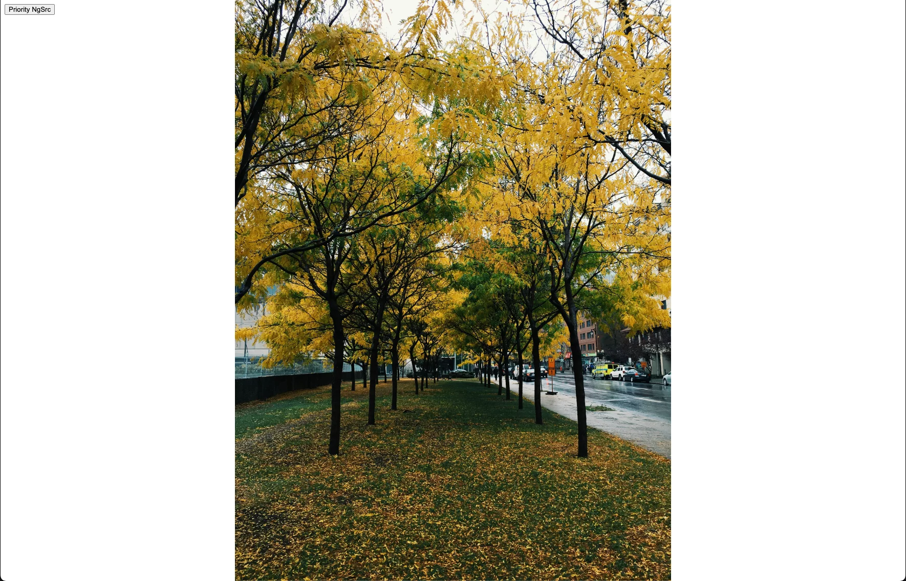
object-fit: contain The image is centered and fit within the
container as good as it can without cropping off anything from the x or
y-axis.

object-fit: cover The image is cropped (either x-axis or y-axis
depending on what side is "too big") and fit within the container.
Note: While we won't dive deep into the CSS aspects since it applies to all images, you can also manage the image's position using the object-position property in conjunction with
object-fit.
All these techniques only affect the rendered size, not the file size of the downloaded image. This brings up a common question: "How can I avoid downloading a 4MB image when I only need to display it in a small element, but my CDN stores high-resolution copies?" Fortunately, there's a solution for that!
Sizes and srcset
Selecting the appropriate image size is arguably the most significant factor in improving page load times. By combining the sizes and ngSrcset attributes on your <img> tag, you can direct Angular on which image size to load under specific conditions.
Browsers support the srcset attribute on image tags, which is an enhancement over src. It allows you to provide a list of image candidates, and the browser picks the most efficient one based on the viewport. The image directive automatically generates a srcset based on the sizes value you provide, enabling the browser to select the optimal size when the image is inserted into the DOM.
A typical srcset might appear as follows:
<img
  src="https://images.unsplash.com/photo-1417325384643-aac51acc9e5d"
  srcset="
    https://images.unsplash.com/photo-1417325384643-aac51acc9e5d?w=1080 1080w,
    https://images.unsplash.com/photo-1417325384643-aac51acc9e5d?w=400   400w,
    https://images.unsplash.com/photo-1417325384643-aac51acc9e5d?w=200   200w
  "
  sizes="(min-width: 50vw) 1080px,
           ((min-width: 20vw) and (max-width: 50vw)) 400px,
           (max-width: 20vw) 200px"
  alt="A treed park"
/>
This configuration ensures the correctly sized image loads based on the space the image occupies in vw units on the screen. While this might seem complex to manage for every image, Angular's Image Loaders simplify the process significantly. In this example, the px value corresponds with the w (width) property of each image, making it straightforward. However, this isn't always as obvious in the rendered HTML, especially with custom loaders. It's important to maintain a 1:1 correspondence between the sizes values and the srcset image URLs.
Note: Angular offers a default array of responsive breakpoints
[16, 32, 48, 64, 96, 128, 256, 384, 640, 750, 828, 1080, 1200, 1920, 2048, 3840]. You have the option to override these by providing theIMAGE_CONFIGwith your ownnumber[]array at the application's root.
The most effective way to harness sizes and srcset is through an Image Loader. This addresses the challenge of serving the right image size from your CDN.
An "Image Loader" is a function you supply to Angular that formats image URLs in a specific manner to ensure efficient delivery. By using an Image Loader along with the srcset attribute, Angular automatically generates URLs for various breakpoints. Angular provides prebuilt loaders for popular image CDNs like Cloudflare Image Resizing, Cloudinary, ImageKit, and Imgix. For our demonstration, we're using Unsplash, which leverages Imgix for dynamic resizing.
Earlier, when loading an Unsplash image directly, the raw file was about 3.7MB, which is far too large for every user to download. By employing the built-in Imgix loader, we can significantly reduce this and serve appropriately sized images based on the user's screen.
The initial step involves adding the provideImgixLoader to the providers array in your AppModule or appConfig for standalone setups.
import { ApplicationConfig } from '@angular/core';
import { appRoutes } from './app.routes';
import { provideImgixLoader } from '@angular/common';

export const appConfig: ApplicationConfig = {
  providers: [
    // ...other providers
    // We are using Unsplash here but if you have your own Imgix distribution you should put your own origin here.
    provideImgixLoader('https://images.unsplash.com'),
  ],
};
registering the Imgix loader app-wide ensures that whenever Angular sees ngSrc, it processes the image through the loader (along with other settings like sizes and ngSrcset) to construct the URLs for the browser.
Note: If your images come from different CDNs, you might wonder about using multiple loaders. While direct multi-loader support isn't available, you can create a custom loader (covered below) and conditionally integrate the built-in loaders or your own logic based on the
srcattribute of the<img>tag.
Next, we use the Image Directive in our template to see it in action!
import { Component } from '@angular/core';
import { NgOptimizedImage } from '@angular/common';

@Component({
  selector: 'ngconf-src-v-ngsrc',
  template: `
    <div style="height: 100%; width: 100%;">
      <!-- Depending on the image loader you are using the value of ngSrc may differ but usually it is the "name" of the image you want to load from your CDN. -->
      <img
        [ngSrc]="'photo-1417325384643-aac51acc9e5d'"
        style="object-fit: cover;"
        fill
        priority
        ngSrcset="300w, 800w, 1500w"
      />
    </div>
  `,
  imports: [NgOptimizedImage],
  standalone: true,
})
export class PriorityNgSrcComponent {}
And that's it! Angular now generates a srcset for your image based on the viewport size! Small screens request width=300, medium screens width=800, and large screens width=1500 from the Imgix (Unsplash) CDN.
Here's the fully rendered <img> tag with the srcset Angular produced. This is remarkable, and with CDN capabilities, it saves developers considerable effort in ensuring images are correctly sized.
<img
fill=""
priority=""
style="object-fit: cover;
position: absolute; width: 100%; height: 100%; inset: 0px;"
loading="eager"
fetchpriority="high"
src="https://images.unsplash.com/photo-1417325384643-aac51acc9e5d?auto=format"
srcset="
https://images.unsplash.com/photo-1417325384643-aac51acc9e5d?auto=format&w=300 300w,
https://images.unsplash.com/photo-1417325384643-aac51acc9e5d?auto=format&w=800 800w,
https://images.unsplash.com/photo-1417325384643-aac51acc9e5d?auto=format&w=1500 1500w
"
sizes="100vw"
/>
Using Chrome DevTools' responsive mode, we can inspect the different URLs generated and the complete srcset:

A very small viewport loads the image with width=300, it is only
73kB!
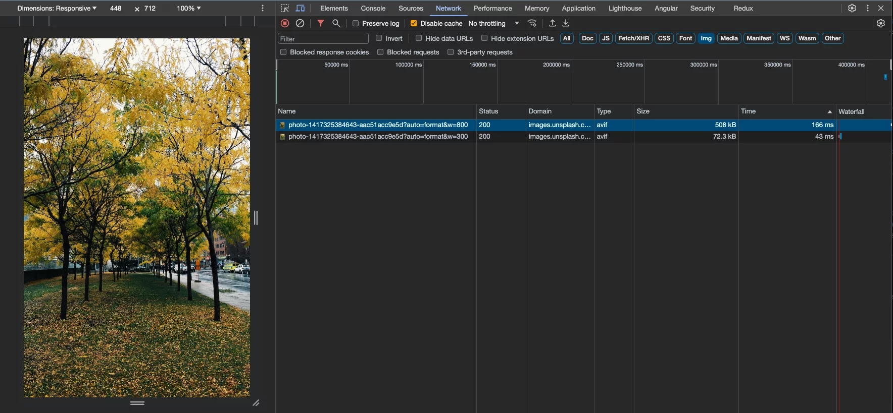
By making it a bit bigger we can see it is now loads width=800, and
has increased to 508kB, which is still a far cry from the 3.7MB originally.
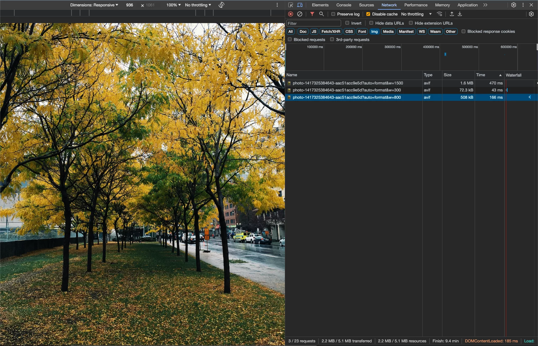
Lastly, on larger screens we are loading the width=1500 which is
still only 1.6MB (still large but less than half the size originally).
It's important to note that the image loader doesn't resize images itself; it generates URLs for your CDN provider based on the specified conditions. The directive sets up the
<img>tag to enable the browser to determine which image to fetch from the CDN based on element and viewport size. The CDN then resizes and caches the images on demand or ahead of time.
Custom Loader
Certain scenarios may require more flexibility than the standard loaders offer. Angular allows you to provide your own loader implementation to handle these cases. Let's create one for Unsplash that permits adjusting compression quality in addition to width and height.
First, we need to define our custom Image Loader—a simple function that takes configuration inputs and returns a URL string:
import { ImageLoader, ImageLoaderConfig } from '@angular/common';

// The origin of the CDN we are going to use to pull images from.
const base = 'https://images.unsplash.com';

export const myCustomLoader: ImageLoader = (config: ImageLoaderConfig) => {
  // Join the value that the user put in the `ngSrc` attribute and the CDN base into a single URL.
  const url = new URL(config.src, base);

  if (config.width) {
    url.searchParams.set('w', config.width.toString());
  }

  if (config.loaderParams?.['compression']) {
    url.searchParams.set('q', config.loaderParams['compression']);
  }

  return url.toString();
};
Here is a breakdown of the implementation:
- Combine the image's source (typically a key without the domain) with your CDN's domain.
- If a width is specified, set the
wquery parameter (which Imgix uses for width). - If a compression level is configured via loader params (extra properties passed to the image directive that reach the loader), set the
qparameter for Imgix compression. - Return the final string, which becomes part of the
srcsetin the rendered<img>tag.
To use this custom loader app-wide, replace the provideImgixLoader() in your root setup with:
import { ApplicationConfig } from '@angular/core';
import { appRoutes } from './app.routes';
import { IMAGE_LOADER } from '@angular/common';

export const appConfig: ApplicationConfig = {
  providers: [
    // ...other providers
    {
      provide: IMAGE_LOADER,
      useValue: myCustomLoader,
    },
  ],
};
This designates your custom loader as the application's image loader, giving you control over compression for each <img> tag:
<img
  [ngSrc]="'photo-1417325384643-aac51acc9e5d'"
  [loaderParams]="{ compression: 50 }"
  ngSrcset="300w, 800w, 1500w"
/>
This configuration results in an image tag where each URL in the srcset includes the q (compression) query parameter:
<img
fill=""
priority=""
style="object-fit: cover; position: absolute; width: 100%; height: 100%; inset: 0px;"
loading="eager"
fetchpriority="high"
src="https://images.unsplash.com/photo-1417325384643-aac51acc9e5d?q=50"
srcset="
https://images.unsplash.com/photo-1417325384643-aac51acc9e5d?w=300&q=50 300w,
https://images.unsplash.com/photo-1417325384643-aac51acc9e5d?w=800&q=50 800w,
https://images.unsplash.com/photo-1417325384643-aac51acc9e5d?w=1500&q=50 1500w
"
sizes="100vw"
/>
This adjustment has a direct impact on the downloaded image file size. There is a balance to strike among compression, quality, and loading speed—the right combination depends on your specific needs.
Results
With all the setup and options behind us, let's examine the outcomes! On the left is an image using our custom loader, ngSrcset, preconnect, preload, and other automatic benefits from the Image Directive. On the right is the same image loaded via its raw URL.
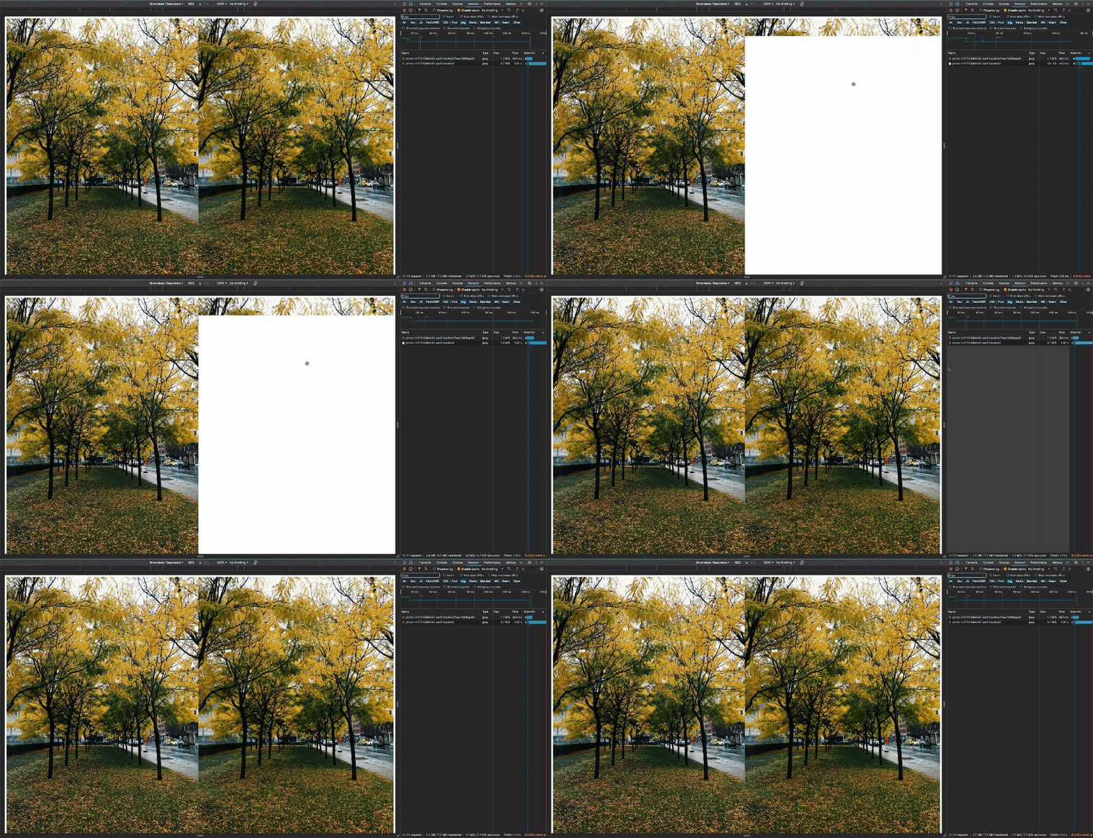
Page load comparison between the raw image URL and using the Image Directive
with every optimization enabled.
Let's review the metrics!
| | Raw | Optimized | Change |
| ———— | —— | ——— | —— |
| Size | 3.7MB | 1.0MB | -73% |
| Loading Time | 1300ms | 452ms | -65% |
Impressive!

Now, how simple is it to apply this in the future with our configuration in place? Here's the entire Component:
import { Component } from '@angular/core';
import { RouterModule } from '@angular/router';
import { NgOptimizedImage } from '@angular/common';

@Component({
  standalone: true,
  imports: [RouterModule, NgOptimizedImage],
  selector: 'ngconf-image-directive-article-root',
  template: `
    <div class="container">
      <!-- Image on the left, all the optimizations -->
      <div class="image">
        <img
          [ngSrc]="'photo-1417325384643-aac51acc9e5d'"
          [loaderParams]="{ compression: 50 }"
          fill
          priority
          ngSrcset="300w, 800w, 1500w"
        />
      </div>
      <!-- Image on the right, no optimizations -->
      <div class="image">
        <img
          style="height: 100vh; width: 50vw"
          [src]="'https://images.unsplash.com/photo-1417325384643-aac51acc9e5d'"
        />
      </div>
    </div>
  `,
  styles: [
    `
      .container {
        display: flex;
        height: 100%;
        width: 100%;
      }

      .image {
        flex: 1;
        height: 100vh;
        width: 50vw;
        position: relative;
        object-fit: cover;
      }
    `,
  ],
})
export class AppComponent {}
To summarize, here's what the Image Directive handles automatically or facilitates for us:
preconnectlink in<head>: Prepares the browser to fetch images from the origin.preloadtag for images flagged withpriority, added during server-side rendering, so downloads start as soon as the browser parsesindex.html—before Angular even initializes.- Automatic
filling of the image to its parent container, eliminating the need to setwidthandheight. - Automatic
srcsetgeneration, enabling the browser to choose the most suitable image. priorityattribute setup to ensure critical images load promptly vialoadingandfetchpriority.
That's an impressive amount of functionality right out of the box with minimal effort! 🚀
Wrapping Up
That covers the inner workings of the Angular NgOptimizedImage directive and the full range of utilities it offers.
For those interested in going further, the official Angular documentation is an excellent resource, and I also delivered a
session on this topic at Angular Tiny Conf 2023 – Shemu if you'd prefer to watch a recording.
The Image Directive is an incredibly capable feature that arrived alongside numerous other notable additions to the
Angular ecosystem, so it has often flown under the radar. Yet, the value it brings to your projects and the performance gains for your Angular apps are substantial.