Understanding polymorphism in views
When developers aim to build scalable, maintainable, and flexible codebases, the idea of polymorphism inevitably comes into play. In Angular, this concept translates directly to the view layer, where a single template can shift its structure and logic in response to varying conditions. To grasp what a truly polymorphic view looks like, it is often easier to first spot the signs of its absence. If accommodating new feature requirements forces your template into any of the following patterns, it is likely that your view architecture is not truly polymorphic:
- Proliferating Boolean Flags: The constant addition of input flags, such as
shouldDisplayTooltip,isCardVisible, orisCollapsible, to manipulate visibility and behavior branch by branch:
@if(isCardVisible) {
<mat-card>
  @if(isHeaderVisible) {
    <mat-card-header>
      <mat-card-title>Title</mat-card-title>
    </mat-card-header>
  }

  <mat-card-content [matTooltip]="shouldDisplayTooltip ? 'tooltip text' : null"> Card content </mat-card-content>
</mat-card>
}
- Tangled Conditional Logic: The over-reliance on extensive
iforswitchblocks to decide which UI fragments to render based on the current state:
@switch(true) {
  @case(viewMode === 'list') {
    <app-list-view></app-list-view>
  } @case(viewMode === 'grid') {
    <app-grid-view></app-grid-view>
  } @case(viewMode === 'detail') {
    <app-detail-view></app-detail-view>
  }
}
- Duplicating View Templates: The maintenance of several near-identical copies of a view component, each hardcoded for a specific use-case scenario:
<mat-card>
  <mat-card-header>
    <mat-card-title>Title</mat-card-title>
  </mat-card-header>
  <mat-card-content>
    @if(isCollapsible) {
      <cdk-accordion
          <cdk-accordion-item>
            Collapsible content
          </cdk-accordion-item>
      ><cdk-accordion>
    } @else {
      Non-collapsible content
    }
  </mat-card-content>
</mat-card>
The cornerstone distinction between polymorphic and non-polymorphic templates lies in evolution. In a polymorphic setup, introducing new behavior or layout changes shouldn't require modifications to the view's core structure or internal logic. As a result, such templates become inherently more adaptable, simpler to reason about, and considerably easier to extend over the long haul.
The remainder of this article will dissect what constitutes a polymorphic view, contrasting it with the standard imperative approach to building interfaces. Furthermore, we will examine how Angular's latest API advancements have revitalized this architectural pattern, revealing the powerful new capabilities they put directly into the hands of developers.
Rendering views dynamically
We’ve established that a polymorphic view morphs its look and feel based on the surrounding context. It’s essential to clarify that while dynamic rendering is a prerequisite for polymorphism, the two are not synonymous. Dynamic loading refers to the mechanism, whereas polymorphism represents the design strategy, utilizing that mechanism to achieve flexibility. Angular provides a suite of built-in tools for dynamic rendering, such as interpolation for strings, the structural ngTemplateOutlet for pieces of markup, and the ngComponentOutlet directive for full component creation. In this discussion, the focus narrows specifically to the component-level directive.
The NgComponentOutlet directive
The ngComponentOutlet directive has been part of the Angular toolbox since version 4, giving developers a direct way to instantiate components based on a type resolved at runtime.
The shift to the Ivy rendering engine marked a turning point for this feature, drastically simplifying the creation process. The era of configuring ComponentFactoryResolver, declaring entryComponents, wrestling with module configurations in angular.json for lazy loading, and debugging the well-known injector pitfalls associated with lazy modules is firmly behind us.
With Ivy, creating a component on the spot is as simple as pointing the directive at the right class. This streamlined approach makes dynamic component instantiation a far more direct and less boilerplate-heavy process for Angular developers.
Handling data flow with dynamic components
Successfully drawing a component on the canvas is only the first hurdle. The far more intricate aspects of dynamic component architecture involve the secure and type-safe exchange of data—propagating inputs down and handling events bubbling up—and ensuring strict type checking throughout this process.
Core Angular capabilities
Angular 14 took a significant step forward in addressing the mechanics of this data exchange by introducing two crucial features:
- The `setInput` method on
ComponentRef: This API offers a modern, standardized way to assign values to the inputs of a dynamically created component. It works uniformly, whether the input is defined with the classic@Inputdecorator or the newer signal-basedinputfunction. Crucially, this method integrates directly with Angular's change detection cycle, ensuring the component remains in sync with the new values without manual prompting:
@Component({
  ...
})
export class MyComponent {
  private readonly vcr = inject(ViewContainerRef);

  private createComponent(): void {
    const componentRef = this.vcr.createComponent(
      MyDynamicComponent
    );

    componentRef.setInput('name', 'Bob');
  }
}
- The `ngComponentOutletInputs` binding on
NgComponentOutlet: This directive input accepts a dictionary of key-value pairs representing the data meant for the embedded component. When this object is provided, Angular binds these values to the component instance seamlessly and takes on the responsibility of change detection management itself. This ensures that even components using theOnPushstrategy are correctly flagged and refreshed when their input references change:
@Component({
  ...
})
export class MyComponent {
  component = MyDynamicComponent;
  inputs = { data: 'Dynamic Data' };
}
<ng-container *ngComponentOutlet="component; ngComponentOutletInputs: inputs"></ng-container>
These features were a leap forward in ergonomics, automating much of the lifecycle and dirty-checking ceremony that previously plagued dynamic component instantiation. However, they leave a gap in type safety. Angular’s compiler doesn’t scrutinize the objects passed to these APIs against the component’s input definitions. It remains the developer’s responsibility to ensure the object structure matches the expected input types at runtime, which is a potential source of silent errors that the type checker won’t find.
Interfacing with events, or outputs, from these dynamic components tends to be less problematic. Because you have a direct reference to the component instance, you can simply access the output property (which is an EventEmitter) and subscribe to it. This approach retains the full benefit of Angular's type checking system:
const componentRef = this.vcr.createComponent(MyDynamicComponent);

componentRef.instance.onEdit.subscribe((value) => {
  // Handle an emitted event
});
Leveraging Dependency Injection for context
The DI system offers another pathway for getting data into these components, a concept popularized by libraries such as ng-polymorpheus. This method tackles the typing challenge from a different angle: by defining a strict interface for the data to be provided and using a DI token. The approach follows this pattern:
  interface MyDynamicComponentContext {
    name: string;
    onEdit: (value: string) => void;
  }

  @Component({
    ...
  })
  export class MyDynamicComponent {
    private readonly context = inject<MyDynamicComponentContext>(POLYMORPHEUS_CONTEXT);
  }
Subsequently, the component is injected into the template using the specialized polymorpheusOutlet directive, which supplies the required context data alongside the component type:
  @Component({
    ...
  })
  export class MyComponent {
    public readonly component = new PolymorpheusComponent<MyDynamicComponent>(MyDynamicComponent);
    public readonly context: MyDynamicComponentContext = { name: 'Bob', onEdit: (value: string) => this.onEdit(value) };

    private onEdit(value: string): void {
      ...
    }
  }
<ng-container *polymorpheusOutlet="content; context: context"></ng-container>
The PolymorpheusComponent acts as a thin, generic wrapper. Its primary role is to facilitate rendering while using the Angular injector to supply the matching context to the wrapped component:
export class PolymorpheusComponent<T> {
  constructor(public readonly component: Type<T>, private readonly i?: Injector) {}

  public createInjector<C>(injector: Injector, useValue?: C): Injector {
    return Injector.create({
      parent: this.i || injector,
      providers: [
        {
          provide: POLYMORPHEUS_CONTEXT,
          useValue,
        },
      ],
    });
  }
}
While this DI-centric pattern can be incredibly effective and offers a structured means to pass contextual data, it has a notable trade-off: coupling. Components become intrinsically tied to this specific rendering strategy, which constrains their reusability. Using them in a more traditional parent-child binding setup with standard property bindings becomes cumbersome. While one could write additional facade properties to support both methods, this adds boilerplate and structural clutter. Furthermore, while the interface provides a contract, the enforcement of that contract relies on runtime accuracy, not compile-time guarantees, leaving a narrow window for error when passing the context.
Signal-based APIs - bridging the typing gap
Reflecting on the historical limitations outlined earlier, a recurring theme emerges: Angular lacked a reflective, automatic way to introspect a component class to definitively determine what constitutes an input. Frameworks with functional components, like React, possess this natively—the function's parameters are inherently the inputs, making prop type inference trivial. In Angular's class-based model, while outputs could be identified by their `EventEmitter` type, inputs were traditionally indistinguishable from other public class properties without the aid of decorators.
The introduction of signal inputs provides a robust solution to this long-standing problem. When you define an input using the new input function, the class property gets an explicit type: InputSignal. This explicit typing is the key that unlocks the ability to scan a component class, identify these special properties, and infer their exact generic value types programmatically:
export type ExtractInputSignalsValues<T extends object> = OmitNever<{
  [Key in keyof T]: T[Key] extends InputSignal<infer ValueType> ? ValueType : never;
}>;

export type PolymorphicComponentInputs<TComponent extends Type<any>> = ExtractInputSignalsValues<InstanceType<TComponent>>;
In a similar fashion, the API landscape for outputs has evolved with the `output` function. Properties assigned using this function are typed as OutputEmitterRef, clearly distinguishing them as event emitters:
export type ExtractOutputEmitterRefs<T extends object> = OmitNever<{
  [Key in keyof T]: T[Key] extends OutputEmitterRef<infer ValueType> ? OutputEmitterRef<ValueType> : never;
}>;
Armed with this new introspective ability, we can now construct a sophisticated wrapper layer. We can build a class that encapsulates the actual component, using metadata to pre-configure how its structural inputs and outputs should be wired when the component is created dynamically:
export class PolymorphicComponent<TComponent extends Type<any> = Type<any>> {
  public readonly inputs: ValueOrNever<PolymorphicComponentInputs<TComponent>>;
  public readonly outputsHandlers: ValueOrNever<Partial<PolymorphicComponentOutputsHandlers<TComponent>>>;

  constructor(public readonly component: TComponent, private readonly params: PolymorphicComponentParams<TComponent>) {
    this.inputs = getInputsFromParams(this.params);
    this.outputsHandlers = getOutputHandlersFromParams(this.params);
  }
}
With this wrapper in place, the template can utilize a bespoke directive to render the target component. During instantiation, the directive uses its knowledge of these typed wrappers to correctly map and propagate the desired inputs and outputs directly onto the encapsulated component instance, all while maintaining full type safety.
Moving From Concept to Code
To build a polymorphic component, we create an instance of the PolymorphicComponent class, supplying it with a component class along with its inputs and outputs:
@Component({
  selector: 'my-icon',
  ...
})
export class IconComponent {
  public readonly icon = input<string>();

  public readonly iconClicked = output<void>();
}

const iconComponent = new PolymorphicComponent(
  IconComponent,
  {
    inputs: {
      icon: 'search'
    },
    outputsHandlers: {
      iconClicked: () => {
        console.log('Clicked')
      }
    }
  }
);
Rendering a polymorphic component requires the polymorphicComponentOutlet directive, which accepts the component instance:
export class MyComponent {
  public readonly iconComponent = iconComponent;
}
<ng-container *polymorphicComponentOutlet="iconComponent"></ng-container>
When you need to override certain inputs or attach additional output handlers directly in the template, or when inputs should be supplied through the template rather than at the outset, the polymorphicComponentOutletInputs and polymorphicComponentOutletOutputsHandlers properties on the directive come into play:
@Directive({
  standalone: true,
  selector: '[polymorphicComponentOutlet]',
})
export class PolymorphicComponentOutletDirective<TComponent extends Type<any>> {
  public readonly polymorphicComponent = input.required<PolymorphicComponentOrFactory<TComponent>>();

  public readonly polymorphicComponentOutletInputs = input<Partial<PolymorphicComponentInputs<TComponent>>>();
  public readonly polymorphicComponentOutletOutputsHandlers = input<Partial<PolymorphicComponentOutputsHandlers<TComponent>>>();
This setup guarantees compile-time type correctness and minimizes runtime errors. It provides a versatile and adaptable way to control component data and interactions from within the template:
<ng-container *polymorphicComponentOutlet="iconComponent; inputs: inputs; outputsHandlers: outputHandlers"></ng-container>
For improved editor support when defining component inputs and outputs, the createInputsFor and createOutputsHandlersFor helpers come in handy. These functions derive their types from the component class passed as the first argument, resulting in precise autocomplete and validation:
@Component({
  ...
  imports: [PolymorphicComponentOutletDirective],
})
export class MyComponent {

  public readonly iconComponent = iconComponent;

  public readonly overriddenInputs = createInputsFor(IconComponent)({
    icon: 'delete',
  });

  public readonly additionalOutputHandlers = createOutputsHandlersFor(IconComponent)({
    iconClicked: () => {
      console.log('Handle the click here as well');
    },
  });
}
By separating input signals from other properties on a component, we can define interfaces that components can implement. This separation lets our code depend on an interface rather than a concrete class, which lies at the heart of polymorphism. It enables handling inputs and outputs without any knowledge of the specific class involved:
interface IconComponent {
  icon: InputSignal<string>;
  iconClicked: OutputEmitterRef<void>;
}

@Component({
  ...
})
export class MyIconComponent implements IconComponent {
  public readonly icon = input<string>();
  public readonly iconClicked = output<void>();
}
To pass type information as an argument with ease, a type helper function can be employed:
export const type = <T>(): T => ({} as T);

@Component({
  ...
})
export class MyComponent {
  public readonly iconComponent: Type<IconComponent>;

  public readonly overriddenInputs = createInputsFor(type<Type<IconComponent>>())({
    icon: 'delete',
  });

  public readonly additionalOutputHandlers = createOutputsHandlersFor(type<Type<IconComponent>>())({
    iconClicked: () => {
      console.log('Handle the click here as well');
    },
  });
}
The essential takeaway is that components can be rendered in the conventional way or through the polymorphicComponentOutlet directive, while still supporting inputs, outputs, and rigorous type safety:
<!-- Render a component using its selector -->
<my-icon icon="search" (iconClicked)="onIconClicked()"></my-icon>

<!-- Dynamically render a component using the polymorphicComponentOutlet directive  -->
<ng-container *polymorphicComponentOutlet="iconComponent; inputs: inputs; outputsHandlers: outputHandlers"></ng-container>
As a result, we finally achieve strict type safety when dealing with dynamic component inputs and outputs.
Handling Asynchronous Input Values
Inputs may also receive observables or signals. Any changes emitted from these sources are automatically propagated and trigger change detection as expected:
const icon$ = of('value as observable');

const iconComponent = new PolymorphicComponent(IconComponent, {
  inputs: {
    icon: icon$,
  },
});

const $icon = signal('value as signal');

const iconComponent = new PolymorphicComponent(IconComponent, {
  inputs: {
    icon: $icon,
  },
});
Since signals are now a core part of Angular, this solution supports both observables and signals, managing the necessary conversions internally. This dual capability ensures that dynamic components can work with data streams regardless of their origin, making the codebase more resilient to different reactive programming patterns.
Adopting a Functional Style for Components
For scenarios where multiple instances of the same component need to be created with varying configuration, the createPolymorphicComponent function proves especially useful, as it supports currying. Here’s a practical illustration of its use:
export const createPolymorphicComponent = <TComponent extends Type<any>>(
  component: TComponent
): PolymorphicComponentFactory<TComponent> => {
  return (params?: PolymorphicComponentParams<TComponent>) => {
    return new PolymorphicComponent(component, (params ?? {}) as PolymorphicComponentParams<TComponent>);
  };
};
Here’s a breakdown of the process:
const createIconComponent = createPolymorphicComponent(IconComponent);

const iconOne = createIconComponent({
  inputs: {
    icon: 'search',
  },
});

const iconTwo = createIconComponent({
  inputs: {
    icon: 'info',
  },
});
When you define a curried function like createIconComponent, you can efficiently set up multiple instances of IconComponent, each with its own distinct inputs. While Angular doesn't support functional components in the same way as frameworks such as React, the automatic inference of input types makes it possible to build custom utilities like createPolymorphicComponent. This utility enables a functional programming style, where components are managed and instantiated through factory functions, thereby boosting flexibility and reusability. For example, the partial function can break down the process of supplying inputs into several steps:
import { createPolymorphicComponent, partial } from '@shared/util-polymorphic-content';

@Component({
  ...
})
export class IconComponent {
  public readonly icon = input<string>();
  public readonly direction = input<IconDirection>();
  public readonly color = input<ThemePalette>();
}

const createIconComponent = createPolymorphicComponent(IconComponent);
const createIconComponentPartial = partial(createIconComponent);

const createSearchIcon = createIconComponentPartial({
  inputs: {
    icon: 'search',
  },
});

const searchIcon = createSearchIcon({
  inputs: {
    direction: 'before',
    color: 'accent',
  },
});
Composing Polymorphic Views
Polymorphism truly shines when it enables flexible composition and customization. To see this in practice, we start with the definition of a PolymorphicContent type. This type accommodates diverse content kinds, including components, templates, strings, or other primitive values:
export type TemplateWithContext<T> = {
  templateRef: TemplateRef<T>;
  context: T;
};

export type ValueOrReactive<TValue> =
  | TValue
  | Observable<TValue>
  | Signal<TValue>;

export type PolymorphicPrimitive =  ValueOrReactive<number | string | null | undefined>;

export type PolymorphicContent<T> = PolymorphicComponent<Type<T>> | TemplateWithContext<T> | PolymorphicPrimitive;
Next, we define an interface that wrapper components must implement. This interface guarantees that any component responsible for wrapping or enriching content follows a consistent pattern for handling polymorphic content inputs:
export interface WithPolymorphicContent<T = any> {
  content: InputSignal<PolymorphicContent<T>>;
}
To conclude this part, let's create the polymorphic-outlet component, which serves as the central rendering point for any given content type—whether it's a component, template, string, and so on. This component takes advantage of Angular’s dynamic rendering capabilities to present content appropriately based on its type:
@Component({
  standalone: true,
  selector: 'polymorphic-outlet',
  imports: [PolymorphicComponentOutletDirective, NgTemplateOutlet],
})
export class PolymorphicOutletComponent<T = any> implements WithPolymorphicContent<T> {
  public readonly content = input<PolymorphicContent<T>>();
}

export const polymorphicOutlet = createPolymorphicComponent(PolymorphicOutletComponent);
@switch (true) {
  @case (isComponent()) {
    @if (asComponent(); as component) {
      <ng-container *polymorphicComponentOutlet="component"></ng-container>
    }
  }

  @case (isTemplate()) {
    @if (asTemplate(); as template) {
      <ng-container
        [ngTemplateOutlet]="template.templateRef"
        [ngTemplateOutletContext]="template.context"
      ></ng-container>
    }
  }

  @default {
    {{ asPrimitive() }}
  }
}
Now, we can build several wrapper components aimed at accepting content and enriching it with extra visual styling or behavior. These components will implement the WithPolymorphicContent interface, thereby including a content input of type InputSignal<PolymorphicContent<T>>. Each of these wrappers will incorporate the previously defined polymorphic-outlet directly in its template to render the provided content.
Badge component:
@Component({
  ...
})
export class WithBadgeComponent<T> implements WithPolymorphicContent<T> {
  public readonly content = input<PolymorphicContent<T>>();
  ...// other inputs
}
<span [matBadge]="badge()" [matBadgeOverlap]="overlap()" [matBadgePosition]="position()">
  <ng-content><polymorphic-outlet [content]="content()"></polymorphic-outlet></ng-content>
</span>
Icon component:
@Component({
  ...
})
export class WithIconComponent<T> implements WithPolymorphicContent<T> {
  public readonly content = input<PolymorphicContent<T>>();
  ...// other inputs
}
<mat-icon [color]="color()" (click)="iconClicked.emit()">{{ icon() }}</mat-icon> <ng-content><polymorphic-outlet [content]="content()"></polymorphic-outlet></ng-content>
Tooltip component:
@Component({
  ...
})
export class WithTooltipComponent<T = any> implements WithPolymorphicContent<T> {
  public readonly content = input<PolymorphicContent<T>>();
  ...// other inputs
}
<span [matTooltip]="text()" [matTooltipPosition]="position()">
  <ng-content><polymorphic-outlet [content]="content()"></polymorphic-outlet></ng-content>
</span>
Angular 18 has introduced a useful feature that allows you to specify fallback content for the ng-content element:
<ng-content><polymorphic-outlet [content]="content()"></polymorphic-outlet></ng-content>
This feature considerably boosts the adaptability of content projection within Angular. It allows your components to support both modes: projecting content supplied via a content input, as well as content provided through Angular's traditional content projection.
For instance, you can now effortlessly support scenarios where the content is embedded within the template:
<with-icon> Content </with-icon>
Alternatively, content might be passed programmatically through the component’s content input:
createIconComponent({
  inputs: {
    content: 'Content',
  },
});
Finally, we define a function to facilitate the composition of views by iterating over a list of wrapper components. Using the reduce function, each wrapper is applied in sequence, thus enclosing a given content (a component, template, or string) within all designated wrappers. This technique offers robust customization options, making it straightforward to stack multiple wrappers around any content piece:
export const composePolymorphicWrappers = (
  ...wrappers: Array<PolymorphicComponentFactory<Type<WithPolymorphicContent>>>
) => {
  return (content: PolymorphicContent<any>): PolymorphicContent<any> => {
    return wrappers.reduce(
      (acc, curr) =>
        curr({
          inputs: {
            content: acc,
          },
        }),
      content
    );
  };
};
Bringing It All Together
Let's tie together all the ideas presented so far with a concrete example.
In this implementation, each wrapper component—Badge, Tooltip, and Icon—is instantiated partially, with its specific input properties configured in advance:
const withIcon = createWithIconComponentPartial({
  inputs: {
    icon: 'delete',
  },
  outputsHandlers: {
    iconClicked: () => {
      inject(MatSnackBar).open('Icon clicked');
    },
  },
});

const withBadge = createWithBadgeComponentPartial({
  inputs: {
    badge: 'Polymorphic',
    position: 'above after',
  },
  className: 'd-inline-flex',
});

const withTooltip = createWithTooltipComponentPartial({
  inputs: {
    position: 'above',
    text: 'Polymorphic tooltip',
  },
  providers: [
    {
      provide: MAT_TOOLTIP_DEFAULT_OPTIONS,
      useValue: {
        disableTooltipInteractivity: false,
      },
    },
  ],
});
These initial configurations produce factory functions, which are subsequently orchestrated by the composePolymorphicWrappers function. This function iterates over an array of wrappers, passing each wrapper itself as the content input to the next wrapper in the sequence, ultimately building a composite structure. The last step is to supply a particular value to the wrapContent function, which then gets wrapped by the combined set of wrappers:
  @Component({
    ...
    imports: [PolymorphicOutletComponent],
  })
  export class MyComponent {
  public readonly polymorphicView = this.getPolymorphicView();

  private getPolymorphicView(): PolymorphicContent<unknown> {
    const wrappers: Array<PolymorphicComponentFactory<Type<WithPolymorphicContent>>> = [
      withBadge,
      withTooltip,
      withIcon
    ];

    const wrapContent = composePolymorphicWrappers(...wrappers);

    return wrapContent('Content');
  }
}
Finally, the polymorphicView is rendered using the polymorphic-outlet component:
<polymorphic-outlet [content]="polymorphicView"></polymorphic-outlet>
Polymorphic Versus Imperative Approaches
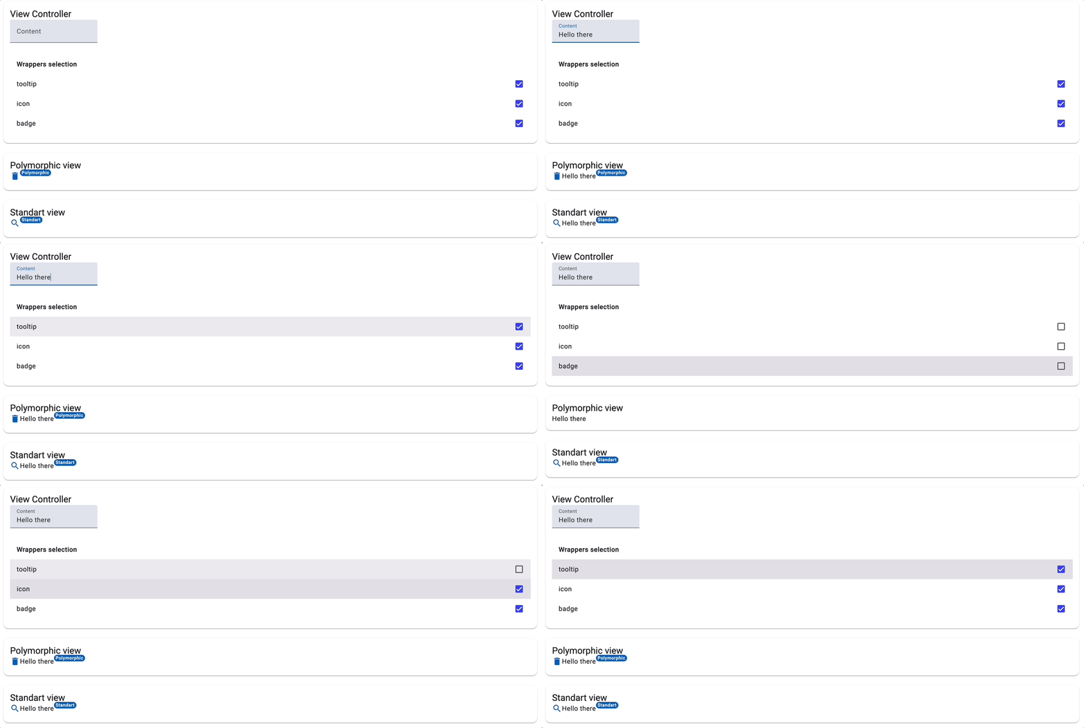
To highlight the distinction, let's compare the conventional imperative style with the polymorphic method in the following example:
<!-- Polymorphic view -->
<polymorphic-outlet [content]="polymorphicView"></polymorphic-outlet>

<!-- Standard view -->
<with-badge badge="Standart" position="above after">
  <with-icon icon="search" (iconClicked)="onIconClicked()">
    <with-tooltip text="Standart tooltip" position="above">
      <span> Content </span>
    </with-tooltip>
  </with-icon>
</with-badge>
The imperative approach is up-front and uncomplicated, yet it concentrates all the logic within the component itself. This centralized logic can complicate maintenance as the codebase expands and components become more intricate. Conversely, the polymorphic approach distributes logic across multiple locations, fostering a more adaptable architecture and simplifying maintenance through clearer separation of concerns.
Moreover, the polymorphic method enables runtime modifications—reordering components, tweaking wrapper compositions, and similar changes—that are not possible with the imperative approach. This flexibility is especially valuable for complex applications that demand a high level of customization.
Enhancing Modularity via Dynamic Injection Context with runInInjectionContext:
On closer look at how the icon component's handler is created, we see that dependencies are injected directly within the handler function:
const ICON = createWithIconComponentPartial({
  inputs: {
    icon: 'delete',
  },
  outputsHandlers: {
    iconClicked: () => {
      inject(MatSnackBar).open('Icon clicked');
    },
  },
});
This direct injection is possible because the output handlers are executed within the runInInjectionContext during component rendering via the polymorphicComponentOutlet directive whenever a value is emitted:
 private propagateOutputValue(...): void {
  ...
  runInInjectionContext(this.injector, () => {
    outputHandlers.forEach((handler) => {
      handler(emittedValue);
    })
  });
In Angular, the runInInjectionContext helper makes it possible to execute code within a particular injection context, granting access to Angular's Dependency Injection (DI) system without being tied to any specific component or injectable class. This approach promotes the creation of standalone features that dynamically leverage DI at runtime, thereby improving both modularity and flexibility. In the world of polymorphic views, it allows components to resolve their dependencies dynamically, supporting their independence and making them highly adaptable and reusable across a variety of contexts.
Wrapping Up
The article's title hints at Functional Components in the style of frameworks like React. However, it's clear that Angular hasn't adopted this paradigm directly. Yet, the ability to automatically infer input types via signal inputs presents compelling new possibilities. This capability encourages us to rethink component creation in Angular, paving the way for a hybrid model that blends class-based components with functional techniques like currying, partial application, and function composition, all of which enhance our management of polymorphic views.
The rewards of this method—added flexibility, better reusability, easier composition, and greater customization—are points we've touched on throughout this article. Additionally, dynamic injection context binding through runInInjectionContext amplifies these advantages, helping to develop more standalone and modular components.
Importantly, we achieve all these gains while upholding strict type safety, an area that is still not fully fleshed out in Angular’s native dynamic component API. These ongoing developments could pave the way for future Angular team initiatives, perhaps bringing native support for utilities like asFunctionalComponent. Who knows what lies ahead?
Showcase
Source code
Here are some references where you can find more information about polymorphic components, polymorphic outlets, and a showcase component in Angular: