Signal-Based Inputs
Input Signals let components receive data through property bindings as Signals. To illustrate how Signal Inputs work, I’m using a simple OptionComponent that represents a—for simplicity’s sake—non-selectable option. Below, three of these components are displayed:

Declaring an Input Signal
Signal Inputs serve as the modern counterpart to the traditional @Input decorator:
@Component({
  selector: 'app-option',
  standalone: true,
  imports: [],
  template: `
    <div class="option">
      {{ label() }}
    </div>
  `,
  styles: [...]
})
export class OptionComponent {
  label = input.required<string>();
}
The Angular Compiler detects the input function and generates the necessary code for property bindings. For this reason, it should only be used alongside properties. The other communication mechanisms covered here rely on the same technique.
Because a function is used instead of a decorator, TypeScript can be informed about the correct type and whether undefined is included. In the example above, label becomes an InputSignal<string>—an Input Signal that provides a string. An undefined value is excluded because input.required defines a mandatory property.
An InputSignal is always read-only and behaves like a regular Signal. The template shown earlier, for instance, retrieves its current value by invoking the getter (label()).
Binding to an Input Signal
With an InputSignal<string>, the consumer must supply a string:
<app-option label="Option #1">
<app-option [label]="myStringProperty">
If that string originates from a Signal, it must be read within the template:
<app-option [label]="mySignalProperty()">Computed Signals and Effects as Alternatives to Lifecycle Hooks
Any changes to the passed Signal are automatically mirrored by the InputSignal inside the component. Internally, both Signals are linked through the graph Angular maintains. Lifecycle hooks such as ngOnInit and ngOnChanges can now be substituted with computed and effect:
markDownTitle = computed(() => '# ' + this.label())

constructor() {
  effect(() => {
    console.log('label updated', this.label());
    console.log('markdown', this.markDownTitle());
  });
}
Configuration Options for Input Signals
Additional configuration options are available when setting up an InputSignal:
| Source Code | Description |
|---|---|
| label = input |
Optional property represented by an InputSignal<string | undefined> |
| label = input('Hello'); | Optional property represented by an InputSignal<string> with an initial value of Hello |
| label = input<string | undefined>('Hello'); | Optional property represented by an InputSignal<string\| undefined> with an initial value of Hello |
Required Inputs Cannot Have Defaults!
By design, input.required cannot be given a default value. This seems reasonable at first, but there is a subtle issue: attempting to read a required input before it has been bound results in an exception from Angular.
Therefore, you cannot access it directly inside the constructor. Instead, ngOnInit or ngOnChanges should be used. Additionally, using inputs within computed or effect is always safe, since these only run once the component has been initialized:
@Component([...])
export class OptionComponent implements OnInit, OnChanges {
  label = input.required<string>();

  // safe
  markDownTitle = computed(() => '# ' + this.label())

  constructor() {
    // this would cause an exception,
    // as data hasn't been bound so far
    console.log('label', this.label);

    effect(() => {
        // safe
        console.log('label', this.label);
    })
  }

  ngOnInit() {
    // safe
    console.log('label', this.label);
  }

  ngOnChanges() {
    // safe
    console.log('label', this.label);
  }
}
Aliases for Input Signals
Both input and input.required accept a parameter object that supports defining an alias:
label = input.required({ alias: "title" });In this scenario, the consumer must bind to the property name defined by the alias:
<app-option title="Option #1">
  <app-option [title]="myStringProperty">
    <app-option [title]="mySignalProperty()"></app-option></app-option
></app-option>
In most cases, aliases should be avoided because they introduce unnecessary indirection. A common exception is renaming a Directive’s property so that it matches the selected attribute selector.
Transformers for Input Signals
Transformers were already available for traditional @Inputs. They allow transforming a value passed through a property binding. In the following example, the booleanAttribute transformer from angular/core is employed:
@Component({
  selector: 'app-option',
  standalone: true,
  imports: [],
  template: `
    <div class="option">
      {{ label() }} @if (featured()) { ⭐ }
    </div>
  `,
  styles: [...]
})
export class OptionComponent {
  label = input.required<string>();
  featured = input.required({
    transform: booleanAttribute
  })
}
This transformer converts strings into booleans:
<app-option label="Option #1" featured="true"></app-option>Additionally, if the attribute is present but no value is assigned, the result is true:
<app-option label="Option #1" featured></app-option>This Signal has the type InputSignal<boolean, unknown>. The first type parameter (boolean) denotes the value delivered by the transformer; the second (unknown) represents the value bound in the consumer’s template that gets passed to the transformer. Alongside booleanAttribute, @angular/core also offers a numberAttribute transformer that converts incoming strings to numbers.
To implement a custom transformer, supply a function that accepts the bound value and returns the value the child component should use:
function boolTranformer(value: unknown): boolean {
  return value !== "no";
}
Then register this function in your input:
@Component([...])
export class OptionComponent {
  label = input.required<string>();
  featured = input.required({
    transform: boolTranformer
  })
}
Two-Way Bindings with Model Signals
Input Signals are read-only. If you need to pass a Signal that the receiving component can update, you must use a so-called Model Signal. To demonstrate this, I’m using a simple TabbedPaneComponent:
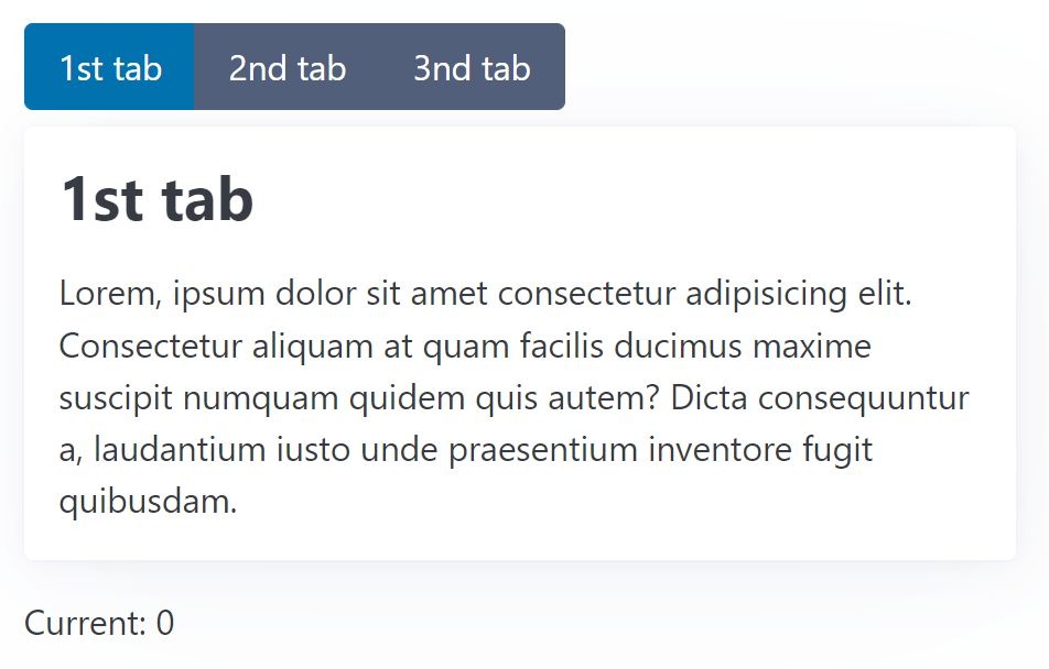
Here’s how a consumer would use this component:
<app-tabbed-pane [(current)]="current">
  <app-tab title="1st tab"> Lorem, ipsum dolor sit amet ... </app-tab>
  <app-tab title="2nd tab"> Sammas ergo gemma, ipsum dolor ... </app-tab>
  <app-tab title="3nd tab"> Gemma ham ipsum dolor sit ... </app-tab>
</app-tabbed-pane>

<p class="current-info">Current: {{ current() }}</p>
It receives several TabComponents. A Signal named current is also bound using Two-way Binding. To allow this, the TabbedPaneComponent must expose a Model Signal via the model function:
@Component([...])
export class TabbedPaneComponent {
  current = model(0);
  [...]
}
Here, 0 serves as the initial value. The available options mirror those for inputs: model.required creates a mandatory property, and an alias can be supplied through an options object. However, transformers are not supported.
When this component updates the Model Signal, the new value propagates upward to the Signal bound in the template:
current.set(1);Two-Way Bindings as a Combination of Input and Output
As is standard in Angular, Signal-based Two-way Bindings can also be defined using a (read-only) Input paired with a corresponding Output. The Output’s name must be the Input’s name suffixed with Change. Thus, for current, we need to define currentChange:
@Component([...])
export class TabbedPaneComponent {
  current = input(0);
  currentChange = output<number>();
}
To set up an Output, the new output API is used. To trigger an event, the application calls the output’s emit method:
<button [...] (click)="currentChange.emit($index)">{{tab.title()}}</button>Content Queries with Signals
The TabbedPaneComponent introduced in the previous section also serves to demonstrate another feature: Content Queries that retrieve projected Components or Directives.
As shown above, a TabbedPaneComponent receives several TabComponents. These are projected into the TabbedPaneComponent’s view. However, only one of them should be displayed at any given moment. Thus, the TabbedPaneComponent needs programmatic access to its TabComponents. This can be accomplished with the new contentChildren function:
@Component({
  selector: 'app-tabbed-pane',
  standalone: true,
  imports: [],
  template: `
    <div class="pane">
      <div class="nav" role="group">
        @for(tab of tabs(); track tab) {
        <button
            [class.secondary]="tab !== currentTab()"
            (click)="activate($index)">
                {{tab.title()}}
        </button>
        }
      </div>
      <article>
        <ng-content></ng-content>
      </article>
    </div>
  `,
  styles: [...]
})
export class TabbedPaneComponent {
  current = model(0);
  tabs = contentChildren(TabComponent);
  currentTab = computed(() => this.tabs()[this.current()]);

  activate(active: number): void {
    this.current.set(active);
  }
}
The contentChildren function is the modern counterpart to the traditional @ContentChildren decorator. Since TabComponent was passed as a so-called locator, it returns a Signal containing an Array with all projected TabComponents.
Having the projected nodes as a Signal enables reactive projection through computed. The given example uses this approach to derive a Signal named currentTab.
The projected TabComponent relies on this Signal to determine its visibility:
@Component({
  selector: "app-tab",
  standalone: true,
  imports: [],
  template: `
    @if(visible()) {
    <div class="tab">
      <h2>{{ title() }}</h2>
      <ng-content></ng-content>
    </div>
    }
  `,
})
export class TabComponent {
  pane = inject(TabbedPaneComponent);

  title = input.required<string>();

  visible = computed(() => this.pane.currentTab() === this);
}
For this to work, we need to know that all ancestors in the DOM can be accessed via dependency injection. The visible Signal is derived from the currentTab Signal.
This approach is typical in the reactive paradigm: rather than imperatively assigning values, they are declaratively derived from other values.
Content Queries for Descendants
By default, a Content Query only discovers direct content children. “Grandchildren,” such as the 3rd tab shown below, are not included:
<app-tabbed-pane [(current)]="current">
  <app-tab title="1st tab"> Lorem, ipsum dolor sit amet ... </app-tab>
  <app-tab title="2nd tab"> Sammas ergo gemma, ipsum dolor ... </app-tab>

  <div class="danger-zone">
    <app-tab title="3nd tab">
      Here, you can delete the whole internet!
    </app-tab>
  </div>
</app-tabbed-pane>
To also capture such nodes, set the descendants option to true:
tabs = contentChildren(TabComponent, { descendants: true });Output API
For API symmetry, Angular 17.3 introduced a new output API. As demonstrated earlier, an output function is now used to define an event exposed by a component. Similar to the new input API, the Angular Compiler detects the output call and emits the corresponding code. The returned OutputEmitterRef’s emit method is used to fire the event:
@Component([...])
export class TabbedPaneComponent {
  current = model(0);
  tabs = contentChildren(TabComponent);
  currentTab = computed(() => this.tabs()[this.current()]);

  tabActivated = output<TabActivatedEvent>();

  activate(active: number): void {
    const previous = this.current();
    this.current.set(active);
    this.tabActivated.emit({ previous, active });
  }
}
Supplying Observables as Outputs
Beyond this straightforward way of defining outputs, you can also use an Observable as the source for an output. The RxJS interop layer provides the outputFromObservable function for this purpose:
import {
    outputFromObservable,
    toObservable
} from '@angular/core/rxjs-interop';
[...]

@Component([...])
export class TabbedPaneComponent {
  current = model(0);
  tabs = contentChildren(TabComponent);
  currentTab = computed(() => this.tabs()[this.current()]);

  tabChanged$ = toObservable(this.current).pipe(
    scan(
      (acc, active) => ({ active, previous: acc.active }),
      { active: -1, previous: -1 }
    ),
    skip(1),
  );

  tabChanged = outputFromObservable(this.tabChanged$);

  activate(active: number): void {
    this.current.set(active);
  }

}
The outputFromObservable function converts an Observable into an OutputEmitterRef. In the shown example, the scan operator tracks the previously activated tab, while skip ensures that no event is emitted when current is initially set. The latter provides feature parity with the earlier example.
View Queries with Signals
While a Content Query returns projected nodes, a View Query returns nodes from the component’s own view—specifically, nodes found within that component’s template. In many cases, data binding is the preferred approach. However, there are situations where programmatic access to a view child is necessary.
To show how view children are queried, I’m using a simple form for entering a username and password:
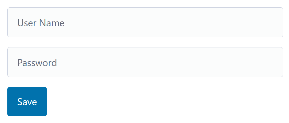
Both input fields are marked as required. If validation fails upon pressing Save, the first field with a validation error should receive focus. For this, we need access to the NgForm directive that the FormModule attaches to our form tag, as well as to the DOM nodes representing the input fields:
@Component({
  selector: "app-form",
  standalone: true,
  imports: [FormsModule, JsonPipe],
  template: `
    <h1>Form Demo</h1>
    <form autocomplete="off">
      <input
        [(ngModel)]="userName"
        placeholder="User Name"
        name="userName"
        #userNameCtrl
        required
      />
      <input
        [(ngModel)]="password"
        placeholder="Password"
        type="password"
        name="password"
        #passwordCtrl
        required
      />
      <button (click)="save()">Save</button>
    </form>
  `,
  styles: `
    form {
      max-width: 600px;
    }
  `,
})
export class FormDemoComponent {
  form = viewChild.required(NgForm);

  userNameCtrl =
    viewChild.required<ElementRef<HTMLInputElement>>("userNameCtrl");
  passwordCtrl =
    viewChild.required<ElementRef<HTMLInputElement>>("passwordCtrl");

  userName = signal("");
  password = signal("");

  save(): void {
    const form = this.form();

    if (form.controls["userName"].invalid) {
      this.userNameCtrl().nativeElement.focus();
      return;
    }

    if (form.controls["password"].invalid) {
      this.passwordCtrl().nativeElement.focus();
      return;
    }

    console.log("save", this.userName(), this.password());
  }
}
Both are handled using the viewChild function. In the first case, the type NgForm is passed as the locator. Simply locating the fields by type won’t work here, as there could be several children of the same type. Therefore, the inputs are tagged with handles (#userName and #password), and the handle name is passed as the locator.
View children can be represented by various types: the type of the corresponding Component or Directive, an ElementRef pointing to its DOM node, or a ViewContainerRef. The latter is used in the next section.
The desired type can be specified using the read option, as shown in the previous example.
View Queries and the ViewContainerRef
Certain scenarios call for components to be inserted dynamically into a designated slot — modal dialogs and toast notifications are typical examples. The *ngComponentOutlet directive offers a straightforward solution here. For greater flexibility, you can query the placeholder's ViewContainerRef directly.
Think of a View Container as an invisible wrapper that surrounds every component and every piece of static HTML in a template. Once you have a reference to it, you gain the ability to insert additional components or templates into that location.
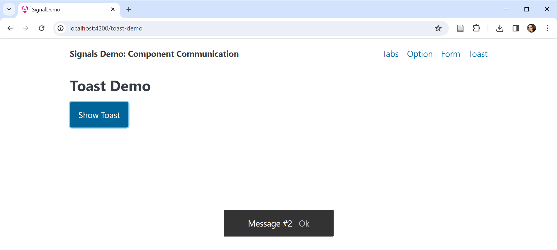
For illustration, consider this straightforward toast example:
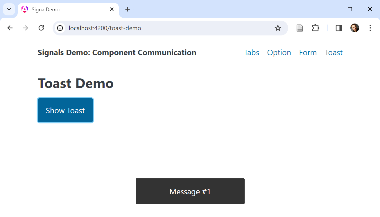
An ng-container serves as the placeholder in this setup:
@Component({
  selector: 'app-dynamic',
  standalone: true,
  imports: [],
  template: `
    <h2>Toast Demo</h2>
    <button (click)="show()">Show Toast</button>
    <ng-container #placeholder></ng-container>
  `,
  styles: [...]
})
export class ToastDemoComponent {
  counter = 0;
  placeholder = viewChild.required('placeholder', { read: ViewContainerRef });

  show() {
    const ref = this.placeholder().createComponent(ToastComponent);
    this.counter++;
    ref?.setInput('label', 'Message #' + this.counter);
    setTimeout(() => ref?.destroy(), 2000);
  }

}
The read option signals that we're interested in the placeholder's ViewContainerRef rather than the placeholder element itself. Calling createComponent instantiates a ToastComponent and adds it to the container. The resulting ComponentRef provides access to the new instance, and its setInput method assigns the label value. After a two-second delay, invoking destroy removes the toast from the view.
The ToastComponent is hard-coded in this example for simplicity. In more realistic, reusable implementations, the component type could be supplied dynamically — for instance, a service method might accept a Component class and then notify another component to instantiate that type at the placeholder.
Defining Output Handlers Programmatically
The earlier demo used setInput to populate the ToastComponent's title input. Now let's examine how to attach event listeners to these dynamically created components.
Suppose the ToastComponent presents a confirmation link:
When activated, this link triggers a confirmed event:
@Component([...])
export class ToastComponent {
  label = input.required<string>();
  confirmed = output<string>();

  confirm(): void {
    this.confirmed.emit(this.label());
  }
}
To register a handler for this event, we can tap into the ComponentRef's instance property. This property references the actual component instance, giving us direct access to all of its members:
@Component([...])
export class ToastDemoComponent {
  counter = 0;
  placeholder = viewChild.required('placeholder', { read: ViewContainerRef });

  show() {
    const ref = this.placeholder()?.createComponent(ToastComponent);
    this.counter++;
    const title = 'Message #' + this.counter;
    ref.setInput('label', title);

    // Event handler for confirm output
    ref.instance.confirmed.subscribe(title => {
      ref?.destroy();
      console.log('confirmed', title);
    });

    setTimeout(() => ref?.destroy(), 5000);
  }

}
The OutputEmitterRef exposes a subscribe method for defining the event handler. In this scenario, the handler removes the toast via destroy and logs the emitted string to the console.
This implementation has a slight flaw, however. The destroy call is scheduled to run after 5 seconds regardless of whether the user clicks the confirmation link. Consequently, the toast could be removed twice — once upon confirmation and again when the timeout expires.
Fortunately, invoking destroy on an already-destroyed component doesn't raise an error. A simple destroyed flag could guard against double removal. The next section presents a more robust approach: consuming outputs as Observables.
Treating Outputs as Observables
Although OutputEmitterRef offers a subscribe method, it isn't an actual Observable. The legacy EventEmitter used with the @Output decorator, in contrast, was one. To regain the full toolkit that Observable-based outputs provide, the outputToObservable helper from the RxJS interop layer comes into play:
import { outputToObservable } from '@angular/core/rxjs-interop';
[...]

@Component([...])
export class ToastDemoComponent {
  counter = 0;
  placeholder = viewChild.required('placeholder', { read: ViewContainerRef });

  show() {
    const ref = this.placeholder()?.createComponent(ToastComponent);
    this.counter++;
    const title = 'Message #' + this.counter;
    ref.setInput('label', title);

    const confirmed$ = outputToObservable(ref.instance.confirmed)
      .pipe(map(title => ({ trigger: 'confirmed', title })));

    const timer$ = timer(5000);
      .pipe(map(() => ({ trigger: 'timeout', title })));

    race(confirmed$, timer$).subscribe(action => {
      ref?.destroy();
      console.log('action', action);
    });

  }

}
The outputToObservable function transforms an OutputEmitterRef into an Observable. In the example above, both the confirmation event and the 5-second delay are expressed as Observables. The race operator ensures that only the Observable that emits first actually takes effect.
The Observable produced by outputToObservable automatically completes when Angular destroys the component that owns the output. As a result, manual unsubscription becomes unnecessary.
Content and View Queries: Feature Equivalence
Up to this point, we've relied on contentChildren to locate multiple projected children and on viewChild to reference a single node within the view. Both approaches, however, offer the same feature set: a contentChild and a viewChildren function also exist.
Moreover, every option we've employed for either View or Content Queries — such as locator handles or the read property — applies equally to both query types.
Summary
A suite of new functions now replaces property decorators for establishing data binding patterns. The Angular compiler recognizes these functions and emits the corresponding code behind the scenes.
The input function creates Inputs for property bindings, model handles Inputs for Two-Way Data Binding, and the quartet contentChild(ren) and viewChild(ren) manages Content and View Queries. All of these functions yield Signals, which can be further derived with computed and consumed within effects.