Note: The original article targeted Angular version 10. Since then, a more hands-on guide for version 13 has been published — see Angular Material Theming System: Complete Guide | Angular Material Dev (angular-material.dev).
This is the second installment of the series. In the previous part, we set up an Angular project with a custom theme, a dark theme, custom heading typography, and a couple of helper modules (MaterialModule and SharedModule).
Now we turn to the internals: by examining the Angular Material Components repository on GitHub, we can get a clear picture of how theming is put together.
A Look Inside the Source Repo
When you open the material2 repository, the first thing you notice is the src folder that holds all the source code. Under src/lib, each component has its own directory, and inside that directory you'll find the core files for that component's theming: the main Sass file (for instance button.scss) and a dedicated theme file (like button-theme.scss).
This separation is deliberate. The main component Sass file contains structural styling — things like layout, sizing, spacing — that does not change with theme. The theme file, on the other hand, carries all the color and typography-related rules that depend on the current theme.
Shared Theming Architecture
Before any component file is compiled, Angular Material loads a core theming file (core.scss). This core file is where the fundamental theming logic lives: it defines the key mixins, functions, and variables that every component theme relies on. It is also where you include the base structural styles for all components via the mat-core() mixin.
Every component's theme mixin (mat-button-theme() for buttons, mat-checkbox-theme() for checkboxes, and so on) is written to work with the structures defined in this core. The mixin itself takes a configuration map — usually a palette — and builds color and typography rules from it. For instance, the button theme mixin uses the primary, accent, and warn palettes to determine the color of the button text, the background, and the ripple effect.
How a Theme is Assembled
When you define your own theme with mat-light-theme() or mat-dark-theme(), you are calling a function that merges a foreground palette, a background palette, and the three main palettes (primary, accent, warn) into one configuration object. The result is a single map that serves as the official theme input for all component theme mixins.
Each component mixin then reads only the keys it cares about. The button mixin checks the primary palette for its default state, the accent palette for the raised state, and the warn palette for the danger state. This modular approach means you can call mat-button-theme() independently if you only want to theme buttons, or rely on the umbrella angular-material-theme() mixin to apply a full theme across every component.
The Role of Foreground and Background Palettes
Two palettes that often go unnoticed are the foreground and background palettes. The foreground palette holds tokens like base, divider, disabled-button, and text. These are used for general text and icon colors across multiple components. The background palette defines the surface colors — for cards, dialogs, menus, and the overall application background.
In a light theme, the text color is dark on a light background; in a dark theme, it flips to light text on a dark surface. Both mat-light-theme() and mat-dark-theme() provide sensible defaults for these palettes, but you can override them if you need a very specific visual feel.
Density and Typography Contributions
Beyond colors, the core theming structure also accommodates density and typography. Density affects spacing and component height, while typography dictates font family, size, and weight for different text levels. These are bundled into the same theme map, so when a component mixin accepts a theme, it can style its colors, its density, and its text styles all at once.
This is why, in the first part of the series, we were able to set custom heading typography globally — that configuration was plugged into the theme map and picked up automatically by every component that renders headings.
Practical Takeaway
Understanding this architecture helps you move beyond copy-pasting themes. You can now look at a component's Sass file and know that its structural rules are free of theme-specific colors, and that all visual variation lives in the theme mixin. This makes it straightforward to create your own theme, tweak individual palettes, or even write a custom component that follows the same theming contract.
With this mental model, the next part of the series will apply these insights to build a more refined custom theme.
A Deep Dive into Angular Material's Theming Architecture
Let's explore the stylesheets in the Angular Components repository. Having the repo open in a separate tab will make it easier to follow along. Cloning my repository is also recommended for a more hands-on experience.
How Themes Are Generated
We'll navigate through the key folders and files in the Angular Material repo that directly relate to our application's theme setup. Before diving in, recall the critical lines from our styles.scss and theme.scss files. The lines are combined below with step numbers for easy reference:
Step 0️⃣ src/style.scss – LINE 7
@import '~@angular/material/theming';
Step 1️⃣ src/style.scss – LINE 13
@include mat-core();
Step 2️⃣ src/theme.scss – LINE 7
$theming-material-components-primary: mat-palette($mat-indigo);
$theming-material-components-accent: mat-palette($mat-pink, A200, A100, A400);
$theming-material-components-warn: mat-palette($mat-red);
Step 3️⃣ src/theme.scss – LINE 12
$theming-material-components-theme: mat-light-theme(
  $theming-material-components-primary,
  $theming-material-components-accent,
  $theming-material-components-warn
);
Step 4️⃣ src/style.scss – LINE 25
@include angular-material-theme($theming-material-components-theme);
Step 5️⃣ src/theme.scss – LINE 30
$dark-primary: mat-palette($mat-blue-grey);
$dark-accent: mat-palette($mat-amber, A200, A100, A400);
$dark-warn: mat-palette($mat-deep-orange);
$dark-theme: mat-dark-theme(
  (
    color: (
      primary: $dark-primary,
      accent: $dark-accent,
      warn: $dark-warn,
    ),
  )
);
Step 6️⃣ src/style.scss – LINE 34
.dark-theme {
  @include angular-material-color($dark-theme);
}
Step 7️⃣ src/theme.scss – LINE 19
$heading-font-family: "'Work Sans', sans-serif";
$typography: mat-typography-config(
  $display-4: mat-typography-level(112px, $font-family: $heading-font-family),
  $display-3: mat-typography-level(56px, $font-family: $heading-font-family),
  $display-2: mat-typography-level(45px, $font-family: $heading-font-family),
  $display-1: mat-typography-level(34px, $font-family: $heading-font-family),
  $headline: mat-typography-level(24px, $font-family: $heading-font-family),
  $title: mat-typography-level(20px, $font-family: $heading-font-family),
);
Step 8️⃣ src/style.scss – LINE 39
@include angular-material-typography($typography);
Remember these references; we'll connect them to specific files in the repo's src/material directory.
Tip: Keep an eye out for the ?, ⛳, ☝️, ?, ?, ✅ and numeric symbols throughout the article to see how they correspond to our steps.
? src/material
Inside this folder, you'll notice a directory dedicated to each individual Material Component, such as autocomplete, badge, and bottom-sheet, alongside helper folders for core, testing, and schematics.
? src/material/_<component-name>_
Each component has its own folder, which contains a dedicated theme file. The naming convention for these files is _\<component-name>-theme.scss_. For instance, MatToolbar has a theme file named _toolbar-theme.scss, located at src/material/toolbar/_toolbar-theme.scss.
? You're now equipped to locate the theme file for any Angular Material component.
The "Go to file" feature is another handy way to find these. After opening the repo, click the Go to file button located to the right of the breadcrumb navigation.

This button allows you to access the file finder.
Once there, you can search directly by file name:

Use the file search to find theme files.
Simply type the pattern _\<component-name>-theme.scss_ to directly locate the relevant file.
? Every component ships with its own theme file. We'll explore how they're integrated into your application shortly.
? src/material/core
This directory holds the essential library code that other @angular/material components depend on. These are the underpinning components not explicitly listed on the public component categories page, but they are fundamental to how Material works.
Let's take a closer look.
? src/material/core/_core.scss
Here is a view of the file:
@import '../../cdk/overlay/overlay';
...

// Core styles that can be used to apply material design treatments to any element.
@import './style/elevation';
...

// Mixin that renders all of the core styles that are not theme-dependent.
@mixin mat-core($typography-config: null) {
  ...
}

@mixin mat-core-color($config-or-theme) {
  ...

    background-color: mat-color($background, background);
    color: mat-color($foreground, text);
  ...
  // Provides external CSS classes for each elevation value. Each CSS class is formatted as
  // `mat-elevation-z$zValue` where `$zValue` corresponds to the z-space to which the element is
  // elevated.
  @for $zValue from 0 through 24 {
    .#{$_mat-elevation-prefix}#{$zValue} {
      @include _mat-theme-elevation($zValue, $config);
    }
  }

  // Marker that is used to determine whether the user has added a theme to their page.
  @at-root {
    .mat-theme-loaded-marker {
      display: none;
    }
  }
}

// Mixin that renders all of the core styles that depend on the theme.
@mixin mat-core-theme($theme-or-color-config) {
  ...
   @include mat-core-color($color);
  ...
}
...
This is a shortened version of the content from src/material/core/_core.scss
In essence, this file handles the following:
- It brings in all the Component Dev Kit (CDK) styles via Sass imports.
- Other foundational styles, such as those for elevation and ripples, are imported. These provide the building blocks for applying Material design principles to any element.
- It defines the ?
mat-coremixin. Its purpose, as stated in the comments, is to "render all of the core styles that are not theme-dependent," including things like ripple effects and CDK behaviors. This is the source of themat-coremixin you use in your application's ? styles.scss (Line 14). - Another mixin, ?
mat-core-theme, is created here. In contrast, this one renders "all of the core styles that depend on the theme," such as the color configurations for ripples and elevations. It leverages themat-core-colormixin, which performs three primary tasks:
- Sets the background and font colors for the entire application.
- Generates elevation utility classes like
mat-elevation-z1. A guide for these can be found here. - Creates a marker to verify if a theme has been applied. The check is essentially done like this:
private _checkThemeIsPresent(): void {
    ...

    const testElement = document.createElement('div');

    testElement.classList.add('mat-theme-loaded-marker');
    document.body.appendChild(testElement);

    const computedStyle = getComputedStyle(testElement);
    if (computedStyle && computedStyle.display !== 'none') {
      console.warn(...);
    }

    document.body.removeChild(testElement);
  }
The code demonstrates how the presence of a theme is verified, slightly simplified for clarity.
So, two main points from ? _core.scss:
- The
mat-coremixin generates all theme-independent core styles. This is imported directly into our ? styles.scss in step 1️. - The
mat-core-thememixin, however, generates core styles that depend on the theme. It is not called directly from our ? styles.scss; we'll see how it gets included later.
? src/material/core/style
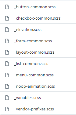
A look at the contents of the src/material/core/style directory.
The style folder contains shared styling utilities. The file names are quite descriptive, so we won't go into every detail here.
? src/material/core/theming
Here is where you'll find all the core theming styles. Let's explore this folder.
? src/material/core/theming/prebuilt
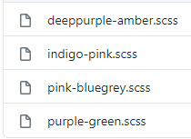
Contents of the prebuilt themes folder.
As is clear, this directory holds all of the ? pre-built theme files.
? src/material/core/theming/_theming.scss
// Creates a map of hues to colors for a theme. This is used to define a theme palette in terms of the Material Design hues.
@function mat-palette($base-palette, $default: 500, $lighter: 100, $darker: 700, $text: $default) {
  ...
}

// Creates a container object for a light theme to be given to individual component theme mixins.
// as it would break existing apps that set the parameter by name.
@function mat-light-theme($primary, $accent: null, $warn: mat-palette($mat-red)) {
...
}

// Creates a container object for a dark theme to be given to individual component theme mixins.
// as it would break existing apps that set the parameter by name.
@function mat-dark-theme($primary, $accent: null, $warn: mat-palette($mat-red)) {
...
}
Here's a snippet from the src/material/core/theming/_theming.scss file.
- The
mat-palettefunction creates and returns a color map from a given color palette. We're ✅ employing this in our ? theme.scss (Line 7) to generate the primary, accent, and warn color maps, which corresponds to step 2️⃣ in our process. - The
mat-light-themefunction generates a light theme configuration for the provided color palettes. This is what we use in ? theme.scss (Line 12) to define our default$theming-material-components-theme, as seen in step 3️⃣. - Similarly,
mat-dark-themedoes the same but for a dark theme. We utilize this function in step 5️⃣.
? src/material/core/theming/_palette.scss
This file contains all the color palettes defined in the Material Design spec.
? It's the source for all the color palettes we use in ? theme.scss, like $mat-indigo, $mat-pink, and $mat-red.
? src/material/core/theming/_all-theme.scss
// Import all the theming functionality.
@import '../core';
...

// Create a theme.
@mixin angular-material-theme($theme-or-color-config) {
  @include _mat-check-duplicate-theme-styles($theme-or-color-config, 'angular-material-theme') {
    @include mat-core-theme($theme-or-color-config);
    ...
  }
}
A condensed view of the file src/material/core/theming/_all-theme.scss.
This file brings together ? theme styles for all Material Components, along with ? mat-core-theme from src/material/core/_core.scss. These mixins are bundled into a new ? mixin named angular-material-theme.
Your instinct is correct — the angular-material-theme mixin is what we include in our ? styles.scss (Line 25), as shown in step 4️⃣. Since it already includes mat-core-theme, there's no need to call it separately, unlike mat-core.
? src/material/core/color/_all-colors.scss
@import '../theming/all-theme';

// Includes all of the color styles.
@mixin angular-material-color($config-or-theme) {
  // In case a theme object has been passed instead of a configuration for
  // the color system, extract the color config from the theme object.
  $config: if(
    _mat-is-theme-object($config-or-theme),
    mat-get-color-config($config-or-theme),
    $config-or-theme
  );

  @if $config == null {
    @error 'No color configuration specified.';
  }

  @include angular-material-theme(
    (
      color: $config,
      typography: null,
      density: null,
    )
  );
}
The contents of the src/material/core/color/_all-color.scss file.
The angular-material-color mixin allows us to generate a theme based on colors. This is the mixin we call in our ? styles.scss (Line 34) to create the dark theme, which you can see in step 6️⃣.
? src/material/core/typography/_typography.scss
...

// Represents a typography level from the Material design spec.
@function mat-typography-level(
  $font-size,
  $line-height: $font-size,
  $font-weight: 400,
  $font-family: null,
  $letter-spacing: normal) {

  @return (
    font-size: $font-size,
    line-height: $line-height,
    font-weight: $font-weight,
    font-family: $font-family,
    letter-spacing: $letter-spacing
  );
}

...

// Represents a collection of typography levels.
// Defaults come from https://material.io/guidelines/style/typography.html
// Note: The spec doesn't mention letter spacing. The values here come from
// eyeballing it until it looked exactly like the spec examples.
@function mat-typography-config(
  $font-family:   'Roboto, "Helvetica Neue", sans-serif',
  $display-4:     mat-typography-level(112px, 112px, 300, $letter-spacing: -0.05em),
  $display-3:     mat-typography-level(56px, 56px, 400, $letter-spacing: -0.02em),
  $display-2:     mat-typography-level(45px, 48px, 400, $letter-spacing: -0.005em),
  $display-1:     mat-typography-level(34px, 40px, 400),
  $headline:      mat-typography-level(24px, 32px, 400),
  $title:         mat-typography-level(20px, 32px, 500),
  $subheading-2:  mat-typography-level(16px, 28px, 400),
  $subheading-1:  mat-typography-level(15px, 24px, 400),
  $body-2:        mat-typography-level(14px, 24px, 500),
  $body-1:        mat-typography-level(14px, 20px, 400),
  $caption:       mat-typography-level(12px, 20px, 400),
  $button:        mat-typography-level(14px, 14px, 500),
  // Line-height must be unit-less fraction of the font-size.
  $input:         mat-typography-level(inherit, 1.125, 400)
) {

  // Declare an initial map with all of the levels.
  $config: (
    display-4:      $display-4,
    display-3:      $display-3,
    display-2:      $display-2,
    display-1:      $display-1,
    headline:       $headline,
    title:          $title,
    subheading-2:   $subheading-2,
    subheading-1:   $subheading-1,
    body-2:         $body-2,
    body-1:         $body-1,
    caption:        $caption,
    button:         $button,
    input:          $input,
  );

  ...
  @return map-merge($config, (font-family: $font-family));
}
...
A shorter excerpt from src/material/core/typography/_typography.scss.
mat-typography-level– This function returns a Sass map containing the font-size, line-height, font-weight, font-family, and letter-spacing for a specific typography level. It plays a role in step 7️⃣ of our theme generation. You can use the type scale generator to help define custom levels for a particular font family.mat-typography-config– This function returns a map that combines all typography levels (headings, body, buttons, inputs, etc.) into a single configuration. It's the function we use in step 7️⃣ to establish our custom typography.
? src/material/core/typography/_all-typography.scss
...

// Includes all of the typographic styles.
@mixin angular-material-typography($config-or-theme: null) {
  ...
  @include mat-badge-typography($config);
  @include mat-base-typography($config);
  ...
}
An abbreviated version of src/material/core/typography/_all-typography.scss.
Within this file, there's a mixin called angular-material-typography. It takes a $config-or-theme argument and applies typography styles for every component (badge, button, bottom-sheet, autocomplete, etc.). This is the mixin we import in our ? src/style.scss (Line 39), marking step 8️⃣ of the process.
At this point, we've successfully pinpointed all the relevant stylesheets.
You might notice that in our ? styles.scss, we only import a single file **@import '~@angular/material/theming';** in step 0️⃣. Let's understand how all these other files are pulled in from that one import:
? During the packaging and publishing of the Angular Material library (@angular/material), the team consolidates all theming, typography, and core styles into one unified file named _theming.scss. This simplifies things, as we only need to import this single file.
? You can verify this directly in your own project by opening node_modules/@angular/material/_theming.scss. The very first comment in the file explains: "File for which all imports are resolved and bundled. This is the entry-point for the `@angular/material` theming Sass bundle. See `//src/material:theming_bundle`.".
? The pre-built theme files are intentionally excluded from the main _theming.scss bundle. Logically, you wouldn't want them in your build if you're defining a custom theme. Should you choose to use a pre-built option, you would import that specific theme file directly.
Wrapping Up
By diving straight into the Angular Material source code on GitHub, we've traced exactly how a theme moves from a set of SCSS variables to the final styles applied in the browser. Note that our exploration stopped at the boundary of theming itself—we didn't touch on how the code is bundled or packaged for distribution.
For a handy visual summary of the whole pipeline, check out the diagram below:
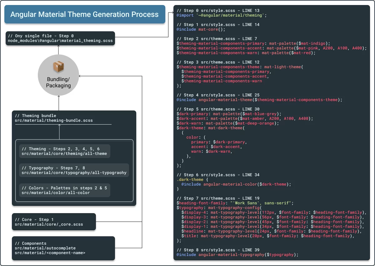
Angular Material Theme Generation Pipeline – View on Figma
A Note of Gratitude
Thanks for sticking with me through this deep dive. In the next installment, we'll take a few real Angular Material components, tweak their default palettes, and build out fully custom styling for them. I'd love to hear your questions or reactions in the comments below.