Components are the most fundamental building blocks in an Angular application. The entire application is structured as a tree of these components.
Angular applications are built by composing components daily. Certain foundational ideas, such as enhancing native elements or harnessing the power of directive selectors, can lead to the creation of high-quality components. This discussion revisits these basics to explore how Angular's directive selectors can simplify component design and boost accessibility. We will examine a straightforward scenario and demonstrate how the concept of "augmenting native elements" can be applied.
- Source code and slide
- Creating a custom button component
2.1. Custom button #1
2.2. Custom button #2
2.3. Create a custom button #3 - Global attributes
- Augmenting native elements
4.1. Re-implement three use cases using augmenting native elements approach
4.2. Custom button #1
4.3. Custom button #2
4.4. Custom button #3
4.5. Why does it work?
4.6. Benefits
4.7. Many popular UI libraries use augmenting native elements approach
4.8. What else can you do with augmenting native elements?
4.9. Should we never replace native components with custom components?
Source code and slide
The content of this article is inspired by a talk I delivered at NGRome 2022.
- Access the original presentation deck → trungk18.com/ngromeconf-2022
- Inspect the live demo code → https://stackblitz.com/edit/angular-directives-use-case
Creating a custom button component
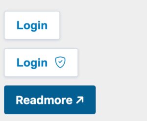
Our goal is to construct a custom button component that comes in three distinct flavors:
- A button that contains only textual content.
- A button that combines text with an accompanying icon.
- A button that includes text and an icon but functions like an anchor tag, navigating to a new URL upon a click.
stackblitz.com/edit/angular-directives-use-case ↗
Custom button #1
For the initial requirement, the implementation is quite direct. We just need a component that can output a button element with some applied styling and text.
export type ButtonType = 'reset' | 'button' | 'submit';
export type ButtonTheme = 'primary' | 'secondary';

@Component({
 selector: 'shared-button',
 template: `
   <button class="button" [ngClass]="'btn-' + buttonTheme" [attr.type]="buttonType">
     <span class="button-text">{{ buttonText }}</span>
   </button>
 `,
 changeDetection: ChangeDetectionStrategy.OnPush,
})
export class ButtonComponent {
 @Input() buttonText!: string;
 @Input() buttonTheme: ButtonTheme = 'secondary';
 @Input() buttonType: ButtonType = 'button';
}
Developing a typical Angular component generally requires three essential pieces:
- A selector, like
shared-buttonin this instance. - A template that describes what to render when the component is used.
- A class that encapsulates the component's logic. For a simple button, this might not involve any special behavior.
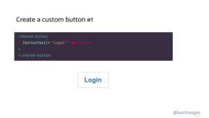
Here's how you can use it for the first scenario. Simply provide the [buttonText] input, and the text Login will appear within the rendered button.
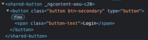
The resulting DOM, shown below, reveals that the shared-button custom element wraps the actual native button element.
Custom button #2
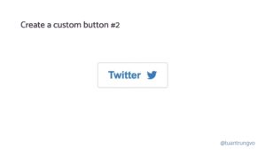
For this next version, we aim to display an icon alongside the text. A straightforward method involves adding a new @Input() icon: string. The shared-button component would then use this input to render an icon from a preferred library, such as Angular Material's icons. A potential code snippet looks like this:
export type ButtonType = 'reset' | 'button' | 'submit';
export type ButtonTheme = 'primary' | 'secondary';

@Component({
 selector: 'shared-button',
 template: `
   <button class="button" [ngClass]="'btn-' + buttonTheme" [attr.type]="buttonType">
     <span class="button-text">{{ buttonText }}</span>
+		 <mat-icon [svgIcon]="buttonIcon"></mat-icon>
   </button>
 `,
 changeDetection: ChangeDetectionStrategy.OnPush,
})
export class ButtonComponent {
  @Input() buttonText!: string;
+ @Input() buttonIcon!: string;
}
This approach, however, comes with some inherent limitations:
- It forces the use of
mat-icon. - The icon is always positioned after the text.
These constraints lead to further questions:
- What if a developer prefers a font-based icon using a simple
<i>tag, or perhaps an<img>tag to display an image? - What if the desired layout is to have the icon appear before the text?
Accommodating these needs becomes much simpler if we allow the consumer to pass both text and icons together as a unit, letting them control the content's structure and icon choice. We can achieve this by shifting from a simple string input. Let's introduce a new @Input() buttonContent that accepts a TemplateRef. Though content projection could also achieve a similar outcome, we will work with TemplateRef in this instance.
@Component({
 selector: 'shared-button',
 template: `
   <button class="button" [ngClass]="'btn-' + buttonTheme" [attr.type]="buttonType">
     <span class="button-text">
       <ng-container> {{ buttonText }} </ng-container>
+      <ng-container *ngTemplateOutlet="buttonContent"> </ng-container>
     </span>
   </button>
 `,
})
export class ButtonComponent {
+ @Input() buttonContent!: TemplateRef<any>;
  @Input() buttonText!: string;
  @Input() buttonTheme: ButtonTheme = 'secondary';
  @Input() buttonType: ButtonType = 'button';
}
This new implementation offers significant flexibility, empowering the user to dictate exactly what appears inside the button. Whether that’s a standalone icon, an icon preceding some text, or a dedicated component like twitter-icon, the choice is theirs.
<shared-button
   [buttonContent]="twitterBtnTmpl"
 >
 <ng-template #twitterBtnTmpl>
   Twitter <twitter-icon class="btn-icon"></twitter-icon>
 </ng-template>
</shared-button>
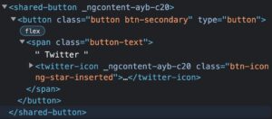
Just like the first example, the rendered DOM shows the custom shared-button element encompassing the native button.
Create a custom button #3
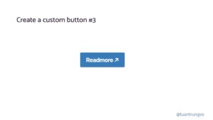
The third use case presents a more intriguing challenge. We intend to create a link that is styled like a button. Upon being clicked, this link should navigate to a specific URL.
Although the concept is simple, the actual implementation is more involved.
A link can serve two primary purposes: to navigate within the application using routerLink for Angular routes, or to point to an external resource via a standard href.
- We must inspect the provided URL to differentiate between internal and external destinations based on the presence of
httporhttps. - The
routerLinkmight require the passing of additional query parameters. - For external links, we need to decide if they should open in a new tab via
target="_blank". - When using
target="_blank", it's crucial to also setrel="noopener noreferrer"on the anchor tag for security best practices. - You can review the complete
shared-buttonimplementation that supports the<a>tag.
The code necessary to render this desired button could be as follows:
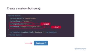
The component's @Input properties, however, could differ from traditional HTML attributes. Instead of the standard target or href, the component might use names like isTargetBlank or redirectURL, respectively.
Examining the DOM output, we see the standard shared-button wrapper, and inside it, an <a> element is rendered as anticipated.
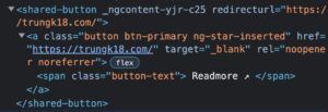
From an external perspective, if a developer is unaware of the component's internal implementation, they might easily attempt to wrap the entire button within an <a> tag in a misguided attempt to achieve the same navigational behavior.
<a href="https://trungk18.com/"
    target="_blank">
   <shared-button
     [buttonContent]="readmoreTmpl"
     [buttonTheme]="'primary'"
   >
     <ng-template #readmoreTmpl>
       Readmore ↗
     </ng-template>
   </shared-button>
 </a>
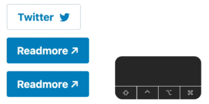
This results in a DOM structure like a > shared-button > button. Because both the a and button elements are inherently focusable, pressing the Tab key would cycle focus through each one sequentially.
The screenshot demonstrates this: pressing Tab first shows the browser's default blue outline on the focused a element. Pressing Tab again shifts focus to the button, triggering our custom outline.
This design strategy won't scale well over time.
Across all three examples, the component's complexity grows as new functionality is requested. Yet, the core need remains simple: **apply specific styling classes to a button or a tag to achieve the desired visual result.** We end up writing a substantial amount of code to reimplement behaviors that native elements already have, all because these elements are trapped inside our shared-button component and are not directly accessible.
Global attributes
Since the native button element is nested within our shared-button, we must add a new @Input every time we want to pass a new button attribute.
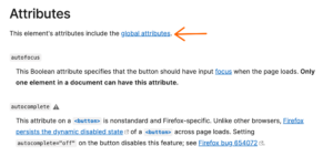
However, every HTML element, like button, supports a broad range of global attributes. This list is extensive, including over 50 ARIA attributes that are crucial for ensuring web accessibility.
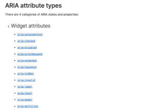
As our shared-button needs to support even a few more standard attributes, the component's signature quickly becomes complex.
@Input() ariaHidden: boolean;
@Input() ariaPlaceholder: string;
@Input() ariaPressed: string;
@Input() ariaReadonly: string;
@Input() ariaRequired: string;
@Input() ariaSelected: string;
@Input() ariaValueText: string;
@Input() ariaControls: string;
@Input() ariaDescribedBy: string;
@Input() ariaDescription: string;
@Input() ariaFlowTo: string;
@Input() ariaLabelledBy: string;
// and another 100 more Inputs ?
Extending built-in elements

The accessibility documentation on angular.io has a brief passage covering the Augmenting native elements pattern.
Native HTML elements capture several standard interaction patterns that are important to accessibility. When authoring Angular components, you should re-use these native elements directly when possible, rather than re-implementing well-supported behaviors.
Check: ngTemplateOutlet: The secret to customisation
For example, instead of creating a custom element for a new variety of button, create a component that uses an attribute selector with a native
<button>element. This most commonly applies to<button>and<a>, but can be used with many other types of element.From <https://angular.io/guide/accessibility#augmenting-native-elements>
Within Angular, the augmenting native elements technique involves defining a component whose attribute selector attaches behavior to a native <button> element.
Here is what the implementation looks like with augmenting native elements
- Selector: rather than introducing a custom tag, we pair
button[shared-button]witha[shared-button], which prevents the component from being mistakenly applied to something like adiv. - Template: relying solely on content projection means we capture whatever is placed between the
buttonoraopening and closing tags. - Then we can attach the desired styling directly to the native element through
HostBinding.
@Component({
+	 selector: 'button[shared-button], a[shared-button]',
+	 template: ` <ng-content></ng-content> `,
	 changeDetection: ChangeDetectionStrategy.OnPush,
	 styleUrls: ['./button-v2.component.scss'],
	 encapsulation: ViewEncapsulation.None,
})
export class ButtonV2Component {
+ @HostBinding('class') get rdButtonClass(): string {
   const classes = ['button', `btn-${this.buttonTheme}`];
   return classes.filter(Boolean).join(' ');
 }

 @Input() buttonTheme: ButtonTheme = 'secondary';
}
Reworking three examples with the augmenting native elements strategy
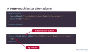
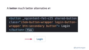
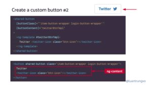
Both versions are presented side by side for easier comparison. The top portion shows the original approach with a dedicated shared-button component; the bottom portion adopts the attribute selector pattern.
Custom button #1
Custom button #2
Custom button #3
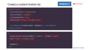
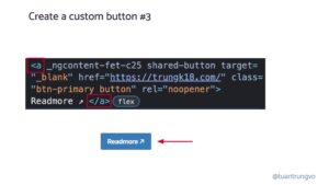
Across all three examples, you will notice
- The DOM output contains the actual
buttonandaelements without any extra nesting wrapper. - Because we select the elements themselves, we gain direct access to
buttonanda, which removes the necessity of forwarding additional attributes. The sole@Inputwe currently accept isbuttonTheme.
What makes this possible?
According to the Angular directive ↗ documentation, the selector field supports:
element-name: Targets elements by their tag name..class: Targets elements by a CSS class.[attribute]: Targets elements that carry a specific attribute.[attribute=value]: Targets elements that have a specific attribute with a given value.:not(sub_selector): Matches only when the element fails to match thesub_selector.selector1, selector2: Applies if eitherselector1orselector2matches.
In our implementation, we combine the element-name and [attribute] selector types, written as button[shared-button], a[shared-button].
Advantages
- Well-known APIs!
- Improved accessibility!
- Less complex code!
Widely used UI frameworks adopt the augmenting native elements pattern
Angular Material
material/button/button.ts#L40 ↗️
@Component({
 selector: `
   button[mat-button], button[mat-raised-button], button[mat-flat-button],
   button[mat-stroked-button]
 `,
 templateUrl: 'button.html',
 inputs: MAT_BUTTON_INPUTS,
 exportAs: 'matButton',
 encapsulation: ViewEncapsulation.None,
 changeDetection: ChangeDetectionStrategy.OnPush,
})
export class MatButton extends MatButtonBase {
NG-ZORRO
components/button/button.component.ts#L40
Worth noting is that ng-zorro expands the template to inject a loading icon as well, going beyond a bare ng-content.
@Component({
 selector: 'button[nz-button], a[nz-button]',
 exportAs: 'nzButton',
 changeDetection: ChangeDetectionStrategy.OnPush,
 encapsulation: ViewEncapsulation.None,
 template: `
+  <i nz-icon nzType="loading" *ngIf="nzLoading"></i>
   <ng-content></ng-content>
 `,
})
export class NzButtonComponent implements OnDestroy, OnChanges,
Other possibilities with augmenting native elements?
Angular Material
@Component({
 selector: 'mat-table, table[mat-table]',
 exportAs: 'matTable',
 template: CDK_TABLE_TEMPLATE,
 providers: [
   {provide: CdkTable, useExisting: MatTable},
   {provide: CDK_TABLE, useExisting: MatTable},
 changeDetection: ChangeDetectionStrategy.Default,
})
export class MatTable<T> extends CdkTable<T> implements OnInit {
material/tabs/tab-nav-bar/tab-nav-bar.ts#L307
@Component({
 selector: '[mat-tab-nav-bar]',
 exportAs: 'matTabNavBar, matTabNav',
 templateUrl: 'tab-nav-bar.html',
 encapsulation: ViewEncapsulation.None,
 changeDetection: ChangeDetectionStrategy.Default,
})
export class MatTabNav extends _MatTabNavBase
Is it always wrong to replace native components with custom ones?
Not at all. Custom components are necessary!
Still, when building a new component, it is worth pausing to consider
Could this be achieved by augmenting an existing element instead?