This guide walks through a full example of building an Angular Material Data Table.
We will explore the most frequent use cases tied to this component, focusing on server-driven pagination, sorting, and filtering.
This is a detailed tutorial, so feel free to code alongside as we begin with a simple starting point. We will then enhance the application feature by feature, explaining each step and common pitfalls.
We will take a close look at the reactive patterns that underpin the Material Data Table and the Angular CDK Data Source.
The final output will be:
- a full implementation of a Material Data Table connected to a server for pagination, sorting, and filtering through a custom CDK Data Source
- a runnable project on Github, equipped with a basic Express backend that delivers the paginated data
Table Of Contents
Here is what we're going to cover:
- The Angular Material Data Table - applicable beyond Material Design
- The Reactive Design of the Material Data Table
- The Material Paginator and Server-Side Pagination
- Sortable Headers and Server-Side Sorting
- Server-Side Filtering with Material Input Box
- A Loading Indicator
- A Custom Angular Material CDK Data Source
- Source Code (on Github) with the complete example
- Conclusions
Let's dive right in and start our tour of the Material Data Table!
Importing Angular Material modules
To get our example up and running, we first need to import the necessary Angular Material modules:
Here's what each module brings to the table:
- MatInputModule: Provides components and directives for Material Design Input Boxes, essential for our search field.
- MatTableModule: The heart of the data table, including the
mat-tablecomponent and its related directives. - MatPaginatorModule: A versatile pagination module that can paginate any kind of data. It can be used independently of the Data Table, for example, in a Master-Detail setup to navigate details.
- MatSortModule: An optional module that adds sortable headers to a data table.
- MatProgressSpinnerModule: Contains the progress indicator we'll use to signal data loading from the backend.
Introduction to the Angular Material Data Table
The Material Data Table is a versatile component for showing data in a grid format. While it's easy to style it with a Material Design look, this is not a strict requirement.
In fact, you can apply a completely different UI design to the Angular Material Data Table. To illustrate this, we'll first create a table where cells are just plain divs without any custom CSS.
This initial table will show a list of course lessons with three columns: sequence number, description, and duration.
Material Data Table Column Definitions
As shown, the table defines three columns, each within its own ng-container element. The ng-container itself won't be rendered on the screen, but it provides a host for the matColumnDef directive.
The matColumnDef directive assigns a unique key to a column, like seqNo, description, or duration. All the configuration for a column resides inside its corresponding ng-container.
Note that the sequence of the
ng-containerelements doesn't dictate the visual order of the columns.
The Material Data Table Auxiliary Definition Directives
The Material Data Table includes several auxiliary structural directives (applied with the *directiveName syntax) to assign specific roles to template sections. These directives always end with the Def suffix. We'll begin with the matHeaderCellDef and matCellDef directives.
The matHeaderCellDef and matCellDef Directives
Inside each ng-container with a column definition, you'll find a few configuration elements:
- a template for the column's header, marked with the
matHeaderCellDefstructural directive - a template for the column's data cells, marked with the
matCellDefstructural directive
These structural directives only designate a template's role (cell or header); they don't apply any styles. In our example, matCellDef and matHeaderCellDef are on unstyled divs, which is why the table lacks any Material design... for now.
Applying a Material Design to the Data Table
Now, let's see how we can give this table a Material Look and Feel. We'll swap the plain divs for some built-in components in our header and cell templates.
This template closely resembles the previous one, but we've replaced the divs with the mat-header-cell and mat-cell components within our column definitions.
With these components in place, let's see the Data Table with its new Material Design:
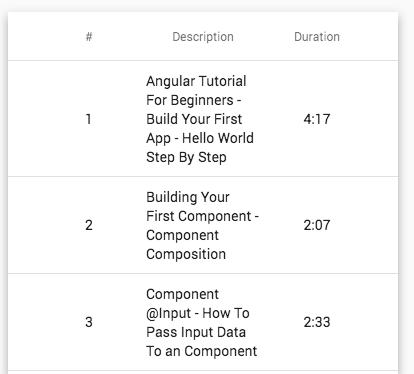
Notice that the table already has data! We'll discuss the data source shortly; for now, let's keep exploring the template.
The matCellDef Directive
The data cell template has access to the row's data. Since our table displays a list of lessons, each lesson object is accessible via the let lesson syntax, and can be used in the template like any other variable.
The mat-header-row component and the matHeaderRowDef directive
This component/directive pair works as follows:
- the
matHeaderRowDefdirective marks a template as the configuration for the table's header row, without adding any styling. - the
mat-header-rowcomponent, on the other hand, applies some minimal Material styling.
The matHeaderRowDef directive also specifies the order of the columns. In our case, its expression points to a component variable called displayedColumns.
Here is what the displayedColumns variable looks like:
The values in this array are the column keys, which must match the names defined by the matColumnDef directive on the ng-container elements.
Important: It's this array that determines the visual order of the columns!
The mat-row component and the matRowDef directive
This component/directive pair operates in a similar fashion:
matRowDefidentifies the configuration for a data row, without providing any specific styling.- Conversely,
mat-rowadds the Material styling to the data row.
With mat-row, you also get a variable, which we've named row, containing the data of the current row. You must set the columns property to specify the order of the data cells.
Interacting with a given table data row
You can use the element identified by matRowDef to interact with data rows. For example, here's how to detect a row click:
When a row is clicked, the onRowClicked() method is called, which logs the row data to the console.
Clicking the first row of our table would result in:
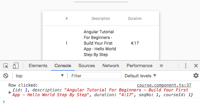
As expected, the data for the first row is printed to the console! But where does this data originate?
To find out, let's examine the data source linked to this table and review the Material Data Table reactive design.
Data Sources and the Data Table Reactive Design
The data table receives its data from a Data Source that follows reactive design principles and an Observable-based API.
This implies that the data table component doesn't know where the data originates. It could be from the backend or a client-side cache; it's transparent to the Data Table.
The Data Table just subscribes to an Observable from the Data Source. When that Observable emits a new value, it contains a list of lessons that the table displays.
Data Table core design principles
With this Observable-based API, not only is the data origin unknown, but the data table also doesn't know what caused the new data to arrive.
New data emissions can be triggered by various events:
- the initial table load
- a paginator button click
- a sortable header click
- a keystroke in a search input box
Again, the Data Table is unaware of the specific event that caused the new data, allowing the table components to focus on displaying data rather than fetching it.
Let's see how to implement such a reactive data source.
Why not use MatTableDataSource?
We won't use the built-in MatTableDataSource because it's designed for filtering, sorting, and pagination of a client-side data array.
In our situation, all these operations happen on the server. So, we'll create our own Angular CDK reactive data source from scratch.
Fetching Data from the backend
Our custom Data Source uses the LessonsService to fetch backend data. This is a standard Observable-based, stateless singleton service built on the Angular HTTP Client.
Let's look at the service and break down its implementation:
Breaking down the LessonsService implementation
As you can see, this service is stateless, and each method forwards calls to the backend via the HTTP client, returning an Observable to the caller.
Our REST API is located under the /api directory, and multiple services are available (here is the complete implementation).
In this snippet, we are only showing the findLessons() method, which obtains a single page of filtered and sorted lessons for a given course.
The function accepts these arguments:
- courseId: The identifier of the course for which we want lessons.
- filter: A search string to filter results. An empty string '' means no server-side filtering.
- sortOrder: The backend can sort by
seqNo. This parameter sets ascending order (the defaultascvalue) or descending order with the valuedesc. - pageNumber: The page number of the sorted/filtered result set. The default is the first page (index 0).
- pageSize: The desired page size, which defaults to a maximum of 3 elements.
With these arguments, loadLessons() constructs an HTTP GET request to /api/lessons.
The resulting GET call for the first page of lessons looks like this:
http://localhost:4200/api/lessons?courseId=1&filter=&sortOrder=asc&pageNumber=0&pageSize=3
We are appending HTTP query parameters to the GET URL using the HTTPParams fluent API.
The loadLessons() method will be the foundation of our Data Source, covering the server-side pagination, sorting, and filtering requirements.
Implementing a Custom Angular CDK Data Source
Using LessonsService, let's implement a custom Observable-based Angular CDK Data Source. Here is some initial code so we can discuss its reactive design (the full version will follow):
Breaking down the design of an Angular CDK Data Source
As you can see, to create a Data Source, we need a class that implements DataSource. This requires implementing the connect() and disconnect() methods.
Note that these methods accept a CollectionViewer argument, which provides an Observable that emits information about what data is displayed (start index and end index).
For now, we recommend focusing less on CollectionViewer and more on a crucial aspect for understanding the whole design: the return value of the connect() method.
How to implement the DataSource connect() method
This method is called once by the Data Table during bootstrap. The Data Table expects this method to return an Observable whose emissions contain the data to display.
In this case, the observable emits a list of Lessons. When a user changes pages, this observable emits a new value with the updated lessons page.
We'll implement this by using a subject that remains private to the class. That subject (the lessonsSubject) will emit values retrieved from the backend.
lessonsSubject is a BehaviorSubject, which means subscribers always receive its latest value (or an initial value), even if they subscribe late.
Why use BehaviorSubject?
Using BehaviorSubject is a great way to write code that is resilient to the ordering of asynchronous operations, such as backend calls or binding the table to the data source.
For example, in this design, the Data Source isn't aware of the Data Table or the moment the table requires data. Because the table subscribes to the connect() observable, it will eventually receive the data whether:
- the data is still in transit from the HTTP backend
- or the data was already loaded
Custom Material CDK Data Source - Full Implementation Review
Now that we understand the reactive design, let's examine the complete final implementation step-by-step.
Note that in this final version, we've added a loading flag to display a spinning indicator to the user:
Data Source Loading Indicator Implementation Breakdown
Let's start with the loading indicator. Given the reactive design, we'll implement it by exposing a boolean observable named loading$.
This observable first emits false (set in the BehaviorSubject constructor), signifying that no data is loading initially.
The loading$ observable is derived using asObservable() from a private subject. Only this class can control when data is loading, so only it can emit new values for this flag.
The connect() method implementation
Let's focus on the implementation of the connect() method:
This method must return an Observable that emits lessons data, but we don't want to directly expose lessonsSubject.
Exposing the subject means giving up control over when and what data is emitted. We want to ensure that only this class can emit values for the lessons data.
So, we'll return an Observable derived from lessonsSubject using asObservable(). This lets the Data Table subscribe to the lessons data without being able to emit new values.
The disconnect() method implementation
Let's examine the disconnect() method:
The Data Table calls this method once during component destruction. In it, we'll complete any observables created internally to prevent memory leaks.
We'll complete both lessonsSubject and loadingSubject, which triggers the completion of any derived observables.
The loadLessons() method implementation
Finally, let's review the loadLessons() method:
The Data Source exposes this public method named loadLessons(). It is invoked in response to user actions (pagination, sorting, filtering) to load a specific data page.
Here's how this method works:
- First, we signal that data is loading by emitting
trueto theloadingSubject, causingloading$to emittrue. - The
LessonsServiceis used to fetch a data page from the REST backend. - A call to
findLessons()is made, returning an Observable. - By subscribing to that Observable, we trigger an HTTP request.
- If the data arrives successfully, we emit it to the Data Table via the
connect()Observable. - To do this, we call
next()onlessonsSubjectwith the lessons data. - The derived observable from
connect()then emits the lessons data to the table.
Handling Backend Errors
Still within loadLessons(), let's see how the Data Source handles backend errors and the loading indicator:
- If the HTTP request errors, the Observable from
findLessons()will error out. - If so, we catch the error using
catchError()and return an Observable that emits an empty array usingof. - We could also choose to use a
MessagesServiceto show an error popup to the user. - Regardless of success or failure, the
loading$Observable emitsfalseviafinalize()(which operates likefinallyin plain Javascript).
And with that, we've finished reviewing our custom Data Source!
This version of the data source supports all our use cases: pagination, sorting, and filtering. As we've seen, the whole design revolves around transparently providing data to the table via an Observable-based API.
Let's now see how to connect this Data Source to the Data Table.
Linking a Data Source with the Data Table
The Data Table will be displayed as part of a component's template. Let's write an initial version of that component, showing the first page of lessons:
This component has several properties:
- The
displayedColumnsarray sets the visual order of the columns. - The
dataSourceproperty, an instance ofLessonsDataSource, is passed tomat-tablevia the template.
Breaking down the ngOnInit method
In the ngOnInit method, we call the Data Source's loadLessons() to load the first page. Here’s a step-by-step flow:
- The Data Source calls
LessonsService, triggering an HTTP request. - The Data Source emits the data via
lessonsSubject, which causes theconnect()Observable to emit the lesson page. - The Data Table component, subscribed to the
connect()observable, retrieves the new page. - The Data Table displays the new page without knowing where the data came from or what triggered it.
And with this "glue" component in place, we now have a working Data Table that displays server data!
The challenge is that this initial example always loads only the first page of data with a page size of 3 and no search criteria.
Let's use this as a foundation and begin adding: a loading indicator, pagination, sorting, and filtering.
Displaying a Material Loading Indicator
The loading indicator uses the Data Source's loading$ observable. We'll use the mat-spinner Material component:
As shown, the async pipe and ngIf control the visibility of the loading indicator. Here is what the table looks like while data is loading:
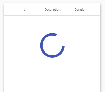
This indicator will also appear when switching between data pages, sorting, or filtering.
Adding a Data Table Material Paginator
The Material Paginator is a generic paginator with an Observable-based API. It isn't specifically tied to the Data Table and can paginate anything.
For instance, in a Master-Detail setup, you could use this paginator to navigate between detail items.
Here is how to use the mat-paginator component in a template:
Notice that there isn't an in-template link between the paginator and either the Data Source or the Data Table; that connection happens in the CourseComponent.
The paginator only requires the total item count to determine the number of pages (via the length property).
Based on that (plus the current page index), it enables or disables the navigation buttons.
We pass the total count via the lessonsCount property of a course object.
How to Link the Material Paginator to the Data Source
Let's now look at the CourseComponent to see where course comes from and how the paginator links to the Data Source:
Breaking down the ngOnInit() method
Let's start with the course object: you can see it's available at component construction time via the router.
This data object was fetched from the backend during navigation using a router Data Resolver (see an example here).
This is a common design, ensuring the target screen already has some data ready to display at navigation time. We also load the first data page in this method (line 20).
How is the Paginator linked to the Data Source?
In the code above, the link between the paginator and the Data Source is established in the ngAfterViewInit() method. Let's break it down:
We use the AfterViewInit lifecycle hook to ensure the paginator component, queried via @ViewChild, is already available.
The paginator has an Observable-based API and exposes a page Observable. This emits a new value each time the user clicks the navigation buttons or changes the page size.
To load new pages in response to pagination, we subscribe to this observable and call loadLessons() via the loadLessonsPage() method.
It's here that we pass the new page index and page size to the Data Source, both taken directly from the paginator.
Why have we used the tap() operator?
We could have made the data source call inside a subscribe() handler, but we've implemented it using the pipeable version of the RxJs do operator, known as tap.
View the Paginator in Action
With this setup, we now have a working Material Paginator! Here is what it looks like while displaying page 2 of the lessons:
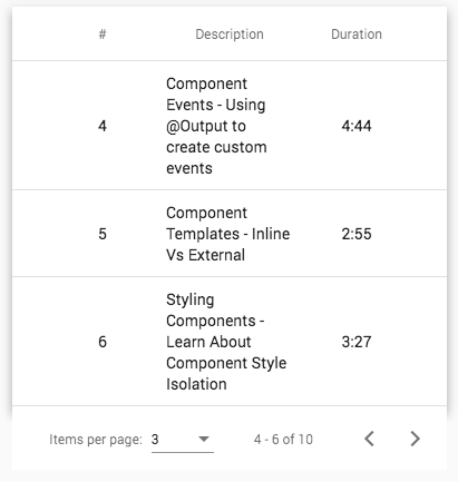
Let's enhance the example further by adding sortable table headers.
Adding Sortable Material Headers
To make headers sortable, we need to attach the matSort directive to our Data Table. In this case, only the seqNo column will be sortable.
Here's the template with all the sort-related directives:
In addition to matSort, we've added several auxiliary sort directives to the mat-table:
- matSortActive: Since incoming data is often pre-sorted, this directive informs the table that the data is already sorted by
seqNo, displaying the column in an 'upward arrow' sort state. - matSortDirection: A companion to
matSortActive, it defines the initial sort direction. In this case, the data is initially sorted ascending, and the arrow icon reflects that. - matSortDisableClear: Sometimes we want a third 'unsorted' header state. Here, we disable that to ensure the
seqNocolumn is always either ascending or descending.
This configures the table's sorting, but we also need to identify which headers are sortable.
Since only the seqNo column is sortable, we annotate its header cell with the mat-sort-header directive.
That covers the template. Now, let's check the changes in the CourseComponent to enable sorting.
Linking the Sortable column header to the Data Source
Much like pagination, a sortable header exposes an Observable that emits values when the header is clicked.
The MatSort directive exposes a sort Observable that triggers a new page load:
As you can see, the sort Observable is now merged with the page observable. A new page load is triggered in two cases:
- when a pagination event happens.
- when a sort event happens.
The sort direction of the seqNo column is now sourced from the sort directive (injected via @ViewChild()) and passed to the backend.
Notice that after each sort, we reset the paginator to the first page of the sorted data.
The Material Sort Header In Action
Here’s the Data Table after loading and clicking the sortable header (triggering a descending sort by seqNo):
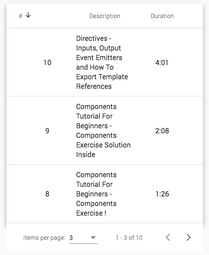
Notice the sort icon in the
seqNocolumn.
At this point, we have server pagination and sorting. Our final major feature is server-side filtering.
Adding Server-Side Filtering
The first step for server-side filtering is to add a search box to our template.
Now, let's present the complete template with all its features: pagination, sorting, and server-side filtering:
Breaking down the Search Box implementation
The only new part in this final template is the mat-input-container, which contains a Material Input box for the search query.
This input follows a standard Material pattern: the mat-input-container wraps a plain HTML input, projecting it.
This provides full access to all standard input properties, including Accessibility-related ones. It also ensures compatibility with Angular Forms, as we can apply Form directives directly on the input element.
Read more about building similar components in this post: Angular ng-content and Content Projection: The Complete Guide.
Notice there isn't even an event handler on this input box! Let's look at the component to see how it works.
Final Component with Server Pagination, Sorting and Filtering
This is the final CourseComponent with all features included:
Let's break down the server filtering aspect.
Getting a reference to the Search Input Box
We've injected a DOM reference to the <input> element using @ViewChild('input'). This time, the injection gave us a reference to a DOM element, not a component.
With that DOM reference, here’s the part that triggers a server-side search when the user types:
In this snippet, we are creating an Observable from the input using fromEvent.
This Observable emits on each keyUp event. We then apply a few operators:
-
debounceTime(150): Users can type quickly, potentially causing many server requests. This operator limits requests to at most one per 150ms. -
distinctUntilChanged(): This eliminates duplicate values.
With these two operators, we can trigger a page load by passing the query string, page size, and page index to the Data Source via the tap() operator.
Here’s what the screen would look like if the user types the search term "hello":
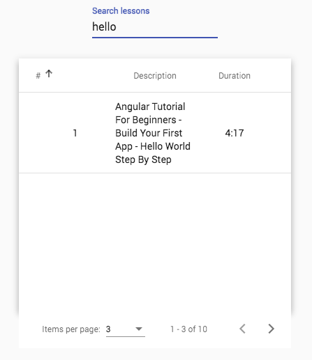
With this, our example is complete! We have a full solution for implementing an Angular Material Data Table with server-side pagination, sorting, and filtering.
Let's briefly summarize what we've covered.
Conclusions
The Data Table, Data Source, and related components are a solid example of reactive design using an Observable-based API. Here are the key points:
- the Material Data Table expects an Observable from the Data Source.
- The Data Source's primary role is building and providing that Observable, which emits new table data.
- A component class like
CourseServiceacts as the "glue" to tie things together.
This reactive design ensures the loose coupling of various elements and enforces a strong separation of concerns.
Source Code + Github Running Example
A running example of the complete code is available here on this branch on Github, complete with a small Express backend server that handles data serving and server-side sorting/pagination/filtering.
I hope this post helps you get started with the Angular Material Data Table and that you found it valuable.
For a deeper dive into Angular Material, we recommend checking the Angular Material Course, where we explain various widgets in greater detail.
If you have questions or comments, please share them below, and I’ll get back to you.
To get notified about upcoming posts on Angular Material and other Angular topics, I invite you to subscribe to our newsletter:
If you are new to Angular, have a look at the Angular for Beginners Course: