
Angular ng-content and Content Projection - The Complete Guide
Content Projection and the ng-content directive are among the most valuable features Angular provides for building reusable components. This guide explores how to leverage this mechanism to craft components with an API that is both minimal and highly effective. The focus is as much on sound component architecture as it is on the mechanics of content projection.
To understand the practical application, we will build a small component known as a Font Awesome Input Box. Through this exercise, we will examine the mechanics of content projection, the rationale for its use, and the substantial design improvements it can bring to certain components.
The finished component we will create is available here, packaged in the Angular Package Format.
Table Of Contents
This guide encompasses the following topics:
- What Problem is Content Projection Trying to Solve?
- An example of a component that would benefit from content projection
- Component Design Problem 1 - Supporting all the HTML Properties of an HTML Input
- Component Design Problem 2 - Integration with Angular Forms
- Component Design Problem 3 - Capturing plain browser events of elements inside a template
- Component Design Problem 4 - Custom third party input properties
- The Key Problem With The Initial Design
- Designing the Same Component Using Content Projection
- How To apply styles to elements projected via
ng-content - Interacting with Projected Content (inside
ng-content) - Multi-Slot Content Projection
- Conclusions
It's worth noting that the @ContentChild and @ContentChildren decorators now have modern signal-based counterparts: the contentChild() and contentChildren() view queries. More details are available here:
Angular Signal Queries: viewChild, contentChild, viewChildren, contentChildren (Complete Guide)
What Problem is Content Projection Trying to Solve?
Let's start with the fundamentals. To truly grasp content projection, we must first identify the specific design challenges this feature addresses. A clear understanding of the problem ensures we use the tool appropriately and avoid misapplication.
To illustrate these challenges, we will construct a small component *without* using content projection. Observing the issues that arise will provide a clear context for the solution.
What We Are About To Build
Our goal is a Font Awesome Input Box that mimics the appearance and behavior of a standard HTML input, enhanced with a small icon inside its border. The icon can be any of the ones available in the Font Awesome open-source library. Let's preview what we are creating.
Encapsulating a common HTML Pattern
Integrating an icon within an input box is a widespread HTML pattern that significantly improves user recognition. For instance, consider these text boxes:
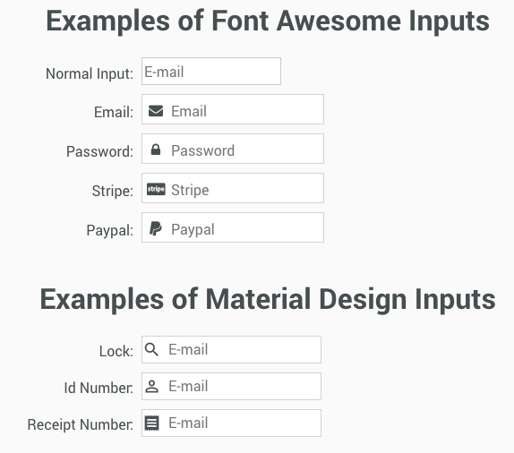
With both the icon and the placeholder text present, a separate field label to the left is largely unnecessary, which is particularly beneficial on mobile devices.
How Does This Component Work?
Standard HTML inputs cannot render images. Yet this component looks like a native input, complete with a blue focus border and keyboard support for Tab and Shift-Tab. How is this achieved? Internally, the component employs a very common HTML pattern:
- It wraps a plain HTML input and an icon within a DIV.
- The input's own border and outline are hidden, and a similar border is applied to the surrounding DIV.
- The
focusandblurevents of the inner input are monitored to add or remove a focus border on the wrapper DIV.
Thus, even this seemingly simple component required certain techniques to look and function like a plain input.
Design Goals
Our objective is to encapsulate this common HTML pattern into a versatile Angular component with the following characteristics:
- easy composability with other Angular pieces
- seamless integration with Angular Forms
With these goals in mind, let's examine an initial implementation *without* content projection to identify its shortcomings. Let's preview how this version might be used:
Here, the component is a custom element, fa-input, which accepts an icon name as an input and emits changes in the text field's value. This is an intuitive design choice and is likely the first option many would consider. However, as we will see, this approach introduces significant problems.
Component API Design - An Initial Attempt
Below is the initial version of the component's implementation:
Take a guess at what the most severe issue with this design is while we walk through the code.
The template displays the core idea: a combination of an icon and a plain HTML input. Let's start by looking at the styling before moving to the class logic:
These styles reveal some key decisions:
- the inner HTML input has had its borders and outline completely removed
- however, the host element itself is given a border, creating the illusion of a standard input field
- the input's focus state is simulated by applying a CSS class,
focus, to the host element
Back in the component class, we can see how these elements are connected:
- the public API includes an
iconstring property to determine which icon is displayed (e.g., an envelope, a lock) - a custom output event,
value, is defined to emit new values whenever the text input is modified - the focus behavior is implemented by listening to the native input's focus and blur events and toggling the
focusCSS class on the host via@HostBinding
The component functions as intended. Yet, when integrated into a real application, we will encounter a series of issues. Let's outline four of them, starting with:
Component Design Problem 1 - Supporting all the HTML Properties of an HTML Input
Designed as a replacement for a standard HTML input, our component fails to support any of its native properties. For example, consider a standard email input with autocomplete disabled and a placeholder. None of these standard browser features are available on our component, and these are just a few of many.
There are currently 31 HTML properties listed at W3schools for inputs, not to mention the full range of HTML ARIA Accessibility attributes.
To support all of these, we would need to implement something like this:
In essence, we would have to explicitly forward every single component input property to the internal HTML input within the template. This approach, while possible, would be extremely tedious. Worse, it doesn't address other more profound issues in the current design.
Component Design Problem 2 - Integration with Angular Forms
Another question arises: what if we need this input to be part of an Angular Form?
We would need to also forward all form-related directives, such as formControlName, to the inner plain input.
Component Design Problem 3 - Detection of plain browser events
What if we want to listen for a standard DOM event, like keydown, on the inner input field? While we could theoretically forward all events that don't bubble by default, it's a complex and messy solution.
It's cumbersome, but feasible. However, we would soon hit a wall with a problem that has no straightforward workaround.
Component Design Problem 4 - Custom third party properties
When building forms, third-party systems may require specific HTML custom data- attributes to be populated, especially in scenarios where a traditional page submission occurs rather than an Ajax request.
This is more problematic than the previous points, as we have no way to anticipate what these attribute names will be. At this point, it's clear that a significant number of common use cases are poorly served by this component.
So, what is the real, fundamental issue at the heart of this design?
The Key Problem With This Design
The core issue lies in our approach of hiding the HTML input within the component's template.
This creates a barrier between the external template, which knows the specific custom properties to apply, and the actual HTML input element.
this barrier is the root cause of every design flaw we've listed.
Concealing the input forces us to build intricate logic to pass properties and events in and out of the template to accommodate various use cases.
The good news is that content projection provides a way to support all of these use cases and beyond.
Designing the Same Component Using Content Projection
Let's redesign the component's API. Instead of hiding the input element inside the component, we can provide it as part of the component's *content*:
Notice that the form field is no longer a component input property. Instead, it is placed in the content area of the fa-input HTML tag. This style of API is common in standard HTML elements, like select boxes or lists:
Angular Core provides a way to do something similar in our own components!
We can query the content within the component tag and use it as a configuration API in the internal template, using the @ContentChild and @ContentChildren decorators. But we can do more than just query. We can also seamlessly use this content *directly* inside the component's template.
This means we can take the HTML input placed within the fa-input tag and project it directly into the Font Awesome template using the ng-content directive:
This new version is still incomplete; it doesn't yet support the simulated focus. However, it resolves all the shortcomings mentioned earlier because we now have direct access to the HTML input.
Interestingly, this change also introduces a new, albeit minor, issue. Take a look at the input box:

See the double border? It seems our previous styling to remove the input's border is no longer effective. Additionally, the focus behavior is gone.
Despite solving our initial API problems, we now have two new questions regarding ng-content:
- how can we style the projected content?
- how can we interact with the projected content?
How To Apply styles to elements projected via ng-content
Let's first understand why our previous styles stopped working. Our styles looked like this, located in fa-input.component.css:
The problem is that styles in a component's file are automatically scoped. Angular adds a unique attribute to *every* element defined within that component's template at runtime. Let's inspect the runtime HTML to understand:
Here is a simplified view of the HTML to clarify the situation:
- each element from the
fa-inputtemplate, like the icon tag, receives a special_ngcontent-c0attribute unique to this component - all component styles target only elements with this attribute
- consequently, the component's styles do NOT affect the projected input, as it lacks this
_ngcontent-c0attribute - this is expected, as the input originates from an external template
Styling projected content
To style the projected input and fix the double border, we need to adjust our CSS as follows:
How do these new styles work? Let's break down the changes:
- we use the
:hostselector to scope the styles to this component's host element - we then apply the
::ng-deepmodifier, which tells Angular to bypass component scoping and apply the styling to any descendant elements
Here's the resulting runtime CSS to illustrate this:
The styles remain anchored to the component, but they are now applied to *all* inputs within it, including the projected one!
This demonstrates the styling approach. Now, let's fix the second issue: how to interact with the projected content to simulate the focus.
Interacting with Projected Content inside ng-content
To simulate the focus functionality, our fa-input component needs to know when the projected input receives or loses focus. We can't directly attach event listeners to the ng-content tag itself.
Instead, the most effective method is to apply a dedicated directive to the projected input. Let's create a directive named inputRef and apply it to the HTML Input:
We can use this directive to track the focus state as well:
Here's how this directive works:
- it defines a
focusproperty that reflects whether the underlying native Input has focus - it uses the
@HostListenerdecorator to listen to the native focus and blur DOM events
We can now use this directive within the Font Awesome Input component. By using the @ContentChild decorator, we can inject the directive instance into the component's class. Then, we use the boolean focus property and @HostBinding to apply the focus CSS class.
With this new implementation, we have a fully working component that is simple to use and inherently supports all HTML input properties, accessibility attributes, third-party data props, and Angular Forms – all thanks to content projection.
So far, we have projected the entire content of fa-input. But what if we only want to project a portion of it?
Multi-Slot Content Projection
Let's consider a scenario where we want to project not just the HTML input but also the icon. We can put multiple types of content within the fa-input tag, for example:
We can then selectively consume these different types of content using the select property of ng-content:
These selectors target a specific element type (input or icon). However, we can also target elements by a CSS class or combine multiple selectors. For instance, this selector would target an input with a class named test-class:
It's also possible to capture content that doesn't match any selector. For example, the following would still project the input element:
An <ng-content></ng-content> without a selector acts as a catch-all. It fetches and projects all content that does not match any of the defined selectors.
In this case, that means all content that is not an icon tag, which is the HTML Input.
Conclusions
As we've seen, understanding how the ng-content core directive works is just as important as recognizing the typical scenarios where it is beneficial. It enables a component design where key internal details are not sealed within the component's template but are instead provided as projection input, which in certain circumstances leads to a much simpler and more flexible architecture.
I hope you found this guide helpful. I invite you to subscribe to our newsletter for the latest Angular news, free courses, and PDFs.
If you're interested in deepening your understanding of advanced Angular Core features, we suggest checking out the Angular Core Deep Dive course, where content projection is covered in much greater detail.
For those who are just getting started with Angular, have a look at the Angular for Beginners Course:

Other posts on Angular
If you enjoyed this post, you might also find these popular articles interesting:
- Angular Router - How To Build a Navigation Menu with Bootstrap 4 and Nested Routes
- Angular Router - Extended Guided Tour, Avoid Common Pitfalls
- Angular Components - The Fundamentals
- How to build Angular apps using Observable Data Services - Pitfalls to avoid
- Introduction to Angular Forms - Template Driven vs Model Driven
- Angular ngFor - Learn all Features including trackBy, why is it not only for Arrays ?
- Angular Universal In Practice - How to build SEO Friendly Single Page Apps with Angular
- How does Angular Change Detection Really Work ?
- Typescript 2 Type Definitions Crash Course - Types and Npm, how are they linked ? @types, Compiler Opt-In Types: When To Use Each and Why ?