Flexbox and Grid Layout for Angular Components
CSS Flexbox and CSS Grid are robust layout mechanisms, natively supported across modern browsers (with IE 11 lagging behind). These are not surface-level styling tools like color or border; they are structural systems that work hand-in-hand with the DOM hierarchy to shape the application's foundation. Styling properties beautify elements, but Flexbox and Grid construct the skeleton of the UI.
In Angular development, a component's view is typically split between a template HTML file and a stylesheet CSS file. Given that Flexbox and Grid layouts are so intertwined with the HTML structure, keeping their configuration external in CSS can feel awkward and breaks the cohesive view of the component's layout. A more elegant solution is to define these layout rules directly within the template markup.
However, resorting to inline style attributes is not the right path either.
This piece explores the usage of the Angular Flex-Layout module---an official solution for crafting Flexbox layouts directly in Angular templates—along with some of its more advanced capabilities.
Introducing Angular Flex-Layout
Angular Flex-Layout is an official npm package created by the Angular team. It provides a comprehensive layout API built on Flexbox CSS and media queries, offering Angular developers a convenient way to define component layouts.


The module provides a sophisticated layout API using Flexbox CSS + mediaQuery. It equips Angular developers with component layout features through a custom Layout API, mediaQuery observables, and injected DOM flexbox-2016 CSS stylings.
The library exposes several NgModules that export directives, enabling a declarative approach to constructing layouts with Flexbox or CSS Grid.
Setting Up
Start by creating a project with the Angular CLI and installing the package via npm or yarn. The Flex-Layout library has a dependency on the Component Dev Kit (CDK), so you will need to install that as well if it's not already part of your project.
$ yarn add @angular/flex-layout @angular/cdk
Following that, integrate FlexLayoutModule into your root AppModule.
import { NgModule } from '@angular/core';
import { BrowserModule } from '@angular/platform-browser';
import { FlexLayoutModule } from '@angular/flex-layout';
import { AppComponent } from './app.component';
import { CardComponent } from './card.component';
@NgModule({
  imports:      [ BrowserModule, FlexLayoutModule ],
  declarations: [ AppComponent, CardComponent ],
  bootstrap:    [ AppComponent ]
})
export class AppModule { }
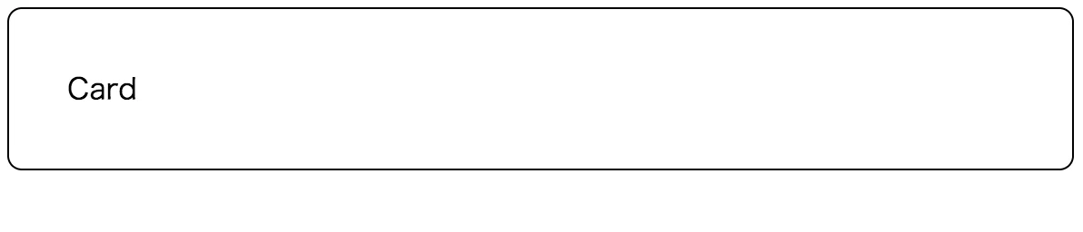
With that, the installation is complete, and you're ready to start building. For demonstration purposes, the AppModule declaring a CardComponent will be used, which is a simple component designed to display a card and showcase various Flexbox layouts.
@Component({
  selector: 'app-card',
  template: `<div>Card: {{name}}</div>`,
  styles: [`
  :host {
    display: block;
    padding: 32px;
    border: 1px solid black;
    border-radius: 8px;
  }
  `]
})
export class CardComponent {}
Creating a Flexbox Layout
Now, let's put the library to work and explore the Flexbox APIs through a series of examples.
Example 1: A Column-Flexible Card List
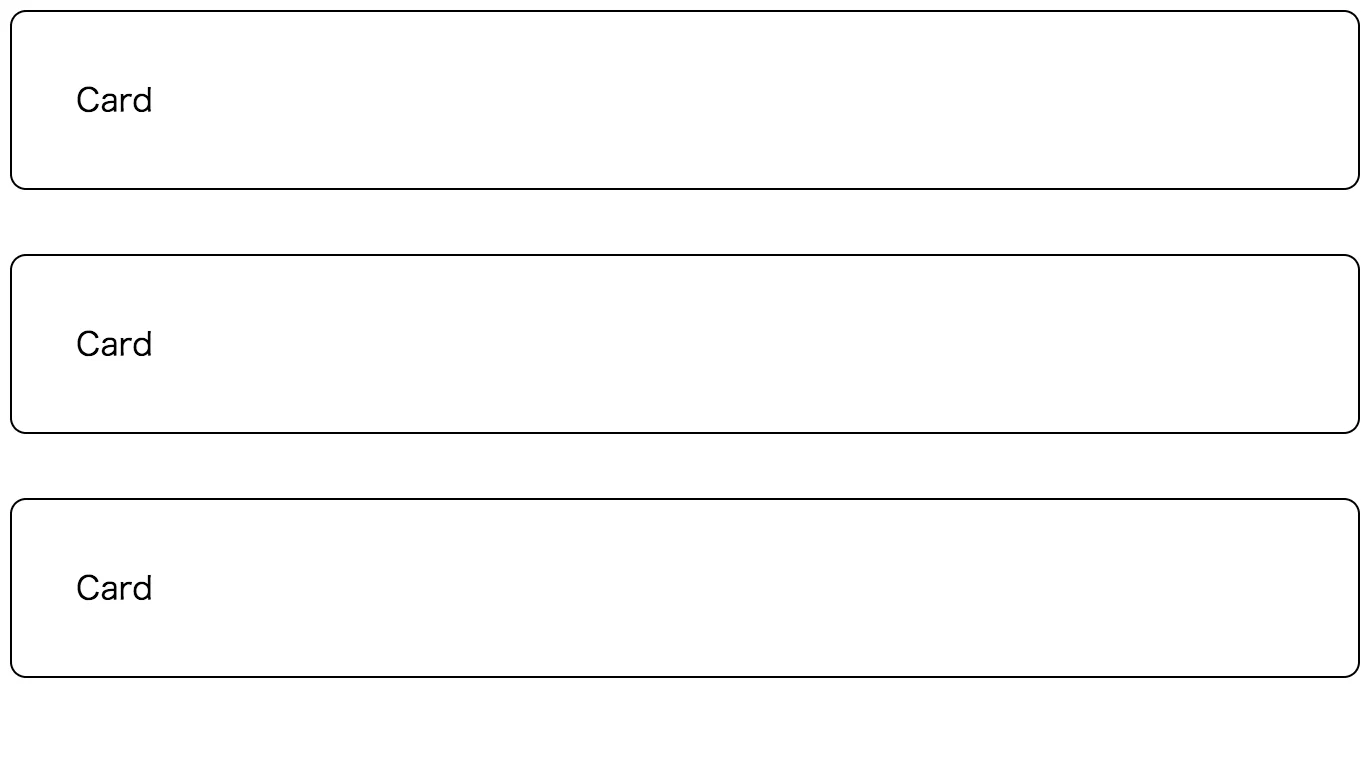
A good starting point is a simple column-based list, which can be achieved with pure CSS like this:
<style>
  .cardList {
    display: flex;
    flex-direction: column;
  }
  /* Row Gap */
  .cardList > *:not(:last-child) {
    margin-bottom: 32px;
  }
</style>
<div class="cardList">
   <app-card></app-card>
   <app-card></app-card>
   <app-card></app-card>
</div>
In this CSS approach, you'd need to set the container to display: flex and specify the direction via the flex-direction property. To space the cards, the :not(:last-child) selector is commonly used to apply margins, because standard Flexbox doesn't support gap properties natively. This can get a bit wordy.
With Angular Flex-Layout, the same layout is expressed much more concisely in the template:
<div fxLayout="column" fxLayoutGap="32px">
   <app-card></app-card>
   <app-card></app-card>
   <app-card></app-card>
</div>
Notice the fxLayout="column" directive establishing the Flexbox container. It's quite intuitive. In this simple case, two directives are used to set up the layout:
fxLayout=”column”-- Covers thedisplay: flexandflex-directionproperties at once, initiating a new Flexbox container with a defined direction.fxLayoutGap=”32px”-- Applies the equivalent ofmargin-bottom: 32pxto all children except the last one, configuring the spacing between the items.
Example 2: A Row-Based Card Grid
Next, let's consider a row-based layout in a three-column format, a classic pattern for presenting a set of smaller cards.
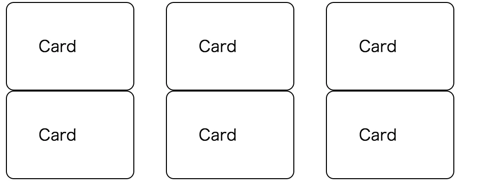
The plain CSS implementation would require a slightly more complex template structure:
<style>
 .cardList {
   display: flex;
   flex-direction: row;
   flex-wrap: wrap;
   justify-content: flex-start;
 }
 /* Column Gap */
 .cardList > * {
   box-sizing: border-box;
 }
 .cardList > *:not(:last-child) {
   margin-right: 32px;
 }
 /* Item sizing */
 .cardListItem {
   flex: 0 1 calc(33.3% - 32px);
 }
</style>
<div class="cardList">
  <ng-container *ngFor="let _ of [1,2,3,4,5,6]">
    <app-card class="cardListItem"></app-card>
  </ng-container>
</div>
The Angular Flex-Layout version, however, keeps things remarkably clean:
<div
  fxLayout="row wrap" fxLayoutGap="32px" fxLayoutAlign="flex-start">
  <ng-container *ngFor="let _ of [1,2,3,4,5,6]">
    <app-card fxFlex="0 1 calc(33.3% - 32px)"></app-card>
  </ng-container>
</div>
In this template, fxLayout="row wrap" configures the container. The fxLayout directive accepts a wrapping option as its second parameter. To ensure each card takes up the correct width, the fxFlex directive is added to each element, helping to align them into three distinct columns.
fxLayoutAlign=”flex-start”-- Aligns tojustify-content: flex-start, controlling the alignment along the main axis of the container.fxFlex="1 0 auto"-- Maps to the CSSflex: 1 0 autoproperty, dictating how items grow, shrink, and set their base size.
Responsive API
The row-based example above has a usability problem on mobile screens. Let's make the card sizes responsive to different viewport widths.
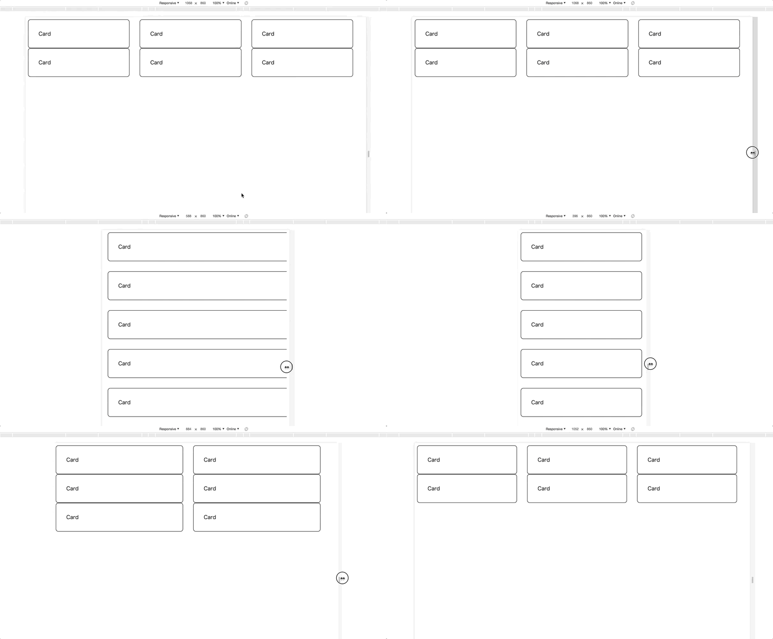
Typically, this requires resorting to CSS media queries and defining custom breakpoints to handle various screen sizes. A typical implementation might look like this:
<style>
  .cardList {
    display: flex;
    flex-direction: row;
    flex-wrap: wrap;
    justify-content: flex-start;
  }
  /* Column Gap */
  .cardList > * {
    box-sizing: border-box;
  }
  .cardList > *:not(:last-child) {
    margin-right: 32px;
  }
  /* Item sizing */
  .cardListItem {
    flex: 0 1 calc(33.3% - 32px);
  }
  /* medium size viewport */
  @media screen and (max-width: 959px) {
    /* Column Gap */
    .cardList > *:not(:last-child) {
      margin-right: 32px;
    }
    /* Item sizing */
    .cardListItem {
      flex: 0 1 calc(50% - 32px);
    }
  }
  /* small size viewport */
  @media screen and (max-width: 599px) {
    .cardList {
      display: flex;
      flex-direction: column;
      justify-content: flex-start;
    }
    .cardList > *:not(:last-child) {
      margin-right: unset;
      margin-bottom: 32px;
    }
  }
</style>
Maintaining such CSS can quickly become unwieldy.
There's a better way! Angular Flex-Layout extends its Static APIs with responsive capabilities, so no extra modules are required.
The directives can be augmented with a breakpoint alias using the syntax <directive>.<breakpoint alias>. As an illustration, fxLayout.lt-sm="column" would be active when the viewport is less than the small (sm) breakpoint. This makes the code easy to read and maintain.
The previous verbose CSS can be replaced with this simple, declarative template:
<div
  fxLayout="row wrap"
  fxLayout.lt-sm="column"
  fxLayoutGap="32px"
  fxLayoutAlign="flex-start">
<ng-container *ngFor="let _ of [1,2,3,4,5,6]">
  <app-card
    fxFlex="0 1 calc(33.3% - 32px)"
    fxFlex.lt-md="0 1 calc(50% - 32px)"
    fxFlex.lt-sm="100%"
  ></app-card>
</ng-container>
</div>
Each child card now has additional directives like fxFlex.lt-md and fxFlex.lt-sm, configuring widths for different viewport sizes. In this case, cards will display as two columns on small-to-medium screens and collapse to a single column on very small screens. This responsive enhancement is available for all Flexbox directives, not just the ones shown here.
Grid API
Now that the card list is well-structured, let's fill in the details of the card itself using the Grid API.
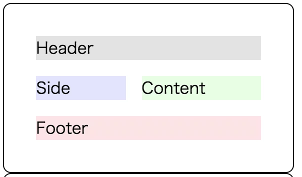
The example below defines a grid container with four distinct areas: a header, a side section, the main content area, and a footer. The structure is typically defined with inline style bindings.
<style>
  .cardInner {
    display: grid;
    grid-template-areas: "header header" "side content" "footer footer";
    grid-template-rows: auto auto auto;
    grid-row-gap: 16px;
    grid-column-gap: 16px;
  }
</style>
<div class="cardInner">
  <div [style.grid-area]="'header'">
    Header
  </div>
  <div [style.grid-area]="'side'">
    Side
  </div>
  <div [style.grid-area]="'content'">
    Content
  </div>
  <div [style.grid-area]="'footer'">
    Footer
   </div>
</div>
No additional setup is needed to use Grid directives---all APIs are initialized once FlexLayoutModule is loaded. The rewritten template looks like this:
<div
  gdAreas="header header | side content | footer footer"
  gdGap="16px"
  gdRows="auto auto auto">
  <div gdArea="header">
    Header
   </div>
  <div gdArea="side">
    Side
   </div>
  <div gdArea="content">
    Content
  </div>
  <div gdArea="footer">
    Footer
  </div>
</div>
On the grid container, gdAreas and gdRows directives define the overall grid structure, mirroring the CSS properties grid-template-areas and grid-template-rows. The gdGap directive sets up the spacing, while each child area is designated with the gdArea directive.
Significantly, the Grid directives also support the same responsive enhancements. For instance, the following template can alter the card's internal layout to a single vertical column on narrower screens, requiring changes to only two lines of code.

<div
  gdAreas="header header | side content | footer footer"
  gdGap="16px"
  gdRows="auto auto auto"
  gdAreas.lt-md="header | side | content | footer"
  gdRows.lt-md="auto auto auto auto"
  >
  ...
</div>
Grid API in Beta
The Grid APIs within Angular Flex-Layout are still not officially documented and should be considered experimental. As such, the API is likely to evolve, so proceed with caution when using it in production environments.
Key Points
- Angular Flex-Layout is a dependable, official tool for defining CSS Flexbox/Grid layouts directly and declaratively in your templates.
- The library includes built-in support for building fully responsive interfaces using straightforward template syntax.
References
- Browser Support: Flexbox / Grid
- GitHub repository
- Documentation Wiki
- Live Demo on Stackblitz