Understanding the portal pattern behind Taiga UI's root component
Around the holiday season, Roman, a teammate of mine, introduced our Angular component library called Taiga UI. When you follow the Getting started instructions, there's a step that requires wrapping your application with the tui-root component. This piece examines what that component does, clarifies the concept of portals, and explains why we adopted this approach.
What exactly is a portal?
Consider a typical select component with a dropdown list of options. If that dropdown remains in the same DOM position as its parent component, you'll encounter various rendering problems. Content can overlay incorrectly, and parent containers may clip or hide the dropdown:
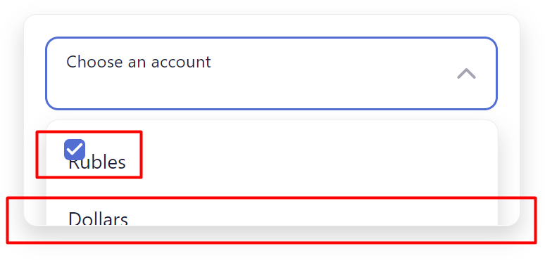
Stacking issues usually get patched up with z-index values, which turns your application into a battleground of ever-increasing numbers like 100, 10000, or 10001. Even if you get that sorted out, a parent with overflow: hidden can still ruin the layout. The alternative is straightforward: render the dropdown in a separate, dedicated container that sits above all other content. This way, your application's regular content remains in its own isolated stacking context, and z-index conflicts disappear. That top-level container is what we call a portal — and setting up this portal is one of the responsibilities of Taiga UI's root component. Here's what its template looks like:
<tui-scroll-controls></tui-scroll-controls>
<tui-portal-host>
	<div class="content"><ng-content></ng-content></div>
	<tui-dialog-host></tui-dialog-host>
	<ng-content select="tuiOverDialogs"></ng-content>
	<tui-notifications-host></tui-notifications-host>
	<ng-content select="tuiOverNotifications"></ng-content>
</tui-portal-host>
<ng-content select="tuiOverPortals"></ng-content>
<tui-hints-host></tui-hints-host>
<ng-content select="tuiOverHints"></ng-content>
Generic versus dedicated portals
The tui-dialog-host and tui-portal-host elements are both portals, but they serve different purposes. Let's start with the second one. Taiga UI primarily uses it for dropdown rendering, though it's built as a generic container. A minimal service controls it:
@Injectable({
  providedIn: 'root',
})
export class TuiPortalService {
  private host: TuiPortalHostComponent;

  add<C>(
    componentFactory: ComponentFactory<C>,
    injector: Injector
  ): ComponentRef<C> {
    return this.host.addComponentChild(componentFactory, injector);
  }

  remove<C>({hostView}: ComponentRef<C>) {
    hostView.destroy();
  }

  addTemplate<C>(
    templateRef: TemplateRef<C>,
    context?: C
  ): EmbeddedViewRef<C> {
    return this.host.addTemplateChild(templateRef, context);
  }

  removeTemplate<C>(viewRef: EmbeddedViewRef<C>) {
    viewRef.destroy();
  }
}
The component itself keeps things simple — it renders templates and dynamic components at the top level. Beyond a small position: fixed utility for iOS, there's no extra logic baked in. That means each portal item handles its own positioning, closure, and other behavior. Having a generic portal is valuable for custom use cases, such as a floating "Scroll to top" button that stays above page content or any other element you might need as a library consumer.
Handling drop-downs
Designing a drop-down involves figuring out the positioning strategy. There are a few approaches you could take:
- Set the position once and disable scrolling until the drop-down closes. This is the default behavior in Material.
- Set the position once and close the drop-down if any scrolling happens. Native drop-downs work this way.
- Track the host's position and update the drop-down accordingly.
We chose the third path, which turned out to be the trickiest. Keeping two elements perfectly in sync is difficult, even with requestAnimationFrame. The problem is that querying the host's position forces a layout recalculation. By the time the next frame arrives and the drop-down gets positioned, the host has already shifted slightly. The result is visible jitter, even on powerful hardware. Our solution was to use absolute positioning rather than fixed positioning. Since the portal container wraps the entire page, the coordinates remain stable during scroll. There's an edge case though: if the host lives inside a fixed-position container, the drop-down still jumps. We detect that scenario when opening the drop-down and switch to fixed positioning in those cases.
There's also this piece:
When the host scrolls out of view, the drop-down needs to close. That task falls to the Obscured service, which monitors whether the host is hidden behind any element and shuts the drop-down when it detects that condition.
Working with dialogs
To understand dedicated portals, dialogs are a good example. Toast notifications and hints follow similar patterns, but modals come with some unique considerations worth exploring.
The dialog host looks like this:
<section
   *ngFor="let item of dialogs$ | async"
   polymorpheus-outlet
   tuiFocusTrap
   tuiOverscroll="all"
   class="dialog"
   role="dialog"
   aria-modal="true"
   [attr.aria-labelledby]="item.id"
   [content]="item.component"
   [context]="item"
   [@tuiParentAnimation]
></section>
<div class="overlay"></div>
Rather than being a generic container, it uses an ngFor loop over specific items. That allows us to incorporate behaviors like focus trapping and scroll blocking directly into the host. There's also a clever use of dependency injection here that keeps dialogs decoupled from specific designs or data models. The host subscribes to observable streams from dialogs registered via a dedicated multi token, merges those streams, and renders whatever comes through. This design permits multiple dialog variations within a single application. Taiga UI ships with two built-in variations — base and mobile — but you can create your own easily. Here's how.
The dialog service returns an Observable. Subscribing to it opens the modal, and terminating the subscription closes it. Data can be sent from the dialog back through that same stream. First, you design your dialog component. The key requirement is the ability to inject POLYMORPHEUS_CONTEXT in the constructor. The injected object contains content and observer properties for that dialog instance. You close the dialog by calling complete on the observer, and you can pass data out via the next method. Additionally, the options you provide to the service — which extends an abstract class — are available:
const DIALOG = new PolymorpheusComponent(MyDialogComponent);
const DEFAULT_OPTIONS: MyDialogOptions = {
  label: '',
  size: 's',
};

@Injectable({
  providedIn: 'root',
})
export class MyDialogService extends AbstractTuiDialogService<MyDialogOptions> {
  protected readonly component = DIALOG;
  protected readonly defaultOptions = DEFAULT_OPTIONS;
}
Once you supply default configuration and specify which component to render, everything falls into place.
Everything in Taiga UI, including dialogs, leverages ng-polymorpheus for customizable content. For a deeper dive into building framework-agnostic, flexible components with it, check out this article.
Focus management is handled by the tuiFocusTrap directive. Since drop-downs appear later in the DOM and multiple dialogs can be open simultaneously, we don't mind if focus moves forward in the document. But if focus goes somewhere that precedes the dialog, we pull it back using utilities from @taiga-ui/cdk:
@HostListener('window:focusin.silent', ['$event.target'])
onFocusIn(node: Node) {
  if (containsOrAfter(this.elementRef.nativeElement, node)) {
    return;
  }

  const focusable = getClosestKeyboardFocusable(
    this.elementRef.nativeElement,
    false,
    this.elementRef.nativeElement,
  );

  if (focusable) {
    focusable.focus();
  }
}
Preventing page scroll requires coordination between a directive and some logic in the root component. When a dialog opens, the root hides the scrollbars, while the Overscroll directive manages touch and wheel scrolling. There's a CSS property for overscroll behavior, but it's not enough on its own — especially when the dialog is small and doesn't scroll internally. That's why our directive adds extra logic to stop scroll propagation to ancestor nodes.
Bonus: other features in tui-root
That covers the portal side of things. Let's also touch on what else the root component brings. The template includes tui-scroll-controls, which renders custom scrollbars for controlling global scroll. You might have also noticed named content projections like <ng-content select="tuiOverDialogs"></ng-content>. These let you insert content between layers of Taiga UI's UI as needed. For instance, if you're running another library for toasts or dialogs and want them properly stacked vertically, this is the way to do it.
Additionally, it registers several event manager plugins in the dependency injection system. Those are explained in a separate article. For proper registration order, TuiRootModule should come after BrowserModule — though if you get it wrong, an assertion message in the console will let you know.
That sums up portals and the root component. Taiga UI is open-source, available on GitHub and npm. You can also explore the demo portal with documentation and experiment using this StackBlitz starter. Keep an eye out for more posts about our features.