Overview at a Glance
Angular ships with a robust animation package (@angular/animations) that introduces a domain-specific language (DSL) for describing web animation sequences. These sequences can define multiple transformations applied to HTML elements over time, either in series or in parallel. The package relies on the native Web Animations API and, starting with Angular 6, gracefully degrades to CSS keyframes when that API is absent from the user’s browser.
Because these animations build on CSS transition capabilities, anything you can style or transform with CSS can be animated through Angular’s tooling. What distinguishes this approach is the added layer of orchestration it grants developers. The result is animations that perform like pure CSS while benefiting from JavaScript’s flexibility, all without pulling in extra libraries.
When working with BrowserAnimationModule, the process unfolds in four stages. I find it helpful to frame these as a set of questions—why, what, where, and how—and the answers dictate how the animation behaves:
- Why: The data binding expression is evaluated, determining which animation state is assigned to the host element.
- What: The data binding target specifies which animation definition contains the CSS styles for the element’s state.
- Where: The state itself tells Angular which CSS styles should be placed on the element.
- How: The transition dictates the manner in which those styles are applied whenever a state change occurs.
JS/CSS Naming Conventions
The style function serves as a foundational piece of Angular animation, providing a spot to define the styles applied to a target element during a particular state. One notable quirk of this function is that it supports two naming conventions. This explains the inconsistent syntax you’ll encounter online—some examples use camelCase, others hyphens.
Camelcase Approach
JavaScript’s convention favors camelCase property names. Angular animation accepts these directly, letting you supply standard key-value pairs as illustrated here:
style({
  backgroundColor: "green",
})
Dashed Case Approach
The CSS convention, which uses hyphens, requires wrapping the property key in quotation marks. This prevents JavaScript from misinterpreting the hyphens as minus signs. The same example from above, rewritten in dashed case, would appear as:
style({
  "background-color": "green",
})
Execution Order
Animations in Angular fire after the event that triggers them. As an example, the :enter state transition activates post-ngOnInit and after the initial change detection pass, while :leave triggers just following the element’s ngOnDestroy call.
Another important detail: when an animation fires, the parent animation takes precedence over its children, effectively blocking child animations unless both are explicitly allowed to run. To let both play, the parent must invoke query on the elements holding the child animations and execute them via the animateChild method, a topic explored in more depth here.
Getting Set Up
To leverage @angular/animations in your project, these steps are necessary:
- Confirm that
@angular/animationsappears in yourpackage.jsonas a dependency (it’s usually included by default) - If it’s missing, install it with
npm install --save @angular/animations - Import
BrowserAnimationsModuleand add it to your module’simportsarray (refer to the snippet below)
import { NgModule } from '@angular/core';
import { BrowserAnimationsModule } from '@angular/platform-browser/animations';

@NgModule({
  imports: [
    BrowserAnimationsModule
  ],
})
Note: Angular also exposes NoopAnimationsModule for disabling animations globally. This is typically employed in testing to substitute the real animation when it’s either too slow or irrelevant to the test’s purpose.
Fundamentals
In this section, we’ll explore several common use cases for the Angular animation module; more complex scenarios come later. To start, it helps to establish a solid grasp of animation states, a concept used throughout most of this guide.
Defining Animation States
Angular allows you to define styles and transitions that apply when an element changes state. Three states are available for use in your animation logic:
- Wildcard (
*) – signifies the default or any state of the element. For example,active => *describes a transition fromactiveto any other state. - Void (
void) – represents the state when the element hasn’t been inserted into the DOM yet or is in the process of being removed. - Custom – any arbitrary name to denote a specific state (such as ‘active’ or ‘inactive’).
Handling State Transitions
Before animating, you must define the distinct states between which the element will move. These serve as the first argument to the state function (in the example that follows, they’re dubbed ‘default’ and ‘disabled’), together with the style each state should apply.
To animate transitions between those states, the transition function must be supplied. It takes two states (e.g., * => * denotes any-to-any; you can be more exact with something like default => disabled depending on your needs) and the animation function that executes during the shift.
import { trigger, state, style, animate, transition } from '@angular/animations';

@Component({
  ...
  animations: [
    trigger('enabledStateChange', [
      state(
        'default',
        style({
			opacity: 1,
		})
	),
	state(
		'disabled',
		style({
			opacity: 0.5,
        })
      ),
      transition('* => *', animate('300ms ease-out')),
    ])
  ]
})
Here’s a short rundown of the functions seen above:
trigger– takes a name for the animation trigger and an array comprising state and transition definitionsstate– takes a name for a state and the styles issued when that state is activestyle– defines the CSS styles to applytransition– outlines the settings for moving between states, including directionanimate– establishes the time span and additional CSS animation attributes like easing
Note that style, transition, and animate accept individual or array-form arguments (grouped), offering flexibility in structuring your animations.
In your template, simply add the animation name defined earlier, prefixed with @, and bind it to a variable that toggles between the states. Angular manages everything else.
<div [@enabledStateChange]="stateOfElement">...</div>
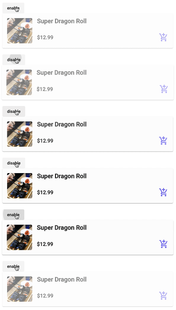
Demo state change animation
Creating Enter and Exit Effects
Angular also supplies convenient aliases such as :enter and :leave for animating elements as they enter or exit the DOM. These aliases correspond to transitions involving the void state—specifically void => * for entrance and * => void for exit. This proves especially handy for elements shown conditionally via *ngIf or *ngFor. The example below demonstrates constructing a fade-in and fade-out effect.
trigger('fadeSlideInOut', [
	transition(':enter', [
		style({ opacity: 0, transform: 'translateY(10px)' }),
		animate('500ms', style({ opacity: 1, transform: 'translateY(0)' })),
	]),
	transition(':leave', [
		animate('500ms', style({ opacity: 0, transform: 'translateY(10px)' })),
	]),
]),
To apply it, place the trigger name prefixed by @ in your template. Since it relies exclusively on the :enter and :leave aliases, no binding is needed.
<div *ngIf="show" @fadeSlideInOut>...</div>
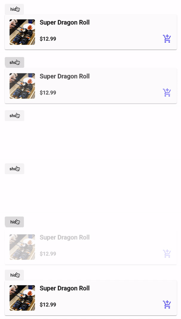
Demo enter exit animation
Going Further
As shown in the fundamentals, many everyday animation needs are simple to implement. The following covers more sophisticated, less frequent scenarios that may fit certain situations well.
Animating Multiple Elements via Queries
Prior sections concentrated on targeting single elements to which the animation trigger is attached. To apply a shared animation set to a whole group of elements with one trigger, the query function comes into play. For instance, you might animate each item of a list as it gets added to the DOM.
A key distinction between query and direct element targeting lies in where the trigger sits. With query, the trigger is placed on a parent element. The query function then scans the parent (including nested descendants) for elements matching the specified parameters and executes the animation on them. By default, query understands these tokens:
:enterand:exit– picks out all elements being added or removed:animating– selects any element currently running an animation:self– targets the present element@{animationName}– finds all elements with a specific animation trigger
You can also combine these tokens by passing a comma-separated string into the query function. As mentioned earlier, you can manipulate the found elements much like you would directly targeted ones. The second parameter for query handles either a single AnimationMetadata or an array of them, opening the door for intricate sequences or layered logic within a single query to affect many elements.
Below is an illustration of applying a ShakeAnimation to child elements through the query function.
const ShakeAnimation = [
	style({ transform: 'rotate(0)' }),
	animate('0.1s', style({ transform: 'rotate(2deg)' })),
	animate('0.1s', style({ transform: 'rotate(-2deg)' })),
	animate('0.1s', style({ transform: 'rotate(2deg)' })),
	animate('0.1s', style({ transform: 'rotate(0)' })),
];
export const QueryShake = [
	trigger('queryShake', [
		transition('* => default', [query('.card', ShakeAnimation)]),
	]),
];
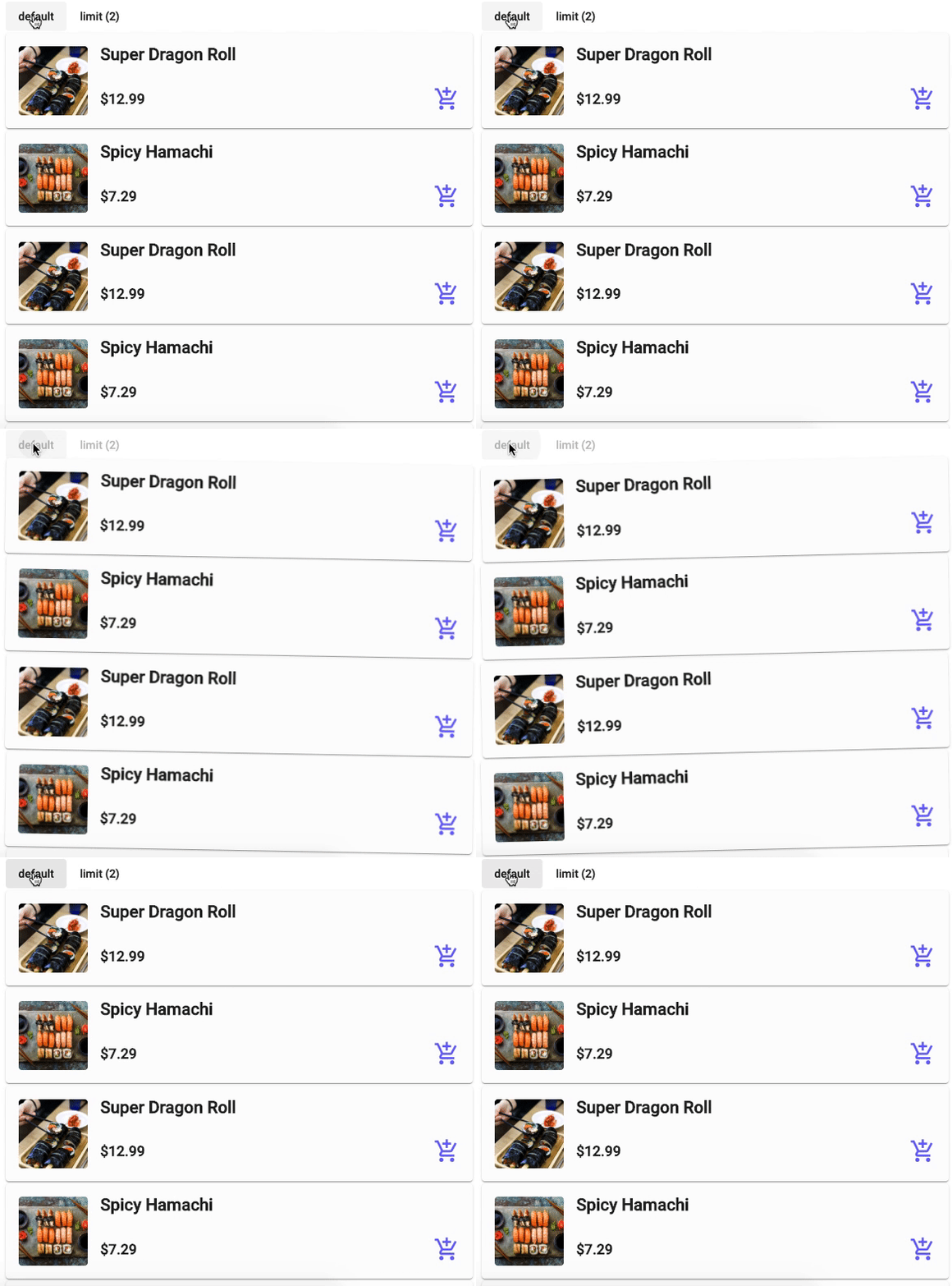
Demo query multiple elements animation
Restricting the Number of Queried Elements
Building on the prior point, Angular’s animation system offers the ability to cap how many elements your query returns. This even extends to negative queries—retrieving a specified number starting from the last item.
This becomes valuable when you want animations limited to the earliest or latest few entries in a dynamic set (like elements generated with *ngFor). Building on the ShakeAnimation example, you can introduce a limit property within the query to specify how many elements should be captured.
export const QueryShake = [
	trigger('queryShake', [
		transition('* => withLimit', [
			query('.card', ShakeAnimation, {
				limit: 2,
			}),
		]),
	]),
];
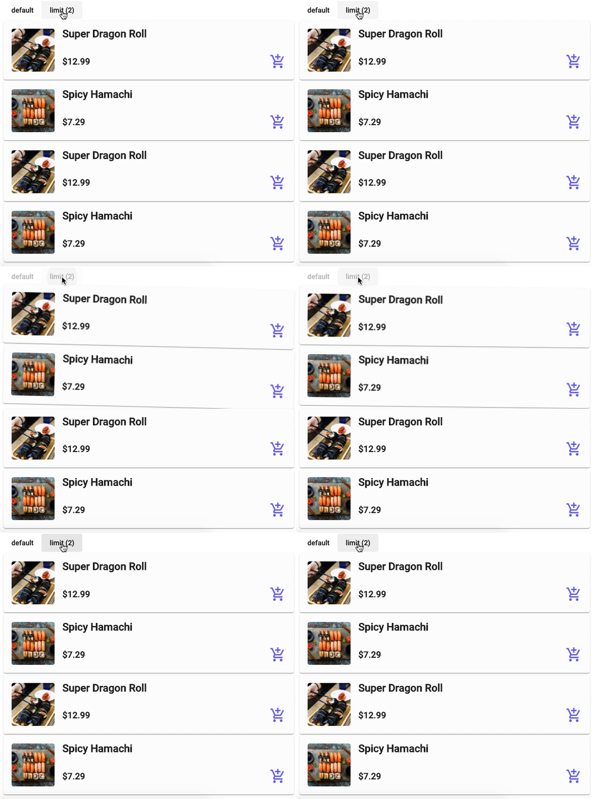
Demo query multiple elements with limit animation
Triggering Animations on Child Elements
Angular provides a utility called animateChild() that, as the name implies, executes the animation defined on a child element. One might wonder why this is necessary if child animations can be triggered independently of the parent.
A typical scenario arises when a parent element is controlled by *ngIf and each of its children has its own animation triggers with distinct entry and exit sequences. When the parent initially enters the DOM, the children’s animations run normally since the elements are being added. Problems surfaces, however, with the leave animations on the children. Because the conditional is on the parent, once the boolean evaluates to false, the entire subtree—children included—is instantly removed from the DOM, preventing the children’s exit animations from ever playing. To solve this, you can attach an animation trigger to the parent, query the children within the parent’s animation sequence, and explicitly run their animations. The following example illustrates this approach.
Imagine a basic wrapper with two child components, each owning separate animation triggers, structured as:
<div *ngIf=”isDisplayed” @container>
	<div @enterExitLeft></div>
	<div @enterExitRight></div>
</div>
export const EnterExitLeft = [
    trigger('enterExitLeft', [
        transition(':enter', [
            style({ opacity: 0, transform: 'translateX(-200px)' }),
            animate(
                '300ms ease-in',
                style({ opacity: 1, transform: 'translateX(0)' })
            ),
    	]),
	    transition(':leave', [
            animate(
                '300ms ease-in',
                style({ opacity: 0, transform: 'translateX(-200px)' })
            ),
	    ]),
    ]),
];
export const EnterExitRight = [
    trigger('enterExitRight', [
        transition(':enter', [
            style({ opacity: 0, transform: 'translateX(200px)' }),
            animate(
                '300ms ease-in',
                style({ opacity: 1, transform: 'translateX(0)' })
            ),
        ]),
        transition(':leave', [
            animate(
                '300ms ease-in',
                style({ opacity: 0, transform: 'translateX(200px)' })
	        ),
        ]),
	]),
];
To orchestrate all the children’s animations via the parent’s *ngIf, you need to query for all child triggers using a wildcard pattern and then invoke animateChild() to tell Angular to play the animations it finds on those queried elements.
export const Container = [
	trigger('container', [
		transition(':enter, :leave', [
			query('@*', animateChild()),
		]),
	]),
];
This instructs the parent to locate every descendant that carries an animation trigger (anything prefixed with @) and execute those animations as part of the parent’s own sequence. The code uses @*, a wildcard that captures all children with triggers. This broad approach may not suit every case. If you need to target only specific children or choose different child animations based on a condition, you can replace the wildcard with a more precise query parameter.
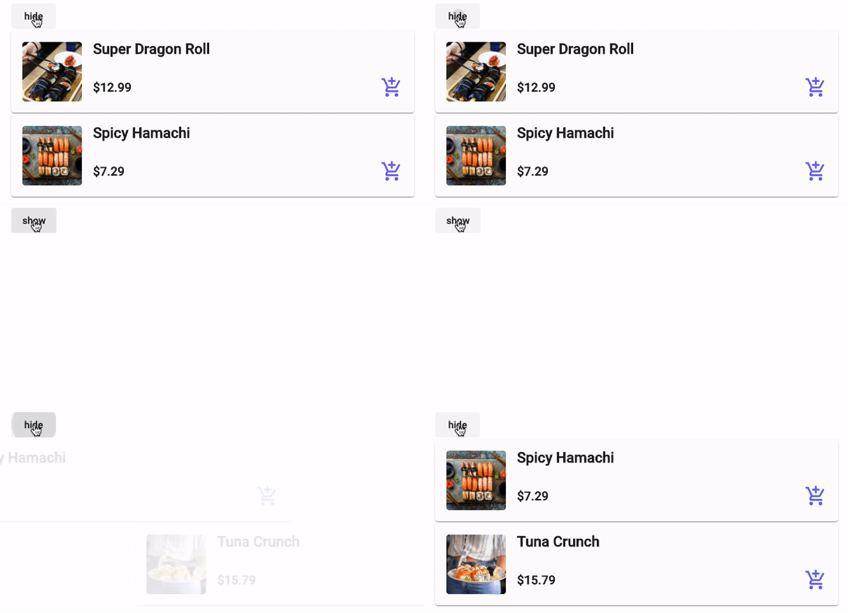
Demo children animation
Animating Route Changes
Route animations apply to the transitions that occur when the user navigates between views. According to the Angular documentation, this is achieved by defining a layered animation sequence in the top-level component that hosts the view and in the components that contain the embedded views. The same pattern works with nested router-outlets; the trigger simply needs to be placed on the div that wraps the outlet.
To set this up, start by enclosing the router-outlet in a div that carries the animation trigger. Next, add an attribute directive on the router-outlet to capture information about the active route and its state, which is then used to assign an animation state value to the trigger based on the route configuration.
<div [@routeAnimation]="prepareRoute(outlet)">
	<router-outlet #outlet="outlet"></router-outlet>
</div>
Then, you need to feed the outlet’s current state into the routeAnimations trigger using the router-outlet’s activatedRoute property. This property updates on each navigation, which in turn fires the animation. A helper function named prepareRoute performs the necessary checks and returns the value expected by the routeAnimation trigger.
prepareRoute(outlet: RouterOutlet) {
	return outlet?.isActivated || '';
}
Once the animation is triggered, you can access the outgoing page through the :leave selector and the incoming page through the :enter selector, exactly as you would with individual elements. This means you can reuse any of the sequence patterns described here for your route transitions. A sample fade in and fade out route animation definition would look like this:
const resetRoute = [
    style({ position: 'relative' }),
    query(
        ':enter, :leave',
	    [
        	style({
                position: 'fixed', // using absolute makes the scroll get stuck in the previous page's scroll position on the new page
                top: 0, // adjust this if you have a header so it factors in the height and not cause the router outlet to jump as it animates
                left: 0,
                width: '100%',
                opacity: 0,
            }),
    	],
	    { optional: true }
    ),
];

// Fade Animation
trigger('routeFadeAnimation', [
    transition('* => *', [
        ...resetRoute,
        query(':enter', [style({ opacity: 0 })], {
        	optional: true,
        }),
        group([
            query(
                ':leave',
                [style({ opacity: 1 }), animate('0.2s', style({ opacity: 0 }))],
                { optional: true }
            ),
            query(
                ':enter',
                [style({ opacity: 0 }), animate('0.5s', style({ opacity: 1 }))],
                { optional: true }
            ),
        ]),
    ]),
]);
Entries in the query array execute sequentially, top to bottom. In the example, the first step, resetRoute, hides and resets some properties on both the old and new views so they can overlap without breaking the layout—both views exist in the DOM simultaneously, with the new view appearing right away instead of waiting for the old one to disappear. After that, the actual enter and leave animations run.
Writing route animations is no different from animating standard HTML elements or Angular components. Consequently, you can apply any animation property you’d normally use on an element to your route transitions as needed.
Making Route Animations Dynamic
If you need varied animations, you can pass extra parameters through the router’s data property. A common situation is when different routes require distinct enter and exit effects.
{
	path: 'home',
	component: HomeComponent,
	data: { animation: 'home' },
},
{
	path: 'post',
	component: PostComponent,
	data: { animation: 'post' },
}
To consume this extra parameter inside your animation, adjust the prepareRoute function to return it. Instead of relying on the router state alone, use the activatedRouteData property to access the data object and pick the animation property.
prepareRoute(outlet: RouterOutlet) {
    return (
        outlet?.activatedRouteData &&
        outlet.activatedRouteData['animation']
	);
}
Then, incorporate that parameter into your animations array, treating each value as separate states you can transition between:
trigger('routeAnimation', [
    transition('home => post', []),
	transition('post => home', []),
]);
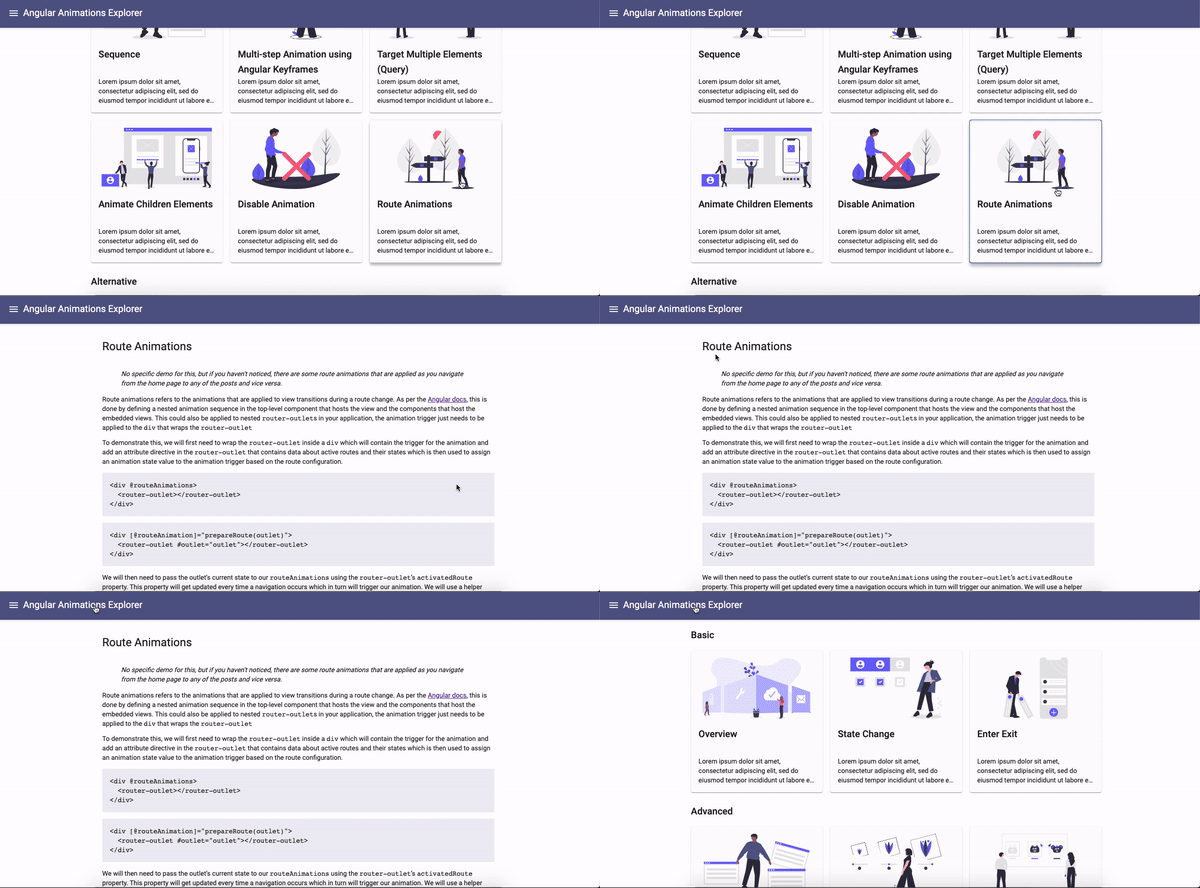
Demo route animation
Turning Off Animations
There are times when you want to suppress animations entirely—on slower hardware, specific browsers, when the user has prefers-reduced-motion enabled in their system settings, or based on an in-app preference. Angular exposes a @.disabled property for exactly this purpose. You can bind it to an expression to conditionally disable animations on child elements, and if no expression is provided, it defaults to true.
<div [@.disabled]="disableAnimationCondition">
	<div [@animate]="expression">Animate</div>
</div>
When applied, this property stops all animations on the element itself and on its descendants, including anything rendered inside a router outlet. Internally, @.disabled adds or removes the .ng-animate-disabled class on the target element. This allows you to disable animations on a single component, on a portion of the app, or globally.
To toggle animations app-wide, add the disabled property via a HostBinding on the top-level AppComponent, as shown below. This disables all animations across the application, with a few exceptions outlined in the next section.
export class AppComponent {
	@HostBinding('@.disabled') private disabled = true;
}

Demo disable animation
Quirks to keep in mind
The disabled property only affects Angular animations. Animations implemented with plain CSS transitions or keyframes are unaffected.
Another limitation: it doesn’t work on elements appended directly to the DOM, such as overlays like bottom sheets or modals. In those cases, instead of the previously described methods, you can use Angular’s Renderer2 to set the attribute directly on the overlay container, disabling animations on it and its children.
constructor( private overlayContainer: OverlayContainer, private renderer:Renderer2 ) {
	const disableAnimations:boolean = true;
    // get overlay container to set property that disables animations
    // Note: how to get the container element might vary depending on what the element is
    const overlayContainerElement:HTMLElement = this.overlayContainer;
    // angular animations renderer hooks up the logic to disable animations into setProperty
    this.renderer.setProperty( overlayContainerElement, "@.disabled", disableAnimations );
}
For elements inserted directly into the DOM, you could alternatively swap out the standard BrowserAnimationModule for the NoopAnimationsModule in the module that contains them, which effectively mocks animations. This, however, turns off every animation within that module.
It’s akin to killing the power to your TV by tripping the main circuit breaker. That approach might be fine for cases like disabling all third-party animations in a module, but it’s too coarse for anything requiring finer control.
Orchestrating Animation Timing
Angular gives you two primary tools for controlling when animation steps execute: sequence() runs steps one after another, while group() executes them simultaneously. These can be combined to create more complex patterns, and for scenarios where you want a cascading effect across multiple elements, the stagger() function is your go-to.
There's a key distinction to keep in mind. The group and sequence functions operate on the animation steps themselves—the values within an animation array. On the other hand, stagger operates on the elements that are being animated.
To put these sequencing techniques into practice, let's set up a template with a parent element we'll animate, along with several child elements. This setup mirrors common list or grid layouts where you have multiple similar children. For our example, we'll animate the children as they enter the viewport, applying both a fade-in and a grow effect using each of the three sequencing methods.
<div @fadeInGrow>
    <div>First Element</div>
    <div>Second Element</div>
    <div>Third Element</div>
</div>
Animating Steps Concurrently
When you need multiple animation steps to happen at the same time, group is the function to use. This is particularly handy when you want to animate different properties with different timing configurations, such as distinct durations, delays, or easing curves.
animations: [
    trigger('fadeInGrow', [
        transition(':enter', [
            query(':enter', [
                style({ opacity: 0, transform: 'scale(0.8)'  }),
                group([
                    animate('500ms', style({ opacity: 1 }),
                    animate('200ms ease-in', style({ transform: ‘scale(1)’ })
                ])
            ])
        ])
    ])
]

Demo of a group animation
Animating Steps in Order
The sequence function is similar to group in that it modifies how animation steps are executed, but it takes a different approach. With sequence, animations run in a defined order, with each step in the animation array waiting for the previous one to finish before starting. This makes chaining multiple animations on a single element much simpler.
If you compare the code below with the example from the previous section, you'll notice they are almost identical. The only difference is that the group function has been swapped out for sequence. The functionality is essentially the same as running in parallel, but the key difference is that sequence instructs Angular to run the animations one after the other. So, instead of fading in and growing the element at the same time, the transform animation will begin only after the opacity animation has completed.
animations: [
    trigger(‘fadeInGrow’, [
        transition(‘:enter’, [
            query(‘:enter’, [
                style({ opacity: 0, transform: ‘scale(0.8)’  }),
                sequence([
                    animate(‘500ms’, style({ opacity: 1 }),
                    animate(‘200ms ease-in’, style({ transform: ‘scale(1)’ })
                ])
            ])
        ])
    ])
]

Demo of a sequence animation
Creating a Cascading Effect with Stagger
Unlike the previous two functions, stagger is applied directly to the elements being animated. It's typically used alongside the query function to select the child elements inside a container and apply animations to each one independently. The unique aspect of stagger is its additional timing parameter, which specifies a delay between the start of each element's animation, creating a pleasing cascading effect.
By default, stagger applies animations in the order the elements are found by the query function. This usually results in an animation that flows from the top element downwards. However, you can easily reverse this by supplying a negative value for the timing parameter. This will cause the animation to start from the last element and work its way up.
The second parameter of the stagger function accepts an array of style and animate functions. This means you can combine it with the sequence and group functions from earlier to time the individual steps within each element's animation, while stagger manages the timing between the different elements.
animations: [
    trigger(fadeInGrow, [
        transition(‘:enter’, [
            query(‘:enter’, [
                style({ opacity: 0 }),
                stagger(‘50ms’, [
	                animate(‘500ms’, style({ opacity: 1 })
                ])
            ])
        ])
    ])
]
Let's break down the new functions introduced in the code above:
- The trigger
fadeInGrowtargets the parent element and defines an:entertransition. When this parent enters the DOM, the transition array's animation steps are executed. - Within that transition array,
query(':enter')is used to select all the child elements that will be entering the DOM. It applies the styles and animations defined in the array passed to it. - Finally,
stagger('50ms'), which is included in the array passed to thequeryfunction, instructs Angular to delay the start of each child's animation by 50 milliseconds relative to the previous one.
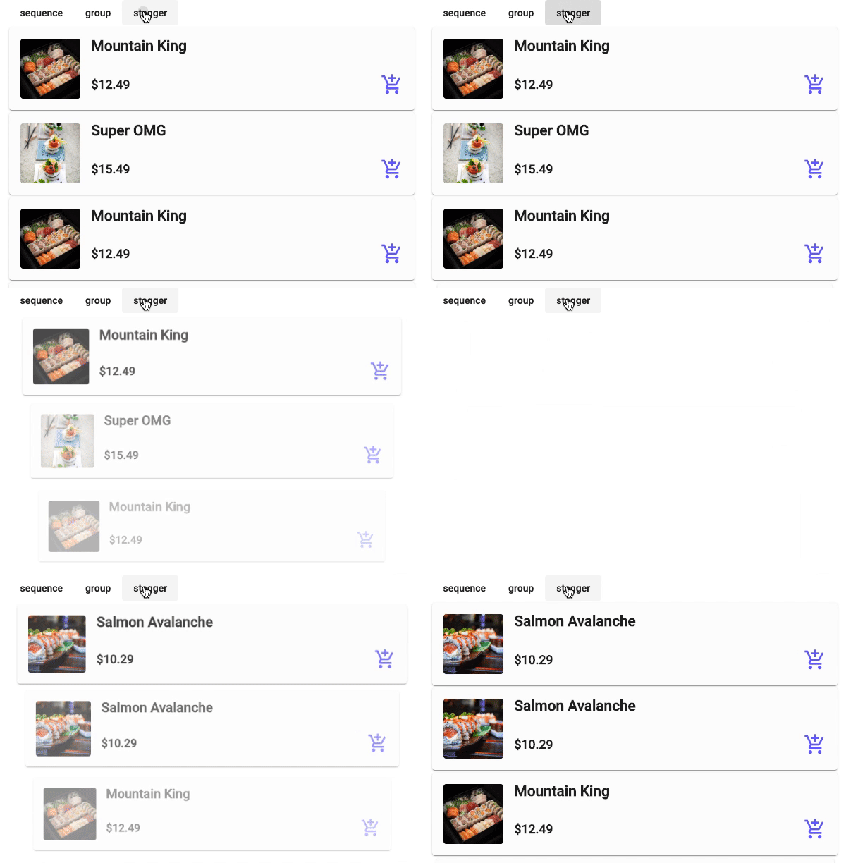
Demo of a stagger animation
Building Multi-Step Animations with Keyframes
Just as CSS keyframes allow for multi-step animations, Angular's keyframe function enables you to build an animation with several distinct style stages. This essentially lets you define a sequence of style changes for an element. Because a keyframe array can be passed directly into the animate function, it works seamlessly with the sequencing functions from the previous section—group, sequence, and stagger—giving you a great deal of control over the timing of your animation.
The keyframe function includes an offset property, which accepts a decimal number between 0 and 1 to mark the specific steps of the animation. This is conceptually the same as using percentages in CSS keyframes, or the to and from properties, to define animation steps. Here’s an example of a simple CSS keyframe animation and its equivalent using Angular's keyframe function.
/* css */
@keyframes 'fadeSlideGrowKeyframe' {
    30% { transform: opacity(1)’ }
    60% { transform: ‘translateY(0)’ }
    100% { transform: ‘scale(1)’ }
}
/* angular animations */
trigger('fadeSlideGrowKeyframe', [
    transition(':enter', [
        style({ opacity: 0, transform: 'scale(0.5) translateY(50px)' }),
        animate(
            '500ms',
            keyframes([
                style({ opacity: 1, offset: 0.3 }),
                style({ transform: 'translateY(0)', offset: 0.6 }),
                style({ transform: 'scale(1)', offset: 1 }),
            ])
        ),
    ])
])
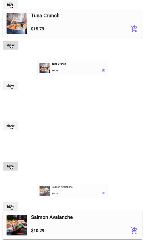
Demo of a multi-step keyframe animation
Reusing Animation Code
It's common to find the same animation being used in multiple places across an application, which often leads to code duplication in different components. To keep your animation code DRY, you can abstract it in a few ways, depending on your needs. Let’s look at a couple of these approaches.
Extracting the Entire Trigger
This is the most direct method if your animation has no configurable parts and you want to ensure consistent naming and behavior throughout your app. You can extract the complete trigger into its own file and then import it for use in the animations array of any component decorator.
// fade.animation.ts
export const Fade = trigger('fade', [
    transition(':enter', [
        style({ opacity: 0 }),
        animate('500ms', style({ opacity: 1 })),
    ]),
    transition(':leave', [animate('500ms', style({ opacity: 0 }))]),
]);
import { Fade } from './fade.animation';

@Component({
	animations: [Fade],
})
Leveraging AnimationReferenceMetadata
This approach allows you to make your animation more flexible by passing in additional parameters when it's used. However, this is limited to pre-compiled values. This means you can't modify the parameters at runtime, like using an element's current position. If you need to provide runtime data, your best bet is to use AnimationBuilder and AnimationPlayer. There's an insightful article by GrandSchtroumpf that details a workaround for using AnimationBuilder along with AnimationReferenceMetadata to achieve dynamic values, though it does have some limitations.
export const Slide = animation([
    style({ transform: 'translate({{x}}px, {{y}}px)' }),
    animate('{{duration}}s', style({ transform: 'translate(0,0)' })),
]);

// use the animation from within the trigger
trigger('slide', [
    transition(
        ':enter',
        useAnimation(Slide, {
            params: {
                x: 0,
                y: 50,
                duration: 0.3,
            },
        })
    ),
]),
The main difference from a typical animation is the use of the useAnimation method instead of an array of animation steps. This method accepts the reusable animation you've created along with a params object containing any variables the animation expects.
Disabling Animations in Tests
When animations are not the focus of your unit tests, you don't have to use the BrowserAnimationModule, which will execute animations as they do in a real application. This can be unhelpful for tests and even slow them down. A better alternative is to use Angular’s NoopAnimationsModule. True to its name, this is a 'no-operation' module that simulates the animation lifecycle but doesn't actually perform the visual animation.
@NgModule({
    imports: [
        // BrowserAnimationsModule // when running the main application
        NoopAnimationsModule // when running tests
    ]
})
Optimizing Animation Performance
Hitting a consistent 60 frames per second while animating is essential; anything lower will be immediately visible to users as stutter, also known as jank. The key is to understand which CSS properties are costly to animate and which ones the browser can handle cheaply by leveraging the compositor thread. Before diving into specific metrics, it's helpful to understand how the browser renders a frame.
The rendering process follows a specific sequence of steps:
- Style calculation (e.g.,
margin,padding) - Layout (e.g.,
height,width) - Paint (e.g.,
background,color,visibility) - Composite (e.g.,
opacity,transform,rotate,scale,translate)
The higher up this list you are, the more expensive animating that property is, because every subsequent step must be recalculated. Layout changes are particularly problematic if you have numerous page elements, as altering one element's size can force a cascade of recalculations for all the others. For instance, if you have 10 elements and you animate the width of the first, the other 9 will all have to move or resize to accommodate it. Conversely, transform and opacity are relatively inexpensive since they only affect the final composite step.
You can find a comprehensive reference for what each CSS property triggers at csstriggers.com while writing your animations.
CSS Animations and Web Animations both leverage the compositor thread, which operates independently of the main UI thread. This means that even if the main thread is bogged down with heavy tasks, your animation remains smooth because it's running on a separate core. Angular Animations builds on these Web Animations and CSS Animations APIs, so this benefit applies. However, you should note that any animation requiring layout or paint work will still fall back to the main thread, and this can lead to stutter if the main thread is already busy.
To achieve silky-smooth motion and prevent frame drops, optimization is crucial. You need to know the hidden performance costs of the properties you choose to animate. As a rule of thumb, stick to composite-only properties such as opacity, rotate, translate, and scale and avoid anything that triggers layout or paint.
Tools for Measuring Performance
I appreciate how Liam DeBeasi, in his talk at Ioniconf 2020, breaks down the essential metrics to track and how modern browser devtools can help visualize them for your specific application. The critical metrics are:
- Average frames per second (FPS)
- Main thread processing
- Average CPU usage and energy impact
There are different tools you can use to verify that your animations are running efficiently. Below, we'll explore each metric in detail, identify the targets you should aim for, and discuss how to use these tools to meet your goals.
Measuring Average Frames per Second
The goal is to get as close to 60 FPS as possible. Dip below that threshold, and users will start to see jank.
In Chrome's DevTools, the Performance tab is your go-to tool for seeing the actual FPS of your animation. Hit the record button, trigger your animation, and then stop recording. Make sure there is some buffer time at the start and end of your recording so that your animation doesn't get clipped. Using the Interactions dropdown, select the Animations filter to highlight the exact spot in the timeline where your animation occurs.
You can then either select that specific time range on the timeline to view the average FPS over that duration, or hover over the Frames section within that range to see the FPS at specific points in time.
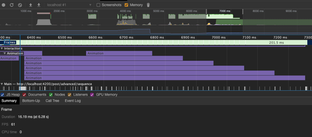
Average FPS across the animation's duration (Chrome DevTools)

FPS at a specific moment during the animation (Chrome DevTools)
A reliable way to ensure you are hitting that 60 FPS target is to confirm the browser is optimizing the animation. Firefox's Animation Inspector is a great tool for this. It presents a synchronized timeline with a top-down view of all running animations. The image below shows what the Animations tab looks like with an active animation.
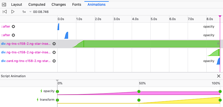
Timeline view in the Animations tab (Firefox DevTools)
Pay attention to the color coding in the main timeline; the colors represent the type of animation:
- Green – Web Animations
- Orange – CSS Animations
- Blue – CSS Transitions
Clicking on any individual chart will expand it to show you which specific properties are being animated.
You may also notice a gray thunderbolt icon on the right side of the main timeline chart, and a green thunderbolt next to the script-based animations below it. This icon indicates that the browser is optimizing that particular animation or property. The goal is to ensure that all (or at least most) of your animations display this thunderbolt icon, confirming they are running on the compositor thread.
Analyzing Main Thread Processing
The main thread is a busy place; it handles layout, paint, and JavaScript evaluation, among other things. You want to keep its workload light so that the non-animation tasks in your application can run without interruption.
Both Chrome and Safari DevTools offer unique insights into the main thread's activity, and it's worth using both.
Starting with Chrome DevTools, you'll use the Performance tab just as before. Instead of focusing on the Frames, you'll select the section of the timeline where your animation runs and choose the Main option from the sidebar. This reveals the main thread's activity over time. As shown in the screenshot below, Chrome provides percentages and millisecond timings for each process running on the main thread. The aim here is for painting and rendering to be minimized, and for the main thread to remain mostly idle during the animation. This prevents your animation from interfering with other processes, which could lead to dropped frames.
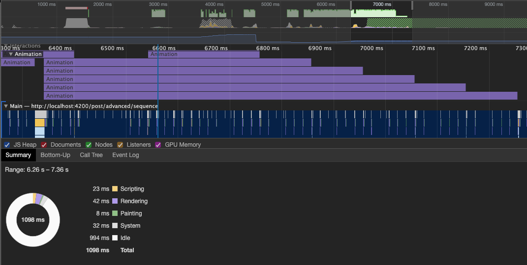
Main thread activity during the animation's runtime (Chrome DevTools)
Safari DevTools takes a slightly different approach by showing the activity for all running threads over the animation duration. To access this, click Start Timeline Recording from the Develop menu (or the red record button if DevTools is open). Start the recording, run your animation, and then stop the recording to view the data. The timeline will show everything that happened. Click on the CPU section where the animation occurred to focus on thread activity. This will display both the main thread's usage over time and a graph of per-thread activity. As with Chrome, you want the main thread activity related to your animation to be as low as possible.

Main thread activity during the animation's runtime (Safari DevTools)
Tracking CPU Usage and Energy Impact
Similar to main thread processing, you want to keep average CPU usage low because it directly correlates with energy consumption. The higher the CPU usage, the faster your battery drains.
Safari's timeline recording feature is the tool to use here to measure both metrics. To get started, click the record button in Safari's DevTools, trigger your animation, and then stop to review the data.
In the results, you can select the specific time period of your animation to analyze its characteristics. Choosing the 'CPU' option from the left sidebar will display detailed information about the main thread usage and its associated energy impact. The objective is to keep these numbers very low. For energy impact, the needle on the dial should rest towards the green end, indicating low consumption, and the 'Average CPU' percentage should also be minimal.
It's worth noting that in a real-world application, other processes running concurrently can skew these measurements, making it unclear if the bottleneck is your animation. For the most accurate data, you should try to isolate the animation code, either by testing it in a minimal environment or by stopping unnecessary background processes during the profiling session.
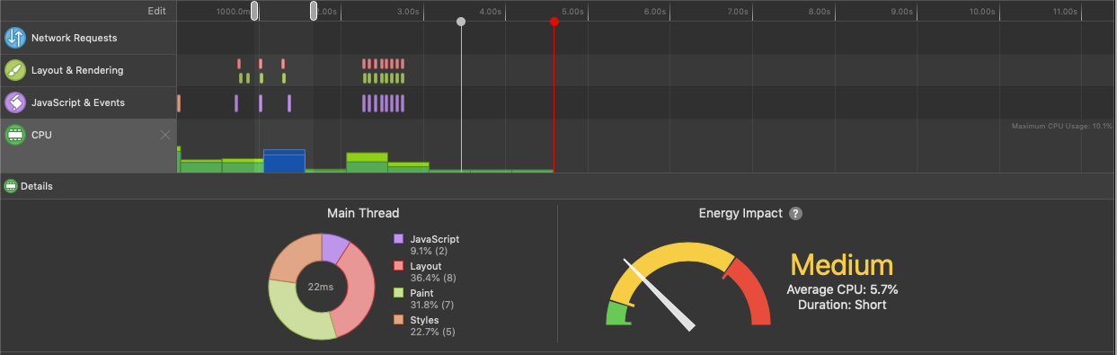
Average CPU usage and energy impact (Safari DevTools)
Keep in mind that Safari's Develop menu is off by default. If you can't see a 'Develop' option on your menu bar, navigate to 'Preferences > Advanced' and enable the 'Show Develop menu in menu bar' checkbox.
Debugging
The developer tools in both Chrome and Firefox include robust animation debugging capabilities that prove invaluable when constructing animations. These utilities allow you to decelerate, replay, and examine the underlying source of your animation. Additionally, the devtools in both browsers enable you to adjust animation properties in real-time and then replay the animation with those modifications applied.
Chrome
Chrome offers two standout features that I find exceptionally useful for debugging animation code. I frequently find myself fine-tuning animations directly within the devtools and then transferring those refined values back into my source files.
Animation Inspector
Before exploring how to utilize Chrome's animation inspector, let me point out where this tool resides. You can locate the animation inspector within the "more tools" submenu of Chrome's devtools.
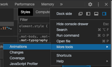
Locating Chrome's Animation Inspector
As of the writing of this post, Chrome's animation inspector only supports CSS animations, CSS transitions, and web animations. If you are using requestAnimationFrame for your animations, this tool will not be available to you.
With the animations tab open in your devtools, you'll notice animation group blocks appearing at the top as animations trigger within your application. Clicking on any block reveals a detailed breakdown of the specific animations being executed, as illustrated in the screenshot below.
Let's examine the animations tab interface more closely and highlight its essential functionalities.
- Controls – provides options to play, pause, and alter the playback speed of the animation
- Animation groups – displays the distinct sets of animations that were triggered. The inspector groups animations based on their start time (excluding any delays), making predictions about which animations are interconnected. From a coding perspective, animations triggered within the same script block are placed into a single group.
- Scrubber – allows you to drag the vertical red marker left or right to view the animation's state at any given point in the timeline
- Timeline – presents a detailed view of the DOM elements being animated within the group, along with each element's individual animation timeline
- Solid circles – these two markers indicate where the animation begins and ends. For animations with multiple iterations, you may see several pairs of these circles, marking the boundaries of each repetition
- Highlighted segment – represents the animation's duration
- Hollow circle – denotes the timing of keyframe rules if the animation defines them (refer to elements 2 through 5 in the image below)
Every component within the timeline for each element can be adjusted by dragging them horizontally. You can modify the duration by repositioning the solid start and end circles, introduce delays by shifting the highlighted segment, and adjust keyframe timings by moving the hollow circle. After making these changes, hit the replay button to run the animation group again and observe the results.
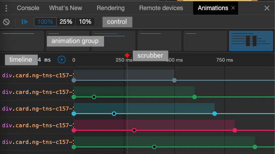
Animation inspector (Chrome devtools)
Bezier Curve Editor
If your animations rely on CSS keyframes (covered later in this series), Chrome's devtools also offers a dynamic curve editing tool built on Lea Verou's cubic bezier visualization.
This proves extremely handy since you avoid the back-and-forth between your editor and browser when refining bezier curves. You can do all your timing adjustments directly in the browser and use the playback button to review the updated animation. To reach this feature, click the squiggly line icon associated with the animation property on your element. The image below shows how to access the bezier curve editor from your animation.
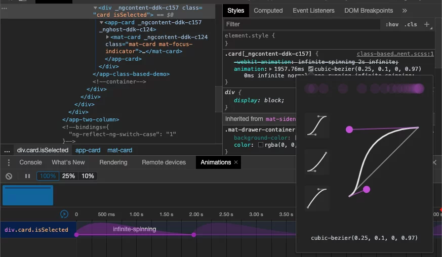
Bezier curve editor for keyframe animations (Chrome devtools)
The purple circles attached to the purple lines within the bezier curve editor can be dragged both vertically and horizontally to shape the curve, which in turn updates the cubic-bezier function. From the smaller purple circle at the top of the popup, you can see a quick visualization of how the timing function behaves, demonstrating the animation's acceleration or deceleration over time.
Firefox
Firefox's devtools provides nearly identical capabilities to Chrome's in regards to both the animation inspector and the bezier curve editor. I'll skip a detailed walkthrough since we've already covered those features, but I'll include a few screenshots of Firefox's interface so you know what to anticipate when debugging animations there.
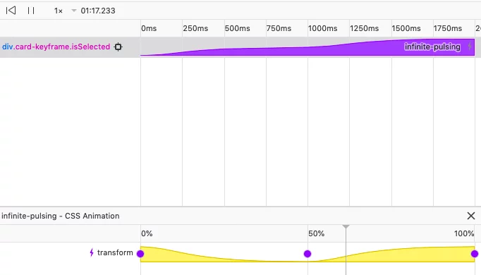
Animation inspector (Firefox devtools)
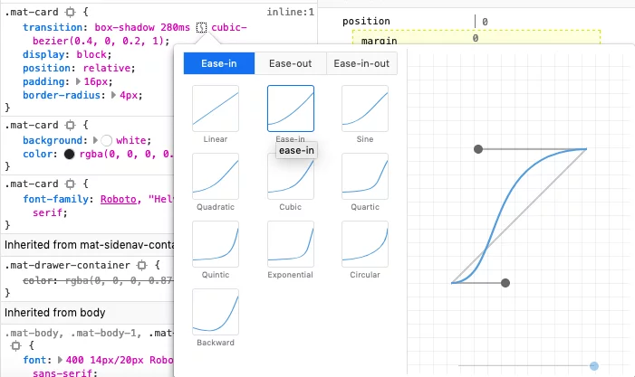
Bezier curve editor for keyframe animations (Firefox devtools)
Alternative to Angular's Animation Module
Beyond Angular's dedicated animation module, the framework offers several other approaches for writing animations. Some of these are slightly adapted versions of patterns familiar from vanilla applications, while others are more specific to Angular's architecture.
Class based animations
Given that Angular operates in the browser using HTML and CSS, you can leverage standard CSS animations within your Angular application exactly as you would in a plain HTML/CSS context. The technique involves attaching a class to an element based on a condition, which then triggers the animation via CSS transitions or keyframes.
For both scenarios, the CSS remains identical—a simple example using CSS transitions looks like this:
#targetElement {
	transition: all 0.5s;
}
#targetElement.shrink {
	transform: scale(0.8);
}
and with CSS keyframes, it would be:
#targetElement.shrink {
    animation: shrink 1s;
}

@keyframes shrink {
    0% {
	    transform: scale(1);
    }
    100% {
    	transform: scale(0.8);
    }
}
The real distinction lies in how Angular simplifies class management. For instance, suppose we need to apply a class called shrink when the isSelected boolean evaluates to true. In plain JavaScript, you'd write something like:
var element = document.getElementById("targetElement");

if (isSelected) {
	element.classList.add("shrink");  // to add a class
} else {
	element.classList.remove("shrink");  // to remove a class
}
This can be managed directly in the Angular template by binding a condition to the class attribute. Here's how it appears in an Angular template:
<div [class.shrink]="isSelected"></div>
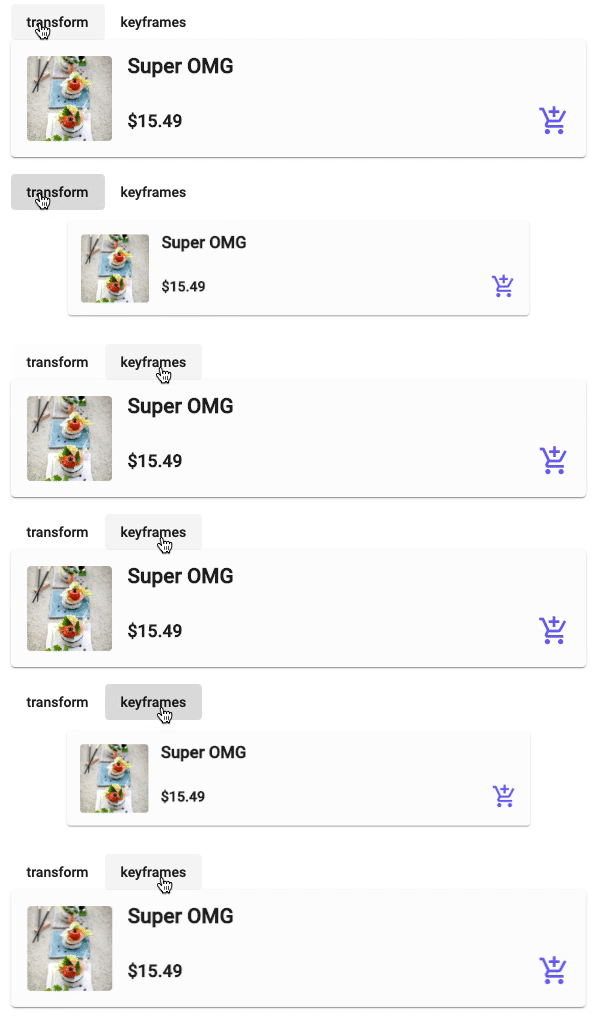
Demo class based animation
Just like Angular's @animation.done event, class-based animations come with their own events you can tap into. Depending on whether you're using keyframes or transitions, you can listen for either the animationend or transitionend event to know when the animation finishes.
A major advantage of this method is its compatibility with any CSS animation library that relies on toggling classes—such as animate.css or magic.css. Chris Coyier has an excellent article listing popular options if you want to explore further.
Inline Animations
This approach is functionally identical to class-based animations, except the animation code lives directly in the template rather than in a CSS class. This becomes especially handy when parts of the animation require dynamic values—for instance, when a transformation quantity needs to be computed from an external factor. You might want to apply a scale with a different magnitude based on an element's index. This is accomplished by binding the transform property to a function that returns a string containing the computed value.
<div
	[style.transition]="'0.5s'"
	[style.transform]="isScaledDown ? getScaleDown(index) : getResetScale()"
></div>
isScaledDown = false;

getScaleDown(index: number): string {
	return `scale(${1 - (index + 1) / 10})`;
}

getResetScale(): string {
	return 'scale(1)';
}
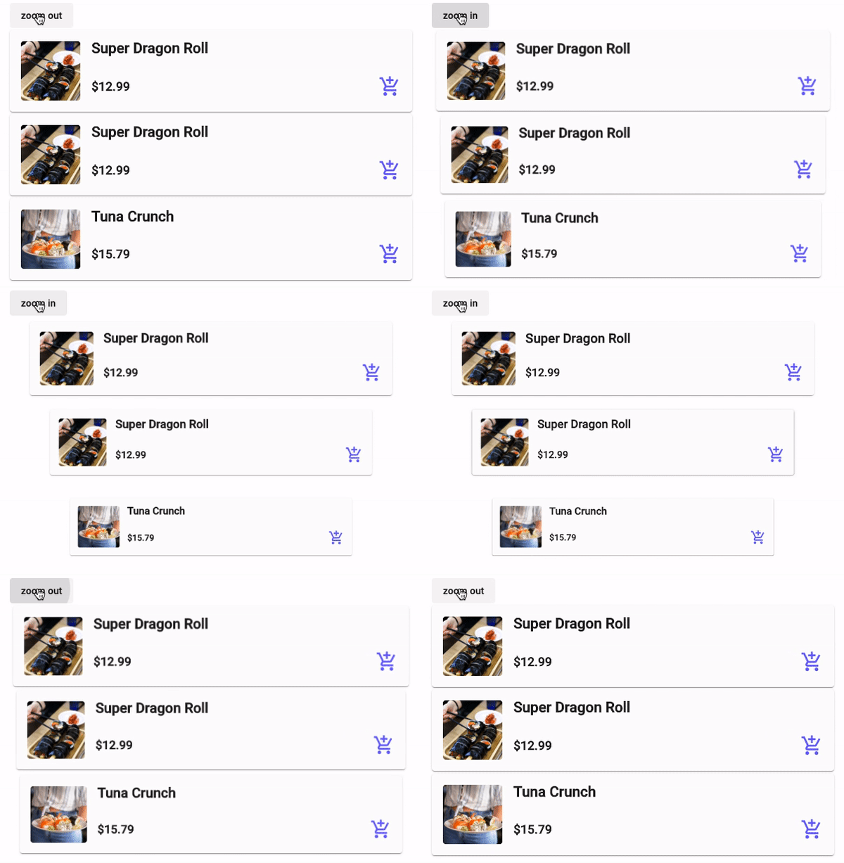
Demo inline animation
Web Animation APIs
The Web Animations API (WAAPI) offers yet another route for adding animations. At the time of writing, WAAPI is supported natively in Firefox 48+ and Chrome 36+, though a comprehensive polyfill makes it safe for production use today even with limited browser coverage. Integrating WAAPI into Angular closely mirrors standard JavaScript usage, with the primary distinction being how DOM elements are accessed.
In a basic HTML/JavaScript setup, you'd typically assign an id to an element and then call document.getElementById with that id to obtain a reference. In Angular, however, you can leverage template reference variables (#) and retrieve the element via the ViewChild decorator.
First, let's define the animation and its timing configuration, which we'll reuse across both examples:
getShakeAnimation() {
    return [
        { transform: 'rotate(0)' },
        { transform: 'rotate(2deg)' },
        { transform: 'rotate(-2deg)' },
        { transform: 'rotate(0)' },
    ];
}
getShakeAnimationTiming() {
    return {
        duration: 300,
        iterations: 3,
    };
}
The next two sets of code show how this animation is employed in a standard HTML/JavaScript app, followed by a slightly adjusted version for an Angular project.
html and js
<div id="targetElement"></div>
document
	.getElementById('targetElement')
	.animate(this.getShakeAnimation(), this.getShakeAnimationTiming());
In an angular application
<div #targeElement></div>
@ViewChild('targetElement') targetElement: ElementRef;

this.targetElement.nativeElement.animate(this.getShakeAnimation(), this.getShakeAnimationTiming());
Notice how the animation-related code remains precisely the same in both snippets!
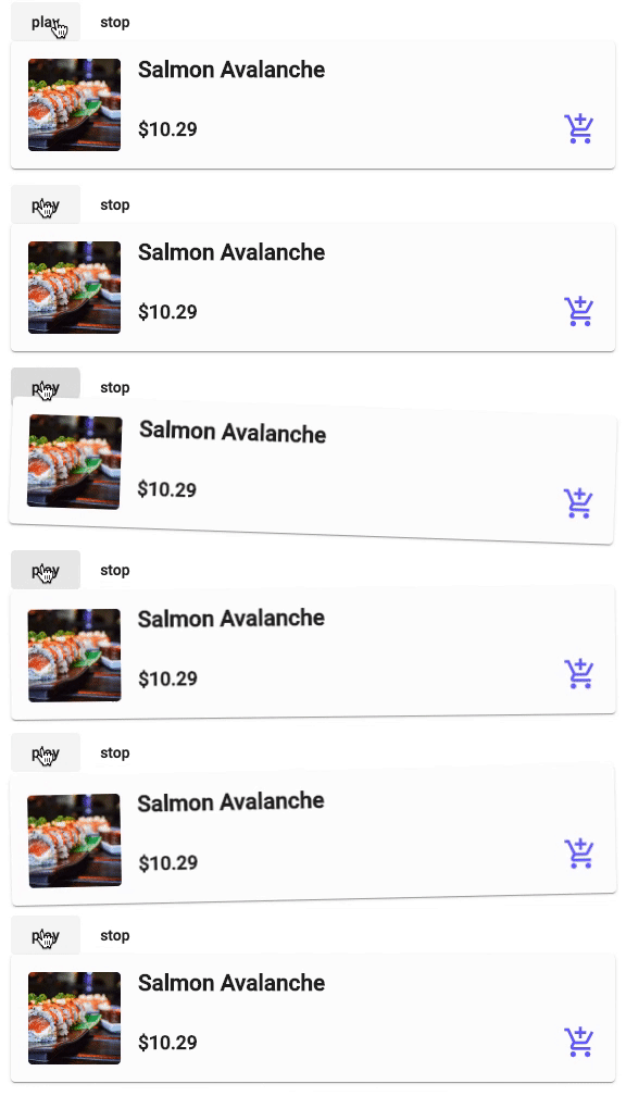
Demo web animations API
The Web Animations API also ships with several useful utility properties and methods that work identically in Angular as they do in vanilla applications—such as cancel to halt the ongoing animation and event listeners like oncancel and onfinish. Here is a reference to the full set of available APIs.
Building Animations With Attribute Directives
According to the Angular documentation, an attribute directive is designed to modify the behavior or appearance of an existing DOM element. This makes directives an ideal vehicle for orchestrating animations that depend on a variety of triggers. A key advantage is that directives grant direct access to the host element, enabling you to manipulate it just as you would inside a component. You can also attach HostListeners to monitor specific events and react dynamically.
In contrast to creating a dedicated component that encapsulates an animation, a directive allows you to attach only the behavioral layer to any element across your app. This makes it far more adaptable when you need to apply the same animation logic to different elements or components without creating a new component class each time.
Since directives do not include an animations array in their decorator configuration, you must leverage Angular's AnimationBuilder to construct the animation instances and AnimationPlayer to control their playback. The example below demonstrates a directive that fades an element out when the mouse is pressed down and fades it back in when the mouse is released.
import { Directive, HostListener, ElementRef } from '@angular/core';
import {
AnimationBuilder,
AnimationMetadata,
style,
animate,
} from '@angular/animations';

@Directive({
	selector: '[appfadeMouseDown]',
})
export class FadeMouseDownDirective {

    @HostListener('mousedown') mouseDown() {
	    this.playAnimation(this.getFadeOutAnimation());
    }
    @HostListener('mouseup') mouseUp() {
    	this.playAnimation(this.getFadeInAnimation());
    }

    constructor(private builder: AnimationBuilder, private el: ElementRef) {}

    private playAnimation(animationMetaData: AnimationMetadata[]): void {
        const animation = this.builder.build(animationMetaData);
        const player = animation.create(this.el.nativeElement);
        player.play();
    }

    private getFadeInAnimation(): AnimationMetadata[] {
    	return [animate('400ms ease-in', style({ opacity: 1 }))];
    }

    private getFadeOutAnimation(): AnimationMetadata[] {
    	return [animate('400ms ease-in', style({ opacity: 0.5 }))];
    }
}
You can similarly respond to keyboard inputs by adjusting the event your HostListener listens for. For instance, using @HostListener('document:keydown.escape', ['$event']) will invoke the handler when the user presses the Escape key.
Once the directive is defined, applying it is simply a matter of placing its selector on the target element in your template as follows:
<div appfadeMouseDown>
    ...
</div>
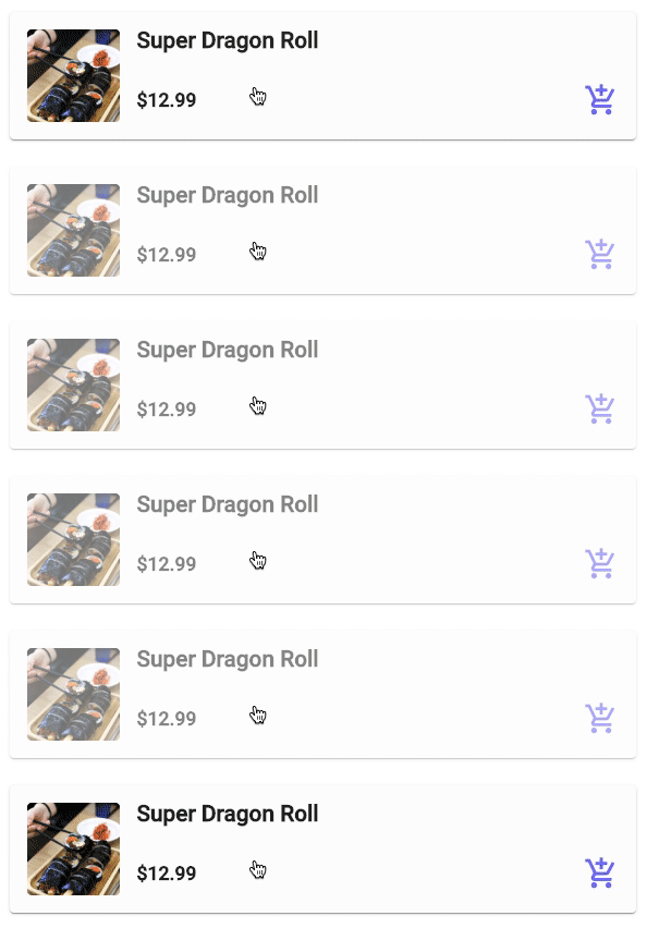
Demo illustrating an attribute directive-driven animation
Directives also support custom inputs, meaning you can pass parameters from the host component to adjust animation settings or toggle states. While I won't cover that in detail here, the official docs offer a wealth of examples for input binding in directives.
Final Reflections
Crafting animations that feel polished in your application, regardless of the framework, usually goes beyond writing the animation code itself. It requires iterating on timing curves, debugging state transitions, profiling rendering performance, and verifying consistency across multiple browsers.
My intention in this post has been to shed light on the underlying mechanics of Angular's animation system and equip you with additional techniques for building elegant and efficient animations.
Animations add a layer of interactivity and delight to any user interface, and Angular ships with a robust toolkit for composing elaborate sequences out of the box. Each method has its trade-offs regarding flexibility, complexity, and reuse. I'll close by sharing a set of principles I keep in mind whenever I integrate animations into an app:
- keep them brief and lightweight
- give them a clear function — like directing user attention or communicating state
- avoid making them distracting so they never block quick interaction with the UI