Introduction
For nearly two years, my work has centered on Adobe Experience Manager (AEM), often pairing it with Angular as the frontend framework. One of the first challenges I faced as an AEM developer was identifying a solid strategy for integrating Angular with the CMS.
At that time, Angular 6 had just launched, and a standout feature was Angular Elements. This tool lets you turn Angular components into Web Components, which can then be used in applications built with other technologies. Because Web Components are framework-agnostic and bootstrap themselves, they're a natural fit for dynamic, CMS-driven sites.
For more background on Angular Elements, you can check out these resources:
- https://juristr.com/blog/2019/04/intro-to-angular-elements/
- https://www.softwarearchitekt.at/aktuelles/angular-elements-part-i/
- https://www.softwarearchitekt.at/aktuelles/your-options-for-building-angular-elements/
Building
A key advantage of Web Components and custom elements is their simplicity: you import the JavaScript and CSS, and they're ready to go. With Angular, you can run ng build --prod and then load the resulting bundle files in other applications to use your custom elements.

Another option is ngx-build-plus, which lets you build custom elements and output a single bundle file via the Angular CLI.
The problem
While bundling all components into one or a few files is convenient in certain scenarios—like design systems—there are situations where it's not the best approach.
In my case, I have an Angular project with roughly 20 sizable components, all exposed as custom elements on a dynamic site powered by Adobe Experience Manager. Yet, each page typically uses only one or two of them.
This means when a page needs just a single component, the browser receives a lot of unnecessary JavaScript, which hurts page load performance.
Lazy loading
Code splitting and lazy loading are effective ways to tackle this. You can break your application into separate NgModules based on features.
For my situation, I could create a dedicated NgModule for each component, plus one or more shared modules for common functionality. Then, I'd only need to lazy load the modules to lazy load the components.
There are various methods to lazy load components in Angular, such as:
But the key question is: how do you lazy load these components from Non-Angular applications?
ngx-element
With ngx-element, you can lazy load Angular components from any environment—whether that's a CMS, a React app, or even plain HTML.
The library defines a custom element that accepts a selector attribute, which specifies the component you want to load. You can also pass data to your component by setting data-attributes on the custom element.
Usage
Let's build a small Angular app to see ngx-element in action. I'm using Angular CLI v9.0.6 and SCSS as the CSS preprocessor.
$ ng new lazy-components --minimal
$ cd lazy-components
We can delete app.component.ts since it won't be needed, and update app.module.ts accordingly.
After that, app.module.ts should look like this:
import { BrowserModule } from '@angular/platform-browser';
import { NgModule } from '@angular/core';

@NgModule({
  declarations: [],
  imports: [
    BrowserModule
  ],
  providers: []
})
export class AppModule {
  ngDoBootstrap() {}
}
Essentially, I've removed the App component and added the ngDoBootstrap method because we're not bootstrapping any component in this module.
Now let's create a Talk component and its feature module.
$ ng g module talk
$ ng g component talk
At this point, your folder structure should look like this:
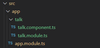
You'll have a feature module and a component in place.
Your talk files should be as follows:
import { NgModule } from '@angular/core';
import { CommonModule } from '@angular/common';
import { TalkComponent } from './talk.component';

@NgModule({
  declarations: [TalkComponent],
  imports: [
    CommonModule
  ]
})
export class TalkModule { }
import { Component, OnInit } from '@angular/core';

@Component({
  selector: 'app-talk',
  template: `
    <p>
      talk works!
    </p>
  `,
  styles: []
})
export class TalkComponent implements OnInit {

  constructor() { }

  ngOnInit(): void {
  }

}
Let's modify the Talk component to display info about a conference talk and add some styling.
Update talk.component.ts to this:
import { Component, OnInit, Input } from '@angular/core';

@Component({
  selector: 'app-talk',
  templateUrl: './talk.component.html',
  styleUrls: ['./talk.component.scss']
})
export class TalkComponent implements OnInit {

  @Input() title: string;
  @Input() description: string;
  @Input() speaker: string;
  @Input() tags: string;

  talkTags: string[];

  constructor() { }

  ngOnInit() {
    this.talkTags = this.tags ? this.tags.split(',') : [];
  }

}
Then create the following talk.component.html and talk.component.scss files alongside talk.component.ts:
<div class="talk">
    <h2 class="title">{{ title }}</h2>
    <p class="description">{{ description }}</p>

    <div class="foot">
        <div class="tags">
            <span class="badge" *ngFor="let tag of talkTags">{{ tag }}</span>
        </div>
        <p class="speaker">{{ speaker }}</p>
    </div>
</div>
.talk {
    background-color: #f0f0f0;
    margin-top: 20px;
    padding: 10px 20px;
    box-shadow: 0 4px 8px 0 rgba(0,0,0,0.2);
    transition: box-shadow .3s ease;

    &:hover {
        box-shadow: 0 8px 16px 0 rgba(0,0,0,0.2);
    }

    .title {
        margin-bottom: 0;
    }

    .description {
        margin-top: 0;
    }

    .foot {
        display: flex;
        justify-content: space-between;
        margin-top: 20px;

        .speaker {
            margin: 5px 0;
        }

        .badge:first-child {
            margin-left: 0;
        }
    }
}
So far, we've built a standard component that, trust me, will look like this later:
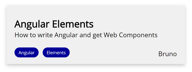
Nothing exotic yet, right? We've just set up a typical Angular app with an AppModule, a feature module, and a single component.
Our goal is to use this component in Non-Angular apps with lazy loading. For that, we'll need Angular Elements and ngx-element. Let's set them up…
Install Angular Elements
Angular offers a schematic to install and configure Angular Elements in your project. It adds a polyfill, but note that it doesn't support IE11. If you need IE11 support, skip this schematic and check this article instead.
$ ng add @angular/elements
Install ngx-element
$ npm install ngx-element --save
Expose the Talk component for ngx-element
To allow ngx-element to access and create our component on demand, we need to make a few adjustments to talk.module.ts.
First, add TalkComponent to the entryComponents array. Second, we'll add a customElementComponent property to the module so the component's class is accessible to ngx-element.
Here's what talk.module.ts should look like now:
import { NgModule, Type } from '@angular/core';
import { CommonModule } from '@angular/common';
import { TalkComponent } from './talk.component';

@NgModule({
  declarations: [TalkComponent],
  imports: [
    CommonModule
  ],
  entryComponents: [TalkComponent]
})
export class TalkModule {
  customElementComponent: Type<any> = TalkComponent;
}
Once that's done, we need to import and configure NgxElementModule in our AppModule like this:
import { BrowserModule } from '@angular/platform-browser';
import { NgModule } from '@angular/core';
import { NgxElementModule } from 'ngx-element';

const lazyConfig = [
  {
    selector: 'talk',
    loadChildren: () => import('./talk/talk.module').then(m => m.TalkModule)
  }
];

@NgModule({
  declarations: [],
  imports: [
    BrowserModule,
    NgxElementModule.forRoot(lazyConfig)
  ],
  providers: []
})
export class AppModule {
  ngDoBootstrap() {}
}
Let's test our component!
To test it, we'll create some HTML that uses the component. Remember, we're not bootstrapping any Angular component—we're just adding custom elements to the DOM.
Replace the index.html file with this markup:
<!doctype html>
<html lang="en">
  <head>
    <meta charset="utf-8">
    <title>LazyComponents</title>
    <base href="/">
    <meta name="viewport" content="width=device-width, initial-scale=1">
    <link rel="icon" type="image/x-icon" href="favicon.ico">
  </head>
  <body>
    <div class="content">
      <h1 class="section-title">Talks</h1>
      <div class="talks">
        <ngx-element
          selector="talk"
          data-title="Angular Elements"
          data-description="How to write Angular and get Web Components"
          data-speaker="Bruno"
          data-tags="Angular,Elements"></ngx-element>

        <ngx-element
          selector="talk"
          data-title="Lazy loading"
          data-description="How to lazy load Angular components in non-angular applications"
          data-speaker="Somebody else"
          data-tags="Angular,Lazy loading,Components"></ngx-element>
      </div>
    </div>
  </body>
</html>
And update the global styles.scss file with:
@import url('https://fonts.googleapis.com/css?family=Open+Sans&display=swap');

body {
    font-family: 'Open Sans';

    .content {
        max-width: 1000px;
        margin: auto;

        .section-title {
            margin-top: 60px;
        }

        .sponsors {
            display: flex;
            flex-wrap: wrap;

            sponsor-element {
                margin: 0 20px;

                &:first-child {
                    margin-left: 0;
                }
            }
        }
    }
}

.badge {
    margin: 0 5px;
    padding: 5px 10px;
    background-color: #000099;
    color: white;
    border-radius: 15px;
    font-size: 11px;
}
Run it!
Now, if you run ng serve, you should see the component in action:
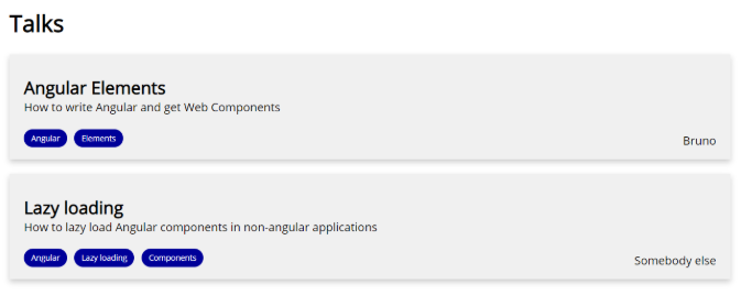
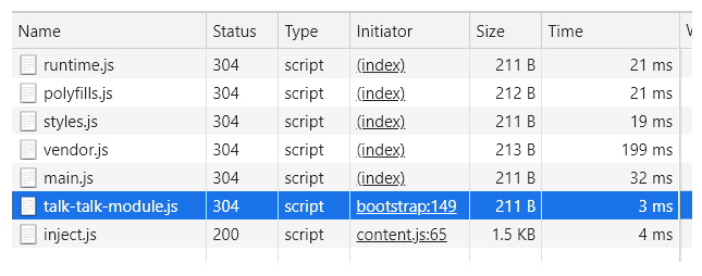
You'll also notice that the Talk Module is being lazy loaded, just as intended.
Play with it
Open the DevTools Network tab to confirm that TalkModule is being lazy loaded.
Here are a few things to experiment with to appreciate custom elements:
- Add a new talk to the DOM and watch it bootstrap itself.
- Modify the
title,description, andspeakerattributes via DevTools. - Remove the talk elements from
index.htmland see thatTalkModuleisn't loaded upfront. Then, add a talk element dynamically from DevTools and verify thatTalkModulegets lazy loaded.
Conclusion
With ngx-element, we've built a component that takes full advantage of the Angular framework, custom elements, and lazy loading.
This library has significantly improved how I integrate Angular with Adobe Experience Manager. I hope it proves useful to developers looking to use Angular alongside CMS platforms or other Non-Angular projects.
Thanks for reading!