
Understanding Angular Components: Purpose and Anatomy
Every Angular newcomer quickly discovers that components are among the first concepts to grasp when starting to build an application. Since Angular 2, components have served as the fundamental building blocks of Angular applications. These components combine various utilities that handle both the visual presentation and the underlying functionality of your app. Therefore, understanding what components are, their purpose, how to operate with them, and how to leverage them for optimal application adjustments is essential.
Defining a component
In Angular, components are the primary building blocks responsible for managing parts of the user interface, encompassing templates, styling, and business logic. Each component controls a distinct portion of the overall view, making it straightforward to organize and structure the UI.
Components can be categorized into UI components and feature components, which manage visual and functional aspects respectively. When designing components, you can make some purely presentational without any logic, while others handle data and communicate with the presentational ones. These are often referred to as dumb and smart components.
Picture a large container where you want to sort your groceries. You have an assortment of fruits, vegetables, and snacks that need categorization—say, fruits together, with each fruit type grouped accordingly. Instead of tossing everything directly into the main container, it makes sense to use smaller boxes for grouping first, then place those boxes into the larger one. For instance, you could take a small box for apples, another for pears, plus ones for bananas and kiwis, then consolidate them into a bigger fruit box, and finally place that into the main groceries container alongside boxes for vegetables and snacks arranged in the same manner.
This analogy illustrates how to structure components in an Angular application. Each box represents a component, and the contents within correspond to the template. Regarding component roles, the smaller boxes function as UI components, while the main groceries box acts as the feature component. To move items around, you take them out of their respective boxes (i.e., emit output events) and notify another box that listens and responds accordingly.
In a typical app without declared components, everything would look like a series of nested templates, which in essence, is what they technically are. However, components offer much more than replacing HTML code. While they significantly reduce the lines of code, they also manage the entire functionality of distinct application sections.
Component structure
When you generate a component with Angular CLI, it creates separate files for the template, styling, logic, and optionally unit tests. The template is an HTML file outlining the view layout with DOM elements and UI components. Styles reside in a CSS file, or alternatively SCSS, Sass, or Less, depending on your project configuration. The component logic is contained in TypeScript code that includes properties, methods, and lifecycle hooks governing the component's behavior and interactions. Additionally, there may be unit test files written in TypeScript for testing the component logic.
Up until Angular 20, component files followed a naming convention where the file was named after the component, then the .component extension, followed by the specific file type. For example, the default App component in a new project would have files such as:
app.component.html – template
app.component.css – styles
app.component.ts – logic
app.component.spec.ts – tests (optional)
Starting with Angular 20, when using Angular CLI to generate files, it may omit the .component extension and other suffixes. In such cases, the component files might appear as:
app.html – template
app.css – styles
app.ts – logic
app.spec.ts – tests (optional)
Although the traditional naming scheme remains functional, it's helpful to be aware of this to avoid confusion.
Generating a component
There are two approaches to creating a component: using Angular CLI or constructing it manually. Angular CLI manages the component creation process efficiently. To create a new component, you use the following command:
ng generate component ComponentNamewhich can be abbreviated as:
ng g c ComponentNameExecuting this command generates a folder within the app/ directory that contains these files:
- component-name.component.css
- component-name.component.html
- component-name.component.spec.ts
- component-name.component.ts
Angular CLI adheres to the Separation of Concerns (SoC) principle by generating the template and style file independently from the component file itself. This practice promotes clean, readable code and prevents files from becoming excessively lengthy. However, for smaller components, you might occasionally find the entire component written within a single .ts file. That's perfectly viable, and we'll explore this later in the article.
Next, I'll discuss how to customize the CLI commands for different scenarios. If you want to exclude the unit test file, append the –skip-tests flag to your command:
ng generate component ComponentName --skip-testsThis generates your component as described earlier but omits the .spec.ts file.
To generate the component files directly in the current directory, use the –flat flag:
ng generate component ComponentName --flatThis creates the component in your current working directory without establishing a new subfolder for it. If you wish to preview what will be generated, use the –dry-run flag, or its short form -d:
ng generate component ComponentName --dry-runThis displays the files that would be created without actually generating them.
For a component with inline styles and templates:
ng generate component ComponentName --inline-styles --inline-templateThis creates the component with both inline styling and markup within the .ts file, skipping the .html and .css files. The shorthand versions are -s for inline styles and -t for inline template.
Additional flags exist for metadata, modules, and control-related settings:
| Flag | Alias | Description | Example |
| –change-detection | -c | Sets the change detection strategy to what you pass to the parameter, either OnPush or Default. | ng g c ComponentName –change-detection=OnPush |
| –standalone | Sets the standalone property to either true or false. | ng g c ComponentName –standalone=true | |
| –selector | Overrides the default selector name (usually in the form of “app-component”) | ng g c ComponentName –selector=app-comp | |
| –view-encapsulation | Sets the encapsulation strategy. Can be “Emulated” (default), None, or ShadowDom | ng g c ComponentName –view-encapsulation=None | |
| –prefix | -p | Sets the prefix for the component selector, overriding the default prefix in angular.json configuration. (usually “app”) | ng g c ComponentName –prefix=proj |
| –module | -m | Specifies in which module to declare the new component | ng g c ComponentName –module=app.module |
| –export | Adds the component to the exports array of the specified module and makes it available to other components | ng g c ComponentName –module=app.module –export | |
| –skip-import | Omits adding the component to any module’s imports or declarations array. | ng g c ComponentName –skip-import | |
| –skip-selector | Generates the component without a selector. Not all components need a selector, depending on the complexity of your app 🙂 | ng g c ComponentName –skip-selector | |
| –style | Specifies the file extension for stylesheets. Normally, the CLI would ask you in the process. | ng g c ComponentName –style=scss | |
| –type | Adds a suffix to the generated file names. The default suffix is “component”. “ui” is passed in the example, so the file would be named “component-name.ui.ts” | ng g c ComponentName –type=ui |
Elementary Component
A basic component in Angular is one that's stateless, with no dependencies, services, or advanced functionality.
Here's an illustration of such a component:
// profile-photo.ts
import { Component } from '@angular/core';

@Component({
  selector: 'app-profile-photo',
  template: `<img src="profile-photo.jpg" alt="Your profile photo">`,
  styles: `img { border-radius: 50%; }`,
  changeDetection: ChangeDetectionStrategy.OnPush
})
export class ProfilePhoto { }
Or alternatively:
// profile-photo.ts
import { Component } from '@angular/core';

@Component({
  selector: 'app-profile-photo',
  templateUrl: './profile-photo.html',
  styleUrl: './profile-photo.css',
  changeDetection: ChangeDetectionStrategy.OnPush
})
export class ProfilePhoto { }
// profile-photo.html
<img src="profile-photo.jpg" alt="Your profile photo">
// profile-photo.css
img { border-radius: 50%; }Example source: https://angular.dev/guide/components
Note: All the examples provided in this article are based on the current Angular version.
Building on these examples, let's move from fundamentals to the syntax of a component file.
Metadata
Every component file includes the @Component decorator, imported from angular/core. Inside this decorator lies an object referred to as the component's metadata. When generated via Angular CLI, the metadata typically contains the selector, templateUrl, and styleUrl properties by default. If you opt out of external stylesheets or markup files, you can define the template and styles inline using template: and styles: respectively. In such cases, the separate files aren't needed, but the TypeScript file remains mandatory.
There are additional advanced metadata properties not immediately needed, but I'll clarify the most frequently used ones.
Selector
A component's selector defines a specific tag utilized in templates and styles. It must be unique for each component to prevent Angular from mixing them up. This selector can function as a CSS selector or as a custom element within another component, as demonstrated:
// profile-photo.ts
@Component({
  selector: 'app-profile-photo',
  template: `<img src="profile-photo.jpg" alt="Your profile photo">`,
  styles: `img { border-radius: 50%; }`,
  changeDetection: ChangeDetectionStrategy.OnPush
})
export class ProfilePhoto { }
// user-profile.ts
@Component({
template: `
<profile-photo />
<button>Upload a new profile photo</button>`,
...,
imports: [ProfilePhoto],
changeDetection: ChangeDetectionStrategy.OnPush
})
export class UserProfile { }In this arrangement, Angular renders the ProfilePhoto component's content inside the UserProfile component's template.
Selectors come in three types: element, attribute, and class. The element selector is the most common for components. An example of its usage is shown above.
Next, we have attribute selectors. These prove useful when your component acts as a child of a specific parent DOM element that restricts what can be placed between them. Therefore, attribute selectors convert a required element into a component without disrupting the structural hierarchy. For illustration, consider a table of contents:
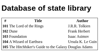
with corresponding markup:
<h1>Database of state library</h1>
    <table class="table table-striped">
  <thead>
    <tr>
      <th scope="col">#</th>
      <th scope="col">Title</th>
      <th scope="col">Author</th>
    </tr>
  </thead>

  <tbody>
    @for(book of books(); track book.id){
      <tr>
        <th scope="row">{{ book.id }}</th>
        <td>{{ book.title }}</td>
        <td>{{ book.author }}</td>
      </tr>
    }
  </tbody>
</table>
Suppose we create a component for the rows that display the content:
// table-row-content.component.ts
@Component({
  selector: 'app-table-row-content',
  imports: [],
  templateUrl: './table-row-content.html',
  styleUrl: './table-row-content.css',
  changeDetection: ChangeDetectionStrategy.OnPush
})
export class TableRowContent {
  readonly book = input.required<Book>();
}
// table-row-content.component.html
<tr>
  <th scope="row">{{ book().id }}</th>
  <td>{{ book().title }}</td>
  <td>{{ book().author }}</td>
</tr>
// app.component.html
<h1>Database of state library</h1>
      <table class="table table-striped">
    <thead>
      <tr>
        <th scope="col">#</th>
        <th scope="col">Title</th>
        <th scope="col">Author</th>
      </tr>
    </thead>

    <tbody>
      @for(book of books(); track book.id){
          <app-table-row-content [book]="book"/>
      }
    </tbody>
  </table>
Let's examine the table:

What's the problem? The HTML table is a DOM element that requires specific child elements to exist between its tags. Thus, replacing <tr> with a component selector doesn't work. However, you can implement an attribute selector:
// table-row-content.component.ts
@Component({
  selector: '[app-table-row-content]',
  imports: [],
  templateUrl: './table-row-content.html',
  styleUrl: './table-row-content.css',
  changeDetection: ChangeDetectionStrategy.OnPush
})
export class TableRowContent {
  readonly book = input.required<Book>();
}
Now, relocate the <tr> from within the child component back into the <tbody> of the parent, and apply the selector like this:
// app.component.html
<h1>Database of state library</h1>
      <table class="table table-striped">
    <thead>
      <tr>
        <th scope="col">#</th>
        <th scope="col">Title</th>
        <th scope="col">Author</th>
      </tr>
    </thead>

    <tbody>
      @for(book of books(); track book.id){
        <tr app-table-row-content [book]="book"></tr>
      }
    </tbody>
  </table>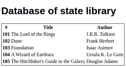
You can experiment with this code right here.
Class selectors operate similarly, but their purpose is to add functionality to elements that already have styling. Much like attribute selectors, they're perfect for reusable components that represent a single DOM element, such as a button or a table. Here's the same solution using a class selector:
// table-row-content.component.ts
@Component({
  selector: '.app-table-row-content',
  imports: [],
  templateUrl: './table-row-content.html',
  styleUrl: './table-row-content.css',
  changeDetection: ChangeDetectionStrategy.OnPush
})
export class TableRowContent {
  readonly book = input.required<Book>();
}
// app.component.html
<h1>Database of state library</h1>
      <table class="table table-striped">
    <thead>
      <tr>
        <th scope="col">#</th>
        <th scope="col">Title</th>
        <th scope="col">Author</th>
      </tr>
    </thead>

    <tbody>
      @for(book of books(); track book.id){
        <tr class="app-table-row-content" [book]="book"></tr>
      }
    </tbody>
  </table>
In this case, the component selector is declared as a CSS class and passed via the element's class attribute. The demo mentioned above includes both approaches, with one commented out for reference.
Imports
Every component includes an imports array where you can bring in other components, directives, pipes, etc., making them available within your component. For instance:
import { Component } from '@angular/core';
import { CounterComponent } from './counter/counter.component';
import { MessagesComponent } from './messages/messages.component';

@Component({
  selector: 'app-root',
  standalone: true,
  templateUrl: './app.component.html',
  styleUrl: './app.component.css',
  imports: [CounterComponent, MessagesComponent],
})
export class AppComponent {/* ... */}
Standalone
The standalone status of a component is set via the standalone: property, accepting true or false. Since Angular 14, components have been able to be standalone, and from Angular 19 onward, components are standalone by default. This allows components to be directly imported through the imports array in other standalone components. In earlier versions, you'd manually add standalone: true inside the decorator. Conversely, you can explicitly set standalone to false, which would then require importing NgModule.
Providers
Angular components include a providers array to supply dependencies at the component level. Providing a class as a token instructs the injector to instantiate a new object of that specified type.
import { Injectable } from '@angular/core';

@Injectable()
export class LoggerService {
  id = Math.random();

  log(message: string) {
    console.log(`[${this.id}] ${message}`);
  }
}
import { Component } from '@angular/core';
import { LoggerService } from './logger.service';

@Component({
  selector: 'child-a',
  template: `<p>Child A works!</p>`,
  providers: [LoggerService]
})
export class ChildAComponent {
  // private _logger = inject(LoggerService);
  constructor(private _logger: LoggerService) {
    this._logger.log('Child A created');
  }
}
Here, ChildAComponent adds LoggerService to its providers to establish a new instance of the LoggerService class within the component's injector tree. This ensures it's available for the component to inject as needed. NOTE: In modern applications, the inject() function is often preferred for creating dependency instances. It serves as an alternative to constructor-based DI; see here for more details on why it's favored.
Be aware that services generated by Angular CLI may include providedIn: 'root' within the @Injectable decorator. This automatically creates the class instance at the root injector level, making component-level provision unnecessary.
Services aren't the only entities you can provide. The provider types encompass class providers, value providers, factory providers, aliases, and injection tokens.
Classes can be supplied using useClass:
providers: [{ provide: LoggerService, useClass: LoggerService}]This is the verbose form of providing LoggerService to the component.
Value providers combined with Injection tokens enable injecting non-class dependencies. Typical usage includes defining tokens for API URLs, configuration objects, or environment-specific values.
import { InjectionToken, Inject, Component } from '@angular/core';

export const API_URL = new InjectionToken<string>('API URL');

@Component({
  selector: 'app-root',
  template: `<p>Check the console</p>`,
  providers: [
    { provide: API_URL, useValue: 'https://api.example.com' } // token is API_URL
  ]
})
export class AppComponent {
  constructor(@Inject(API_URL) private apiUrl: string) {
    console.log('API URL:', this.apiUrl);
  }
}
In this scenario, API_URL constitutes a unique token, and useValue binds it to a specific literal value. When API_URL is injected, it holds that literal value. Factoryproviders employ the useFactory key to have Angular execute a function that constructs the dependency object.
providers: [
  {
    provide: LoggerService,
    useFactory: () => new LoggerService()
  }
]
Alias providers utilize the useExisting key to map one token to another, creating an alternative way to access the same token. As an example:
providers: [
    BetterLoggerService,
    { provide: LoggerService, useExisting: BetterLoggerService }
]
The injector provides BetterLoggerService as a singleton and maps LoggerService to it, with LoggerService acting as an alias. Thus, whenever LoggerService is requested, it yields an instance of BetterLoggerService instead.
viewProviders
This concept is akin to providers, but the distinction is that dependencies configured in viewProviders are shared only with view children, not content children projected via ng-content. In contrast, providers gives access to all children. This is ideal for creating a private service instance with limited reach (content children cannot access it), or to prevent injection conflicts when a content child might request the same dependency.
Encapsulation
When you author styles for components, Angular doesn't simply add them to a global stylesheet. Instead, it uses a style scoping system to prevent your styles from affecting unrelated parts of the application. This is controlled by the encapsulation property, which offers three modes: Emulated (the default), ShadowDom, and None.
- ViewEncapsulation.Emulated:
In this mode, Angular modifies the CSS selectors to be scoped to the component by adding unique attributes to the DOM elements. This ensures that styles only apply to the specific component. Still, global styles defined outside the component may affect its elements even with emulated encapsulation.
As an example, suppose you define a component with styles such as:
@Component({
  selector: 'app-hello',
  template: `<p>Hello</p>`,
  styles: [`p { color: red; }`],
  encapsulation: ViewEncapsulation.Emulated
})
After rendering and inspecting dev tools, you'd see your CSS and DOM appear as follows:
<p _ngcontent-abc="">Hello</p>p[_ngcontent-abc] { color: red; }- ViewEncapsulation.ShadowDom:
This mode enables a shadow tree that includes only the dedicated component's elements. This isn't built into Angular itself but leverages the native Shadow DOM API. The advantage here is that even global styles cannot interfere with the component's elements. After rendering, the component and its generated DOM might resemble:
import { Component, ViewEncapsulation } from '@angular/core';

@Component({
  selector: 'app-profile-card',
  template: `
    <div class="card">
      <h2>John Doe</h2>
      <p>Frontend Developer</p>
    </div>
  `,
  styles: [`
    .card {
      border: 2px solid blue;
      padding: 1rem;
      background: lightyellow;
      font-family: Arial, sans-serif;
    }
    h2 {
      color: darkblue;
    }
  `],
  encapsulation: ViewEncapsulation.ShadowDom
})
export class ProfileCardComponent {}
<app-profile-card>
  #shadow-root
    <style>
      .card {
        border: 2px solid blue;
        padding: 1rem;
        background: lightyellow;
        font-family: Arial, sans-serif;
      }
      h2 {
        color: darkblue;
      }
    </style>
    <div class="card">
      <h2>John Doe</h2>
      <p>Frontend Developer</p>
    </div>
</app-profile-card>
- ViewEncapsulation.None:
With this mode, there's no encapsulation, and all registered styles are treated as global styles.
@Component({
  encapsulation: ViewEncapsulation.None
})
Component lifecycle hooks
Angular components also follow a lifecycle! This lifecycle spans from creation, through change detection, rendering, and ultimately destruction. Numerous hooks allow you to execute code at various stages of this lifecycle. For beginners, two essential hooks stand out: ngOnInit and ngOnDestroy (besides the constructor). We'll focus on these two, as they're sufficient for fundamental Angular projects.
- ngOnInit():
This method runs only once during the component's lifecycle, after all component inputs have been initialized, which means it executes after the constructor(). Let's examine a simple greeting app:
// greeting.component.ts
import { Component, input, OnInit } from '@angular/core';

@Component({
  selector: 'app-greeting',
  template: `
    <h2>{{ greetingMessage }}</h2>
  `
})
export class GreetingComponent implements OnInit {
  readonly name = input.required<string>();
  greetingMessage = '';

  constructor() {}

  ngOnInit(): void {
    this.greetingMessage = `Hello and welcome, ${this.name()}! 👋`;
  }
}
// app.component.ts
import { Component } from '@angular/core';
import { GreetingComponent } from './greeting.component';

@Component({
  selector: 'app-root',
  template: `
    <h1>My App</h1>
    <app-greeting [name]="'Alice'"></app-greeting>
  `,
  imports: [GreetingComponent],
})
export class AppComponent {}
The constructor in GreetingComponent remains empty for two reasons: there's nothing to set up there, and the input name isn't available yet at construction time. You can test this demo here.
- ngOnDestroy():
This method runs exactly once just before the component is destroyed or cleaned up from the view. Its main purpose is to perform cleanup tasks and release resources that wouldn't be handled automatically. Now let's add ngOnDestroy() to our greeting app:
// greeting.component.ts
import { Component, input, OnInit, OnDestroy } from '@angular/core';

@Component({
  selector: 'app-greeting',
  template: `
    <h2>{{ greetingMessage }}</h2>
  `
})
export class GreetingComponent implements OnInit, OnDestroy {
  name = input.required<string>();
  greetingMessage = '';

  ngOnInit(): void {
    console.log(`Fetched ${this.name()}`);
    this.greetingMessage = `Hello and welcome, ${this.name()}! 👋`;
  }

  ngOnDestroy(): void {
    console.log(`Greeting for ${this.name()} destroyed. Goodbye! 🛑`);
  }
}
// app.component.ts
import { Component } from '@angular/core';
import { GreetingComponent } from './greeting.component';

@Component({
  selector: 'app-root',
  standalone: true,
  template: `
    <h1>My App</h1>
    <button (click)="showGreeting = !showGreeting">
      Toggle Greeting
    </button>

    @if (showGreeting) {
      <app-greeting [name]="'Alice'"></app-greeting>
    }
  `,
  imports: [GreetingComponent]
})
export class AppComponent {
  showGreeting = true;
}
A toggle button is included in the earlier example to trigger ngOnDestroy, which executes after the button removes the component from the view.
Take a look at this example here. The lifecycle hooks are best observed in the developer tools console (press F12).
For more lifecycle hooks and in-depth information, check this page.
Wrap-up
Components form the cornerstone of Angular applications. While Angular CLI frequently handles component generation, it's crucial to understand the structure of component files and the role each part plays. A component is defined by a decorator containing metadata with primary properties that can be customized or removed as needed. The introduction of standalone components in Angular 14 means any standalone component can directly import others, regardless of their location in your project (though staying organized is still recommended). You've also learned about the component lifecycle and how to incorporate logic at each phase. Happy coding!