
Designing Reusable CRUD Components for Angular
Our team is developing a set of Angular components designed to handle CRUD operations against a backend system called Knora. Knora functions as a content management system, exposing a RESTful API that allows clients to read, create, and update data. The system accommodates a variety of data types, from numeric values and plain text to text with markup and dates. While each of these data types comes with its own unique requirements, they all share a common set of behaviors.
Given that commonality, we've chosen to build one Angular component for each supported data type. Every one of these components is derived from an abstract base class, which houses the logic that applies across all data types. This keeps the specialized components lean and focused, as any reusable functionality is centralized in the parent class.
Examining Other Methods
Extending components is a standard practice within Angular, so we won't delve into the fundamentals here. For those interested in a deeper dive, these two resources are quite useful:
- Angular Component Inheritance: A thorough walkthrough for setting up an Angular app with centralized routing logic
- Component Inheritance in Angular: A clear explanation of how inheritance operates, including what is and is not passed down to child classes
When it comes to structuring the CRUD operations, we see two main possibilities:
- Consolidating all CRUD actions within a single component, as illustrated in Building a CRUD application with Angular and Angular Tutorial: Create a CRUD App with Angular CLI and TypeScript
- Assigning a dedicated component to each operation, which is the strategy demonstrated in Angular 8 CRUD Web Application
The first option seems much more effective to us. The second approach would lead to unnecessary duplication in the templates and logic, because creating and updating a value are visually and functionally almost identical—the only real distinction is that update begins with a pre-existing data point.
Building Reusable CRUD UI Components in Angular
Defining the Challenge
Every data type in the system requires a consistent set of user-facing capabilities:
- viewing existing data (read)
- modifying current data (update)
- introducing new entries (create)
- removing obsolete entries (delete)
Validation is mandatory before any write operation is submitted. Two layers of checks are involved. First, user input must conform to the constraints of the specific data type — for instance, an integer cannot contain decimal places, and a text field must not be left blank. Second, when updating an existing entry, the proposed new version must differ from the current one; creating duplicate versions is not permitted.
Although the backend CMS enforces these rules and would reject any operation that violates them, the UI must perform its own validation prior to sending requests. This prevents users from initiating invalid actions and provides immediate feedback. The validation workflow carries considerable complexity, yet much of that complexity repeats across different data types.
State management also deserves careful attention. Following every CRUD operation, the UI component must return to a sensible state. If the user aborts an edit session, for example, the previously stored value needs to be restored exactly as it was. After a successful creation, the newly generated value should be read back from the CMS so that the user can continue working with it, including further edits.
Proposed Solution
Our strategy involves building one dedicated Angular component per data type, with each implementing a common abstract base class. The base class contains shared logic and establishes the public interface that all these components adhere to. We call these components value components — IntValueComponent for integers serves as one illustration. Such a component is responsible for rendering a value on screen and enabling the user to change or generate it.
The uniform public interface opens the door for a second category of components: operation components. These handle all server interactions — fetching, saving, creating, and deleting values. Given that every data type shares the same interface, a single operation component can be built to manage updates for every value component, removing the need for data-type-specific CRUD implementations.
The Abstract Base Class and Its Subclasses
The base class is abstract, declaring members and methods that each value component must supply. It also comes with ready-to-use implementations for the subclasses to leverage.
@Directive()
export abstract class BaseValueComponent {

   /**
    * Value to be displayed, if any.
    */
   @Input() abstract displayValue?: ReadValue;

   /**
    * Sets the mode of the component.
    */
   @Input() mode: 'read' | 'update' | 'create';

   ...
}
Inputs inherited from the Abstract Base Class
Every value component inherits the @Input property mode, which dictates whether the component runs in read, update, or create mode. Additionally, each subclass implements a data-type-specific displayValue, for example a ReadIntValue in the case of integers (details are provided in the official documentation). This consistent structure means templates can incorporate value components generically, accommodating any data type.
Editing support relies on Angular Material components, with FormControl serving as the communication bridge between the component class and its template. Validation is arguably the trickiest piece of the puzzle (as described earlier), so we aim to absorb as much of that logic in the base class as possible, keeping the derived classes lightweight.
The base class includes the method resetFormControl(): void (see source code). It initializes both the values and the validators of the associated FormControl, adapting them to the current component mode — reading, updating, or creating:
// set validators depending on mode
if (this.mode === 'update') {
    this.valueFormControl.setValidators(
        [Validators.required, this.standardValidatorFunc(...)]
        .concat(this.customValidators)
    );
} else {
    this.valueFormControl.setValidators(
       [Validators.required].concat(this.customValidators)
    );
}
Streamlining Validator Logic
To offer flexibility in validation across data types, the base class exposes the abstract member <a href="https://wp.angular.love/the-best-way-to-implement-custom-validators/">customValidators</a>: ValidatorFn[]. These validators serve as type guards beyond what TypeScript or JavaScript natively provide — for example ensuring a string is a valid URI or that a number is a whole integer. Subclasses simply add their specific validators to this array.
The rule that a new version must differ from its predecessor is implemented in the standardValidatorFunc() method (see source code), which generates a ValidatorFn suited for primitive data types. Internally, the generated validator calls standardValueComparisonFunc(): boolean (see source code) to compare the old and proposed new versions. For an integer, this function compares two numbers; if they match, validation fails. One nuance: altering purely the comment attached to a value does not constitute a distinct version; this comment is an optional string accompanying each version. Since this comparison logic is uniform across data types, it lives in the base class. For more intricate value structures, such as an object, the subclass only overrides standardValueComparisonFunc(). This applies, for instance, to an interval that has both a beginning and an end.
From the perspective of a value component, the workload is minimal: invoke resetFormControl() during ngOnInit and again within ngOnChanges. The latter is triggered whenever the mode changes or a new displayValue arrives — such as right after a successful update.
Beyond these shared members, each value component is required to implement methods that extract the final, user-edited or newly created value from the UI. This extracted value is what operation components later pass along to the backend.
Orchestrating CRUD through Operation Components
Up to now, the focus has been on value components, which render data and support editing. We now examine operation components, which handle the transition between display and edit states and manage backend communication. The existing DisplayEditComponent (see source code) is our first implementation. It works with any value component, relying solely on the interface defined by the base class. The snippet below shows how a value component is referenced within its template:
@ViewChild('valComp') valueComponent: BaseValueComponent;
Accessing Any Value Component Generically from DisplayEditComponent
Thanks to the common base class, DisplayEditComponent needs only this public interface to function correctly. The figure below illustrates an IntValueComponent nested inside a DisplayEditComponent. The former encapsulates all integer-specific rendering and user interaction, while the latter orchestrates the surrounding CRUD operations, such as save and cancel.
Operation Component Wrapping a Value Component
Substituting IntValueComponent with any other value component is trivial. The DisplayEditComponent's template inspects the value's type and dynamically selects the corresponding value component. Both IntValueComponent and TimeValueComponent, for instance, accept the same mode and displayValue inputs inherited from the base class.
<span [ngSwitch]="valueType">
	<dsp-int-value
		#valueComponent
		*ngSwitchCase="'IntValue'"
		[mode]="mode"
		[displayValue]="displayValue"
	></dsp-int-value>
	<dsp-time-value
		#valueComponent
		*ngSwitchCase="'TimeValue'"
		[mode]="mode"
		[displayValue]="displayValue"
	></dsp-time-value>
	...
</span>
DisplayEditComponent Template
One operation component serves all value components effectively. To display and modify a timestamp rather than an integer, only the selector within the DisplayEditComponent template changes to TimeValueComponent.
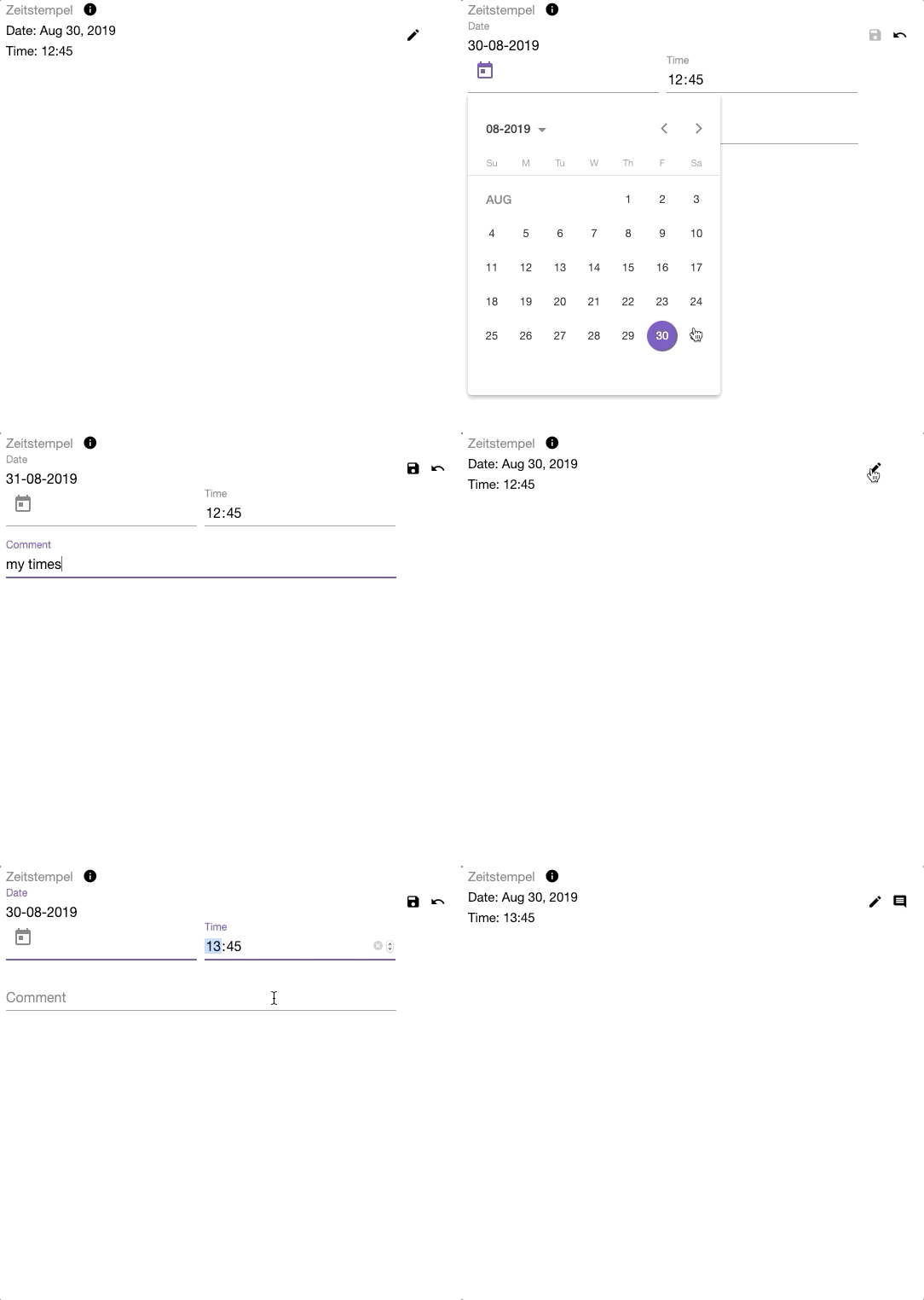
Modifying a Timestamp: Save and Cancel Actions
For every implemented value component, we now possess the complete logic required to:
- present an existing value, complete with its comment, in read mode

Text Value with Comment in Read Mode
- modify an existing value within update mode

Boolean Value in Edit Mode
- discard an in-progress update, reverting to the original value
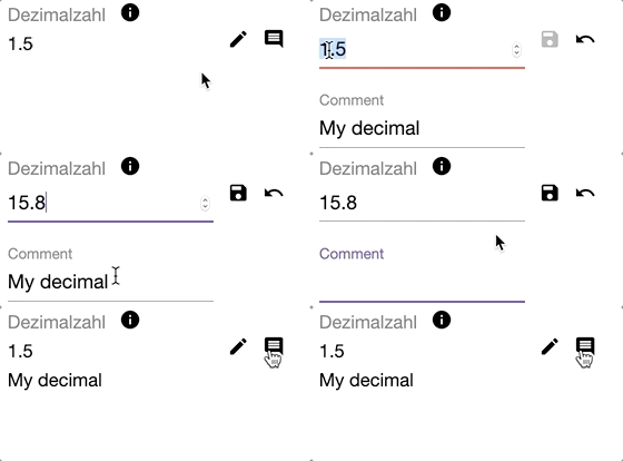
Aborted Update of a Decimal Value
- finalize an update and push the new version back, displaying the refreshed metadata from the CMS
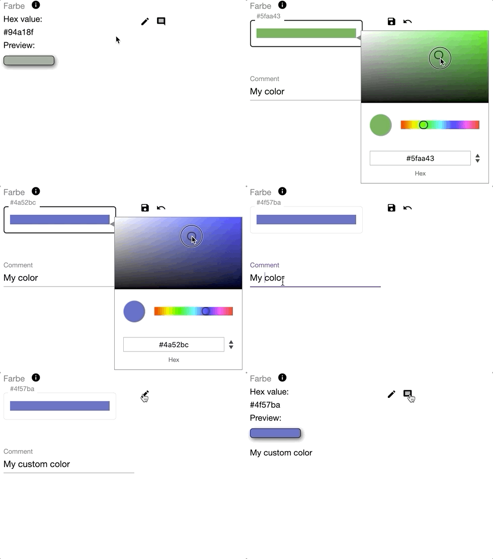
Updating a Color Value (via ngx-color-picker)
Operation components never interface with Knora's API directly. Instead, they depend on @knora/api, a TypeScript library. This abstraction obscures URL construction, serialization, and deserialization, so the client code remains focused on the domain. Classes like ReadValue and ReadIntValue originate from this library.
Future work includes a dedicated operation component for value creation, reusing the same value components, and adding a delete action as long as permissions permit. @knora/api already provides the underlying backend methods for these features.
Testing Strategy
Each component requires its own spec file. Even when a value component (such as IntValueComponent) mostly relies on base class logic, it remains accountable for correctly implementing the lifecycle hooks and invoking the appropriate base class methods at the right moments. Since shared logic is centralized, comprehensive testing of complex base class functionality is done once. For other components, the tests primarily verify that base class calls occur at the correct lifecycle stages. Sticking to a standardized set of test cases for each component promotes consistency, making specs from any contributor easier to read and modify.
Project Context
These CRUD UI components are fundamental to the DaSCH Service Platform (DSP), developed by the Data and Service Center for the Humanities (DaSCH), which ensures long-term preservation of qualitative research data. Going beyond mere archival, the platform also equips researchers to work with that data effectively, hence the crucial role of these CRUD widgets.
Recognition
The development of this work was a collaborative effort by the Research and Development Team at the Data and Service Center for the Humanities (DaSCH).