Understanding Component Communication in Angular
Angular components frequently need to exchange data or trigger actions in one another, whether they have a direct relationship or operate independently. The communication patterns available cover a spectrum of scenarios, from simple parent-child data passing to more complex interactions. As applications scale, breaking functionality into dedicated components becomes increasingly important. This article explores the various mechanisms Angular provides for component interaction.
Anatomy of a Simple Component
At its most fundamental level, an Angular component is a stateless class that lacks services, extensions, or advanced capabilities.
Here's how a straightforward component looks:
// profile-photo.ts
import { Component } from '@angular/core';

@Component({
  selector: 'app-profile-photo',
  template: `<img src="profile-photo.jpg" alt="Your profile photo">`,
  styles: `img { border-radius: 50%; }`,
})
export class ProfilePhoto { }
Or, using an alternative syntax:
// profile-photo.ts
import { Component } from '@angular/core';

@Component({
  selector: 'app-profile-photo',
  templateUrl: './profile-photo.html',
  styleUrl: './profile-photo.css',
})
export class ProfilePhoto { }
// profile-photo.html
<img src="profile-photo.jpg" alt="Your profile photo">// profile-photo.css
img { border-radius: 50%; }Example source: https://angular.dev/guide/components
Note: All examples in this article reflect the latest Angular version.
Expanding Your Application
To leverage another component, pipe, directive, or module within your code, you must register it in the imports array of the component decorator.
Consider a scenario where a component imports both the ProfilePhoto component from earlier and the built-in DatePipe, which converts string dates to Date objects.
// user-profile.component.ts
import { Component } from '@angular/core';
import { DatePipe } from '@angular/common';
import { ProfilePhoto } from './profile-photo';

@Component({.
  selector: 'app-user-profile',
  template: `
	<main>
		<app-profile-photo/>
		<p>Joined on: {{ joinedOn() | date }}</p>
	</main>
  `,
  styleUrl: './user-profile.css',
  imports: [ProfilePhoto, DatePipe],
  /* ... */
})
export class UserProfile {
  protected readonly joinedOn = signal<string>('2025-07-15');
}
Once imported, these components are referenced in templates using their selector.
Starting with Angular 14, components could be marked as standalone, and as of Angular 19, this is the default behavior. Consequently, standalone components can import other components directly via the imports array. In earlier versions, you had to explicitly add standalone: true in the decorator. Alternatively, a component can be set with standalone: false, requiring it to be declared in an NgModule.
Component Inheritance
Inheritance offers a method to augment components or directives. When a class extends another component, it inherits decorated members like public and protected properties, inputs, outputs, and lifecycle hooks. This is a more advanced concept; many projects find that input properties and output events suffice for their needs.
It's worth noting that for sharing logic, composition or directives are often preferable to inheritance, which can introduce rigidity as the codebase matures.
Critically, inheritance is not a mechanism for communication or state management.
Here's a demonstration with a parent and a child component that extends it:
// parent.component.ts
@Component({ ... })
export abstract class Parent {
  readonly isLoading = signal<boolean>(false);

  protected startLoading() {
	this.isLoading.set(true);
  }

  protected stopLoading() {
	this.isLoading.set(false);
  }
}
// child.component.ts
@Component({
  ...
  template: `
	@if(isLoading()){
	  <div> Loading... </div>
	}
  `
})
export class Child extends Parent implements OnInit {
  ngOnInit() {
	this.startLoading();
	setTimeout(() => {
	  this.stopLoading();
	}, 1000);
  }
}
In this scenario, Child has full access to Parent's members, effectively behaving as a merged entity. To use it, only Child's selector is required in the template, unless you explicitly need to reference Parent's template elsewhere.
Data Transfer Between Components
Components exchange information via data and events. This section details the techniques for passing data.
- input() signal and @Input decorator
Parent-to-child communication is typically handled with the input() signal or the @Input() decorator. The signal-based input was introduced in Angular 17 alongside other signal features. (Remember, they are case-sensitive.)
Let's see how the app component passes a value to a CustomSlider component:
// custom-slider.component.ts
import { Component, input } from '@angular/core';

@Component({
  selector: 'app-custom-slider',
  standalone: true,
  templateUrl: './custom-slider.component.html'
  styles: /*...*/
})
export class CustomSlider {
  readonly value = input.required<number>();
}
 <!-- custom-slider.component.html -->
<div class="slider-container">
    <label>Slider Value: {{ value() }}</label>
    <input type="range" min="0" max="100" [value]="value()">
</div>
 // app.component.ts
import { Component } from '@angular/core';
import { RouterOutlet } from '@angular/router';
import { CustomSlider } from './custom-slider.component';

@Component({
  selector: 'app-root',
  standalone: true,
  imports: [
    RouterOutlet,
    CustomSlider // import the child component
  ],
  templateUrl: './app.component.html'
  styles: /*...*/
})
export class AppComponent {
  // This property holds the value we want to pass down.
  initialSliderValue = 75;
}
 <!-- app.component.html -->
<main>
    <h1>Parent App Component</h1>
    <p>
      We will pass this value to the slider:
      <strong>{{ initialSliderValue }}</strong>
    </p>
    <app-custom-slider [value]="initialSliderValue"></app-custom-slider>
</main>
Here, CustomSlider accepts a slider value of type number. Since the example uses the input signal, accessing this value in the template requires calling it like a function, e.g., value(). The same result can be achieved with the @Input() decorator:
@Input({required: true}) value!: number;In the template, you would then use:
<div class="slider-container">
    <label>Slider Value: {{ value }}</label>
    <input type="range" min="0" max="100" [value]="value">
</div>
While signals are currently preferred over decorators for performance benefits, familiarity with Input/Output decorators remains valuable.
- output(), @Output() decorator, and EventEmitter
Child-to-parent interaction relies on outputs and events. A child component emits an event containing a value to its parent. For instance:
// vote-button.component.ts
import { Component, output } from '@angular/core';

@Component({
  selector: 'app-vote-button',
  standalone: true,
  templateUrl: './vote-button.component.html'
})
export class VoteButtonComponent {
  readonly voted = output<string>();

  onClick(){
	this.voted.emit('Voted for Angular');
  }
}
 <!-- vote-button.component.html -->
<button (click)="onClick()"> Vote for Angular! </button>
// app.component.ts
import { Component } from '@angular/core';
import { VoteButtonComponent } from './vote-button.component';
@Component({
selector: 'app-root',
templateUrl: './app.component.html',
imports: [VoteButtonComponent],
})
export class AppComponent {
voteStatus: string = 'No one has voted yet.';
handleVote(eventPayload: string) {
this.voteStatus = eventPayload;
}
}
 <!-- app.component.html -->
<h1>Parent Component</h1>
    <p>{{ voteStatus }}</p>
<app-vote-button (voted)="handleVote($event)"></app-vote-button>
In this case, when the button in the child component VoteButton is clicked, an output notifies the parent. This output acts as a broadcaster; the parent listens for it and captures the event payload via $event. The parent's template then calls handleVote, receiving the string value that the child emitted.
Using the @Output decorator, the same logic would look like:
@Output() voted = new EventEmitter<string>();with the rest of the implementation unchanged.
The @Output decorator alone just marks a property; it doesn't include the event-emitting logic. You need to instantiate the EventEmitter class for that. The output() function, being a factory, eliminates this extra step.
Data Binding Fundamentals
Binding creates a live link between component logic and its template. Its primary goal is to keep the template in sync with component state. Binding can be one-way, where data changes propagate only to the UI, or two-way, where changes in the UI also update the underlying data.
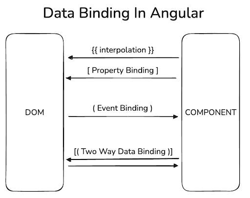
The diagram illustrates the various data binding directions.
- Interpolation
This feature pulls data directly from the component class and displays it in the view:
<label>Slider Value: {{ value }}</label>- Two-way binding
This keeps a property in the component and an element's value in the template in constant sync.
Syntax:
[(ngModel)]="prop"Two-way binding is a combination of property binding [ ] and event binding ( ), commonly using the ngModel directive from the FormsModule. The combined syntax can be seen as two distinct steps:
// Property binding
[ngModel]="prop"
// Event binding
(ngModelChange)="prop = $event"
Property binding sets the input element's value to prop from the component. In the event binding step, an ngModelChange event is fired when the input changes. Angular uses $event to capture the new value and updates prop accordingly.
With signals, a more contemporary approach has emerged: the model() signal.
import { Component, model } from '@angular/core';

@Component(...)
export class AppComponent {
  prop = model('World');
}
model() provides a signal specifically designed for two-way binding. You can directly update its value, simplifying the process. With the shift toward zoneless change detection in Angular 21, signal-based tools offer clear advantages because they update only what's necessary, independent of zone.js.
Content Projection
Content projection is a powerful Angular feature for crafting reusable and adaptable component layouts. Here are some ways to achieve it:
- ng-content
Suppose you want your main component to control the logic of a DOM element, but you want it rendered within a child component's view. This is where the <ng-content> element becomes useful. Here's the parent component:
// app.component.ts
@Component({
  selector: 'app-root',
  template: `
    <main>
      <app-header>
        <input #projectedInput type="text" placeholder="Search...">
      </app-header>

      <div class="content">
	...
      </div>
    </main>
  `,
  styles: [`...`],
  imports: [HeaderComponent]
})
export class AppComponent {
    // some logic
}
and the child:
// header.component.ts
@Component({
  selector: 'app-header',
  template: `
    <header>
      <span>MyApp</span>
      <ng-content></ng-content>
    </header>
  `,
  styles: [`...`]
})
export class HeaderComponent {/*...*/}
The content enclosed within the app-header tags will be projected into the header component's template at the exact location of <ng-content>. Components using <ng-content> are like bagels—they have a hole through which you can see and pass things! 🙂
Signal Queries for Components
- viewChild
Beyond sending signals for method calls, you can give a parent component direct access to a child's instance, enabling it to invoke public methods or read public properties.
viewChild is a signal-based view query. This approach is handy when input signals aren't enough and a parent must directly command a child. Consider this example:
// alert.component.ts
@Component({
  selector: 'app-alert',
  template: `
    @if (visible) {
      <p class="alert">{{ message }}</p>
    }
  `,
  styles: [`.alert { background: #ffc107; padding: 1rem; border-radius: 4px; }`]
})
export class AlertComponent {
  visible = false;
  message = 'This is a default alert!';

  public show(message: string) {
    this.message = message;
    this.visible = true;
    setTimeout(() => this.visible = false, 2000);
  }
}
// app.component.ts
@Component({
  selector: 'app-root',
  template: `
    <div class="container">
      <div class="section">
        <h3>viewChild Example</h3>
        <p>This parent directly controls the alert below.</p>
        <button (click)="showAlert()">Trigger Direct Child Alert</button>
        <app-alert />
      </div>
    </div>
  `,
  styleUrl: "./app.component.css",
  imports: [AlertComponent],
})
export class AppComponent{
  private directAlert = viewChild.required(AlertComponent);

  showAlert() {
    this.directAlert().show('Alert triggered directly from the Parent!');
  }
}
Here, AlertComponent is part of the parent's template. Through viewChild, the parent gains access to call AlertComponent's public methods. You can also use viewChild to access native DOM elements within the child's view. For instance, you can focus a specific input field:
// app.component.ts
@Component({
  selector: 'app-root',
  template: `
   <section>
    <div class="container">
        <h3>@ViewChild Example (DOM Element)</h3>
        <p>This parent directly accesses the input element below.</p>
        <input #nameInput type="text" placeholder="Your name">
        <button (click)="focusInput()">Focus the Input</button>
    </div>
   </section>
  `,
  styles: [`...`],
  imports: [AlertComponent, CardComponent],
})
export class AppComponent {
  private _nameInputElement = viewChild.required<ElementRef<HTMLInputElement>>('nameInput');

  focusInput() {
    this._nameInputElement().nativeElement.focus();
    this._nameInputElement().nativeElement.value = 'Focused!';
  }
}
For DOM elements, you must provide the template reference variable.
Prior to Angular 17.2, decorator-based queries were the standard. Here's the @ViewChild decorator equivalent:
@ViewChild('nameInput')
private _nameInputElement!: ElementRef;
and for querying components:
@ViewChild(AlertComponent)
private _directAlert!: AlertComponent;
Note: the decorator-based query supported a static option:
@ViewChild('nameInput', {static: true})
inputEl!: ElementRef<HTMLInputElement>
This setting allowed immediate access to the queried element without waiting for the view to initialize fully.
Signal queries don't have a static option. Instead, you can react to the element becoming available within effect(). More details on effect can be found here.
- contentChild
contentChild is a signal-based query that lets a component access a child component, element, or directive that has been projected into it. When a component uses <ng-content> to project content from its parent, it can search for a specific element within that projected content.
Imagine AppComponent uses CardComponent and places an <app-alert> inside the <app-card> tags:
// card.component.ts
@Component({
  selector: 'app-card',
  standalone: true,
  template: `
    <div class="card">
      <h4>Card Wrapper</h4>
      <p>This card has a slot where content can be placed:</p>
      <div class="content-slot">
        <!-- Content from a parent will be projected here -->
        <ng-content />
      </div>
      <button (click)="showAlertInside()">Trigger Alert Inside Card</button>
    </div>
  `,
  styles: [`...`]
})
export class CardComponent {
  private projectedAlert = contentChild(AlertComponent);

  showAlertInside() {
    this.projectedAlert()?.show('Alert triggered from INSIDE the Card Wrapper!');
  }
}
// app.component.ts
@Component({
  selector: 'app-root',
  template: `
      <div class="section">
        <h3>contentChild Example</h3>
        <p>This parent places an alert inside the card wrapper.</p>
        <!-- The Card wrapper has an <app-alert> projected into it -->
        <app-card>
          <app-alert />
        </app-card>
      </div>
  `,
  styles: [`...`],
  imports: [AlertComponent, CardComponent],
})
export class AppComponent {/*...*/}
Content between a child component's tags is projected into its template via ng-content. In this example, AlertComponent is projected, and CardComponent can query that instance. It's worth noting the query may be undefined initially. Once available, it can access public methods—similar to observing a colleague's work rather than modifying your own internal state.
This also applies to DOM elements. To manipulate an element defined in the parent's template but rendered in the child:
// app.component.ts
@Component({
  selector: 'app-root',
  template: `
    <main>
      <app-header>
        <input #projectedInput type="text" placeholder="Search...">
      </app-header>

      <div class="content">
	...
      </div>
    </main>
  `,
  styles: [`...`],
  imports: [HeaderComponent]
})
export class AppComponent {/*...*/}
// header.component.ts
@Component({
  selector: 'app-header',
  template: `
    <header>
      <span>MyApp</span>
      <ng-content />
    </header>
  `,
  styles: [`...`]
})
export class HeaderComponent {
  private projectedInputElement = contentChild<ElementRef<HTMLInputElement>>('projectedInput');
   /* some logic */
}
contentChild will locate the element with the #projectedInput identifier. Since signal queries are reactive, their initial value will be undefined until content is initialized. Using effect() with these queries is efficient since it automatically triggers when the signal's value changes.
Before Angular 17.2, the @ContentChild decorator was the way to do this. Its syntax is:
// for DOM elements
@ContentChild('projectedInput') private _projectedInputElement: ElementRef | undefined;

// for components
@ContentChild(AlertComponent) private _projectedAlert: AlertComponent | undefined;
Wrapping Up
Components form the foundation of any Angular app. In larger projects, you'll inevitably have numerous components, whether related or not, that need to cooperate. This article has surveyed the different ways they can connect. You can inherit from base classes to share logic and features, send data via inputs and outputs, implement two-way binding, and leverage content projection with ng-content.
The most typical flow is between parent and child, with inputs receiving data and outputs emitting events. Additionally, viewChild and contentChild give you direct programmatic access to a child's public elements.