
Why accessibility matters
Roughly 15% of the global population lives with some form of disability that prevents them from interacting with web applications in the conventional way—be it through a keyboard, mouse, or touchscreen. Accessibility is the discipline that addresses this gap.
Accessibility is the practice of making your websites usable by as many people as possible. We traditionally think of this as being about people with disabilities, but the practice of making sites accessible also benefits other groups such as those using mobile devices, or those with slow network connections. You might also think of accessibility as treating everyone the same, and giving them equal opportunities, no matter what their ability or circumstances. (source: developer.mozilla.org)
I prefer to frame accessibility as a favor to my future self. When I build accessible features, I continually ask: “What might happen to me down the road?” What if I break my arm, or face another physical limitation? Could I still navigate an application without a mouse? Without a keyboard? Only with a screen reader?
Accessibility extends beyond those with permanent disabilities. It also covers future you, and our aging parents, who might struggle to interact with the web the standard way simply because of their age.
Certain application types demand accessibility by nature. Government websites are a prime example. The United States government, for instance, publishes clear guidelines on making applications sufficiently accessible: https://accessibility.digital.gov.
My goal here is to lay out the foundational principles for making your application accessible. Below are 11 practical tips to make your Angular application more welcoming to every user.
A word of caution: any technique described below should be applied only after carefully reviewing the documentation. It’s all too easy to introduce new accessibility problems when you lack the proper knowledge.
What we’ll cover
- Use meaningful HTML
- Natural content flow
- Provide alternative content
- Think about contrast
- Don’t auto focus
- Don’t
outline: none - Use ARIA attributes
- Use landmarks
- Provide a unique title for each page
- Use Angular CDK
- Test for a11y
Craft HTML with Intent
The most straightforward way to begin improving accessibility is to use classic HTML as it was intended. By opting for semantic HTML, you're making a significant stride forward because assistive technologies rely on these elements for a variety of functions. We have a responsibility to ensure that our Angular applications use HTML correctly. Let's look at some key reasons why this matters:
- Native keyboard support—standard HTML elements come with built-in keyboard interactivity. A button is always focusable and can be activated with the keyboard; a select element is always traversable via the keyboard. Should you choose to build custom elements instead of using native ones, those features will need to be implemented manually.
- Logical content structure—arranging your content with headings, paragraphs, files, and lists is fundamental because screen readers use it for navigation. Many screen readers will create a temporary index from your page headings, letting users quickly jump to any one of them.
- Avoiding table layouts—tables were designed for presenting structured data, not for page design. Using tables to layout your page might lead to problems and illogical content being read out by screen readers. Even though some screen readers now try to detect and treat layout tables differently, you shouldn't depend on this detection.
These are just a few arguments for using semantic HTML, but plenty of others exist. To get a fuller picture of the topic, this developer.mozilla.org guide serves as a good starting point.
Keep the flow natural
HTML dictates how page elements are positioned in relation to each other and how the page content is arranged. It defines the order of elements, determining which one comes before the next and how they stack on the screen. The set of rules governing this arrangement is called the HTML content flow.
It would seem that the usual flow from left to right and top to bottom is the most widespread across the web, though in certain cultures, you might observe a right-to-left flow. Making sure your content flow feels instinctive for the user is crucial. It is especially important to ensure that your page's tab order feels logical and intuitive. However, beware that these can be easily compromised by misusing features like flex boxes, floats, and tabindex.
- Reversed flex containers—these can disrupt the tab order because the visual order of elements may not match as expected when compared to the order they appear in the page's code and structure.
- Floats—similar to reversed flex containers, a float can preserve the place of an element in the code but shift its visual position, leading to potential confusion for keyboard users.
tabindexattribute—this attribute is meant to alter the tab order, making it easy to create confusion. It sets a positive integer value. A negative value removes the element from the keyboard sequence,0places the element in the standard order, and a positive value brings the element to the front of the tab order sequence. When multiple elements have positivetabindexvalues, the tab order proceeds from the lower value to the higher one. Because of this behaviour, a positivetabindexis best avoided. More detailed information ontabindexis available here: https://developers.google.com/web/fundamentals/accessibility/focus/using-tabindex
As we've discovered, careless use of HTML and CSS can inadvertently create an unpredictable tab order. Keyboard users wouldn't expect that, and it will make navigating your application a puzzling task for them.
Check out these articles for more on preserving a natural tab order:
- Control focus with
[tabindex](https://web.dev/keyboard-access/) - Keyboard access fundamentals article on web.dev
Offer alternative content
Always provide a text equivalent when you add non-text content to a page. A few examples to keep in mind:
- For your website containing images, charts, or maps, you must provide a text distinction. Screen readers can't interpret these visual elements, needing you to supply a text that carries all the crucial data. An
alt=”Description”attribute on the element is the customary approach. - Sites with videos must have subtitles. It ensures those who cannot rely on speakers have access to your message, and this is where subtitles become invaluable.
- Attach an empty
altfor purely decorative elements like<img src=”…” alt=””>. Adding text to a decorative image will cause screen readers to try and interpret it, which is not their intended purpose. It's best that they are silently skipped.
Pay attention to contrast
Contrast is an accessibility aspect that touches nearly every user of your app, so give it constantly thought. If the contrast is low, the article becomes tough to read, even for people without any visual impairment.
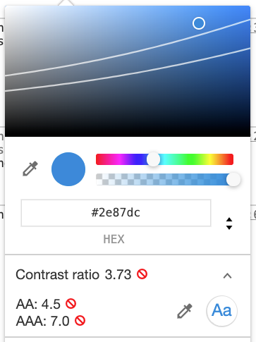
Chrome's color picker showing conformance issues
If you use Google Chrome, you can easily debug the contrast from the *styles* tab on the *Elements* panel.
Select any HTML element and click on its color style in the CSS list to test this. A section will show up at the bottom of the color picker, letting you know how the text contrast relates to the background.
As you can see in the image on the left, there is a problem with the contrast. This example also shows how the tool adds a pair of lines on the color spectrum, along with small red indicators with A letters. These indicators point to WCAG Conformance levels—a model of metrics that determines how accessible your site is. For this particular situation here's what they mean:
- If you choose a color above the its designated line for the A conformance level—it's close to the minimum standards, but will not provide a broad accessibility base for many use cases.
- Choosing a color between the lines (AA Conformance level)—is fine. WCAG suggests attaining the AA conformance level at a minimum for website content.
- If your color is below the (AAA Conformance level) line—you've achieved a great rating. However, it is worth knowing that it is almost impossible to always meet all guidelines for the highest AAA level, so do not treat it as a mandatory requirement.
Do not auto focus
Autofocus is very challenging for screenreader users to follow. It can otherwise drop them directly into your form without any context, making them feel disoriented and uncertain about their location on the page. It also can dish out a frustrating experience for standard or mobile users. Avoid surprises by refraining from automatically focusing fields—let the user click into controls as they need to. Use this article to read in-depth about how autofocus causes downstream effects.
Never apply outline: none
It is frequent practice to set outline: none project-wide, to spare us from the default browser styles, which are sometimes visually unappealing and ruin the UI design. However, having that outline is an absolute requirement to enable ease of use for keyboard users. That small indicator tells them exactly where they are and permits them to locate their next move while playing it nicely with the design.
- Instead, the best way is simply adjusting the outline so it fits your design, without removing it. Keeping a familiar outline avoids users struggling to figure out where to tab next time around.
- The other commons strategy is to style focus indicator with a change of background, underline, or border using your design. Avoid using the background color alone when doing this; ensure your decorative attribute, not just a color, makes the selection discriminate—it has to be noticeable to users with color blindness as well.
- If you’re absolutely set on removing outline in your apps, hide it dynamically with JavaScript, only for those who are exploring by mouse. That same code can detect their next keyboard interaction which then makes the focus indicator visible again for the right set of users.
- More so, modern browsers support is here—the
:focus-visiblepseudo-class applies whenever the matching [:focus](https://developer.mozilla.org/en-US/docs/Web/CSS/:focus) element matches algorithms that decide the indicator must be apparent. Details into how that works here: https://developer.mozilla.org/en-US/docs/Web/CSS/:focus-visible
Read a related easy guide on this from the a11yproject’s take.
Lean on ARIA
ARIA is short for Accessible Rich Internet Applications. It consists of a handful of attributes you can set on elements, offering you a refined handle on communicating structure and behavior to the assistive technologies.
When native HTML can’t communicate the semantics you need, ARIA comes in handy to bridge these gaps.
Main structural concepts of ARIA consist of Roles and States/properties:
- The role—declares a meaning or behavior to a piece of the interface. (Like button, menuitem, or scrollbar)
- The state/property—defines the current status on an element (
aria-checked,aria-labelledby,aria-activedescendant).
Keep this rule in mind though:
When possible, stick to the platform built-in features, unless you cannot express the logic in any possible way.
In case you are annoyed and doubt a behavior could never be implemented using HTML precisely, first, look it up on this HTML5 Accessibility support matrix..
Set up landmarks
HTML 5’s semantic structures provide aid for the navigation experience of assistive-tech users. Instance cases: a screenreader will start reading at a region and point out where it ends, and it also lets you inspect the list from the page context with web rotor tools.
Better imagine landmarks as destinations a can jump the user. They can then choose either to ignore. or arrive directly to another block in your app.
Here are the often found: article, aside, nave, main, footer, and many others.
In the event you have to compensate for missing support (older browsers for instance), we have an ARIA landmark attributes. With ARIA properties attached in on a section of your page, you become able to bend its semantic for that context.
The HTML and ARIA matching is described in more detail in this piece: https://www.w3.org/TR/wai-aria-practices/examples/landmarks/HTML5.html
Set unique titles
A page with meaningful title is essential because the screen reader will speak it the very moment page changes
This is probably a bigger deal in Angular because SPAs do not match traditional expectations— by default they leave the title identical no matter which view you land on.
Still it's straightforwardly treat this: the Title in @angular/platform-browser offers methods to manipulate <title> directly, inside your code.
export class AppComponent {
  constructor(title: Title) {
    title.setTitle('My Cool Page');
  }
}
Leverage Angular CDK
For developing accessible experiences specifically in Angular, it’s essential to bring up the a11y package from Angular CDK. It gets you set for rapid develop accessibility since it includes abstractions several classic patterns:
ListKeyManager—quickly enables a keyboard-friendly for lists- Focus trap—keeps focus contained inside any container; you often use as a wall inside modals to, say, prevent users from tabbing onto the background controls during this time.
- LiveAnnouncer—as a way to broadcast to screen readers practically whenever you need to, for those parts of app where an event fires. Since readers won't announce you dynamic, immediate updates unless told explicitly.
- FocusMonitor—tracks focus states and movement of elements, it abstracts very well over listening to
focusandbluryourself with a basic API, also notes the input that resulted — mouse, keyboard, touch, or something else programmable - Styling helpers—small bits for SCSS to improve accessible comps—like mechanically keeping things visually hidden while still available to assistive tech, respectively target certain color schemes and contrast themes within your users
Testing for accessibility
Once you commit to building an accessible application, you should also plan how you will test for it. This approach helps you avoid overlooking important details during development while also keeping regressions under control.
Accessibility testing can be performed in two distinct ways:
- Manual testing — some accessibility problems simply cannot be detected by automated checks, so going through your app by hand is often necessary. To get started with structured manual reviews, have a look at this useful guide: https://developers.google.com/web/fundamentals/accessibility/how-to-review
- Automated testing — though automated tools won't catch every issue, they can save a significant amount of time by flagging obvious problems early. For a thorough breakdown of the available tools, check out Tim Deschryver's article on the subject.
Final Thoughts
By now it should be clear that accessibility is a key requirement for nearly any web application. It enhances the user experience for everyone, breaking down hurdles and allowing people to interact with your app without friction.
The topics covered here represent the essential first steps you should take when introducing accessibility into your workflow. Let's join forces to build a more inclusive web.
Thanks for stopping by!
Great Starting Points for Accessibility
- Web Accessibility Initiative — https://www.w3.org/WAI/
- The US Government's accessibility guide — https://accessibility.digital.gov/
- Mozilla Developer Network — https://developer.mozilla.org/en-US/docs/Web/Accessibility