
Understanding Global Styles
Let’s begin with the basics: global styles. These are stylesheets that influence elements throughout the entire application, no matter where the HTML file is located.
For instance, defining a .red-highlight class in the default styles.scss file makes it accessible in every component. The sole exception is components using ShadowDOM encapsulation, which we’ll set aside for now.
styles.scss
.red-highlight {
  background-color: #ff0000;
}
app.component.html
<div class="red-highlight">Example Box</div>Unsurprisingly, the code above displays “Example Box” with a red background. As demonstrated, working with global styles is straightforward.
Global styles are ideal for:
- declaring utility classes for typography, margins, and padding
- applying a CSS reset to ensure consistent rendering across browsers.
- initializing CSS/SCSS variables
- setting up a UI library theme, such as Angular Material
- adjusting or overriding theme-specific styles
Setting Up Global Styles
With a clear understanding of global styles, we can explore their configuration, which depends on whether the project uses the @nrwl/nx library. You can configure global styles in:
- angular.json (without Nx)
- project.json (with Nx)
For the angular.json file, the path to the global stylesheet is defined as follows:
projects > (project name) > architect > (configuration) > options > styles
angular.json
{
  "projects": {
    "ExampleProject": {
      "architect": {
        "build": {
          "options": {
            "styles": ["src/styles.scss"]
          }
        }
      }
    }
  }
}
In the project.json file, the paths are specified under the
targets > (configuration) > options > styles key.
project.json
{
  "targets": {
    "build": {
     "options": {
         "styles": ["apps/ourApplication/src/styles/styles.scss"]
      }
    }
  }
}
By default, each Angular application includes only one global stylesheet, styles.scss, located in the src folder. The styles list also serves to import external UI libraries, such as Angular Material or Bootstrap.
Incorporating a Global Style (Bootstrap)
Let’s use Bootstrap as a practical example. This library offers utility classes and pre-designed components that streamline UI development. Install it with:
npm install bootstrap bootstrap-iconsAfter installation, register it in either the angular.json or project.json file, depending on your use of Nx.
"styles": [
  "node_modules/bootstrap/scss/bootstrap.scss",
  "node_modules/bootstrap-icons/font/bootstrap-icons.css",
  "src/styles.scss"
]
Keep in mind that modifying global style configurations requires restarting the ng serve command. Once done, Bootstrap classes and components become available. Don’t forget to add its .js file as well!
As you can see, configuring global styles is a breeze. Now, let’s delve into something more intricate—importing styles into components.
Component-Level Styling
Typically, each Angular component has its own dedicated, "local" stylesheet. This approach keeps applications modular and well-organized.
Importing Styles into Components
To bring styles into a component, we can utilize these properties within the @Component decorator:
- styleUrls — takes an array of relative file paths.
- styleUrl — takes a single file path string. Note that this property is only available from Angular 17.0.0-next.4 onward.
@Component({
  ...,
  styleUrls: ['./example-component.scss'],
 })
export class ExampleComponent { }
When you need to include CSS directly in the component file, the styles property inside the @Component decorator comes in handy. It accepts a list of styles. Additionally, from Angular 17.0.0-next.4 onward, this property can also be a string.
@Component({
  ...,
  styles: [`
  .box {
    height: 1000px !important;
  }
  `]
})
export class AppComponent {}
In the Angular ecosystem, however, inline styles within component files are uncommon. This approach is best reserved for scenarios where the styles are very brief.
Style Encapsulation Options
Angular provides various encapsulation strategies, each working differently. Understanding these distinctions is crucial for avoiding unexpected issues later.
Currently, we have three encapsulation modes:
- Emulated encapsulation (the default)
- ShadowDOM
- None
Emulated Encapsulation (Local Styles)
This default mode ensures that imported styles only affect elements within the component’s template. This guarantees that one component’s styles won’t interfere with another’s. Consequently, applications using this approach are dependable—adding features won’t introduce visual glitches from class name collisions.
Emulated encapsulation is set via the encapsulation property in the @Component decorator. Declaring it explicitly is optional, as Angular applies it by default to every new component.
@Component({
 ...,
  encapsulation: ViewEncapsulation.Emulated
})
export class AppComponent {}
ShadowDOM Encapsulation
ShadowDOM encapsulation leverages a dedicated Shadow Root for components. This isolates them from the main DOM, meaning they WILL NOT have access to global styles.
It’s worth noting that ShadowDOM lacks support in certain older browsers.
@Component({
 ...,
  encapsulation: ViewEncapsulation.ShadowDom
})
export class AppComponent {}
In the DOM tree, shadow roots are encapsulated within the #shadow-root element.
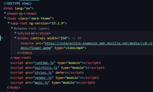
The screenshot illustrates the DOM after applying ShadowDOM encapsulation to the app-root component.
No Encapsulation
Alternatively, you can opt out of encapsulation entirely, turning all component styles into global ones.
This method carries significant risk, as new features may cause visual regression—unexpected appearance changes. This often stems from duplicate class names. Therefore, it’s advisable to avoid no encapsulation unless absolutely necessary.
@Component({
  ...,
  encapsulation: ViewEncapsulation.None
})
export class AppComponent {}
If you choose this route, consider wrapping styles in a unique class that won’t clash with others. Naming it after the component is a wise practice.
File: color-picker.component.ts
<div class="color-picker">
  <input class="hex-input"/>
  <input class="rgb-input"/>
</div>
File: styles.scss
.color-picker {
  .hex-input {
    ...
  }
  .rgb-input {
    ...
  }
}
Targeting with Component Selectors
Special style selectors allow precise targeting of elements.
:host
This selector enables styling of the component’s own tag.
:host {
  display: block;
  height: 100px;
  width: 100px;
  background-color: #53e1d0;
}
When imported into a component using the app-card selector, the snippet compiles into:
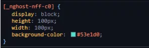
Since Angular components are inline by default, using :host to display them as block-level elements is a common pattern.
Be aware that the :host selector has a constraint: it only functions with Emulated or ShadowDOM encapsulation. With no encapsulation, a different approach is required:
app-root {
  display: block;
  height: 100px;
  width: 100px;
  background-color: #53e1d0;
}
:host-context
This selector conditionally styles the component’s host element based on a parent’s class.
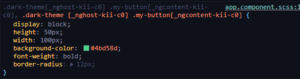
For example, the following style applies to the my-button class within our component only when an ancestor (like the body element) has the dark-theme class:
:host-context(.dark-theme) .my-button {
  display: block;
  height: 50px;
  width: 100px;
  background-color: #4bd58d;
  font-weight: bold;
  border-radius: 12px;
}
::ng-deep
This selector targets the component’s child elements. It’s important to note that ::ng-deep is now marked as deprecated. Because of this, its usage is a topic of debate.
Establishing a design system
One of the most effective habits when building web applications is defining a design system — a shared collection of values that govern the entire app. These values often include spacing units, color palettes, or typography rules.
To illustrate this approach, we'll build a basic design system using SCSS variables.
The application must be configured correctly in angular.json (or project.json) so that global variables and mixins are available everywhere. In the section where global styles were added, we introduced two additional entries: stylePreprocessorOptions and includePaths. After restarting the application, Angular will permit us to pull in variables and utility functions directly from the src directory in local style files.
"styles": [
  "src/styles.scss",
  "src/styles/utils/index.scss"
],
"stylePreprocessorOptions": {
  "includePaths": [
    "src"
  ]
},
Let's begin by setting up the directory layout:
- Make a
stylesfolder, and inside it, autilsfolder. - Within
utils, create three SCSS partials — _breakpoints.scss, _colors.scss, and _spacing.scss (don't forget the leading underscore). - Place an index.scss file inside the
utilsfolder.
The resulting structure looks like this:
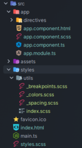
Once the folders and files are in place, we can start defining the design system. Let's first outline the color palette in _colors.scss. To simplify the process, consider using an online palette generator or a pre-made palette.
If you prefer to craft your own palette from scratch, a solid strategy is to include:
- A primary color
- An accent color
- A warning color (yellow/orange)
- An error indication color (red)
When designing UI components, keep the 60/30/10 rule in mind: choose your colors so the interface is composed of:
- 60% base color (usually a neutral tone like white, gray, or black)
- 30% supporting color
- 10% accent color
Following this guideline keeps the UI clean and ensures that interactive elements — like buttons — stand out clearly with their action colors.
A sample _colors.scss file could look like this:
File: _colors.scss
$primary-color: #2bec89;
$accent-color: #8a5cc2;
$alert-color: #ff9012;
$error-color: #e11b1b;

// Declaring color with shades (material design pink)
$pink-color-50: #fce4ec;
// ... Shades 100-700
$pink-color-800: #ad1457;
$pink-color-900: #880e4f;
Beyond a consistent color scheme, the application should also use uniform spacing to properly separate UI elements. A common guideline is to use 8 or 12 pixel gaps inside a component, and larger gaps between distinct components.
An example spacing file:
File: _spacing.scss
$space-xs: 4px;
$space-s: 8px;
$space-md: 12px;
$space-lg: 16px;
$space-xl: 20px;
The final piece of our design system is defining breakpoints. When building responsive applications, we should target three main viewport categories:
- smartphones
- tablets and small laptops
- desktops and TVs
We'll store each breakpoint in a variable. To simplify responsive development, we'll also add a few mixins.
A sample breakpoints file might look like this:
File: _breakpoints.scss
$breakpoint-tablet: 768px;
$breakpoint-desktop: 1024px;


@mixin mobile-view {
  @media screen and (max-width: #{$breakpoint-tablet - 1px}) {
    @content;
  }
}

@mixin tablet-view {
  @media screen and (min-width: #{$breakpoint-tablet}) and (max-width: #{$breakpoint-desktop - 1px}) {
    @content;
  }
}

@mixin desktop-view {
  @media screen and (min-width: #{$breakpoint-desktop}) {
    @content;
  }
}
That wraps up the design system itself.
Now we need to expose the variables from all the partials. The @forward rule in the index.scss file does exactly that. We'll also apply @forward in the main global stylesheet.
File: index.scss
@forward "./breakpoints";
@forward "./colors";
@forward "./spacing";
To make use of the design system within a component, we rely on @use, specifying the path to the directory that contains the index.scss file.
File: app.component.scss
@use "styles/utils" as ds;

.box {
  padding: ds.$space-md;
  background-color: ds.$primary-color;

  @include ds.desktop-view {
    padding: ds.$space-lg;
  }
}
Building a custom design system does involve a fair amount of boilerplate. Fortunately, there are existing frameworks — such as Tailwind CSS — that come with a built-in design system which you can customize to fit your project.
Directives
Directives are an Angular mechanism that allows us to write reusable logic for altering an element's behavior and appearance.
In this section, we'll construct directives that apply a rainbow background to an element. Along the way, we'll explore three distinct techniques for manipulating element styles:
- the ElementRef — a wrapper around the HTML element
- the @HostBinding decorator
- the host property on a component or directive
We'll begin by generating three directives:
ng g d directives/rainbowElementRef --standalone --skip-tests
ng g d directives/rainbowHostBinding --standalone --skip-tests
ng g d directives/rainbowHostProperty --standalone --skip-tests
Afterwards, the file structure should appear as follows:
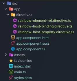
Before implementing the directive logic, we need to lay some groundwork. First, we'll add a global style in styles.scss that provides a rainbow background.
@keyframes rainbow {
  0% { background-position: 0 50% }
  50% { background-position: 100% 50% }
  100% { background-position: 0 50% }
}

.rainbow-background {
  background: linear-gradient(238deg, #fd8800, #fd008f, #9700fd, #003dfd, #05c7e6, #4bd58d);
  background-size: 1200% 1200%;
  animation: rainbow 5s ease infinite;
}
Next, we import the directives into app.component.ts.
@Component({
  selector: 'app-root',
  templateUrl: './app.component.html',
  styleUrls: ['./app.component.scss'],
  standalone: true,
  imports: [
    RainbowElementRefDirective,
    RainbowHostBindingDirective,
    RainbowHostPropertyDirective
  ]
})
export class AppComponent {}
Finally, we'll insert three divs into the application's main view to observe how each directive affects the HTML elements.
File: app.component.html
<div class="box" appRainbowHostProperty></div>
<div class="box" appRainbowHostBinding></div>
<div class="box" appRainbowElementRef></div>
File: app.component.scss
.box {
  border-radius: 12px;
  margin: 32px;
  width: 64px;
  height: 64px;
}
With that setup complete, let's move on to implementing the directives — starting with the one based on ElementRef.
ElementRef and native element
import {Directive, ElementRef, inject, Input, OnInit} from "@angular/core";

@Directive({
  selector: '[appRainbowElementRef]',
  standalone: true,
})
export class RainbowElementRefDirective implements OnInit {
  @Input() set duration(duration: number) {
    this._elementRef.nativeElement.style.animationDuration = `${duration}s`
  }

  @Input() set hideBackground(hideBackground: boolean) {
    const CLASS_NAME = 'rainbow-background'

    if (hideBackground) {
      this._elementRef.nativeElement.classList.remove(CLASS_NAME)
    } else {
      this._elementRef.nativeElement.classList.add(CLASS_NAME)
    }
  }

  private readonly _elementRef = inject(ElementRef<HTMLElement>)

  ngOnInit(): void {
    this.duration = 5;
    this.hideBackground = false;
  }
}
The logic in this component can be broken down into three steps:
Initialization:
We inject ElementRef and store it in the _elementRef variable.
Style logic
We define the duration input, which controls the animation's length.
We define the hideBackground input, which toggles the rainbow-background class on or off.
Default Values
We implement the OnInit interface and the ngOnInit method, which assigns default values to the inputs.
Once the code runs, the element should display a rainbow background.

Personally, I find working with ElementRef quite cumbersome — it demands a lot of manual work. It can be handy for advanced scenarios, like the Badge Element. However, in most typical cases, simpler Angular features — such as the @HostBinding decorator — are sufficient for styling elements.
The @HostBinding decorator
import {Directive, HostBinding, Input} from "@angular/core";

@Directive({
  selector: '[appRainbowHostBinding]',
  standalone: true,
})
export class RainbowHostBindingDirective {
  @Input() duration = 5
  @Input() hideBackground = false

  @HostBinding('style.animationDuration')
  get animationDuration(): string {
    return `${this.duration}s`
  }

  @HostBinding('class.rainbow-background')
  get showRainbowBackground(): boolean {
    return !this.hideBackground
  }
}
A more elegant method for applying styles through directives is the @HostBinding decorator. With it, Angular automatically assigns attributes to the element based on the value of a variable or getter.
Let's examine the example above:
Initialization:
We declare two inputs — duration and hideBackground.
Style logic
We bind the animationDuration style to the element via the @HostBinding decorator. The element's animation-duration style matches the getter's value (defaulting to "5s").
We bind the rainbow-background class, which is present on the element only when the @Input hideBackground is false.
Clearly, the @HostBinding decorator helps reduce the styling code considerably. But can we improve even further?
The Host property
import {Directive, Input} from '@angular/core';

@Directive({
  selector: '[appRainbowHostProperty]',
  standalone: true,
  host: {
    '[class.rainbow-background]': '!hideBackground',
    '[style.animationDuration]': 'duration + "s"',
  }
})
export class RainbowHostPropertyDirective {
  @Input() duration = 5
  @Input() hideBackground = false
}
The host property within the directive's decorator offers a straightforward way to bind attributes to the element. In the example above:
Initialization
We declare two inputs — duration and hideBackground.
Style logic
We bind the rainbow-background class when hideBackground is false.
We bind the animationDuration style to the duration variable's value, appending the string "s".
Summary
Angular's styling capabilities should no longer hold any mysteries for you. The framework offers a rich set of CSS features — from selectors and scoped styles to global SCSS variables — enabling you to craft consistent, maintainable user interfaces.