Breaking down the problem
No matter how long you have been working with Angular or how deeply you understand its internals, there is one skill that always leaves room for growth. That skill is decomposition — the ability to split a complex problem into smaller, manageable pieces. It is arguably the most defining characteristic of a skilled architect. If you already feel confident in your technical expertise, this is the area where you can continue to develop.
Let us take a challenging feature and examine how to approach it with clean architecture and long-term maintainability. Over the years, while building the Taiga UI component library, I have encountered numerous pitfalls, gained valuable insights, and refined my approach. Popovers are an excellent example to illustrate this process. Although the focus here will be on dropdowns, the same strategy is applied to hints within Taiga UI.
"Give me six hours to chop down a tree and I will spend the first four sharpening the axe." - Abraham Lincoln
Defining the challenge
Until the Popover API becomes widely supported in the browsers we must target, we need to handle many aspects ourselves. We will adopt the "portals pattern", a common technique for rendering popover content that helps avoid issues with overflow, scrollbars, and z-index. If you are unfamiliar with this pattern, you can refer to my earlier article on the subject.
With that foundation in place, let us assume we need to build a flexible dropdown system for an Angular application or library. The first step is to break the overall objective into distinct high-level questions:
- We must determine what content to display.
- We must determine where to place it.
- We must determine when to show it.
Once these questions are stated, we can address them individually. Notice that they are largely independent of each other, which is a positive indicator. The essence of decomposition is identifying which parts of a solution can function in isolation, ensuring each responsibility remains small and manageable. Let us examine each item and explore how to solve it, along with the reasons why flexibility is essential.
Selecting the content
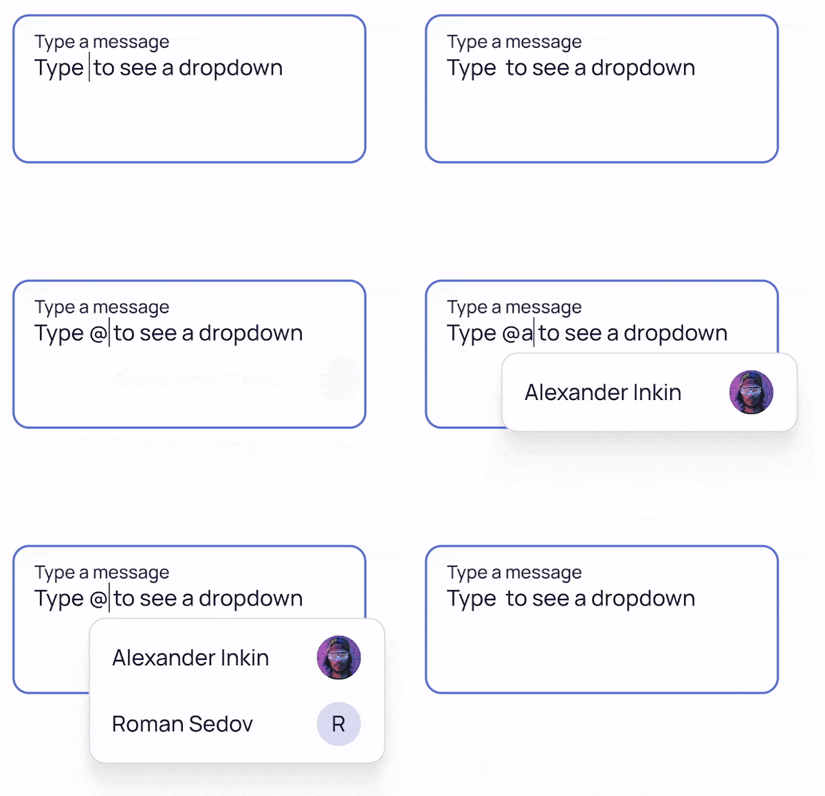
In Angular, you can pass content through interpolation, templates, or dynamic components. However, this section is not about those mechanisms. Instead, we will concentrate on the design considerations surrounding the content itself. For passing content around, I recommend checking out my article about a library I developed called Polymorpheus. In essence, it serves as a universal outlet that handles various content types without requiring you to manage ngTemplateOutlet, ngComponentOutlet, or interpolation directly — a polymorphic structural directive takes care of all of it.
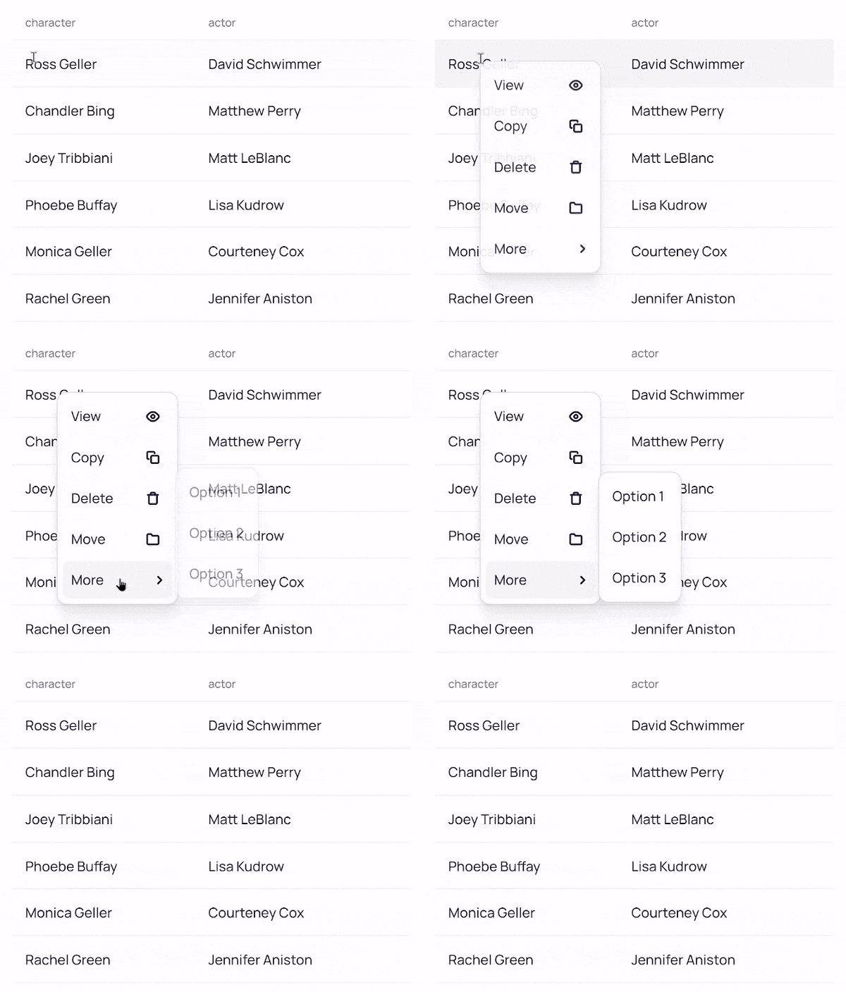
Why is it important to support different components as content containers? Dropdowns and hints can look vastly different depending on the context in which they appear. However, this does not imply that we need a separate infrastructure for each variation. The following GIFs illustrate some of these different popover styles:
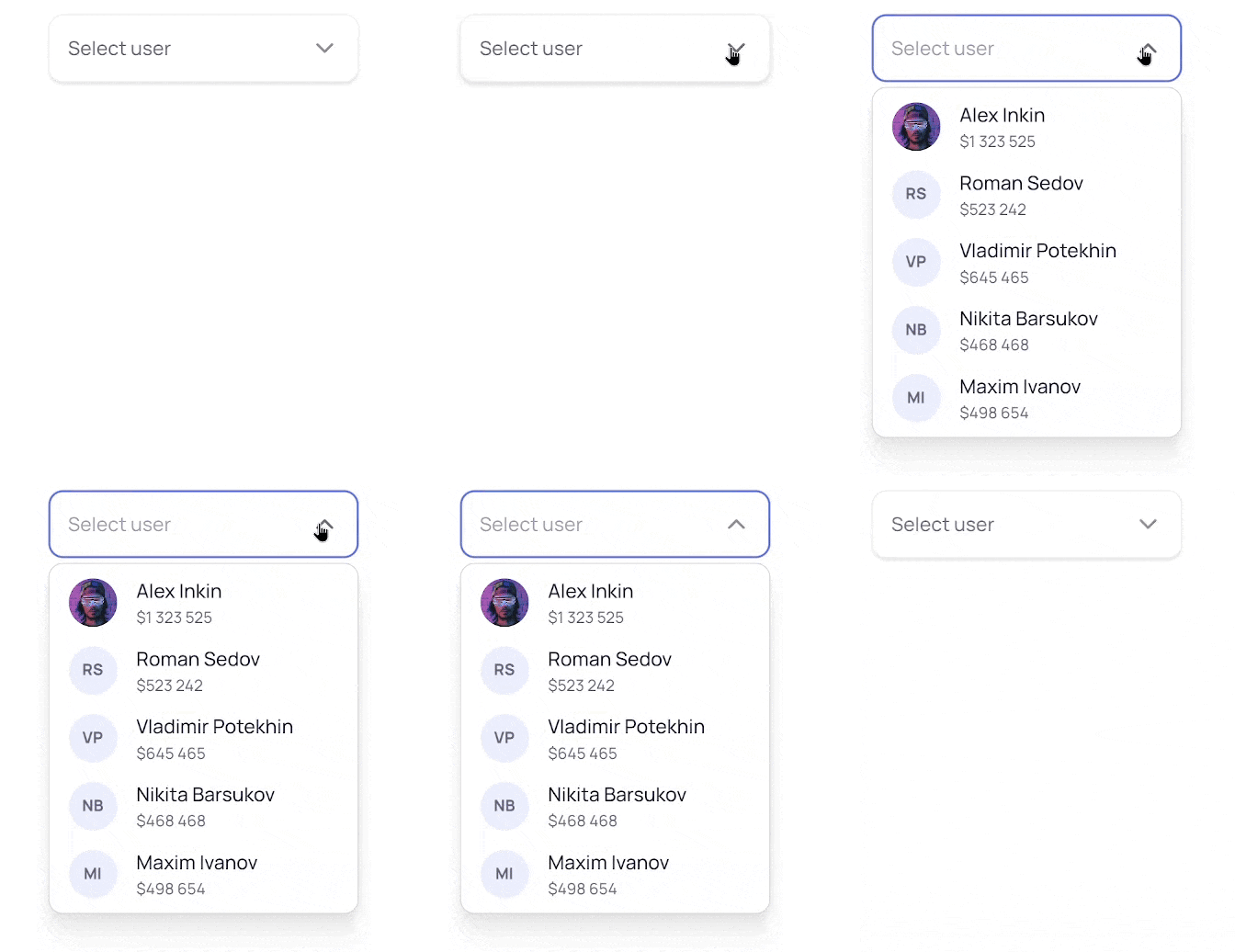
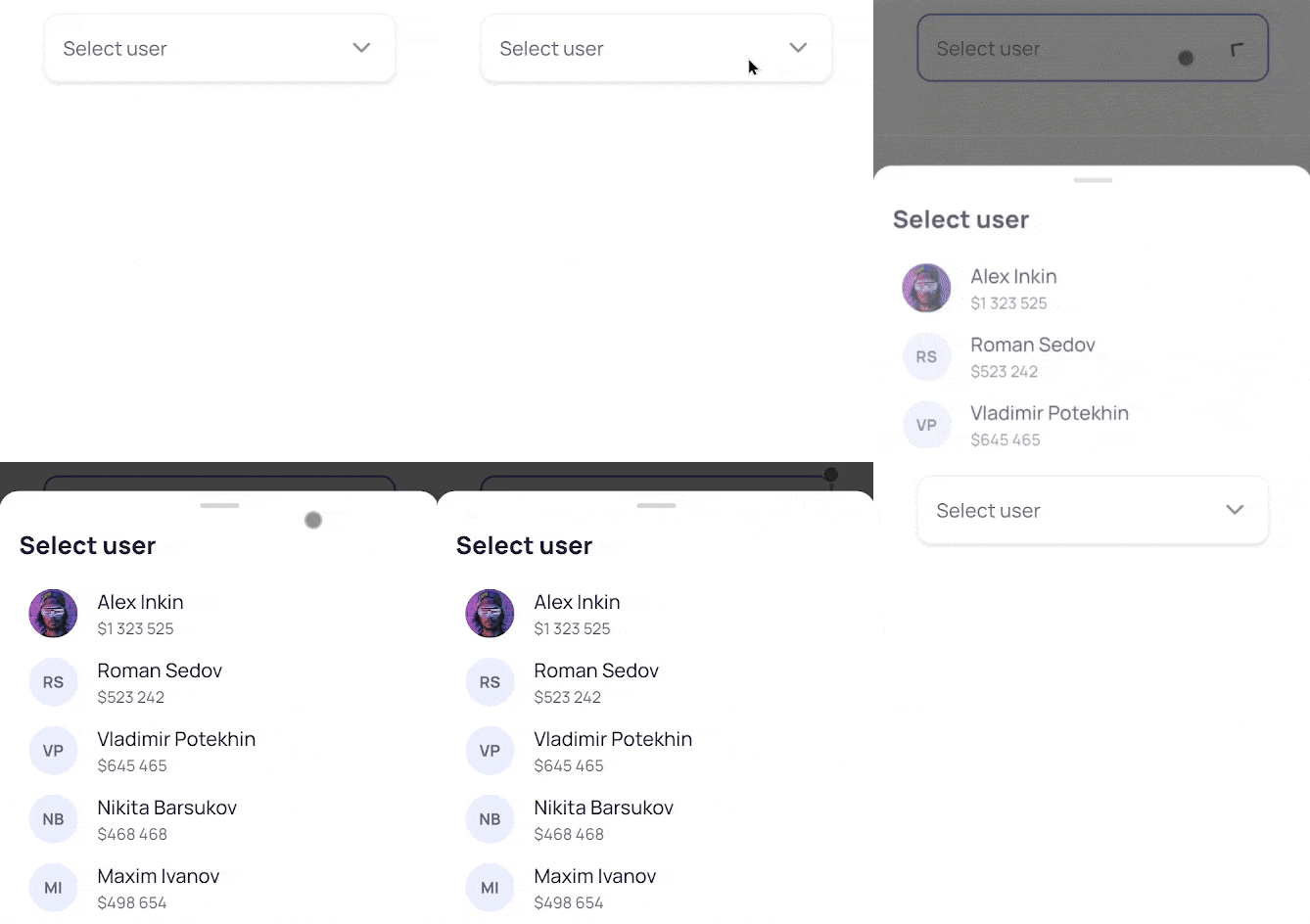
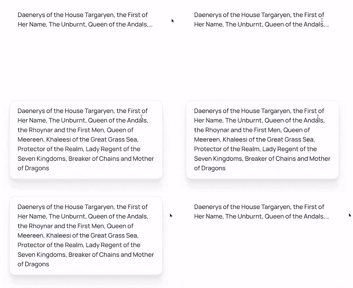
We can accomplish this using dependency injection. Ultimately, our popovers will be dynamically created components. Therefore, we can provide the component to be instantiated through a DI token. This approach allows us to establish a default component, while individual directives can supply alternative implementations. For instance, the LineClamp hint component leverages the CSS line-clamp property to truncate content to a specified number of lines and displays the full text in a popover upon touch or pointer hover, in contrast to the standard hint bubble with an arrow.

This part was relatively straightforward. Now that we know what to display, we need to figure out where to position it.
Determining the position
Calculating the position is not a simple task. In fact, it will likely be the most extensive part of the code you write for this entire feature. We will not dive into the actual JavaScript calculations here; it is mostly arithmetic based on the concepts we are about to discuss.
First, each popover typically has a host element. This could be a hint icon, a dropdown button, a selection for context menus, or even the pointer position for hints that follow the cursor in a pie chart.
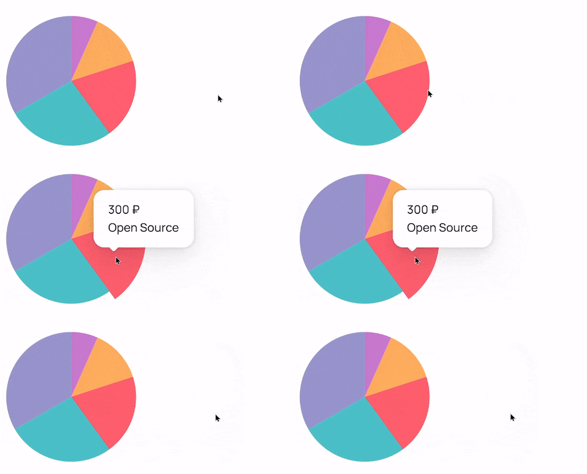
To calculate the position, we need to know where the host is located and its dimensions. For this, we will create our first abstract entity — RectAccessor. Its sole purpose is to provide a method that returns the DOMRect of the host when needed.
Next, depending on the desired behavior, we need a second abstract class — PositionAccessor. This class accepts the popover's DOMRect and returns the coordinates where the popover should be displayed, based on its size and the host's RectAccessor. For example, the LineClamp popover appears exactly at the host's position, while hints are positioned so that the arrow points to the middle of the host, and dropdowns appear above or below the host at a specified distance.
These abstract entities are what our components will interact with, and different directives will supply the concrete implementations.
Managing visibility
Finally, we need to handle showing and hiding our popovers. Various triggers can be employed: hints can appear on pointer hover or keyboard focus, dropdowns can open on clicks, context menus on right-clicks, or we can have popovers that are manually controlled by other parts of the application. To support this, we introduce another concept — a Driver.
Essentially, a Driver is an Observable that toggles the visibility of our popover, which we can refer to as a Vehicle in contrast. Once again, directives will provide the implementation. It is advisable to use a multi token here, allowing you to augment existing drivers with new ones. For instance, if your dropdowns typically open on click, but a specific one should also open on hover.
This is a textbook scenario for RxJS, as it fundamentally deals with event management. You can combine multiple fromEvent calls into a single resulting stream. For example, you might want to open a dropdown on click, arrow down keypress, or pointerenter, and close it on the Escape key or when clicking outside the host or the dropdown itself. Although Angular is currently moving away from requiring RxJS as a core dependency, I still highly recommend investing time in becoming proficient with it. Not only is it incredibly powerful when used correctly, but it is also likely to be integrated into native browser JavaScript. You can practice with my small repository of bite-sized RxJS challenges to sharpen your skills.
Summary of the approach
We are building a popover infrastructure. We have decided to use the portal pattern, creating dynamic components as portals above our app content. An InjectionToken holds the component we will instantiate, allowing directives to override it with different implementations. Depending on our needs, we have directives that help determine the popover's position, providing the host's DOMRect and an algorithm to calculate the placement based on that and the popover's size. To control when the popover is shown or hidden, we have another set of directives. We can have default implementations in the basic hint or dropdown directive and fall back to them unless a custom behavior is provided by another directive.
Let's look at a few examples from Taiga UI:
<button
    tuiDropdown="Great Scott!" ← basic directive with content to show
    tuiDropdownOpen ← a driver that opens on click and keyboard arrows
    tuiDropdownHover ← a driver to show on hover
>
    This is heavy!
</button>
<div
tuiHint="Wow! How exciting!" ← basic directive with hint text
tuiHintPointer ← both a driver and a rect accessor to follow pointer
>
In this block hint follows cursor
</div>Thanks to the hierarchical nature of dependency injection, we do not need direct access to the dropdown directive to provide a custom component somewhere higher up the component tree:
<tui-select
    tuiDropdownMobile="Select user" ← custom dropdown component
    [(ngModel)]="user"
>
    Select user
    <tui-data-list-wrapper *tuiDataList [items]="users" />
</tui-select>
Implementation details
Here is a simplified version of the code described above for a typical dropdown. Real-world scenarios require more nuanced handling, but this gives you a general overview.
First, we need a component to display. As discussed, it will be provided through a token with a default value:
export const DROPDOWN_COMPONENT = new InjectionToken('', {
    factory: () => DropdownComponent,
});
In the GIF above, we saw a mobile sheet-like dropdown for Select. This can be achieved with a directive:
@Directive({
    // ...
    providers: [
        {
            provide: DROPDOWN_COMPONENT,
            useFactory: () =>
                isMobile(inject(DOCUMENT).defaultView.navigator.userAgent)
                    ? DropdownMobileComponent
                    : inject(DROPDOWN_COMPONENT, {skipSelf: true}),
        },
    ],
})
export class DropdownMobileDirective {}
This directive injects DOCUMENT to check the userAgent. If we are on a mobile device, it provides the mobile implementation; otherwise, it falls back to the previous value in the DI hierarchy.
Next, we'll handle positioning. As I mentioned, we won't dive into the calculation logic, so imagine we have a PositionDirective that does all the coordinate math. However, it needs a RectAccessor to perform its job:
export class RectAccessor {
    private readonly element = inject(ElementRef).nativeElement;

    // Required RectAccessor method
    public getRect(): DOMRect {
        return this.element.getBoundingClientRect();
    }
}
We also need a driver directive that connects all the drivers with the vehicle:
export class DriverDirective {
    private readonly vehicle = inject(Vehicle);

    // Injecting multi token Driver and merging all the streams
    private readonly sub = merge(...inject(Driver))
        .pipe(distinctUntilChanged(), takeUntilDestroyed())
        .subscribe(this.vehicle.toggle.bind(this.vehicle));
}
A dropdown directive acts as the vehicle:
@Directive({
    // ...
    providers: [{ provide: Vehicle, useExisting: DropdownDirective }],
    hostDirectives: [DriverDirective, RectAccessor, PositionDirective],
})
export class DropdownDirective {
    // To handle component creation
    private readonly service = inject(DropdownService);
    private readonly component = inject(DROPDOWN_COMPONENT);

    public dropdown = input(''); // string, template, component

    // Required Vehicle method
    public toggle(show: boolean): void {
        this.dropdownBoxRef = this.service.toggle(this.component, show);
    }
}
Our DROPDOWN_COMPONENT will inject PositionDirective after it is created to query for the position where it should be placed. The DropdownService is responsible for creating and destroying dynamic components as portals in the desired part of the DOM. All that remains is a driver to toggle visibility. The simplest one is the manual dropdown, controlled by an external input:
@Directive({
    // ...
    providers: [{ provide: Driver, useExisting: DropdownManual, multi: true }],
})
export class DropdownManual extends Observable<boolean> {
    public open = input(false);

    constructor() {
        super(subscriber => toObservable(this.open).subscribe(subscriber));
    }
}
More complex drivers, such as hover, context menu, keyboard, or click-based triggers, follow the same fundamental logic — we compose a stream and provide it as a Driver. Exploring the details of those implementations goes beyond the scope of this article.
Final thoughts
Angular is a well-architected framework. It encourages best practices through directive composition, dependency injection for swapping implementations, multi tokens, services, and hostDirectives — all the elements needed to build maintainable and extensible solutions. When new requirements come in, I am confident that a complete rewrite won't be necessary. When implemented properly, Angular code is not only visually elegant but also allows for expansion while keeping the core principles intact.
So, my primary advice is this: before writing any code, carefully consider whether that code is even necessary. Take the time to properly design your feature, look beyond your immediate specifications, and aim to build infrastructure that accommodates future needs rather than a rigid solution for current ones. You already have all the necessary tools — learn to use them well. Not only will you become an invaluable asset to any team, but you'll also find genuine pleasure in the coding process. After all, we entered engineering because we love solving problems, and Angular is both effective and ergonomic in this regard.