
Composing Directives on Angular Components
Building applications that are both clean and reusable is a core part of development. Angular provides a number of utilities to support this, including the Directive Composition API. This feature helps you write code that is easier to manage and reuse. The focus here is on the hostDirective option, how it functions, and how you can integrate it into your Angular applications.
Overview
In Angular, directives are classes that attach new behavior to elements in your templates. The hostDirective option gives you a way to manage these directives more cleanly and keep your codebase organized.
The official documentation for the Directive Composition API is available at this link.
The following topics will be covered:
- The concept of the Directive Composition API
- An in-depth look at the
hostDirectiveoption - A walkthrough of a practical scenario
- The semantics of host directives
- Guidelines and recommendations
What is the Directive Composition API?
This API enables you to attach directives directly to a component's host element using the component's TypeScript class. This approach allows you to encapsulate logic in separate, focused directives and then combine them within your components.
Exploring the hostDirective Option
This option is available for both components and directives. It allows you to declare and reuse business logic that can be applied in various parts of your application.
To attach a directive to a component, you add a hostDirectives property to the component's decorator.
@Directive({
    // ...
    hostDirectives: [UserDirective]
})
Any directive referenced in the hostDirectives array must be marked as Standalone. This means they need to have standalone: true set in their own decorator metadata.
In the example that follows, let's imagine that UserDirective has the responsibility of finding a button in the template to emit a userRemoved event when the user card's click event is triggered.
@Directive({standalone: true})
export class UserDirective implements AfterViewInit {
    userId = input.required<number>();
    userRemoved = output<number>();

    private elementRef = inject(ElementRef);
    private destroyRef = inject(DestroyRef);

    ngAfterViewInit() {
        this.userRemoveListener();
    }

    private userRemoveListener() {
        const removeButton =
            this.elementRef.nativeElement.querySelector('button.user-remove');

        if (!removeButton) return;

        const listener$ = fromEvent(removeButton, 'click');
        listener$
            .pipe(
                takeUntilDestroyed(this.destroyRef) // unsubscribe on destroy
            )
            .subscribe(() => this.userRemoved.emit(this.userId()));
    }

    // ...
}
It's possible to make certain inputs and outputs part of your component's public API by expanding the entry in the array.
@Component({
    selector: 'user-cart',
    template: `
      <button class="user-remove">X</button>
      ...
    `,
    standalone: true,
-   hostDirectives: [UserDirective]
+   hostDirectives: [
+       {
+           directive: UserDirective,
+           inputs: ['userId'],
+           outputs: ['userRemoved'],
+       },
+   ],
})
<user-cart [userId]="user.id" (userRemoved)="removeUser($event)"/>With this approach, data and interactions can be passed to your directive through the host component.
Aliases are also supported. After declaring an input or output, you can set an alias by placing it after a colon.
@Component({
    selector: 'user-cart',
    template: `
      <button class="user-remove">X</button>
      ...
    `,
    standalone: true,
    hostDirectives: [{
        directive: UserDirective,
+       inputs: ['userId: id'],
+       outputs: ['userRemoved: removed'],
    }]
})
export class UserCartComponent {}
<user-cart [id]="user.id" (removed)="removeUser($event)"/>A Practical Example
Let's examine a specific use case.
A demo application for the code below can be found via this link.
We have components for buttons and tags.
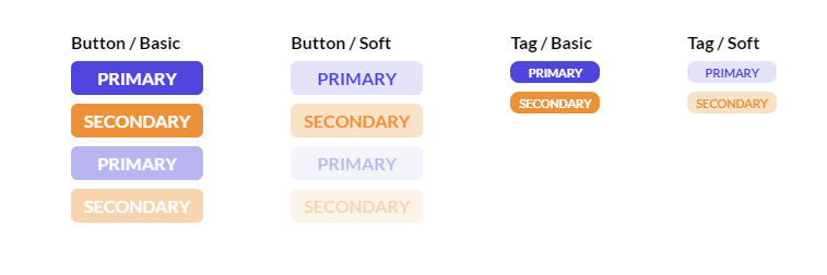
Button - Component
Our button component's logic is defined as follows.
@Component({
    selector: 'app-btn',
    template: `<button><ng-content /></button>`,
    styleUrls: ['./button.component.scss'],
    standalone: true,
    changeDetection: ChangeDetectionStrategy.OnPush,
})
export class ButtonComponent {
    type = input<'basic' | 'soft'>('basic');
    variant = input<'primary' | 'secondary'>('primary');

    @HostBinding('class')
    get hostClass(): string {
        return [this.type(), this.variant()].join(' ');
    }
}
Tag - Component
@Component({
    selector: 'app-tag',
    template: `<small><ng-content /></small>`,
    styleUrls: ['./tag.component.scss'],
    standalone: true,
    changeDetection: ChangeDetectionStrategy.OnPush,
})
export class TagComponent {
    type = input<'basic' | 'soft'>('basic');
    variant = input<'primary' | 'secondary'>('primary');

    @HostBinding('class')
    get hostClass(): string {
        return [this.type(), this.variant()].join(' ');
    }
}
Additionally, there's a directive that's intended for use on buttons.
Disabled - Directive
@Directive({
    selector: '[appBtnDisabled]',
    standalone: true,
})
export class BtnDisabledDirective {
    disabled = input(false, {
        transform: booleanAttribute,
        alias: 'appBtnDisabled', // data pass by selector
    });

    @HostBinding('attr.disabled')
    get isabledAttr(): '' | null {
        return this.disabled() ? '' : null;
    }

    @HostBinding('class.disabled')
    get disabledClass(): boolean {
        return this.disabled();
    }

    @HostListener('click', ['$event'])
    @HostListener('dbclick', ['$event'])
    onClick(event: Event): void {
        if (this.disabled() === false) return;
        event.preventDefault();
        event.stopImmediatePropagation();
    }
}
These components can be used in the template like this:
<strong>Button / Basic</strong>
<app-btn>primary</app-btn>
<app-btn variant="secondary">secondary</app-btn>
<app-btn appBtnDisabled>primary</app-btn>
<app-btn variant="secondary" appBtnDisabled>secondary</app-btn>

<strong>Button / Soft</strong>
<app-btn type="soft">primary</app-btn>
<app-btn type="soft" variant="secondary">secondary</app-btn>
<app-btn type="soft" appBtnDisabled>primary</app-btn>
<app-btn type="soft" variant="secondary" appBtnDisabled>secondary</app-btn>

<strong>Tag / Basic</strong>
<app-tag>primary</app-tag>
<app-tag variant="secondary">secondary</app-tag>

<strong>Tag / Soft</strong>
<app-tag type="soft">primary</app-tag>
<app-tag type="soft" variant="secondary">secondary</app-tag>
While this code works, there are a few potential improvements:
- There is code duplication between the
ButtonComponentand theTagComponent. - There's nothing to stop the
BtnDisabledDirectivefrom being applied to theTagComponent, which isn't desired. - For better accessibility, the
disabledproperty should also be set on the nativebuttonelement.
Let's refactor this.
How to Apply hostDirective
As a first step, let's create directives to manage the appearance based on the type and variant inputs.
TypeAppearanceDirective
// Selector is optional, in that case we don't need them
@Directive({standalone: true})
export class TypeAppearanceDirective {
    type = input<'basic' | 'soft'>('basic');

    @HostBinding('class')
    get hostClass(): string {
        return this.type();
    }
}
VariantAppearanceDirective
// Selector is optional, in that case we don't need them
@Directive({standalone: true})
export class VariantAppearanceDirective {
    variant = input<'primary' | 'secondary'>('primary');

    @HostBinding('class')
    get hostClass(): string {
        return this.variant();
    }
}
It's possible to consolidate TypeAppearanceDirective and VariantAppearanceDirective into a single directive. Let's do that.
AppearanceDirective
// Selector is optional, in that case we don't need them
@Directive({
    standalone: true,
    hostDirectives: [
        {
            directive: TypeAppearanceDirective,
            inputs: ['type'], // declare inputs
        },
        {
            directive: VariantAppearanceDirective,
            inputs: ['variant'], // declare inputs
        },
    ],
})
export class AppearanceDirective {}
The inputs declared in AppearanceDirective become available in the components that use it, so there's no need to redeclare them. You simply need to load the directive.
Now, AppearanceDirective should be included in both ButtonComponent and TagComponent. The BtnDisabledDirective, on the other hand, should be included only in the ButtonComponent.
For the disabled state, we want to use an alias disabled for the original appBtnDisabled.
We can also use the inject function to pass values to the host. In the ButtonComponent, we should also provide the disabled value to the native button element. This value comes from a signal property in BtnDisabledDirective. Let's mark our injection accordingly.
It's also wise to use the self flag with inject. This tells Angular to look for a value only on the component's own injector and not to search higher up.
After making these adjustments, the refactored components look like this:
ButtonComponent
@Component({
    selector: 'app-btn',
+   template: `<button [disabled]="disabled()" ><ng-content /></button>`,
    styleUrls: ['./button.component.scss'],
    standalone: true,
    changeDetection: ChangeDetectionStrategy.OnPush,
+   hostDirectives: [
+       AppearanceDirective, // 'inputs' are declared inside directive
+       {
+           directive: BtnDisabledDirective,
+           inputs: ['appBtnDisabled: disabled'],
+       },
+   ],
})
export class ButtonComponent {
+   disabled = inject(BtnDisabledDirective, { self: true }).disabled;
-   type = input<'basic' | 'soft'>('basic');
-   variant = input<'primary' | 'secondary'>('primary');
-
-   @HostBinding('class')
-   get hostClass(): string {
-       return [this.type(), this.variant()].join(' ');
-   }
}
TagComponent
@Component({
    selector: 'app-tag',
    template: `<small><ng-content /></small>`,
    styleUrls: ['./tag.component.scss'],
    standalone: true,
    changeDetection: ChangeDetectionStrategy.OnPush,
+   hostDirectives: [
+     AppearanceDirective, // 'inputs' are declared inside directive
+   ],
})
export class TagComponent {
-   type = input<'basic' | 'soft'>('basic');
-   variant = input<'primary' | 'secondary'>('primary');
-
-   @HostBinding('class')
-   get hostClass(): string {
-       return [this.type(), this.variant()].join(' ');
-   }
}
The components are then used in the template as shown.
<strong>Button / Basic</strong>
<app-btn>primary</app-btn>
<app-btn variant="secondary">secondary</app-btn>
-<app-btn appBtnDisabled>primary</app-btn>
+<app-btn disabled>primary</app-btn>
-<app-btn variant="secondary" appBtnDisabled>secondary</app-btn>
+<app-btn variant="secondary" disabled>secondary</app-btn>

<strong>Button / Soft</strong>
<app-btn type="soft">primary</app-btn>
<app-btn type="soft" variant="secondary">secondary</app-btn>
-<app-btn type="soft" appBtnDisabled>primary</app-btn>
+<app-btn type="soft" disabled>primary</app-btn>
-<app-btn type="soft" variant="secondary" appBtnDisabled>secondary</app-btn>
+<app-btn type="soft" variant="secondary" disabled>secondary</app-btn>

<strong>Tag / Basic</strong>
<app-tag>primary</app-tag>
<app-tag variant="secondary">secondary</app-tag>

<strong>Tag / Soft</strong>
<app-tag type="soft">primary</app-tag>
<app-tag type="soft" variant="secondary">secondary</app-tag>
The disabled input is now an inherent part of the ButtonComponent. As a result, the BtnDisabledDirective does not need to be imported for use in the TagComponent.
Semantics of Host Directives
Order of Execution
Host directives follow the same lifecycle as directives used directly in a template. It's important to remember that host directives always run their constructor, lifecycle hooks, and host bindings before the host component does.
Keeping this in mind is critical to avoid performance problems. Using our button component example,
@Directive({
    standalone: true,
    hostDirectives: [
        {
            directive: TypeAppearanceDirective,
            inputs: ['type'],
        },
        {
            directive: VariantAppearanceDirective,
            inputs: ['variant'],
        },
    ],
})
export class AppearanceDirective {}

@Component({
    selector: 'app-btn',
    template: `<button><ng-content /></button>`,
    styleUrls: ['./button.component.scss'],
    standalone: true,
    changeDetection: ChangeDetectionStrategy.OnPush,
    hostDirectives: [
        AppearanceDirective,
        {
            directive: BtnDisabledDirective,
            inputs: ['appBtnDisabled: disabled'],
        },
    ],
})
export class ButtonComponent {
    // ...
}
the order of execution is:
- Instantiation of
TypeAppearanceDirective - Instantiation of
VariantAppearanceDirective - Instantiation of
AppearanceDirective - Instantiation of
BtnDisabledDirective - Instantiation of
ButtonComponent - Lifecycle hooks of
TypeAppearanceDirective - Lifecycle hooks of
VariantAppearanceDirective - Lifecycle hooks of
AppearanceDirective - Lifecycle hooks of
BtnDisabledDirective - Lifecycle hooks of
ButtonComponent TypeAppearanceDirectiveapplies host bindingsVariantAppearanceDirectiveapplies host bindingsAppearanceDirectiveapplies host bindingsBtnDisabledDirectiveapplies host bindingsButtonComponentapplies host bindings
As shown, a new instance is created for the component and each of its host directives. In this case, there are five instances. To ensure good performance, it's best not to overuse this feature or to put complex, computationally heavy logic inside these directives.
Dependency Injection
A host can inject instances of its own host directives. Conversely, host directives can inject the instance of the component that includes them.
In the ButtonComponent example, we can define the dependency injection by class.
@Component({
    selector: 'app-btn',
    template: `<button [disabled]="disabled()" ><ng-content /></button>`,
    styleUrls: ['./button.component.scss'],
    standalone: true,
    changeDetection: ChangeDetectionStrategy.OnPush,
    hostDirectives: [
        // ...
        {
            directive: BtnDisabledDirective,
            inputs: ['appBtnDisabled: disabled'],
        },
    ],
})
export class ButtonComponent {
    disabled = inject(BtnDisabledDirective, {self: true}).disabled
}
If both a host component with hostDirectives and one of its host directives provide the same injection token, the provider from the host component takes precedence.
Guidelines and Recommendations
- The
selectorproperty is not required for directives used only with thehostDirectivesoption. It can be omitted in those cases. - Angular will detect if you're using elements that aren't declared in your directive's
inputsandoutputs`. You will be alerted to any incorrect implementation. - When injecting a directive into a host, it's a good practice to use the
selfflag.
Conclusion
The Directive Composition API in Angular provides a method for writing more reusable and maintainable code. It makes it simpler to adhere to the "Don't repeat yourself" (DRY) principle. However, be mindful of how this code executes to prevent potential performance issues.