Introduction
Websites and web applications have become indispensable in our daily routines. Across the globe, countless individuals rely on them for communication, work, shopping, and a variety of other tasks. Sadly, many websites fail to accommodate users with disabilities. The 2023 WebAIM (Web Accessibility In Mind) report highlights a striking figure: 96.3% of sites do not satisfy even the fundamental criteria needed for full use of common services by such users.
Recurring accessibility problems include:
- Images without alt text (67.9% of websites)
- Text that lacks sufficient contrast with backgrounds (86.3% of websites)
- Form fields with labels that are missing or inaccurate (68% of websites)
- Challenges with keyboard navigation (59.6% of websites)
Given these issues, accessibility deserves deliberate consideration during the creation of any website.
What tools does Angular bring to the table?
A key resource is the a11y package within Angular CDK. It provides a range of widely used solutions aimed at making websites more accessible for individuals with disabilities.
Now, let’s dive into the key areas you should prioritize.
HTML Structure
Everyone recognizes how crucial HTML tags are for search engine optimization (SEO) and adhering to web standards. However, their importance for assistive technologies—like those relied upon by the visually impaired or individuals navigating purely with a keyboard—is frequently overlooked. Semantic tags supply extra information that helps screen readers interpret a page’s structure and content. Additionally, they simplify keyboard navigation and use with other assistive tools, since elements like <nav> and <aside> are automatically identified as navigation regions.
Splitting components into distinct sections is a wise practice, rather than relying on nothing but <div> or <p> tags. Introducing a variety of other tags into the overall structure does wonders for accessibility. Some common examples are:
- <article> and <section> – used for organizing content
- <nav> – designed for grouping navigation links
- <details> – lets users expand or collapse extra information as needed
- <mark> – helps to visually emphasize key pieces of text
By leveraging these and other semantic tags, you can significantly boost how easily users can move around your application.
| NOT | YES |
|
|
Let’s look at an example:
<div role="button">Save</div>and
<button>Save</button>Although both approaches achieve the same outcome, only one aligns with established best practices. Here’s what happens when you opt for each:
- <button> is automatically rendered by browsers as a native button, complete with its expected look and interaction. To replicate this with <div>, you’ll need to write supplementary code.
- <button> comes with a built-in button role. If you choose <div>, you must explicitly set role='button' along with the necessary ARIA attributes so assistive technologies recognize it as a button.
- <button> responds to keyboard input out of the box. With <div>, you’ll need to add tabindex (covered later in the 'Keyboard Usage' section) and manage keyboard events manually.
- <button> includes form-related features like type='submit' and type='reset'. Since <div> lacks these, extra scripting becomes necessary.
Screen reader
This software reads page text (including what’s visually hidden) and transforms it into speech or outputs it to a Braille device. What’s the approach to using it?
Leverage HTML attributes, such as the ARIA (Accessible Rich Internet Applications) set defined in the HTML spec.
Attributes let you modify your chosen HTML tags when their default behavior isn’t enough, adjusting an element’s properties or function. This enriches page components with details that screen readers rely on. Developers might not immediately see why these are needed—they can appear like redundant descriptions—but for users who can’t see but can hear, they’re indispensable.
Keep in mind: your primary strategy should be to use the correct HTML tags wherever possible, and only fall back to extra attributes when those tags fall short.
Here are a few attribute examples:
- aria-label – provides a name for an element, particularly when it lacks visible text, like an icon or image.
<button mat-icon-button aria-label='Share our blog'>share</button>- aria-description — this attribute enables attaching an extra explanatory note to any given element.
<button mat-icon-button aria-description="Click here for more info about the article">info️</button>- aria-hidden – this attribute is applied to suppress non-interactive elements from the accessibility tree.
<mat-icon aria-hidden="true" class="only-aesthetic"></mat-icon>- aria-live – this attribute announces dynamic changes to an element's content. In this case, the value polite means the update is delivered when the screen reader is free, for instance once the ongoing phrase completes.
<div>
 <button [disabled]="isDisabled">Save</button>
 <div class="alert" aria-live="polite">{{ isDisabled ? 'Button is active' : 'Button is inactive' }}</div>
</div>- aria-orientation – this attribute describes whether an element, like a menu or toolbar, is laid out horizontally or vertically.
<ul aria-orientation="vertical" class="menu">
 <li></li>
 <li></li>
</ul>- alt – alternative text for an image.
<img src="img_girl.jpg" alt="Angular Love logo"/>Notice that the attribute doesn't have to contain descriptive text such as "Image showing the Angular Love blog logo". Screen readers extract this data from the relevant tags and rely on it while rendering content aloud.
LiveAnnouncer steps in as another helpful tool here. It functions much like the aria-live attribute, enabling real-time text updates to be pushed to screen readers, though this happens directly from a function, effect, or service instead of through markup.
private _liveAnnouncer = inject(LiveAnnouncer);
this._liveAnnouncer.announce('25 products found for your search query' );
Customized UI/UX
The WCAG (Web Content Accessibility Guidelines) highlight the need for sufficient color contrast on any webpage. A contrast ratio of at least 4.5:1 is required in most cases, though some scenarios permit a lower ratio of 3:1. Because of this, the main color palette for each page must be built with these thresholds in mind. But what happens when these contrast levels cannot be achieved, and a high-contrast version becomes necessary? Or when both a light theme and a dark theme are desired? CSS variables offer a solution, enabling distinct color palettes that can be switched in based on the user's preference.
:root {
 /* Light mode colors */
 --primary-color-light: #3498db;
 --background-color-light: #ffffff;
 --text-color-light: #000000;


 /* Dark mode colors */
 --primary-color-dark: #2980b9;
 --background-color-dark: #2c3e50;
 --text-color-dark: #ecf0f1;
}


body.light-mode {
 --primary-color: var(--primary-color-light);
 --background-color: var(--background-color-light);
 --text-color: var(--text-color-light); }


body.dark-mode { --primary-color: var(--primary-color-dark);
 --background-color: var(--background-color-dark);
 --text-color: var(--text-color-dark);
}


.expampleClass {
 color: var (
 --primary - color
)
}
Animations on a site are another area worth revisiting. Cutting back on the movement of animated elements can make a meaningful difference for accessibility. The CSS media feature prefers-reduced-motion lets us align those effects with what the user has set in their system.
/* Standard animations */
.element {
 transition: transform 0.5s ease-in-out;
}


/* Motion reduction when the user prefers less animation */
@media (prefers-reduced-motion: reduce) {
 .element {
   transition: none;
 }
}
Keyboard Usage
Mouse input isn't the only way to interact with an app. That's why, during development, we need to offer an alternative, like keyboard navigation.
Several options exist, and Angular brings some to the table. Take libraries like ngx-mousetrap or angular2-hotkeys, or the widely adopted @HostListener directive. These tools give us the ability to listen for key presses or combos and trigger specific behaviors, like pulling up a search box.
- angular2-hotkeys
private _hotkeysService = inject(HotkeysService);
ngOnInit() {
 this._hotkeysService.add(new Hotkey('ctrl+s', (event: KeyboardEvent): boolean => {
     event.preventDefault();
   }
 ));
}- ngx-mousetrap
private _mousetrap= inject(NgxMousetrapService);
ngOnInit() {
 this.mousetrap.bind('ctrl+s', (e: KeyboardEvent) => {
     e.preventDefault(); this.saveDocument();
   }
 );
}- @HostListener
@HostListener('keydown.enter', ['$event']) onEnterKeyDown(
 e: KeyboardEvent,
): void {
 event.preventDefault();
}
Beyond forms, the a11y library comes with utilities to handle collections of items, for example:
- ListKeyManager – it simplifies tasks like controlling focus in a list, moving between menu options with arrow key presses, cycling from the end back to the start via the
withWrap()method, or directly selecting any particular entry.
items = ['Item 1', 'Item 2', 'Item 3'];
items = viewChildren<QueryList<MatListItem>>('itemRef', { read: MatListItem })
keyManager: ListKeyManager<MatListItem>;


ngAfterViewInit() {
 this.keyManager = new ListKeyManager(this.items).withWrap();
}
- ActiveDescendantKeyManager – a more sophisticated variant of ListKeyManager which goes further by monitoring and controlling which element is currently active.
items = ['Item 1', 'Item 2', 'Item 3'];
itemElements = viewChildren<QueryList<ElementRef>>('itemRef')
keyManager: ActiveDescendantKeyManager<ElementRef>;
ngAfterViewInit() {
 this.keyManager = new ActiveDescendantKeyManager(this.itemElements).withWrap();
}
// isActive() function checks if a given element is active by comparing its text content with that of the currently active element
isActive(item: string): boolean {
 return this.keyManager.activeItem && this.keyManager.activeItem.nativeElement.textContent.trim() === item;
}
Earlier in this piece, we brought up the HTML property tabindex. Its purpose is to control the sequence in which keyboard users cycle through elements (via the Tab key) and to designate which elements are interactive.
Here are some scenarios where it comes in handy:
- By assigning increasing positive numbers to the tabindex property, we can reorder the default tabbing sequence.
<input type="text" tabindex="2">
<input type="text" tabindex="1">
<input type="text" tabindex="3">- Assigning tabindex='0' to non-interactive elements—such as <div>, <span>, or <p>—brings them into the keyboard tabbing order, enabling them to receive focus once any elements carrying a tabindex value above zero are tabbed through:
<div tabindex="0">You can click me</div>- tabindex='-1' takes the element out of the keyboard tab order. This comes in handy when you need an element to remain interactive, yet skip it during standard tab navigation:
<a tabindex="-1">Hidden link</a>Applying tabindex correctly establishes a sensible keyboard navigation sequence, particularly when that sequence doesn't align with the page's visual arrangement. Still, this approach isn't always advisable, as it may disorient users. In practice, elements carrying tabindex='1' receive focus ahead of those with tabindex='2' or tabindex='0', which is why experts typically suggest limiting usage to only 0 and -1.
For this reason, much like choosing semantic HTML elements, tabindex should be reserved for exceptional cases where existing tools fall short. Keyboard usability also depends on making the current element visible. The browser's default outline style offers a clear focus indicator. Users of assistive tools, including screen readers, depend on this visual cue to track their position.
Yet the standard outline often clashes with a site's visual style. It typically appears as a black or blue border around the focused element, and this is frequently why developers opt to turn it off. That practice, however, should be avoided. A better solution is to craft custom styles that align with the page's design.



Autofocus
Autofocus is a browser behavior that automatically directs attention to a specific interactive element—for instance, when a page finishes loading or a dialog appears. In many scenarios this comes in handy, yet for people with disabilities it can introduce serious obstacles when autofocus isn't implemented thoughtfully. What makes it problematic?
- Users navigating primarily via the keyboard can get lost when the focus abruptly lands in an unexpected input.
- If autofocus steers the cursor into a different field, a screen reader might announce that field's content right away, bypassing other key information displayed on the screen.
- The focus shift can trigger surprise context changes. Individuals may find themselves bounced around the page without any evident reason, leading to irritation and bewilderment.
Still, autofocus isn't inherently bad—let's look at the positive side too.
A number of ready-made components, like Angular Material's Dialog, will by default move focus to action buttons or other elements, and this can disrupt smooth navigation. But consider a modal launched via a button or keyboard shortcut that includes a search field—here it feels logical for the focus to land directly in that text input. So when adapting a website for accessibility, being deliberate about autofocus is essential. Here are a few techniques:
- Turning off autofocus programmatically when a dialog opens
this.dialog.open(YourDialogComponent, {
 autoFocus: false
});
- Leveraging FocusKeyManager — a subclass of ListKeyManager designed to automatically place focus on elements within a list:
items = viewChildren<QueryList<MatListItem>>(‘itemRef’);
private keyManager: FocusKeyManager<MatListItem>;
itemsArray = ['Item 1', 'Item 2', 'Item 3', 'Item 4'];


ngAfterViewInit() {
 this.keyManager = new FocusKeyManager(this.items).withWrap();
}- Employing the CdkTrapFocus directive — this limits page interactivity to a designated region; when attached to an element (like a temporary panel), it blocks the user from moving focus elsewhere, say, by hitting Tab:
<div *ngIf="dialogOpen" class="dialog" cdkTrapFocus>Accessibility Testing
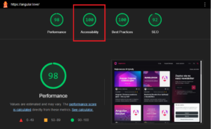
It’s important to verify on a regular basis that our app stays aligned with accessibility guidelines. To do so, we have several tools at our disposal, including
- Lighthouse (integrated into Chrome DevTools)
- Axe (available as a browser extension)
- Screen readers (such as NVDA or JAWS)
Summary
Making web applications accessible to users with disabilities is an extensive subject. Angular comes with a wealth of built-in features and methods to address this, eliminating the need for third-party libraries. Incorporating the tools and strategies discussed here into your development workflow enhances usability for individuals with impairments while also elevating the overall experience, creating interfaces that are more intuitive and convenient for all users.