TL;DR;
The Reasoning Behind a Theme Switch
Dark Mode may not be breaking news anymore, yet it remains a hugely popular addition across modern applications. A significant number of platforms now embrace it in the form of customizable themes.
And for good reason. Dark Mode reduces eye strain, lowers energy usage on certain displays, and tends to improve the overall experience, especially in dim environments. While it is perfectly fine to enable it in bright spaces, this mode feels most at home when the lights are low.
The UX angle here matters more than it might seem at first glance. Giving users the ability to adjust the visual character of an application, while keeping the underlying design language coherent, is generally a sound approach. Themes are the mechanism through which most applications achieve this.
There is one more avenue worth exploring, though it may strike some as a bit of a novelty. By toggling themes in response to the user's ambient light levels, you can push the experience of your web app even further. More on that later.
Among the sites I frequently visit, the Angular Material Site stands out for its theme handling. The toggle it provides in the header is quite effective.
The Theme Picker on the Angular Material Site
Our goal is to recreate a similar mechanism inside an Angular application. With that in mind, we can begin.
Getting Started with the Setup
To hit the ground running, there is a StackBlitz starter available to you, complete with Angular Material configured on it:
This is where we start.
From there, we need a few Angular Material components on screen so we have something tangible to interact with. I will be adding: a toolbar, an icon within it, a menu for selecting themes, plus a button.
As all of these Angular Material components will be used inside the AppModule, it is a good idea to put together a dedicated AppMaterialModule. This module will export everything Material-related that the app needs.
...
import { MatButtonModule } from "@angular/material/button";
import { MatIconModule } from "@angular/material/icon";
import { MatMenuModule } from "@angular/material/menu";
import { MatToolbarModule } from "@angular/material/toolbar";
...

@NgModule({
  exports: [
    MatButtonModule,
    MatIconModule,
    MatMenuModule,
    MatToolbarModule,
  ]
})
export class AppMaterialModule {}
**app-material.module.ts**
The AppMaterialModule then gets added to the imports array in the AppModule.
...
import { AppMaterialModule } from "./app-material.module";
...

@NgModule({
  imports: [
    ...
    AppMaterialModule,
    ...
  ],
  ...
})
export class AppModule {}
**app.module.ts**
This approach works for the current demo because every Angular Material component used in the app lives inside this one AppModule context. For larger applications, creating a common Material module and importing it everywhere is less ideal, since that forces each feature module to carry all those dependencies regardless of what it actually renders. Holding back from doing that helps avoid some unnecessary overhead.
With that, we have what we need to use the Angular Material components. The final visual target is straightforward: THIS
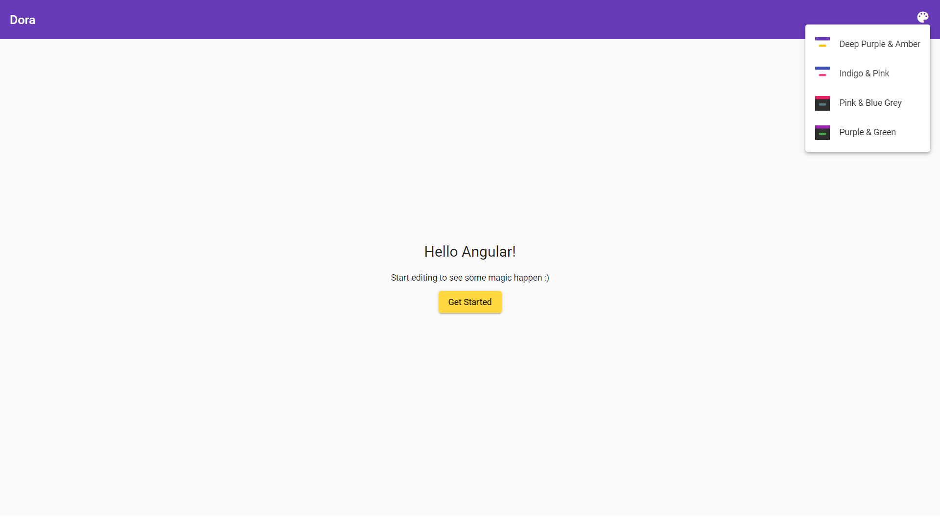
The UI that we're trying to build in this article
Looking at the image, we'll need a HeaderComponent, plus a MenuComponent that appears when the ? icon is clicked. The remaining part of the layout is already covered by our base StackBlitz project.
Building the HeaderComponent
I intend for this one to play the role of a smart component. For more background on dividing responsibilities between smart and dumb components, take a look at this video from Stephen Fluin.
The HeaderComponent needs to hand off a list of available theme options to the MenuComponent. Each entry will include styling values such as backgroundColor, buttonColor, and headingColor to draw each row; along with a visible label and a matching value.
Angular Material ships with 4 pre-built themes, listed at their theming documentation:
deeppurple-amber.cssindigo-pink.csspink-bluegrey.csspurple-green.css
With four items needed, hard-coding all of those values directly inside a component feels redundant. Putting those details into a JSON file inside the assets folder under the name options.json allows fetching them by pointing at the path /assets/options.json.
Here is what that file will contain:
[
  {
    "backgroundColor": "#fff",
    "buttonColor": "#ffc107",
    "headingColor": "#673ab7",
    "label": "Deep Purple & Amber",
    "value": "deeppurple-amber"
  },
  {
    "backgroundColor": "#fff",
    "buttonColor": "#ff4081",
    "headingColor": "#3f51b5",
    "label": "Indigo & Pink",
    "value": "indigo-pink"
  },
  {
    "backgroundColor": "#303030",
    "buttonColor": "#607d8b",
    "headingColor": "#e91e63",
    "label": "Pink & Blue Grey",
    "value": "pink-bluegrey"
  },
  {
    "backgroundColor": "#303030",
    "buttonColor": "#4caf50",
    "headingColor": "#9c27b0",
    "label": "Purple & Green",
    "value": "purple-green"
  }
]
**options.json**
If those options were exposed through some REST endpoint, we could then retrieve them inside the app through HttpClient. That is precisely what this article does. Alternatively, this could simply stay a static resource. For a static version, you could write import options from 'path-to-options.json' directly inside the HeaderComponent. In that case, it helps to enable resolveJsonModule and esModuleInterop under compilerOptions inside tsconfig.app.json or tsconfig.json. A similar sample can be found in this StackBlitz example if that approach appeals to you.
Now, with the rough shape of our option object in mind, an interface can be written for type safety. It can live in a file called option.model.ts:
export interface Option {
  backgroundColor: string;
  buttonColor: string;
  headingColor: string;
  label: string;
  value: string;
}
option.model.ts
At this point, the HeaderComponent ends up handling two tasks:
- Rendering the header, naturally.
- Fetching the list of options and forwarding them to the
MenuComponent.
Since actually swapping the theme is still on our list, it makes sense to centralize the entire theme-related logic in a single service named ThemeService. Let us set that up first:
import { Injectable } from "@angular/core";
import { HttpClient } from "@angular/common/http";
import { Observable } from "rxjs/Observable";

import { Option } from "./option.model";

@Injectable()
export class ThemeService {
  constructor(
    private http: HttpClient,
  ) {}

  getThemeOptions(): Observable<Array<Option>> {
    return this.http.get<Array<Option>>("assets/options.json");
  }

  setTheme(themeToSet) {
    // TODO(@SiddAjmera): Implement this later
  }
}
theme.service.ts
With the service done, the HeaderComponent can inject ThemeService as a dependency:
import { Component, OnInit } from "@angular/core";
import { Observable } from "rxjs/Observable";

import { Option } from "../option.model";
import { ThemeService } from "../theme.service";

@Component({
  selector: "app-header",
  templateUrl: "./header.component.html",
  styleUrls: ["./header.component.css"]
})
export class HeaderComponent implements OnInit  {
  options$: Observable<Array<Option>> = this.themeService.getThemeOptions();

  constructor(private readonly themeService: ThemeService) {}

  ngOnInit() {
    this.themeService.setTheme("deeppurple-amber");
  }

  themeChangeHandler(themeToSet) {
    this.themeService.setTheme(themeToSet);
  }
}
header.component.ts
As shown above, the HeaderComponent now owns the theme switching logic as well.
The markup for that component is:
<mat-toolbar color="primary">
  <mat-toolbar-row>
    <span>Dora</span>
    <span class="spacer"></span>
    <app-menu
      [options]="options$ | async"
      (themeChange)="themeChangeHandler($event)">
    </app-menu>
  </mat-toolbar-row>
</mat-toolbar>
**header.component.html**
Rather than subscribing to the options$ Observable inside the class, the template relies on the async pipe to handle the unwrapping. Relying on reactive patterns like this keeps the template in sync with the data source, which is what you want to aim for in Angular. Once the options arrive, they are bound to the MenuComponent's options @Input property.
Since the HeaderComponent is already in charge of the theme changing logic, the MenuComponent can happily stay a dumb/presentational component. This is what that looks like.
Setting up the MenuComponent
The MenuComponent accepts options through an @Input, iterates over them, and presents each option. There is also a themeChange @Output that notifies the parent with the new theme when the user makes a selection. That gives us a fairly clean class definition:
import { Component, EventEmitter, Input, Output } from "@angular/core";

import { Option } from "../option.model";
import { ThemeService } from "../theme.service";

@Component({
  selector: "app-menu",
  templateUrl: "./menu.component.html",
  styleUrls: ["./menu.component.css"]
})
export class MenuComponent {
  @Input() options: Array<Option>;
  @Output() themeChange: EventEmitter<string> = new EventEmitter<string>();

  constructor(private themeService: ThemeService) {}

  changeTheme(themeToSet) {
    this.themeChange.emit(themeToSet);
  }
}
menu.component.ts
And the template looks like so:
<mat-icon
  class="icon"
  [matMenuTriggerFor]="menu">
  palette
</mat-icon>
<mat-menu #menu="matMenu">
  <button
    *ngFor="let option of options"
    mat-menu-item
    (click)="changeTheme(option.value)">
    <mat-icon
      role="img"
      svgicon="theme-example"
      aria-hidden="true">
      <svg
        xmlns="http://www.w3.org/2000/svg"
        xmlns:xlink="http://www.w3.org/1999/xlink"
        width="100%"
        height="100%"
        viewBox="0 0 80 80"
        fit=""
        preserveAspectRatio="xMidYMid meet"
        focusable="false">
        <defs>
          <path
            d="M77.87 0C79.05 0 80 .95 80 2.13v75.74c0 1.17-.95 2.13-2.13 2.13H2.13C.96 80 0 79.04 0 77.87V2.13C0 .95.96 0 2.13 0h75.74z"
            id="a">
          </path>
          <path
            d="M54 40c3.32 0 6 2.69 6 6 0 1.2 0-1.2 0 0 0 3.31-2.68 6-6 6H26c-3.31 0-6-2.69-6-6 0-1.2 0 1.2 0 0 0-3.31 2.69-6 6-6h28z"
            id="b">
          </path>
          <path d="M0 0h80v17.24H0V0z" id="c"></path>
        </defs>
        <use xlink:href="#a" [attr.fill]="option.backgroundColor"></use>
        <use xlink:href="#b" [attr.fill]="option.buttonColor"></use>
        <use xlink:href="#c" [attr.fill]="option.headingColor"></use>
      </svg>
    </mat-icon>
    <span>{{ option.label }}</span>
  </button>
</mat-menu>
menu.component.html
With this setup in place, the remaining job is what actually switches the theme. Where should we look for that?
How to Implement the Theme Switching Logic
No doubt there are various routes to reach the same outcome. The Angular Material website already tackled this use case, and its code base happens to be open-source. That gives us a practical option: avoid re-inventing the wheel and see how the Angular Material docs app dealt with it.
Inside the Angular Material Website
In the actual implementation, the relevant piece is a ThemePicker. That component renders in the header area, top-right.
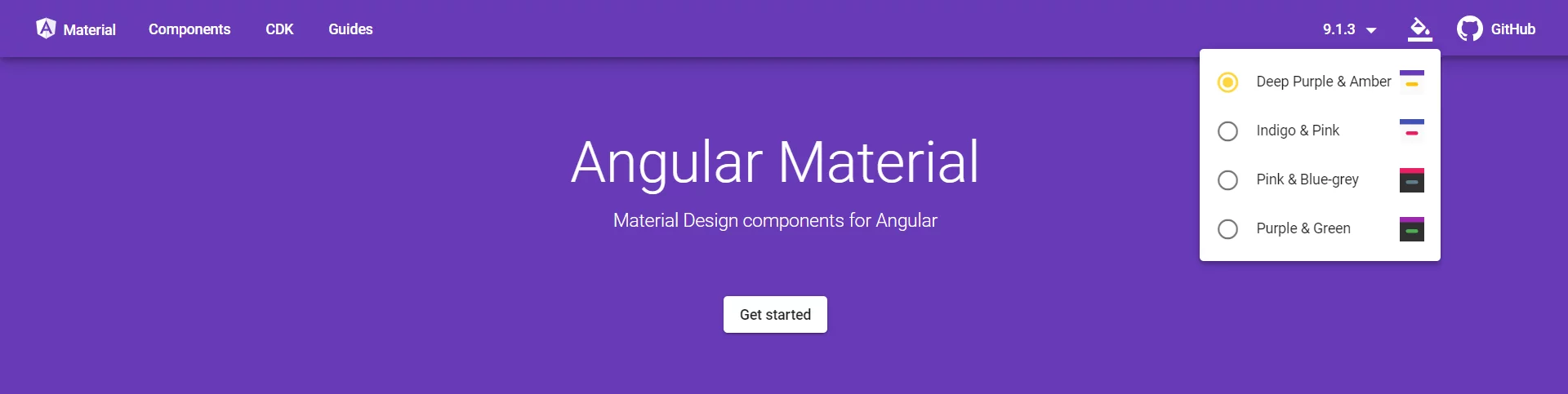
The Theme Picker on the Angular Material Site
As its name suggests, the ThemePicker is what toggles the site's theme. Internally, it talks to a service named StyleManager.
What actually goes on inside that service? When you pick a new theme via the ThemePicker, it:
- Looks for an existing
linkelement in the document whoseclassattribute holds the valuestyle-manager-theme. - When missing, it creates such a
linktag, places it in the document head, and assigns the chosen theme path to itshrefattribute. - When found, it simply updates that same
hrefattribute to the newly selected theme path.
Once we know how the StyleManager works, using it in our project is straightforward. Injecting it into our ThemeService and calling setStyle with the right arguments should be enough.
Let's try that.
Our Version
First, copy the style-manager.ts into a file named style-manager.service.ts:
/**
 * Copied from https://github.com/angular/material.angular.io/blob/master/src/app/shared/style-manager/style-manager.ts
 * TODO(@SiddAjmera): Give proper attribution here
 */

import { Injectable } from "@angular/core";

@Injectable()
export class StyleManagerService {
  constructor() {}

  /**
   * Set the stylesheet with the specified key.
   */
  setStyle(key: string, href: string) {
    getLinkElementForKey(key).setAttribute("href", href);
  }

  /**
   * Remove the stylesheet with the specified key.
   */
  removeStyle(key: string) {
    const existingLinkElement = getExistingLinkElementByKey(key);
    if (existingLinkElement) {
      document.head.removeChild(existingLinkElement);
    }
  }
}

function getLinkElementForKey(key: string) {
  return getExistingLinkElementByKey(key) || createLinkElementWithKey(key);
}

function getExistingLinkElementByKey(key: string) {
  return document.head.querySelector(
    `link[rel="stylesheet"].${getClassNameForKey(key)}`
  );
}

function createLinkElementWithKey(key: string) {
  const linkEl = document.createElement("link");
  linkEl.setAttribute("rel", "stylesheet");
  linkEl.classList.add(getClassNameForKey(key));
  document.head.appendChild(linkEl);
  return linkEl;
}

function getClassNameForKey(key: string) {
  return `app-${key}`;
}
style-manager.service.ts
With that available to us, our ThemeService can take it as a dependency and use it in the setTheme method:
...
import { StyleManagerService } from "./style-manager.service";

@Injectable()
export class ThemeService {
  constructor(
    ...
    private styleManager: StyleManagerService
  ) {}

  ...

  setTheme(themeToSet) {
    this.styleManager.setStyle(
      "theme",
      `node_modules/@angular/material/prebuilt-themes/${themeToSet}.css`
    );
  }
}
theme.service.ts
The only thing happening here is a call to setStyle from the StyleManagerService, passing both the style key (theme) and the desired href value.
The setStyle logic conditionally creates a new link element, configures its href, then adds it to the document; or, if that element exists, just updates its href.
With all that in place, that is essentially it. Here is the finished version of everything combined.
Final Solution
There you have it: a theme switch that behaves like the one seen on the Angular Material site, all functioning as expected.
What’s Next?
All of this is wonderful—but imagine how much better it would be if the app could react to the lighting around the user and flip themes on its own. That’s precisely the challenge we’ll tackle in the upcoming follow-up. Find the full guide here.
A big thank-you goes out to Martina Kraus and Rajat Badjatya, who took the time to review the draft and offered all the helpful suggestions that made this piece sharper. If you picked up a new Angular trick here, feel free to share it with your friends who are just starting with Angular and hoping to build something similar.
This piece was originally written by me for the Angular Publication on DEV.TO