
Understanding the different approaches to disabling controls in reactive forms
Disabling parts of a form is something every large-scale application eventually needs. There are scenarios where access must be restricted based on user permissions, or where a field is pre-filled and shouldn't be modified by the user.
This article looks at how different disabling techniques for reactive form controls influence the form's overall state, and why that matters for your application state. The examples below use a basic form with two inputs and a submit button to demonstrate each approach.
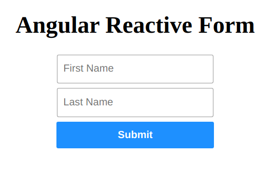
The form is set up in the component code as shown here:
The component class for the form
@Component({
  selector: 'app-root',
  templateUrl: './app.component.html',
  styleUrls: ['./app.component.scss']
})
export class AppComponent implements OnInit {
  form: FormGroup;

  constructor(private formBuilder: FormBuilder) { }

  ngOnInit(): void {
    this.form = this.formBuilder.group({
      firstName: [{ value: 'Foo', disabled: true }, [Validators.required]],
      lastName: ['Bar']
    });
  }

  onSubmit(): void { }

  get firstName(): FormControl {
    return this.form.controls.firstName as FormControl;
  }

  get lastName(): FormControl {
    return this.form.controls.lastName as FormControl;
  }
}
Note: the component class exposes getter methods for both form controls to make them easier to reference throughout the code.
The form's template
<form [formGroup]="form">
 <h1>Angular Reactive Form</h1>
 <input formControlName="firstName" placeholder="First Name" />
 <input formControlName="lastName" placeholder="Last Name" />
 <button (click)="onSubmit()">Submit</button>
</form>
The template relies on the formGroup and formControlName directives from the Reactive Forms API.
Disabling a control with the disable() method
This approach deactivates both the UI element and the underlying FormControl instance. To apply it, call the method inside ngOnInit after the form has been constructed. Here’s how to disable the lastName field:
  ngOnInit(): void {
    this.form = this.formBuilder.group({
      firstName: [{ value: 'Foo', disabled: true }, [Validators.required]],
      lastName: ['Bar']
    });

    this.lastName.disable();
  }
If you inspect the lastName control via console.log, you’ll see its instance is now marked as disabled.
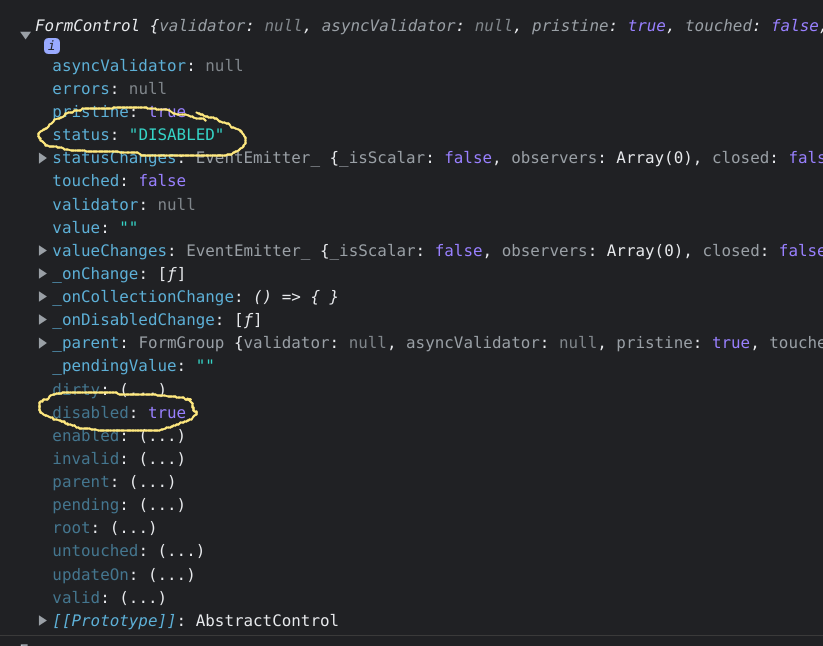
The log output above shows which properties change when a control is disabled.
This is a simple, direct way to get the job done.
When does this method become problematic?
It becomes a challenge when you rely on a FormGroup's validity to trigger certain actions. To illustrate, let's modify the ngOnInit method to include logging:
  ngOnInit(): void {
    this.form = this.formBuilder.group({
      firstName: [{ value: 'Foo', disabled: true }, [Validators.required]],
      lastName: ['Bar']
    });

    this.lastName.disable();

    console.log(this.lastName);
    console.log('Form:::', this.form);
  }
In this version, defaults are set, both controls are disabled, and the firstName control has a required validator. Notice that the firstName field is disabled right from the start.
The output from that last console.log is shown below:
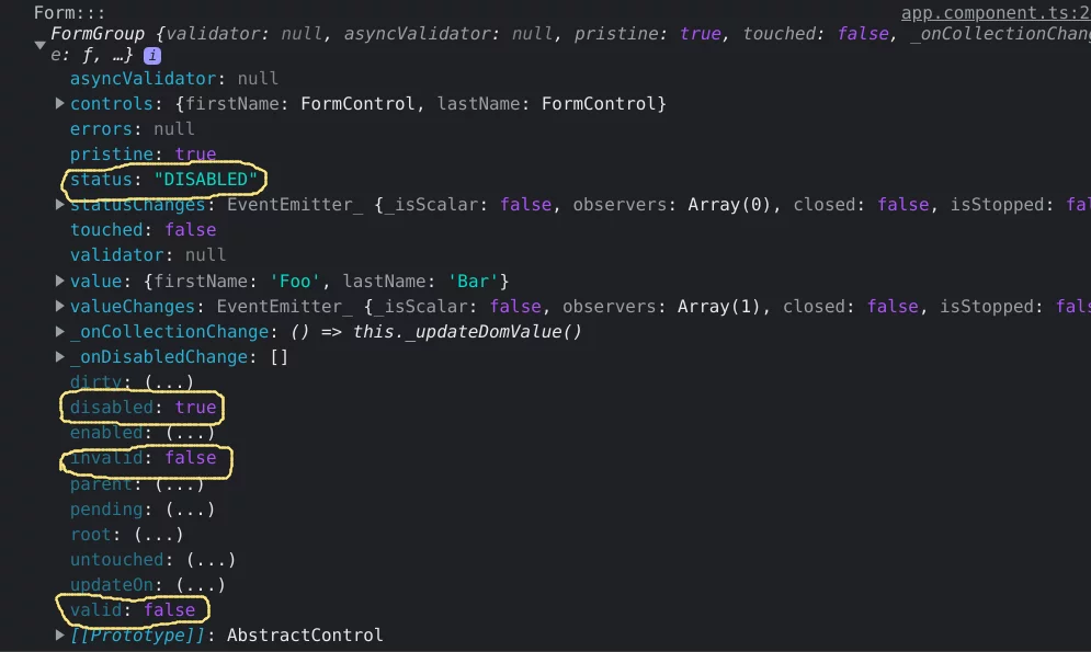
The above output demonstrates how disabling all controls affects the form's overall status and validity flags.
One key detail: when every control in a group is disabled, the group’s status is "DISABLED", regardless of each control’s validity. Also, observe that the form’s valid and invalid properties are both false in this state, even though the controls have values and would normally be considered valid. This disconnect can cause confusion if you use the form’s validity to drive logic elsewhere.
Consider a larger form where particular fields are purposely disabled. For example, imagine a second page that shows the user’s first and last name from an earlier step. Those fields would be pre-filled and disabled. Now, suppose you want to sync the form’s value to a state store whenever it changes and is valid.
If something external updates one of those disabled fields, and you have a listener on value changes:
   this.form.valueChanges
     .pipe(
       distinctUntilChanged()
     )
     .subscribe(
       (status) => {
         if (this.form.status === 'VALID') {// `this.form.status` is "DISABLED"
           // set some state value
         }
       }
     );

   this.lastName.setValue('Baz');
We subscribe to the form's value changes and then modify the lastName control.
The value will not be propagated to the state store. When the subscription fires, the form’s status is "DISABLED", even though the value itself is perfectly valid. This mismatch can lead to subtle bugs, especially if other parts of the app rely on that store.
This is a notable drawback of this particular disabling technique.
Closely related is the method used to disable the firstName control directly in the form configuration:
    this.form = this.formBuilder.group({
      firstName: [{ value: 'Foo', disabled: true }, [Validators.required]],
      lastName: ['Bar']
    });
This behaves identically to calling the .disable() method on the control.
Disabling controls with a template attribute
Alternatively, you can add a disabled=true attribute directly in the HTML template:
<form [formGroup]="form">
 <h1>Angular Reactive Form</h1>
 <input formControlName="firstName" placeholder="First Name">
 <input formControlName="lastName" disabled="true" placeholder="Last Name">
 <button (click)="onSubmit()">Submit</button>
</form>
This, however, produces the following warning:
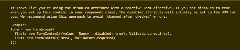
This warning is a heads-up about potential "changed after checked" errors. If you were to bind a dynamic value, like [disabled]="isDisabled", the model could differ between the initial check and the verification phase of change detection, leading to that error.
For more details on this, check this deep dive into the ExpressionChangedAfterItHasBeenCheckedError.
To avoid this warning entirely, you can use the [attr.*] binding instead:
<form [formGroup]="form">
 <h1>Angular Reactive Form</h1>
 <input formControlName="firstName" placeholder="First Name">
 <input formControlName="lastName" [attr.disabled]="true" placeholder="Last Name">
 <button (click)="onSubmit()">Submit</button>
</form>
No warning appears here, but there’s a nuance: the HTML disabled attribute is purely Boolean. Setting it to false still results in a disabled field. You can only re-enable it by setting the value to null or undefined, or by removing the attribute entirely.
The key difference is that with these template approaches, the form control itself remains enabled in the reactive forms model. The form’s overall status stays VALID, which neatly avoids the state-syncing problem mentioned earlier.
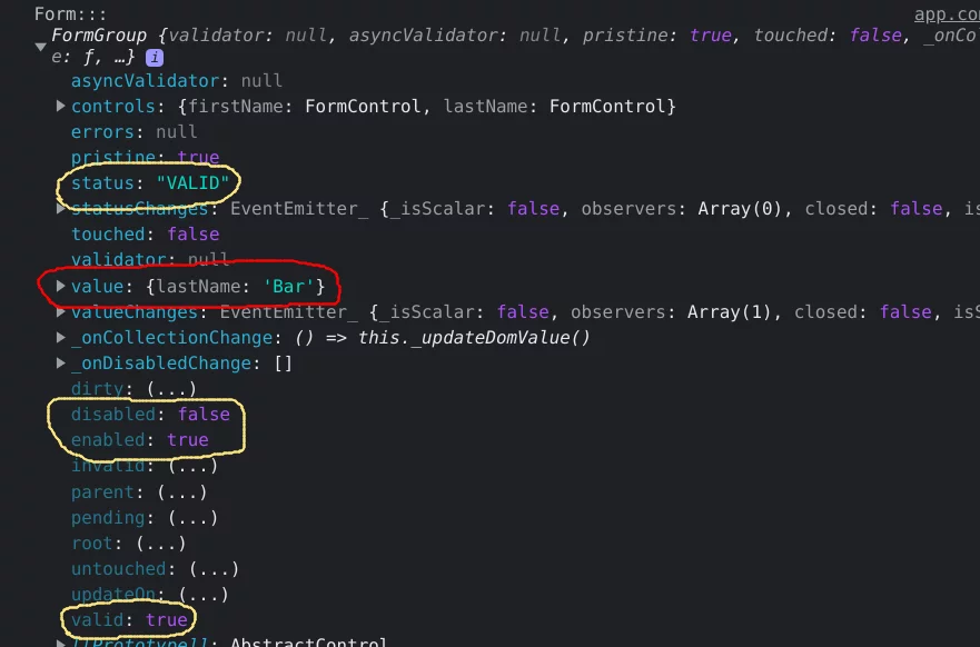
Notice here that the firstName field is omitted entirely from the form’s value.
That omission happens because the control is disabled at the instance level. This is true whether it’s done with disable() or at form creation. When some controls are disabled this way and others are not, the form’s value will be incomplete.
To get the full value including disabled controls, you can use the getRawValue() method:
this.form.getRawValue()
console.log(this.form.value);
console.log(this.form.getRawValue());

// The logs will have

The comparison above shows the difference between .value and .getRawValue().
The template-based approach keeps the form’s UI and its model value in sync, without altering the underlying control instances.
An additional option is to use the readonly attribute, which is similar but visually distinct:
<form [formGroup]="form">
 <h1>Angular Reactive Form</h1>
 <input formControlName="firstName" placeholder="First Name">
 <input formControlName="lastName" readonly="true" placeholder="Last Name">
 <button (click)="onSubmit()">Submit</button>
</form>
This disables user input but does not apply the usual "dimmed" styling of a disabled field. To make it look properly read-only, you can add custom styles:
input {
   margin-bottom: 8px;
   width: 250px;
   height: 45px;
   border-radius: 3px;
   padding-left: 10px;
   border: 1px solid rgba(0, 0, 0, 0.4);

   &:read-only {
     color: rgb(84, 84, 84);
     cursor: default;
     background-color: rgba(239, 239, 239, 0.3);

     &:focus {
       outline: none;
     }
   }
 }
These are the main distinctions I’ve encountered when dealing with disabled form controls.
Wrapping up
To summarize, there are three primary ways to disable reactive form controls:
- Calling the control’s
disable()method - Declaring the control as disabled in its configuration
- Using template attributes like disabled or readonly
The first two options will change the form’s overall status, which can have unintended consequences if you sync the form state to your application's state. Choosing the right approach for your specific needs can save you from future headaches and flexibility issues.
The source code for this project is available on GitHub.