
The size of your application bundle has a direct impact on the user experience. The vast ecosystem of npm libraries makes it incredibly easy to unknowingly degrade performance by adding unnecessary weight. This article looks at why bundle size matters, how to measure it correctly, and practical strategies for keeping it in check.
Defining Bundle Size
The bundle size is the aggregate compiled footprint of your application's code. This includes Angular components, styling, libraries, and dependencies—everything contributes to the final weight. As features accumulate, the bundle grows proportionally, eventually reaching a point where optimization becomes necessary.
The Importance of Keeping It Lean
Shrinking your bundle directly translates to a reduction in loading time. The lighter the application, the quicker it responds. This factor is critical for landing pages, online stores, and any site where first impressions count. Search engine rankings are also influenced by performance metrics.
The business side of this equation is compelling. Research from Google shows a 32% rise in bounce probability when load time escalates from 1 second to 3 seconds. The BBC similarly found that for each extra second of loading, user departure increases by 10%.
The takeaway is straightforward: a optimized bundle is a key factor in keeping users engaged, particularly for those on slower connections.

How to Analyze the Bundle Size?
To examine your bundle, you can rely on bundle size analyzers. These are tools that produce reports or charts, effectively breaking down the size contribution of each file in your project.
Several analyzers are available:
Lighthouse Treemap (for Development)
Browsers based on Chromium come with this integrated tool. Lighthouse Treemap is intuitive and doesn't require adding any external dependencies. Its standout feature is identifying the amount of JavaScript that is never executed. This makes it particularly effective for evaluating the initial bundle while working on the development server.
webpack-bundle-analyzer (for Production)
This is an npm package which visualizes your webpack bundle as an interactive, zoom-able treemap. I've listed it here mainly to highlight its limitations for Angular projects. While widely used, it comes with certain costs: it can slow down the build process, require a more involved setup, and isn't always completely precise. For a detailed look at its accuracy issues, I suggest checking out a tweet by Minko Gechev—the Angular tech lead—or the relevant GitHub issue.
source-map-explorer (for Production)
This npm tool, source-map-explorer calculates bundle size by using source maps, connecting the minified output back to the original source files. In my view, it's the optimal choice for Angular applications.
Live Coding Demonstration
For this session, we will construct a basic application that uses the Angular Font Awesome icon library and then check its bundle with source-map-explorer. The task starts simple, but the nuances become apparent as we progress.
Initial Setup
Start by creating a fresh application with Angular CLI version 17.2.0:
ng new Playground --standalone --style=scss --ssr=false --routing=falseOpen the project in any IDE, clear out app.component.html, and then delete the title property from app.component.ts.
Integrating source-map-explorer
Since we're targeting production builds, we need to add a bespoke configuration to angular.json to ensure source-map-explorer operates correctly.
To get a comprehensive treemap, these Angular build options are required:
-
- Source Maps — This creates source maps for both scripts and styles, giving every JavaScript file a matching .js.map file. For instance, main.js will have main.js.map alongside it. The Angular docs provide more details on this.
- Output Hashing — This controls the file name caching strategy. Setting it to "none" removes the hash suffixes, so you'll see main.js instead of something like main-5R55YYTO.js in the finished build.
- Named Chunks — This keeps meaningful names for async loaded modules. With this set to true, a lazy-loaded route will produce a file named feature-file-3DXD2T2D.js rather than a non-descriptive chunk-Q6M2GG4B.js. This becomes very useful when inspecting apps with lazy loading.
Let's add a custom configuration block to our application in angular.json based on these criteria:
"configurations": {
 "production": { ... },
 "analyze-bundle": {
   "sourceMap": true,
   "outputHashing": "none",
   "namedChunks": true
 },
 "development": { ... }
},
With the build configured, we can now install the source-map-explorer package as a devDependency:
npm i -D source-map-explorerAt this point, running the source-map-explorer command will yield the analysis. Check the official docs for all its command options.
Adding a dedicated script in your npm package configuration for such commands is a wise practice for a few reasons:
- It makes the command visible to any other developer who opens package.json.
- There's no need to recall the exact syntax.
- It enables running the tool from the IDE's GUI or CLI without extra arguments.
Let's create an analyze-bundle script in package.json:
"scripts": {
 "analyze-bundle": "ng build --configuration=analyze-bundle && source-map-explorer dist/**/*.js --no-border-checks"
},
Now, execute the script to see the output:
npm run analyze-bundleIf you see Unable to map X/X bytes (X%) notices, don't worry as long as they represent less than 5% of the file. Once it completes, a visualization of the application will open in your default web browser.

Interpreting the Treemap
Reading this could not be easier. Use the dropdown in the top-left corner to switch between different files in the build. For a basic app, you are presented with these two options:
- main.js — this houses your application's initial bundle.
- polifills.js — this contains code that guarantees consistent behavior across a range of older browsers.
Once you introduce lazy-loading or @defer blocks, additional files will show up here. The main visualization consists of black-outlined rectangles, each providing two vital pieces of data:
- The component name — either a file or folder (for example, node_modules, main.js, or core.mjs).
- The space it occupies — expressed in KB as well as a percentage of the currently selected file or the overall bundle.
Click any rectangle to drill down into its own children. This is immensely helpful when digging through dependencies in substantial projects. As a rule of thumb, a larger rectangle means a greater share of your bundle size.
Let's move from theory to practice. Our fresh app has an initial main bundle size of 77.43KB. Keep this number handy, as we'll compare it later.
Modifying the Project — Adding an External Library
Right now, the @fortawesome/angular-fontawesome package is a perfect case study on why you must inspect the bundle after adding any dependency. Despite having over ~200k weekly downloads, it can lead to surprising bloat, as we are about to see.
Let's return to the project and add the fortawesome packages:
ng add @fortawesome/angular-fontawesome@0.14.1
When prompted to select icon packs, opt for:
- Font Awesome 6
- Free Solid Icons
The application is now ready to use the <fa-icon/> component. Begin by adding FaIconComponent to the imports array in your module or component. Then, bring in the faClose icon and attach it to a public property in the AppComponent. A key point here is that icons may be imported from either barrel files or specific paths:
- @fortawesome/free-solid-svg-icons
- @fortawesome/free-solid-svg-icons/faClose — we'll use this specific import type to start
app.component.ts:
import { Component } from '@angular/core';
import { faClose } from "@fortawesome/free-solid-svg-icons/faClose";
import { FaIconComponent } from "./fa-icon/fa-icon.component";


@Component({
 selector: 'app-root',
 standalone: true,
 imports: [FaIconComponent],
 templateUrl: './app.component.html',
 styleUrl: './app.component.scss'
})
export class AppComponent {
 protected readonly faClose = faClose;
}
Finally, place the <fa-icon/> into the component's HTML template.
app.component.html:
<fa-icon [icon]="faClose" />Bundle Size Review After the Addition
It's time to see how this impacts the numbers. Re-run the analyze-bundle command:
npm run analyze-bundleA treemap will appear again, though initially it may not show any highlighting. (Make sure main.js is the file you are inspecting).
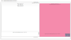
The outcome is stark: our bundle has increased by nearly 95KB from the baseline. I've highlighted the newly added sections in magenta and purple to make them obvious. It is clear that we've accepted a lot of unnecessary weight.
This demonstration, while miniature compared to real production software, effectively illustrates how package choices can affect performance. In real life, you'll juggle dozens of libraries, but the core strategy is unchanged: locate the largest segments of your bundle and scrutinize whether they are justified.
As part of this audit, it is wise to keep notes. Documentation helps you formulate a clear set of prioritized action items. Which is a perfect segue into our next section…
Strategies for Shrinking Your Bundle
You have a number of options at your disposal for trimming down the size of your bundle:
- Lazy-load modules and components that aren't necessary for the initial render
- Leverage the @defer block syntax within your templates. (Be aware of its implications for SEO)
- Employ TypeScript's dynamic import expressions for on-demand code loading. This is a frequent pattern, especially when dealing with modal dialogs.
- Swap out external libraries for your own lightweight, custom-built solutions.
- Move styles out of the global stylesheet (styles.scss) and into individual component files.
- Adopt standalone components or the SCAM pattern (if you're on Angular versions before 14.0.0) to fully benefit from tree-shaking, effectively dropping unused parts of your codebase.
- Eliminate all dead code—this includes unused services, directives, pipes, and modules. Also, audit and remove any dependencies or libraries you no longer need.

Optimizing Our Application's Bundle
Let's revisit the file size analysis of our app. The introduction of the Font Awesome library tacked on 82.95KB to our initial bundle. This pushes our app's total weight to 160.38KB — which is nearly the same as the core Angular bundle itself!
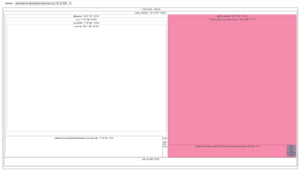
Our first optimization is a straightforward one. If you look at the purple sections in the treemap, you'll notice that importing the faClose icon also dragged in the faXMark icon, despite never using it. We can fix this by changing our import statement from:
import { faClose } from "@fortawesome/free-solid-svg-icons/faClose";to:
import { faClose } from "@fortawesome/free-solid-svg-icons";Re-run the analyze-bundle script to see the difference.
The result is a 1.12KB slimmer bundle – our main.js file went from 160.38KB down to 159.26KB. It's a step in the right direction, but it's hardly a game-changer in terms of performance.
Let's dig a bit deeper and take a closer look at the fontawesome-svg-core/index.mjs section. This is a heavy hitter, contributing a whopping 60.03KB to our bundle! My suspicion is that the Font Awesome component includes a lot of functionality we don't actually utilize, leading to unnecessary bloat.
Digging into the GitHub repository and the official documentation, it's obvious that there's a lot more to this library than what we're using. We essentially have two paths forward: we could hold out for the Font Awesome team to make their package more tree-shakable, or we could explore alternative strategies.
Looking back at our list of optimization strategies, a couple of avenues seem promising for cutting down the initial bundle:
- Utilize the @defer block to lazy-load our components. We'll skip this, as it could harm SEO and doesn't tackle the underlying issue — the heavy component will still be downloaded, just at a later time.
- Create a bespoke fa-icon component that mimics the API of the Font Awesome library. It's a more difficult path, but it feels like the right call. It was enough of a challenge that I took it on.
Building Our Own Font Awesome Component
Even though creating your own components gives you better long-term control and performance, it's not without its hurdles. One major consideration is accessibility—things like keyboard controls, ARIA labels, localization, and setting up test harnesses. You'll likely spend a lot of time combing through docs, source code, and issue trackers. Because of this, tailoring an external component to your exact needs can eat up a lot of time.
So, I won't walk you through every step of my research on Font Awesome. The goal here is to show you what's achievable when you're serious about slimming down your bundle.
To begin, we'll generate a new component:
ng g faIcon --inline-style --inline-template --skip-testsNext, update the fa-icon.component.ts file with the following code:
`fa-icon.component.ts`
import { Component, computed, inject, input, ViewEncapsulation } from '@angular/core';
import { IconDefinition } from "@fortawesome/free-solid-svg-icons";
import { DomSanitizer, SafeHtml } from "@angular/platform-browser";


/**
* Code based on https://github.com/FortAwesome/react-fontawesome/issues/232#issuecomment-1158654385
*/
@Component({
 selector: 'app-fa-icon',
 standalone: true,
 template: ``,
 host: {
   '[innerHTML]': 'iconHtml()',
 },
 styles: `
   .svg-inline--fa {
     display: inline-block;
     height: 1em;
     overflow: visible;
     vertical-align: -0.125em;
   }
 `,
 encapsulation: ViewEncapsulation.None
})
export class FaIconComponent {
 icon = input.required<IconDefinition>()
 iconHtml = computed(() => this._createIconHtml(this.icon()))


 private readonly _sanitizer = inject(DomSanitizer);


 private _createIconHtml(faIcon: IconDefinition): SafeHtml {
   const [width, height, , , svgPathData] = faIcon.icon;


   const iconHtml = `
  <svg aria-hidden="true" focusable="false" class="svg-inline--fa" viewBox="0 0 ${width} ${height}" xmlns="http://www.w3.org/2000/svg" role="img">
     <path fill="currentColor" d="${svgPathData}" />
   </svg>`


   return this._sanitizer.bypassSecurityTrustHtml(iconHtml);
 }
}
Let's break down what this code does:
- The essential part is the icon input. It's defined as an IconDefinition, a type we get from the font-awesome package.
- We derive an iconHtml signal from that input. This signal uses the _createIconHtml method to turn the provided icon definition into an actual SVG string.
- Finally, we bind this sanitized HTML to the [innerHTML] property on the host element, along with some basic styling.
The rendering logic here is surprisingly simple, isn't it? Now, let's see how we can integrate this custom component elsewhere in the app. Let's make use of it!
`app.component.ts`
import { Component } from '@angular/core';
import { faClose } from "@fortawesome/free-solid-svg-icons/faClose";
import { FaIconComponent } from "./fa-icon/fa-icon.component";


@Component({
 selector: 'app-root',
 standalone: true,
 imports: [FaIconComponent],
 templateUrl: './app.component.html',
 styleUrl: './app.component.scss'
})
export class AppComponent {
 protected readonly faClose = faClose;
}
`app.component.html`
<app-fa-icon [icon]="faClose" />
From a usage standpoint, our custom component is nearly indistinguishable from the official one! If we wanted, we could even tweak the selector to match the original fa-icon.
Is this the perfect solution for you? Well, it depends on your needs. But if you don't rely on the extra features of the full component (I have to admit, I never have) or the utility classes it provides (say, if you're using Tailwind), this lightweight approach seems like a great fit.
So, did we hit our optimization target? Let's fire up the analyze-bundle script again and check the results. (Be sure to select main.js)
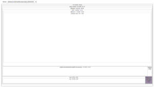
The numbers are in, and they're impressive. We've cut the bundle size dramatically from 158.27KB to 94.64KB. That's a huge win (we'll see the full progression in a chart shortly). While it looks simple on paper, know that this process could realistically take days or even weeks of dedicated research and development to replicate in a real-world scenario.
Disclaimer:
You'll notice our new custom “fa-icon” component isn't visible in the treemap visualization. That's simply because its footprint is too small to register on the chart. For larger components, you would see them inside the /src section.
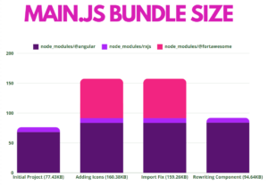
To wrap things up, let's examine the overall impact on the main.js bundle. I've put together a chart that maps the results of each optimization step:
- (1) Initial Project – This is the baseline size right after scaffolding a new Angular application.
- (2) Adding Icons – This shows the bundle size right after we installed and started using the @fortawesome/angular-fontawesome library. You can see a dramatic jump here.
- (3) Import Fix – This measurement comes after correcting our icon import. We saw a slight reduction, but nothing that would meaningfully change the user experience.
- (4) Rewriting Component – This is the final measurement after building our custom fa-icon. This is where we saw major results, as the @fortawesome package vanished from the treemap entirely—the generated SVG icon code carries almost no weight at all.
As we've seen, your initial bundle size is a critical performance indicator for your application. Utilizing bundle analyzers can help you keep tabs on size for both dev and production builds. It's a smart habit to check the bundle size regularly, and especially after integrating any new libraries. This simple routine can help you avoid major performance headaches later on. You might also look into configuring budgets for both your initial bundle and your component styles, which is a great way to enforce performance standards as your project evolves.