
Generic-minded components
Building a reusable component library puts API design front and center. You want something clean and dependable, but you also have to accommodate a wide range of use cases. It’s not just about handling different data shapes—your components also need to adapt visually. Updates and distribution across projects should be straightforward as well.
These components need to be more customizable than most. The customization process itself must stay simple, since both seasoned developers and newcomers will interact with it. And because the whole point of such a library is to avoid duplicating code, configuration should never turn into a copy-paste routine.
Imagine you are building a drop-down menu button. What should its API look like? At minimum, it would take a list of items for the menu. Chances are you’d start with an interface like this:
interface MenuItem {
    readonly text: string;
    readonly onClick(): void;
}
Soon enough you’d add a way to disable items. Then the design team would request menu icons. Next, they’d want the icons on the opposite side for another project. The interface keeps absorbing more cases, and before long your component becomes a committee meeting with too many members.

Look familiar?
A generic approach solves this. If the component is built without any dependency on the shape of the data, the problem disappears. Instead of directly invoking item.onClick, the component could simply emit the clicked item. It would then be up to whoever uses the component to decide what to do next. They can still call item.onClick internally, or structure their model any way they prefer.
For disabled state, the component can rely on a handler. That handler is a function which takes a generic item as input and returns whether the item is disabled. We’ll come back to visual flexibility later.
For a ComboBox, one common design is an interface with a string used for display and another property holding the actual value. That sounds reasonable at first, especially since you need to filter options based on the text typed by the user.
interface ComboBoxItem {
    readonly text: string;
    readonly value: any;
}
But you’ll quickly hit its limits when a design arrives where plain text doesn’t cut it. Also, forms typically wrap the value in a container object, and filtering isn’t always a string-based operation. You might filter contacts by phone number while displaying their names. And every new component like this tends to spawn yet another interface, even when the underlying data is the same.
Generics work here too: pass a stringify function to the component—something like (item: T) => string. A simple String(item) can serve as the default. That way, you can even use class instances as options, provided they implement toString. As noted, text is not always the right basis for filtering. That’s another spot where handlers shine—you can supply a custom matching function to the ComboBox. It compares the user input with an item and returns true if the item is a match.
Another place where interfaces tend to appear is unique id handling. You might receive the selected value in one request, and the list of options in another. The reference you receive won’t match the one in the list. Rather than forcing an id field, you could use an equality function. It takes two items and decides if they are the same, with the default being the standard triple
=comparison.
Many components—tabs, radio groups, lists of various kinds—don’t actually need to understand the data they render. Abstracting over the data makes the code more extensible and decoupled from a concrete model. Adding new features becomes non-breaking. Consumers won’t need to reshape their data, and components end up fitting together like building blocks.
The same option component could be used in a context menu, a Select, or a MultiSelect. Simple building blocks assemble into bigger, more complex structures. But generic data still has to be rendered somehow, and that’s where avatars, colors, counters, and all sorts of visual flourishes come in.
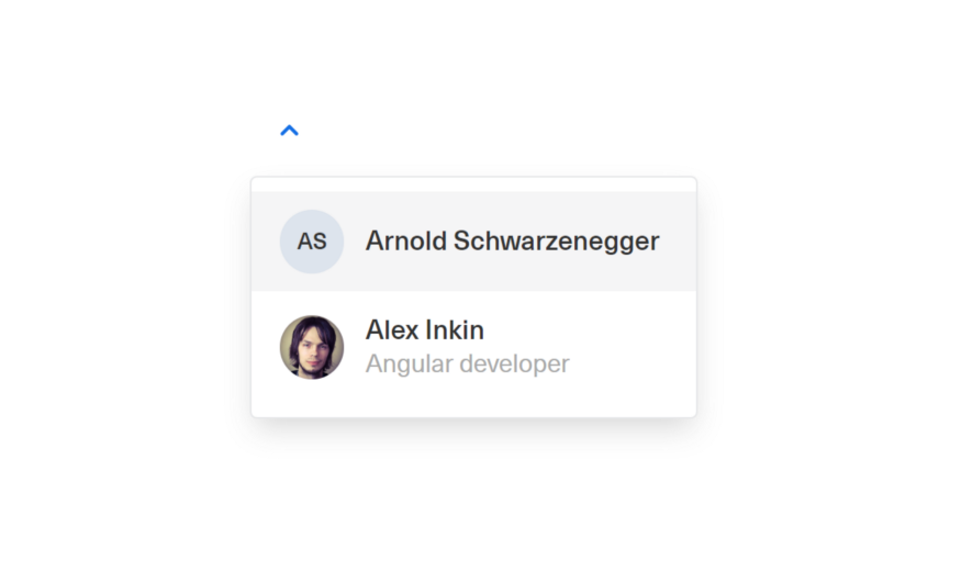
Example drop-down with custom design
To support this, we need to treat presentation with the same level of abstraction as we do the data.
Presentation-agnostic components
Angular offers robust facilities for controlling appearance. Let’s stick with ComboBox as the example, since its visual variants are so broad. There will, of course, be some built-in constraints. The component still needs to follow a certain design language—dimensions, base colors, and spacing should not all be delegated to the consumer.
You put water in a cup, it becomes the cup.
You put water in a bottle, it becomes the bottle.
You put water in a teapot, it becomes the teapot.

Bruce Lee
Generic data behaves much like that—shapeless yet adaptable. Our goal is to let users pour it into a container of their choosing. In practice, building a presentation-agnostic component looks like this:
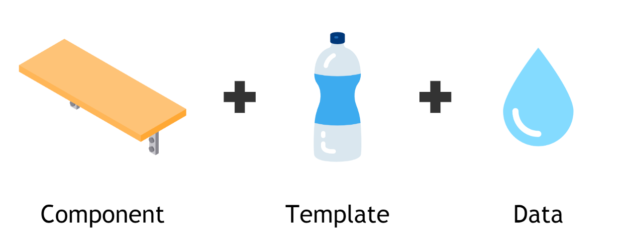
Think of the component as a shelf with fixed dimensions; the user supplies the decorative box that goes on it. A basic text representation is built in by default. For more involved designs, the user can supply a custom template that matches their own model.
Let’s take a look at Angular’s toolbox for customization:
String interpolation
The most basic tool is textual interpolation. If the menu component just receives a string, it won’t do much for rendering option labels. A raw string brings no context with it. It can, however, serve well for phrases like “Nothing is found” when the list is empty.
<div>{{content}}</div>
Function interpolation
Earlier we touched on string representation. The result is still a string, but it is derived from the input value. Context here means the actual list item. This approach introduces dynamics, but it stops short of injecting raw HTML. It also can’t include directives or child components.
<div>{{content(context)}}</div>
Templates
For reusable HTML fragments, Angular provides ng-template. Using it, we can define a block of markup that anticipates some input data and pass that block to a component. Inside, the component instantiates it with real context. We’ll work with the item without prior knowledge of its type. Crafting the right template is the responsibility of the developer consuming the component.
<ng-container
    [ngTemplateOutlet]="content"
    [ngTemplateOutletContext]="context"
></ng-container>
Templates are quite effective, but they must be declared inside an existing component. That limits how easily they can be reused. The same design often has to appear in multiple places across an app, or even across several applications. In my case, an account selection control is a good example:
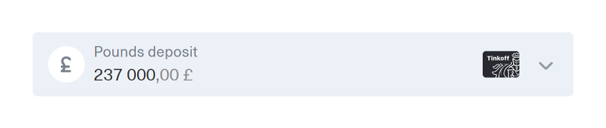
Account selection component
Know more about ngTemplateOutlet
Components
The most advanced way to modify the view is through dynamic components. Angular has had a declarative directive for this—*ngComponentOutlet—for some time. It doesn’t provide context directly, but dependency injection steps in. Define a token for the context, then include it in the Injector that creates the component.
<ng-container
    [ngComponentOutlet]="content"
    [ngComponentOutletInjector]="injector"
></ng-container>
It’s worth noting that the context doesn’t have to be limited to the element being displayed. It can also capture the state we are rendering under:
<ng-template let-item let-focused="focused">
    <!-- ... -->
</ng-template>
For instance, account select changes its look when focused—the icon’s background shifts to gray. More generally, the context can include conditions that affect outward appearance. This is where the approach touches an interface-like boundary.
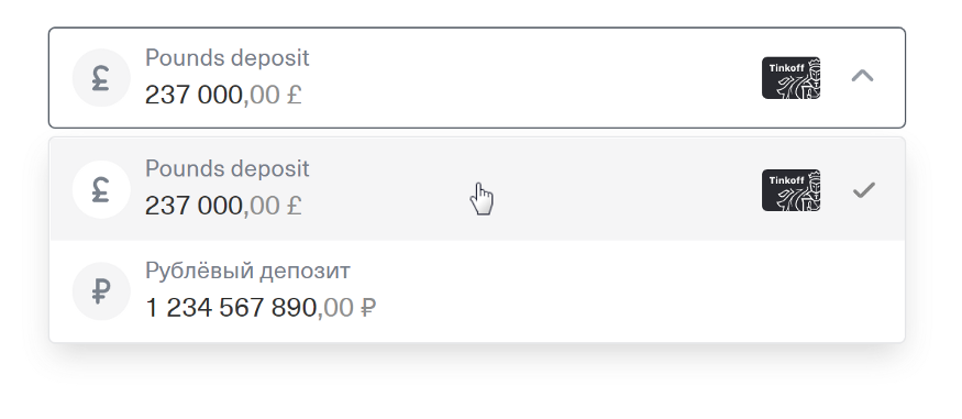
In the drop-down, the focused background is gray instead, leaving the icon background white
Universal Outlet
Each of these methods is available from Angular version 5 onward. But we want to move between them at runtime. To make that happen, we bundle them inside a component that takes both content and context as inputs. It then selects the appropriate rendering branch based on the type of the content. We need to tell apart string, number, (context: T) => string | number, TemplateRef<T> and Type<any>. There are some subtleties we’ll get to shortly.
The template for this component would resemble:
<ng-container [ngSwitch]="type">
  <ng-container *ngSwitchCase="'primitive'">{{content}}</ng-container>
  <ng-container *ngSwitchCase="'function'">{{content(context)}}</ng-container>
  <ng-container *ngSwitchCase="'template'">
    <ng-container *ngTemplateOutlet="content; context: context"></ng-container>
  </ng-container>
  <ng-container *ngSwitchCase="'component'">
    <ng-container *ngComponentOutlet="content; injector: injector"></ng-container>
  </ng-container>
</ng-container>
In essence, we compute a getter to pick the matching tool. One caveat: it’s not possible to reliably distinguish between a plain function and an arbitrary component class. But there’s a way to handle that. For dynamic components placed in lazy-loaded modules, you’d need the module’s own Injector. Otherwise, the local Injector may miss some entryComponents when running a pre-Ivy app. We can store that injector alongside the component by introducing a wrapper class. It also gives us instanceof for free.
export class ComponentContent<T> {
  constructor(
    readonly component: Type<T>,
    private readonly injector: Injector | null = null,
  ) {}
}
The wrapper class will provide a method that constructs the Injector with the required context:
createInjectorWithContext<C>(injector: Injector, context: C): Injector {
    return Injector.create({
        parent: this.injector || injector,
        providers: [{
            provide: CONTEXT,
            useValue: context,
        }],
    });
 }
As for templates, they mostly work as-is. However, remember that a template follows the change detection of the view where it was defined, not where it is inserted. If you pass it up the view hierarchy, any changes it triggers internally won’t automatically be picked up by its original view.
To get around this, we switch to a custom directive instead of a plain template. Its job is simply to track the ChangeDetectorRef, so it can mark the view for checking when required.
Polymorphic templates
In real-world scenarios, it’s often useful to change rendering behavior based on the content type. You might want one template for a certain special case, while a generic icon is the default. In that scenario, we can define fallback behavior for primitives and functions. Even the distinct primitive types might matter. If you have a badge component specifically for numbers, it might be nice to show it on a tab with unread message counts instead of the usual icon.
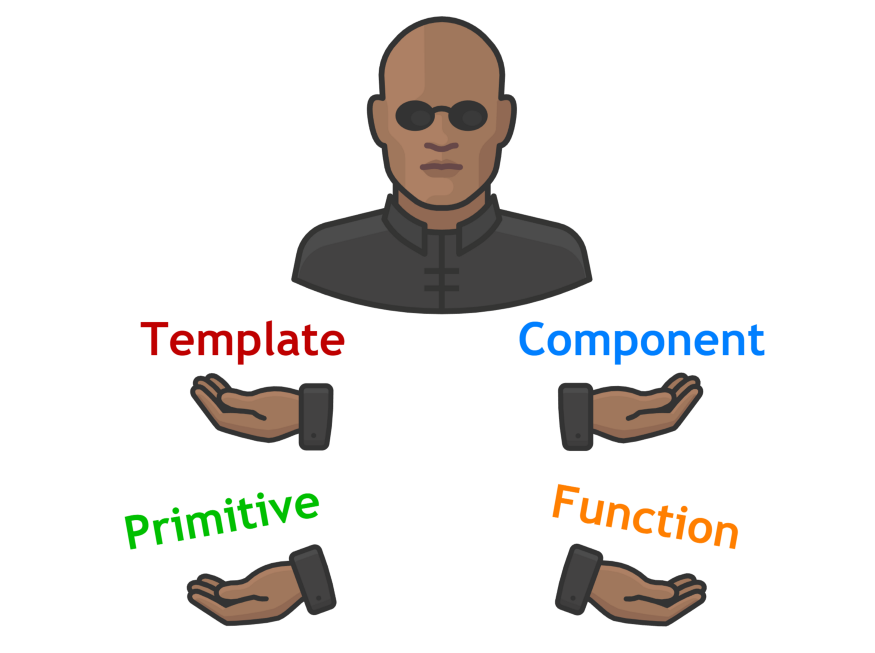
Which pill will you choose? Polymorpheus has plenty
One more piece is needed: a default template for primitives. We can use @ContentChild to query the component’s content for a TemplateRef. If one is found, we instantiate it with our primitive as the context:
<ng-container *ngSwitchCase="'interpolation'">
  <ng-container *ngIf="!template; else child">{{primitive}}</ng-container>
  <ng-template #child>
    <ng-container
      *ngTemplateOutlet="template; context: { $implicit: primitive }"
    ></ng-container>
  </ng-template>
</ng-container>
The interpolation section of our Outlet, now with a custom template
This opens the door to styling the interpolation or handing it off to a dedicated display component:
<outlet [content]="content" [context]="context">
  <ng-template let-primitive>
    <div class="primitive">{{primitive}}</div>
  </ng-template>
</outlet>
Usage with a custom template for primitives
It’s time to test all of this in real code.
Usage
Let’s create two components: Tabs and ComboBox. The tabs template will reuse our outlet component inside an *ngFor loop. Each tab item serves as context, along with the currently active tab:
<outlet
   *ngFor="let tab of tabs"
   [class.disabled]="disabledItemHandler(tab)"
   [content]="content"
   [context]="getContext(tab)"
   (click)="onClick(tab)"
></outlet>
Basic styles—font size, colors, underline—are provided by our component. But the actual appearance of each tab comes from the content. The component code looks like this:
export class TabsComponent<T> {
   @Input()
   tabs: ReadonlyArray<T> = [];

   @Input()
   content: Content = ({$implicit}) => String($implicit);

   @Input()
   disabledItemHandler: (tab: T) => boolean = () => false;

   @Input()
   activeTab: T | null = null;

   @Output()
   activeTabChange = new EventEmitter<T>();

   getContext($implicit: T): IContextWithActive<T> {
       return {
           $implicit,
           active: $implicit === this.activeTab,
       };
   }

   onClick(tab: T) {
       this.activeTab = tab;
       this.activeTabChange.emit(tab);
   }
}
This lets us render any array as a set of tabs.

We can pass strings to get basic tabs.

Or we can build something more elaborate.
Passing objects and custom templates allows icons, HTML styling, and extra indicators.
For the ComboBox, we first need to assemble its building blocks: an input field with an icon and a drop-down menu. We won’t dwell on the menu—it’s fundamentally similar to tabs, just vertical with different base styles. The input, on the other hand, might look like this:
<input #input [(ngModel)]="value"/>
<content-outlet
   [content]="content"
   (mousedown)="onMouseDown($event, input)"
>
   <ng-template let-icon>
       <div [innerHTML]="icon"></div>
   </ng-template>
</content-outlet>
If the native input is positioned absolutely, it covers the outlet and grabs all clicks. That works nicely if you only need a decorative icon, like a magnifying glass. A string can supply the SVG icon source. But if you prefer an avatar inside the field, a custom template does the job.
The ComboBox needs an interactive arrow icon. It should respond to clicks without stealing focus from the input. To handle that, we attach a mouse down listener to the outlet:
onMouseDown(event: MouseEvent, input: HTMLInputElement) {
    event.preventDefault();
    input.focus();
}
Inside the ComboBox, we pass the arrow icon as a template rather than a string. This lets us lift it above the input using CSS position: relative, and subscribe to click events:
<app-input [content]="icon"></app-input>
<ng-template #icon>
   <svg
       xmlns="http://www.w3.org/2000/svg"
       width="24"
       height="24"
       viewBox="0 0 24 24"
       class="icon"
       [class.icon_opened]="opened"
       (click)="onClick()"
   >
       <polyline
           points="7,10 12,15 17,10"
           fill="none"
           stroke="currentColor"
           stroke-linecap="round"
           stroke-linejoin="round"
           stroke-width="2"
       />
   </svg>
</ng-template>
That gives us the desired behavior:
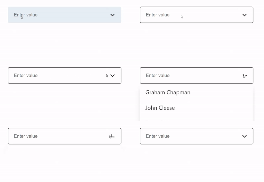
Handling interactive icon
The component’s code, like the tabs before it, knows nothing about the data model. It looks, roughly, like this:
export class ComboBoxComponent<T> {
   @Input() items: ReadonlyArray<T> = [];
   @Input() content: Content = ({$implicit}) => String($implicit);
   @Input() stringify = (item: T) => String(item);
   @Input() value: T | null = null;

   @Output() valueChange = new EventEmitter<T | null>();

   stringValue = '';

   get filteredItems(): ReadonlyArray<T> {
       return this.items.filter(item =>
           this.stringify(item).includes(this.stringValue),
       );
   }
}
Form-control specifics are intentionally excluded to keep the samples short. The getter for
filteredItemscan be optimized with a pure pipe; see this example
With such a simple component, any object can be used inside a ComboBox, and customization is quite flexible. After a few unrelated UX tweaks, it becomes truly production-ready. You can shape it to fit almost any visual direction:
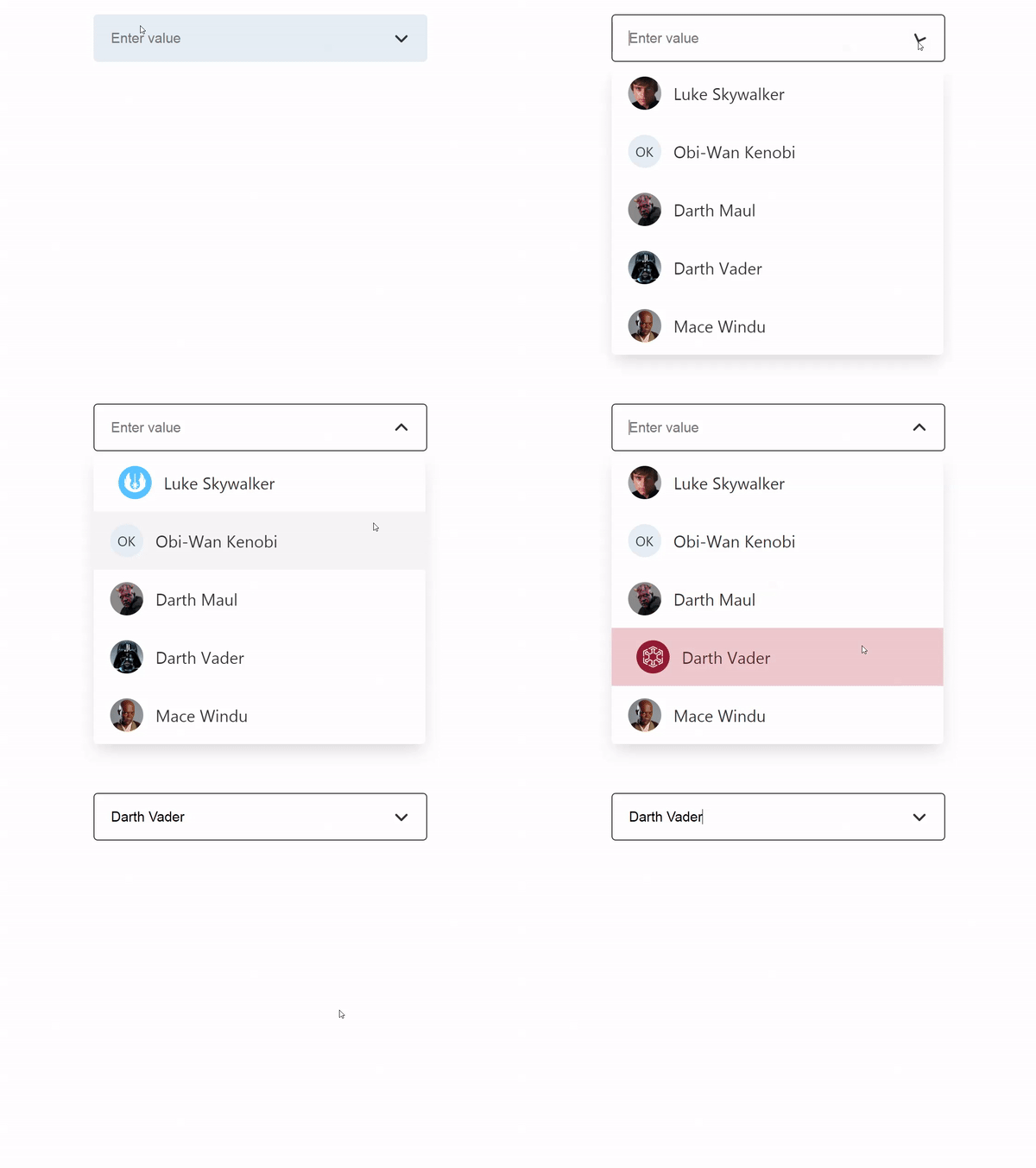
The force is with us on this one!
Bear in mind that this view-customization logic can be extracted into its own component and shared among several projects if needed.
Key Insights
Building components without strict model dependencies removes the burden of anticipating every possible use case. At the same time, it hands your users a straightforward way to adapt the component to their own scenarios. These patterns are highly reusable. When a component no longer depends on a particular data structure, it becomes more universal, more robust, and easier to extend. Best of all, you can achieve this with minimal code — Angular's own features handle most of the heavy lifting.
Adopting this mindset shifts the way you approach design. It's surprisingly useful to reason about content blocks rather than fixed templates or hard-coded strings. Whether you're dealing with validation messages, popovers, or dialogs, this strategy works well for any kind of dynamic content. Testing and prototyping get simpler too — to display a modal, for example, you don't need a full component or even a template. A placeholder string is enough to validate your logic, and you can fill in the details later.
At Tinkoff, we've relied on this approach for some time now. We've packaged the core ideas into a small open-source utility called ng-polymorpheus, which weighs in at just 1 KB gzipped.
You can try it out in an interactive demo and sandbox.
Thinking about open-sourcing your own project but put off by the related overhead? Take a look at the Angular Open-source Library Starter we built for our own needs. It handles continuous integration, pre-commit hooks, linting, versioning, changelog generation, code coverage, and more.