This guide walks through a full implementation of a custom dialog with Angular's Material Dialog component.
We will look at several frequent scenarios surrounding Angular Material Dialog: typical configuration choices, supplying data into the dialog, retrieving results from it, and structuring the dialog's layout.
This is a hands-on walkthrough, so follow along. We begin with a basic setup and then build up features incrementally, with explanations at each stage.
Table of Contents
Here is what we will cover:
- Defining a Material Dialog body component
- Instantiating and launching an Angular Material Dialog
- Angular Material Dialog configuration options
- Assembling the Material Dialog body
- Supplying input data to the Material Dialog
- Closing the dialog and sending output data
- Code and live GitHub example
Step 1 of 5 - Defining a Material Dialog body component
To start using the Angular Material Dialog, the first step is to bring in MatDialogModule:
Also, observe the CourseDialogComponent. This component will serve as the content area of our custom dialog.
For this component to work as a dialog body, we must also register it as an entryComponent. If we fail to do so, attempting to open the dialog will trigger this error:
Error: No component factory found for CourseDialogComponent. Did you add it to @NgModule.entryComponents?
Step 2 of 5 - Instantiating and launching an Angular Material Dialog
With that in place, we're set to start constructing our dialog. Let's first look at how we can launch a dialog from a component:
Let's dissect this code to understand what happens here:
- to generate Material Dialog instances, we inject the
MatDialogservice through the constructor - we then create a
MatDialogConfiginstance, which provides a standard set of behaviors for the dialog - we adjust a couple of those defaults. For example, setting
disableCloseto true prevents the user from closing the dialog simply by clicking outside of it - we also enable
autoFocus, which means the focus will be placed automatically on the first form field inside the dialog
Angular Material Dialog configuration options
The MatDialogConfig class offers numerous configuration properties. Beyond the two we modified, here are some other widely used Material Dialog options:
-
hasBackdrop: controls whether the dialog shows a shadowed backdrop that prevents interaction with the rest of the UI while it is open (default is true). -
panelClass: adds custom CSS classes to the dialog panel. -
backdropClass: adds custom CSS classes to the dialog backdrop. -
position: specifies an initial absolute location for the dialog. For instance, this would place the dialog at the top left of the page instead of the center:
direction: determines whether content inside the dialog is aligned left or right. The default is left-to-right (ltr), but we can switch to right-to-left (rtl). A right-to-left dialog looks like this:
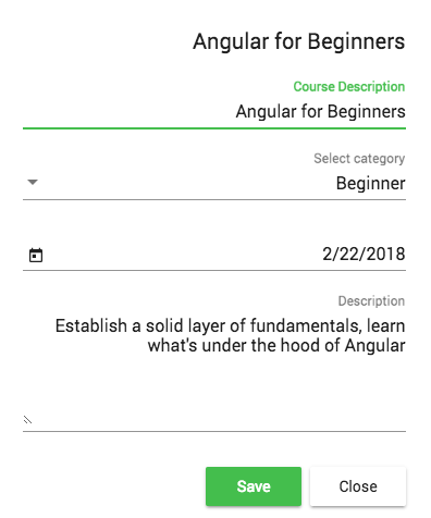
closeOnNavigation: decides if the dialog should close automatically when we switch to another route in our SPA; this defaults to true.
A scenario where we would set this to false is a draft email dialog in an app like Gmail, where the draft stays open while you browse older messages.
MatDialogConfigalso exposes thewidth,height,minWidth,minHeight,maxWidth, andmaxHeightproperties.
Step 3 of 5 - Assembling the Material Dialog body
Now, let's examine CourseDialogComponent. It is a standard Angular component—no special base class or dialog-specific interface is required.
The component's content can be anything; we don't have to use any of the auxiliary Angular Material directives. We could even build the dialog body using plain HTML and CSS.
However, to achieve the typical Material Design aesthetic, we can craft the template with these directives:
Using these directives, our dialog will appear like this:
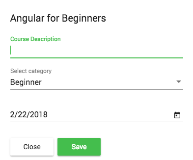
Here are the three main directives we used to build this dialog:
-
mat-dialog-title: marks the dialog header, here it's the "Angular For Beginners" title at the top. -
mat-dialog-content: this container holds the dialog's main body, which in this case is a reactive form. -
mat-dialog-actions: this container holds the action buttons at the bottom of the dialog.
Step 4 of 5 - Supplying input data to the Material Dialog
Dialogs frequently handle editing pre-existing data. We can pass data into the dialog component via the data property of the dialog configuration object.
Looking back at our AppComponent, here's how we can provide input data to the dialog:
We can then obtain a reference to this data object in CourseDialogComponent using the MAT_DIALOG_DATA injection token:
As shown, the entire data object initially provided in the dialog configuration can be injected directly into the constructor.
We also inject something else: a reference to the dialog instance, named dialogRef. We will use this to close the dialog and send output data back to the parent component.
Step 5 of 5 - Closing the dialog and sending output data
Now that we have an editable form within a dialog, we need a mechanism to return the modified (or new) data to the parent component.
We can achieve this via the close() method. We can call it with no arguments to simply dismiss the dialog:
Alternatively, we can pass the updated form data back to AppComponent like this:
In the originating component, we can now receive the dialog data in this manner:
Notice that calling dialog.open() returns a dialog reference—the same object that is injected into the constructor of CourseDialogComponent.
We can then utilize this dialog reference to subscribe to the afterClosed() observable, which emits a value containing the output data passed to dialogRef.close().
Code and live GitHub example
A live runnable version of the complete code is available here on this branch on Github.
We hope this guide helps you get going with the Angular Material Dialog and that you found it useful.
If you want to dive deeper into Angular Material, we suggest checking out the Angular Material Course, where we explore various widgets in greater depth.
If you have questions or comments, please leave them below and we will get back to you.
To stay updated on future posts about Angular Material and other Angular topics, we invite you to subscribe to our newsletter:
If you are new to Angular, check out the Angular for Beginners Course:
Other Angular Material posts:
Angular Material Data Table: A Complete Example (Server Pagination, Filtering, Sorting)