
"Repetition is the root of all software evil" — Martin Fowler.
Angular is far more capable than what most YouTube tutorials suggest. As a full-fledged framework, it carries strong opinions about many parts of the development process, enforcing a set of best practices along the way. It ships with powerful patterns and utilities designed to help you build scalable, well-structured, and maintainable applications.
These advanced concepts are easy to overlook when you're learning, since most beginner material tends to skip them.
In this article, we'll start with a simple drawer component and progressively refine it to be more flexible and reusable, version by version. The real goal here isn't to end up with a perfect component, but to pick up patterns worth carrying into your own projects.
Angular component design patterns
Earlier, I wrote about component design patterns in Angular, inspired by the Material library. That piece looked at the decisions made in Material's components and how we might borrow those ideas. This article puts that into practice — we'll build a custom side drawer and apply several design pattern solutions along the way to keep the code clean and the component easy to work with.
What we're aiming for is something like the drawer Medium shows when you want to view responses to a story.
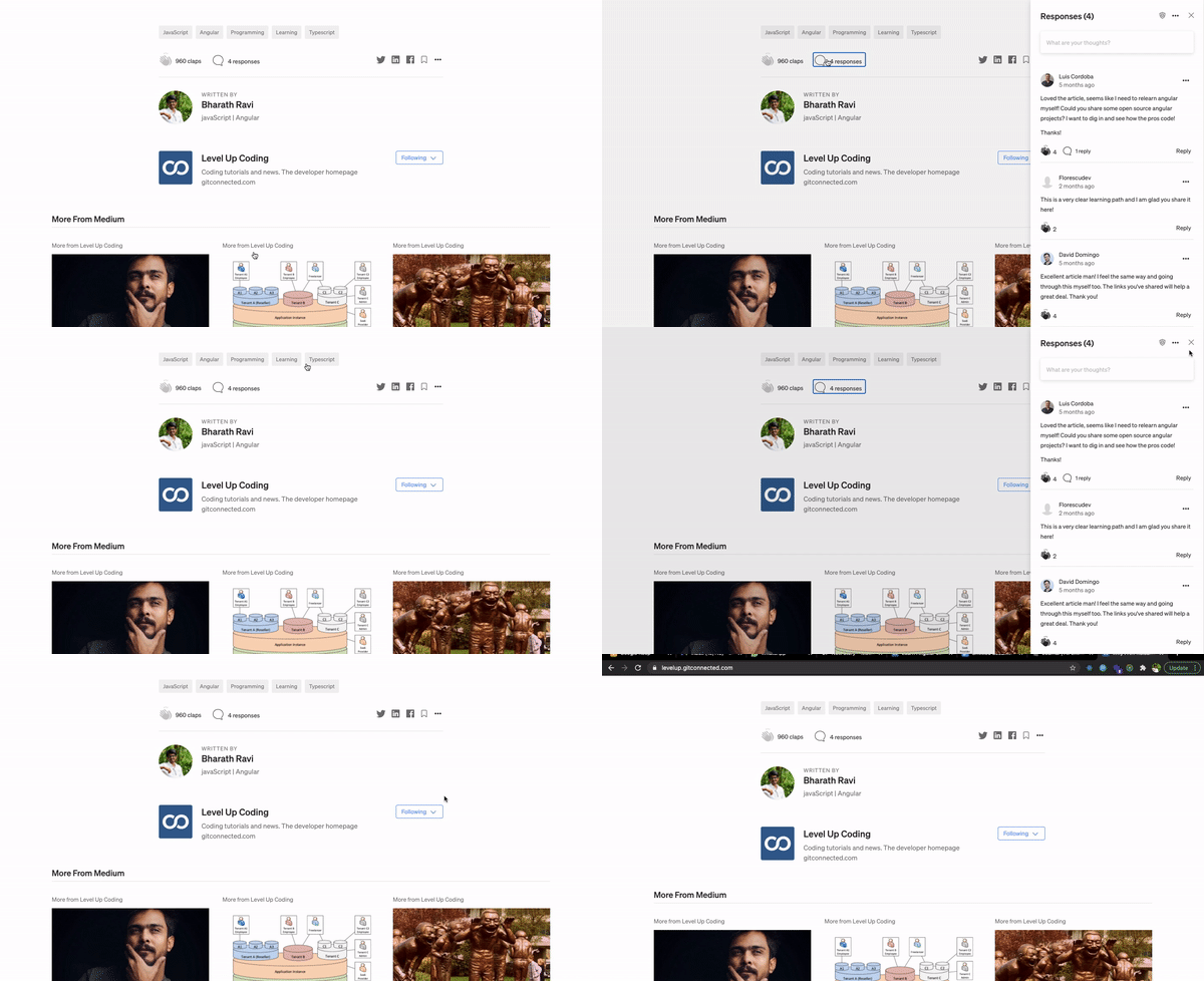
Medium comments drawer
Now that we know the target, let's dive in.
How it started — v1
For our first shot at this, here's the plan:
- Create a component for the drawer (
comment-drawer.component). - Use
@Inputto manage theisOpenstate. - Update the
rightCSS property dynamically to slide the drawer in and out. - Emit an
@Outputto let the parent know when the drawer closes.
It doesn't get much simpler than that.
<div class="drawer-container" [style.right.px]="isOpen ? 0 : -400">
  <button class="close" (click)="close()">X</button>
  <div class="header">
    <h5>Responses</h5>
  </div>
  <div class="body">
    <p>
      Loved the article
    </p>
  </div>
</div>
v1.drawer.component.html
We're using style binding here to control the element's right property. When the drawer is open (isOpen == true), the element sits at right:0; when closed, it's pushed off-screen to right:-400px (the element's width).
Now let's bring in some CSS to make it behave as expected.
.drawer-container {
  position: absolute;
  top: 0;
  right: 0;
  width: 400px;
  transition: all 300ms;
}
v1.drawer.component.css
This is a fairly standard way to build a sidebar or drawer.
The component class stays simple:
export class DrawerComponent {
  @Input() isOpen = false;
  @Output() closed = new EventEmitter();
  close() {
    this.closed.emit();
  }
}
v1.drawer.component.ts
And in the parent component, we use the drawer like this:
<app-drawer
    [isOpen]="isDrawerOpen"
    (closed)="isDrawerOpen = false"
  ></app-drawer>
v1.parent.component.html
It's a bit rough around the edges, but it works fine for the application in this state.
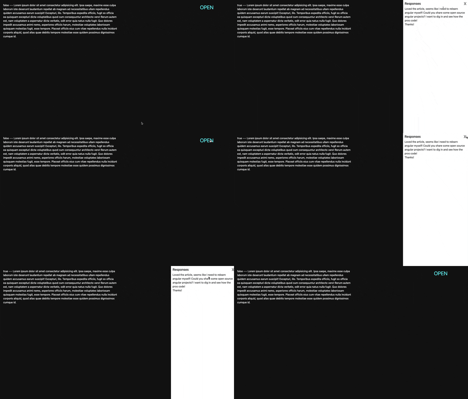
v1 output
That looks pretty decent, right? Or does it?
Taking it to the next level — v2
Let's say we now need to use this same drawer concept elsewhere in the app — for showing user data, for instance. With the current implementation, how would you go about that? And what if you needed a second drawer that opens from the left?
Right now, the implementation is tight and tied to a specific use case, which makes it hard to reuse elsewhere. To put the same drawer logic in another place, you'd have to duplicate the component, copy everything over, and wire it up again.
In practice, you end up repeating everything just done. And copying and pasting the same logic is a serious no-go.
For v2, we have two main objectives:
- Make the component reusable across the whole application
- Give the parent more control, such as choosing the drawer's position (left or right)
- Provide the ab
Let's take a different route and refactor the component to make it more flexible and easier to reuse.
Here's the approach we'll follow:
- Create a wrapper component for the drawer (
drawer.component) - Move the open/close logic into this wrapper
- Have
comment-drawer.componentusedrawer.componentinternally, passing the comments as content
Time to code! Our drawer component will just project whatever template it receives from the parent (via content projection). It also includes an icon to close the pane, which triggers close() so the parent can listen and act if needed.
<div class="drawer-container">
  <button class="close" (click)="close()">X</button>
  <ng-content></ng-content>
</div>
v2-drawer.component.html
The component takes a few inputs and raises the drawerClosed() event.
export class DrawerComponent {
  @Input() isOpen: false;
  @Input() width: number = 400;
  @Input() position: 'left' | 'right' = 'right';
  @Output() drawerClosed = new EventEmitter();

  close() {
    this.drawerClosed.emit();
  }
}
v2-drawer.component.ts
The position property above determines which side the drawer slides in from. By default, it opens from the right edge, as in the demo above.
We can use these inputs to apply styles to .drawer-container like this:
<div class="side-pane-drawer-container" [ngStyle]="drawerStyles">
...
</div>
v2-drawer.component.html
The drawerStyles getter conditionally applies styles to the template:
// ...
get drawerStyles() {
    const commonStyles = { width: `${this.width}px` };
    if (this.position == 'right') {
      return {
        ...commonStyles,
        right: `${this.isOpen ? 0 : -1 * this.width}px`,
      };
    } else {
      return {
        ...commonStyles,
        left: `${this.isOpen ? 0 : -1 * this.width}px`,
      };
    }
  }
// ...
v2-drawer.component.ts
Our wrapper (drawer-component) is ready. Now we update comment-drawer.component to use it.
<app-drawer [isOpen]="isOpen" (drawerClosed)="close()">
  <div>
    <h5>Responses</h5>
  </div>
  <div>
    <p>
      Loved the article!
    </p>
  </div>
</app-drawer>
v2-comment-drawer.component.html
v2 is good to go!
You'll notice the refactor doesn't change anything visually for the user, but it makes it much easier to drop the drawer into any part of the application later.
? You probably want to move your open/close logic to a service with observables. You can head to my dark mode toggle article to take inspiration.
That's already a big step forward!
Multiple content projection for better control – v3
Let's keep pushing.
We're already using content projection, so let's take it one step further and implement multiple content projections. Strictly speaking, this isn't the perfect scenario for multiple projections, but it's a great way to learn the concept.
Multiple content projection, as the name suggests, lets us project more than one template from the parent into the component. Instead of dumping everything between <app-drawer></app-drawer> all at once, we project different chunks separately. In our case, we'll split it into two: one for the drawer header and one for the body.
<div class="drawer-container" [ngStyle]="drawerStyles">
  <button class="close" (click)="close()">X</button>
  <div class="header">
    <ng-content select="[header]"></ng-content>
  </div>
  <div class="body">
    <ng-content select="[body]"></ng-content>
  </div>
</div>
v3-drawer.component.html
The select attribute picks the right content for each placeholder. So the projected content gets divided into header and body respectively.
Over in the parent component:
<app-drawer [isOpen]="isOpen" (drawerClosed)="close()">
  <div header class=”drawer-header”>
    <h5>Responses</h5>
  </div>
  <div body>
    <p>
      Loved the article!
    </p>
  </div>
</app-drawer>
v3-comment-drawer.component.html
? The selector here is a CSS selector, so any valid CSS selector works. As you've probably noticed, we're using an attribute selector with square brackets. That means you could also match the same header with
select=".drawer-header"instead ofselect="[header]"
Why bother with this?
One drawback of v2 is that any content could be projected into the drawer. That freedom makes it harder to control what ends up in there. In v3, we specify that a drawer can have a header and a body, and we can bake in some basic styling so users don't accidentally break the layout.
'exportAs' for flexibility — v4
A big limitation of the current setup is there's no way to provide the close button from the outside. But in some places, you might want the close button to live inside the header, or styled differently.
How can we do this?
One option is to use @ViewChild in the parent component (comment-drawer.component) and call close() explicitly. That adds boilerplate, though.
This is where exportAs comes in handy.
The Angular component metadata includes a property called exportAs. It accepts a name that exposes the component instance in the template. This is perfect when you want to make public methods, like close() in our case, available to the template.
Think of it as a template variable that points to the component itself.
// ...
@Component({
  selector: 'app-drawer',
  ...
  exportAs: 'drawer',
})
// ...
v4.drawer.component.ts
Now we can drop the fixed close button from drawer.component and pass it from the parent instead:
<app-drawer
  [isOpen]="isOpen"
  #commentDrawer="drawer">
  <div header>
    // ---
    <button class="close" (click)="commentDrawer.close()">X</button>
  </div>
  <div body>
   // ---
  </div>
</app-drawer>
v4.comment-drawer.component.html
Pretty neat, wouldn't you say?
The magic of CSS variables — v5
Here's something you might not expect: you can bind a CSS property (like a CSS variable) directly through style binding.
Stick with me.
Right now, we're applying styles through a getter in the drawer component.
get drawerStyles() {
    if (this.position == 'right') {
      // return style object for right position
    } else {
      // return return style object for left position
    }
  }
This approach works, but it puts a lot of logic in the controller just to handle conditional styling. Is there a cleaner, more straightforward way?
As it turns out, there is! Here's the plan.
We'll pass the width via property binding as a CSS variable to the drawer component. Then we use class binding to figure out:
- Whether the drawer is open, using the
isOpenproperty - If it's open, whether it should slide in from the left or right, based on the
positionproperty
With this approach, we no longer need to pass width as a separate input.
<!-- Use class binding instead of the getter -->
<div
  class="drawer-container"
  [class.is-open]="isOpen"
  [class.position-right]="position === 'right'"
  [class.position-left]="position === 'left'"
>
  <div class="header">
    <ng-content select="[header]"></ng-content>
  </div>
  <div class="body">
    <ng-content select="[body]"></ng-content>
  </div>
</div>
v5.drawer.component.html
We're binding the is-open, position-left, and position-right classes to the container. Notice there's no ngStyle binding anymore — the conditional getter goes away too.
The only thing left is to write those classes.
:host {
  --drawer-width: 400px;
}
.drawer-container {
  // ---
  width: var(--drawer-width);
  // ---
  &.position-right {
    right: calc(-1 * var(--drawer-width));
    &.is-open {
      right: 0;
    }
  }
  &.position-left {
    left: calc(-1 * var(--drawer-width));
    &.is-open {
      left: 0;
    }
  }
}
v5.drawer.component.scss
We define --drawer-width on the :host selector so it's available throughout the component's styles. Here's where the CSS magic kicks in: you can simply override --drawer-width in the parent that uses this component (like comment-drawer) like this:
<app-drawer [style.--drawer-width]="'500px'">
    <!-- ... -->
</app-drawer>
v5.comment-drawer.component.html
And just like that, it works!
Now, for the element with the position-right class, we set the right property to be off-screen so the drawer stays hidden (critical for the transition to work smoothly). When the drawer is in the isOpen state, we change right to 0 so it becomes visible with a smooth animated entrance.
The same logic applies to the left side with the position-left class.
Lazy load for performance — v6
Every time you build a reusable component (and every component should aim for that), you should ask your app:
"Is it essential to render this component on the initial page load? Is the information inside it crucial for that first paint?"
If the answer is "no" or "maybe," you should think about lazy loading the component. Otherwise, you're adding unnecessary burden to the browser and hurting performance.
You might wonder what the big deal is with a bit of text in the body. But imagine your drawer fires an API call to fetch comments. That request happens during initial load, slowing things down for zero benefit to the user.
Yes, this is a solid case for lazy loading. We need to tell Angular not to render any content until the drawer is actually opened.
What's your first instinct for implementing this?
A straightforward solution is to use isOpen with *ngIf and, when rendering via a TemplateRef in the drawer.component, ensure the body doesn't appear until the drawer opens.
But what if you need more nuanced lazy loading? Say, only part of the component? That approach gets messy quickly.
I've covered lazy loading components in detail in this article — the same technique works here to make your drawer even more performant.
Final thoughts
That brings us to the end of this extensive refactoring session. Throughout this piece, we explored how Angular’s built-in capabilities can help craft top-tier components. Features like multi-slot content projection, on-demand loading, and the exportAs option prove invaluable for building flexible, reusable parts. A solid grip on these patterns can make coding more enjoyable and significantly boost your output.
The complete, working example is available on StackBlitz.
Of course, there are always further refinements to consider for this drawer component. Hopefully, this walkthrough has sparked some ideas for your own enhancements — a bit of thoughtful refactoring never does any harm!