Create Angular custom controls that are reusable by combining FormValueControl, model(), touch events, and schema-driven validation—no ControlValueAccessor required.

Kevin Kreuzer
@nivekcode
Aug 12, 2026
7 min read
Hello to all Angular developers!
Handling custom form controls often appears straightforward—until they must genuinely function as form controls.
A date picker can show a date. A tag selector can emit tags. A map can return an address.
Up to this point, things are easy.
BUT
When we place that component inside a real form, updating values is just the starting point. The form also requires details such as:
- is the control disabled?
- has the user interacted with it?
- is validation still in progress?
- what errors need to be shown?
- how can the form focus or reset it?
For a long time, Angular's solution was ControlValueAccessor.
It functions reliably and has proven itself in production. However, it involves substantial boilerplate for a component that essentially only wants to declare: "Here is my value."
Now that Angular 22 has stabilized the Signal Forms control contracts, the connection for most new custom controls can be a model() paired with a minimal interface.
A custom control should expose a form contract. It should not reimplement the form.
We'll construct one using a genuine location picker that integrates an address field, autocomplete functionality, and an interactive map.
Value Binding Is Not Form Integration
Assume we already have a standalone location picker:
<app-location-picker
  [address]="conferenceForm.location().value()"
  (addressChange)="conferenceForm.location().value.set($event)"
/>
Synchronizing a string is all this achieves for now—it does not qualify as a form control yet.
The burden of crafting a touched-state event, relaying the disabled state, choosing where validation errors appear, and duplicating that same adapter logic in every consumer of the picker still falls on the parent component.
What starts as a first draft typically evolves into a shape resembling this:
<app-location-picker
  [address]="conferenceForm.location().value()"
  [disabled]="conferenceForm.location().disabled()"
  [errors]="conferenceForm.location().errors()"
  (addressChange)="conferenceForm.location().value.set($event)"
  (blurred)="markLocationTouched()"
/>
It can be adapted to function.
Yet each bespoke component brings its own forms interface. A date picker relies on dateChange. A tag selector fires selectionChanged. A rich text editor broadcasts contentUpdated. Every parent ends up acting as a small bridge layer.
Angular forms offer a standard contract for controls. Our component should adopt it.
Why ControlValueAccessor Became the Default
In Reactive Forms, a typical custom control integrates with the forms engine via ControlValueAccessor.
Even the simplest setup demands several components:
export class LocationPickerCva implements ControlValueAccessor {
  readonly value = signal('');
  readonly disabled = signal(false);

  #onChange: (value: string) => void = () => {};
  #onTouched: () => void = () => {};

  writeValue(value: string | null) {
    this.value.set(value ?? '');
  }

  registerOnChange(fn: (value: string) => void) {
    this.#onChange = fn;
  }

  registerOnTouched(fn: () => void) {
    this.#onTouched = fn;
  }

  setDisabledState(disabled: boolean) {
    this.disabled.set(disabled);
  }
}
Each user interaction now has to refresh the local component state while also invoking the appropriate callback:
onAddressInput(value: string) {
  this.value.set(value);
  this.#onChange(value);
}

onBlur() {
  this.#onTouched();
}
Nothing about this API is inherently flawed. It handled a tough interoperability challenge well, and legacy ControlValueAccessor-based controls still function seamlessly with Signal Forms.
However, Angular’s current toolkit includes signal inputs, signal outputs, and model inputs. For a brand-new control, a callback-based registration mechanism no longer has to be the default go-to.
The Signal Forms Contract Is Tiny
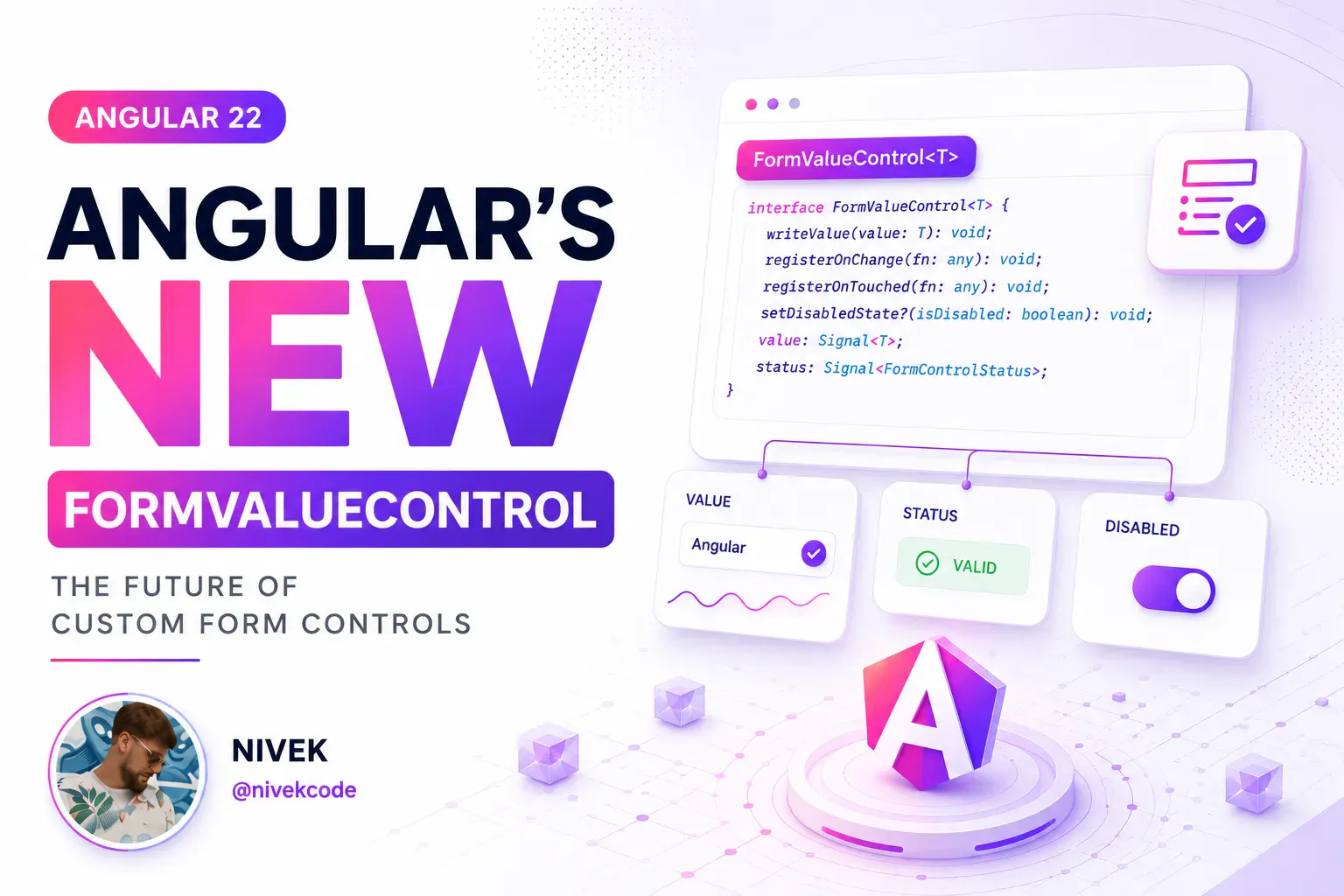
For most custom inputs, implementing FormValueControl<T> is sufficient.
This interface requires only a single property: a value model matching the exact type of the value the control edits.
import { model } from '@angular/core';
import { FormValueControl } from '@angular/forms/signals';

export class LocationPicker implements FormValueControl<string> {
  readonly value = model('');
}
Your component is now a value control that works with Signal Forms.
The key is model(). It provides Angular with a bidirectional signal contract:
- the form pushes an updated value to the control
- the control sends user input back to the form
The parent hooks up the component exactly like a built-in input:
<app-location-picker [formField]="conferenceForm.location" />
There's no bespoke addressChange callback. The parent component doesn't need a manual value adapter. And you skip the NG_VALUE_ACCESSOR provider entirely.
The component's purpose is declared by
FormValueControl<string>, whilevalue = model('')acts as the connecting link.
This approach embodies the same model-first philosophy that makes Signal Forms intuitive throughout. The field itself manages the form state, and the control reveals only the minimal UI contract necessary for editing it.
Internal Complexity Stays Internal
Our location picker goes beyond a simple text input.
Typing an address triggers autocomplete suggestions for selection. Alternatively, a user might click on the map, which reverse-geocodes the coordinates and populates the address from that result.
Each of these paths feeds into the same value model:
onAddressInput(value: string) {
  this.value.set(value);
}

onSelectSuggestion(suggestion: LocationSuggestion) {
  this.value.set(suggestion.displayName);
  this.#moveMarker(suggestion.lat, suggestion.lng);
}

async onMapClick(lat: number, lng: number) {
  const address = await this.#locationService.reverse(lat, lng);

  this.value.set(address ?? `${lat.toFixed(5)}, ${lng.toFixed(5)}`);
}
The parent form remains unaware of how the address value was arrived at.
Autocomplete calls, map pin placement, loading indicators, or reverse geocoding are all invisible to it. To the form, this is just a text field.
This separation is exactly what gives the control its reusability.
Touched State Is Not Automatic
A form control's value is just one piece of the puzzle.
Browser-native inputs provide events that Angular can listen to directly. For a custom component, the forms API must be explicitly notified when an interaction counts as a touch.
Starting with Angular 22, you can provide the optional touch output:
import { model, output } from '@angular/core';
import { FormValueControl } from '@angular/forms/signals';

export class LocationPicker implements FormValueControl<string> {
  readonly value = model('');
  readonly touch = output<void>();
}
When the user moves focus away from the text input, emit the value:
<input
  [value]="value()"
  (input)="onAddressInput($any($event.target).value)"
  (blur)="touch.emit()"
/>
Also keep in mind the interactions that don’t involve the keyboard:
async onMapClick(lat: number, lng: number) {
  this.touch.emit();

  const address = await this.#locationService.reverse(lat, lng);
  this.value.set(address ?? `${lat.toFixed(5)}, ${lng.toFixed(5)}`);
}
A click on the map is all too easy to overlook. If the text input never receives focus, a blur event will simply never trigger.
When the control emits touch, [formField] refreshes the field's touched status. This also lets blur-dependent validation treat the custom component exactly like a built-in control.
For any control with multiple interaction points, every meaningful path must carry the same form semantics.
Expose Only the Form State Your UI Demands
FormValueControl builds on FormUiControl, which provides a bigger, all-optional surface.
This control can accept disabled, readonly, hidden, invalid, pending, errors, required, minLength, and further field properties. It can also expose focus() and reset().
What matters here is optional.
To disable both the input and map in the location picker, pass a disabled input:
export class LocationPicker implements FormValueControl<string> {
  readonly value = model('');
  readonly touch = output<void>();
  readonly disabled = input(false);
}
<input
  [disabled]="disabled()"
  [value]="value()"
  (input)="onAddressInput($any($event.target).value)"
  (blur)="touch.emit()"
/>
When the form disables the location field, the updated state is passed along automatically via [formField].
Skip implementing every optional property unless it's actually needed. Begin with value. Introduce touch once the control requires interaction behavior. Add disabled, errors, or focus() only when the UI demands them.
Simple controls stay lean this way, while complex ones retain the flexibility to function correctly.
Validation Is Defined in the Form Schema
The location picker is responsible for editing an address, not for determining whether one is mandatory.
In our conference form, a location is only mandatory when the event is held in person:
readonly conferenceForm = form(this.#conferenceModel, (path) => {
  required(path.location, {
    message: 'Please enter a location.',
    when: ({ valueOf }) => valueOf(path.online) === false,
  });
});
Business rules belong in the form schema, not inside the picker component.
That same picker can serve a venue form, a user profile page, or a shipping workflow, each with its own validation logic. When the control needs to surface validation feedback itself, it can accept the optional invalid and errors inputs—yet it still has no ownership of the rules that computed those states.
Custom controls handle values. Schemas handle validation.
The distinction looks minor, yet it stops a generic UI widget from drifting into a conference-specific component over time.
Checkbox-Style Controls Follow a Different API
Some form controls don't manage an arbitrary value.
A switch or checkbox deals with a boolean checked state. In that case, reach for FormCheckboxControl and surface checked rather than value:
import { model } from '@angular/core';
import { FormCheckboxControl } from '@angular/forms/signals';

export class OnlineToggle implements FormCheckboxControl {
  readonly checked = model(false);

  toggle() {
    this.checked.update((value) => !value);
  }
}
This distinction is what lets Angular handle value-like controls and checkbox-like controls correctly, with both APIs staying explicit.
Does This Mean ControlValueAccessor Is Dead?
Not at all.
Existing component libraries ship years of battle-tested ControlValueAccessor controls. Rebuilding them purely to adopt a newer interface would rarely justify the effort.
Signal Forms keeps support for those controls deliberately, ensuring backward compatibility.
The more notable Angular 22 shift runs the other way: a fresh custom control built on FormValueControl or FormCheckboxControl also works with Reactive Forms and Template-Driven Forms, no second compatibility layer needed.
That yields a straightforward rule of thumb:
- stick with the
ControlValueAccessorcontrols you already trust - choose the signal-native contracts for anything newly created
- migrate when it genuinely cuts maintenance or improves API design
There is no forced overnight switch. It just becomes the smarter option for your next control.
Putting the Control Together
The contract that matters for our location picker remains remarkably compact:
@Component({
  selector: 'app-location-picker',
  templateUrl: './location-picker.html',
  changeDetection: ChangeDetectionStrategy.OnPush,
})
export class LocationPicker implements FormValueControl<string> {
  readonly value = model('');
  readonly touch = output<void>();
  readonly disabled = input(false);

  #locationService = inject(LocationService);

  onAddressInput(value: string) {
    this.value.set(value);
  }

  async onMapClick(lat: number, lng: number) {
    this.touch.emit();

    const address = await this.#locationService.reverse(lat, lng);
    this.value.set(address ?? `${lat.toFixed(5)}, ${lng.toFixed(5)}`);
  }
}
<app-location-picker [formField]="conferenceForm.location" />
The autocomplete and map logic can be as sophisticated as the product demands, without forcing that complexity into the public form API.
This is the actual benefit.
Prefer hands-on practice over reading?
Our Angular Signal Forms Workshop offers a dedicated lab where you build a custom control from scratch using the full location picker—address search, autocomplete, map interaction, value synchronization, and touched state. You will receive the starter project, essential theory, the exercise, and a fully coded solution.
Afterward, the workshop ties this approach into validators, subforms, form arrays, create/edit flows, data mapping, migration, configuration, and Standard Schema.
Check out the Angular Signal Forms Workshop.
Like how the code preview looks? See our new theme plugin
Skol - the ultimate IDE theme

Aurora vibes, delivered right into your editor. This lean yet impactful dark scheme keeps things easy on the eyes.
Create sharper interfaces when you combine Angular and AI
Video Tutorial: Angular and AI

A practical workshop that walks you through embedding AI capabilities into Angular applications, with Hash Brown as the foundation, for crafting responsive, smart interfaces.
Progress through real-time chat streams, tool invocation, generative UI patterns, structured data outputs, and further topics one stage at a time.
Seeking a concrete resource on Angular Signal Forms design principles, validation strategies, and transition steps?
The Angular Signal Forms Guide

Create Angular forms with signals that are typed, validated, and ready for production through a model-first approach.
Master schema-driven validation, form-state signals, custom controls, Reactive Forms migration, and seamless API mapping patterns.
Find this content useful and eager to deep-dive into Angular's latest Signal Forms?
Angular Signal Forms: Practical Workshop

Dive into Angular's cutting-edge Signal-Forms across 12 stepping-stone chapters, blending conceptual grounding with practical exercises.
Explore everything from form foundations and validation rules to bespoke controls, nested forms, and transitioning existing codebases.

Get notified
about new blog posts
Subscribe to Angular Experts Content Updates & News, and we will alert you the moment fresh blog posts go live on Angular, Ngrx, RxJs, or other compelling Frontend subjects!
Your email address stays confidential, and withdrawing your consent is possible at any time!
Responses & comments
Feel free to ask about anything and contribute your personal insights or viewpoints on the subject matter
You might also like
Browse these additional posts from Angular Experts to gain deeper insights into adjacent matters, including Modern Angular or Signals !
Angular Signal Forms: The Missing Create/Edit Pattern
Learn a practical Angular Signal Forms pattern for create and edit flows, with route-based mode, edit data loading, linkedSignal prefilling, submit branching, and validation context.
Kevin Kreuzer
@nivekcode
Aug 1, 2026
6 min read
Angular Signal Forms Essentials
Understand the core concepts behind modern Angular Forms. Learn how to create Signal Forms, wire them up in templates, use built-in and custom validators, handle cross-field validation, submit forms, and more.
Kevin Kreuzer
@nivekcode
Feb 14, 2026
12 min read
Angular Signal Forms Config
Learn how to configure Angular Signal Forms to bring back the classic CSS state classes (like ng-valid, ng-invalid, and ng-touched)—either for backward compatibility with existing styles or to unlock new customization, like emitting your own tailored state classes for advanced styling.
Kevin Kreuzer
@nivekcode
Jan 24, 2026
4 min read
Our extensive experience is here for your team
Years of work with both enterprises and startups, alongside running workshops, delivering tutorials, and crafting open source projects, have given Angular Experts deep insight into modern front-end development. We take genuine pride in this expertise, and nothing would make us happier than to see your business thrive with our support