
Why Component-Driven UI Matters
The Component Driven User Interface (CDUI) philosophy treats each piece of the interface as a self-contained, reusable building block. These blocks become fundamental units of an Angular application rather than being tightly coupled to the surrounding code.
This practice aims to improve modularity and scalability. It also supports the development of a consistent, maintainable UI across the whole application.
When the codebase is assembled from discrete, independent components, adapting to new business demands becomes less risky and more straightforward. Teams can respond faster to defects and regression because the scope of any change is naturally contained.
Introducing Storybook
Storybook is a specialized environment for developing and showcasing UI components without requiring the full application to be running. It offers developers, designers, and QA engineers a focused sandbox for each component.
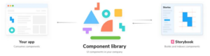
src: https://prateeksurana.me/blog/react-component-library-using-storybook-6/
Beyond being a dev tool, Storybook acts as living, interactive documentation for your components. It is easy to distribute across a team. Inside Storybook, you can define multiple states or versions of a component, populate them with different datasets, and inspect them under various edge conditions to catch issues early.
A significant benefit here is reducing development cycles. Instead of booting up the entire application to check a small detail, contributors can work directly on the isolated component, which accelerates and simplifies the development process.
Preconditions for Using Storybook
To get the most out of Storybook within the CDUI framework, the UI must first be extracted into its own distinct layer. A practical way to do this is by splitting components into two categories:
- presentational components, which handle only the rendering layer, and
- container components, which take care of routing and business logic.
Adopting a few naming and structure conventions helps to organize this split in the source tree:
- naming patterns like adding a postfix to container files (e.g.,
*-container.component.ts)
- directory layout so that each type resides in a named folder (e.g.,
containersandcomponents)
- module boundaries so that reusable presentation parts have their own NgModules or libraries independent of the application shell
- isolated interfaces so presentation components rely on their own shape of data instead of importing business models directly. This interface can live in a file adjacent to the component, such as
*-foo.interface.tsnext to*-foo.component.ts. Prefer a prefix likeUI-for these models (e.g.,UiUserDetails)
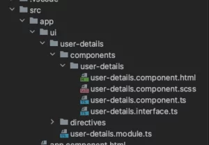
The snippet below shows a typical folder arrangement where a UI layer groups modules together. The user-details module holds its component and interface in separate files.
Project size determines whether this structure should be made simpler or more elaborate.
Setting Up Storybook in Angular
For an app already in place, adding Storybook is as simple as launching a command from the project root:
npx storybook@latest init
This instruction will:
- install external libraries
- write out configuration settings
- insert helpful npm scripts into
package.json - generate starter story files
After executing npm run storybook, you should get an output resembling this:
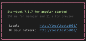
Storybook will then be served at the printed address. It includes live reload functionality: any modification to a component is instantly reflected in the Storybook browser tab.
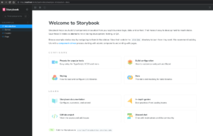
Going back to the user-details component, let’s check its basic implementation and the separate interface file.
// user-details.interface.ts
export interface UiUserDetails {
 firstName: string;
 lastName: string;
 email: string;
 avatar: {
   url: string;
   alt: string;
 } | null;
}
// user-details.component.ts
import { Component, Input } from "@angular/core";
import { UiUserDetails } from "./user-details.interface";


@Component({
 selector: "app-user-details",
 templateUrl: "./user-details.component.html",
 styleUrls: ["./user-details.component.scss"]
})
export class UserDetailsComponent {
 @Input() user?: UiUserDetails;
}
For this component, we create a user-detail.stories.ts file housed right alongside it.
import type { Meta, StoryObj } from "@storybook/angular";
import { UserDetailsComponent } from "./user-details.component";
import { UiUserDetails } from "./user-details.interface";


// story meta config
const meta: Meta<UserDetailsComponent> = {
 title: "User/UserDetails",
 component: UserDetailsComponent
};
export default meta;


// mocks
const userMock: UiUserDetails = {
 firstName: "John",
 lastName: "Smith",
 email: "john.smith@abc.efd",
 avatar: {
   url: "https://placehold.it/100x100",
   alt: "John Smith avatar"
 }
};


// stories
type UserDetailsStory = StoryObj<UserDetailsComponent>;


export const primary: UserDetailsStory = {
 args: {
   user: userMock
 }
};
By defining a meta object that binds to our target component and exporting it as a default, we pave the way for showing various states of the component in Storybook.
Next, we set up a sample value for the user input—a mock object. Finally, we define a story with its own specific data set.
This setup is enough to view the ready component in Storybook without booting the Angular app:

Making Components Interactive in Storybook
The example above uses only the core feature. Storybook has a much wider range of capabilities worth exploring.
Let’s enrich the component with an extra input called notificationCount. This number will show the user count of pending notifications, but only when the value exceeds zero.
import { Component, Input } from "@angular/core";
import { UiUserDetails } from "./user-details.interface";


@Component({
 selector: "app-user-details",
 templateUrl: "./user-details.component.html",
 styleUrls: ["./user-details.component.scss"]
})
export class UserDetailsComponent {
 @Input() user?: UiUserDetails;
 @Input() notificationCount = 0;
}
Rather than writing another static mock into the stories file, we’ll use Storybook’s controls to adjust the component’s inputs directly in the UI.
Our meta object needs another property to define how these controls behave.
const meta: Meta<UserDetailsComponent> = {
 title: "User/UserDetails",
 component: UserDetailsComponent,
 argTypes: {
   notificationCount: {
     options: [0, 1, 9, 15, 99, 123, 999, 2317],
     defaultValue: 0,
     control: { type: "radio" }
   }
 }
};
export default meta;
This gives us a hands-on way to test edge cases, such as making sure long values do not break the layout or get truncated unexpectedly.
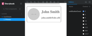

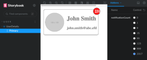
Real-world components are often more involved than this illustration. They might ask for extra dependencies in meta, mocked providers, or multiple stories per component.
By following the earlier guidelines and keeping the UI in a standalone layer, maintaining Storybook for any component stays quick and efficient:
The source code from the example above is available at:
https://github.com/Herdu/storybook-demo
Enhancing Workflow with Chromatic
Chromatic is a platform that takes Storybook a step further. It makes the following tasks simple:
- Publishing the component library so the entire team (including non-programmers) can view it. Team members can add comments, which shortens the feedback loop.
- Running automatic UI regression checks.
- Verifying component behavior against cross-browser variations.
- Maintaining a timeline of UI updates.
- Wiring all of that into CI/CD pipelines.
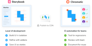
src: https://www.chromatic.com/docs/
Integrating Chromatic does not demand much extra work, and the return on investment can be substantial once the Storybook setup is done.
Wrapping Up
With the concepts and utilities described here, you can turn CDUI theories into practical development workflows. The interface layer becomes a separate unit of work, something that can be delegated to another person or even to a different squad entirely. Isolated component development speeds up the day-to-day work, while testing edge scenarios becomes simpler at both the moment of creation and later during maintenance.
Even a minimal Storybook installation provides ready-made examples for every UI part. With extensions such as the docs addon, you can generate component documentation without writing extra markup manually.
When you optimize for reusability, you also encourage visual and behavioral consistency throughout the app. Taking it one step further, these components can become a shared library used in several projects. Since they exchange data through their own interfaces, they never need to couple themselves to the business requirements of a specific application.
Sources:
Storybook’s documentation: https://storybook.js.org/docs/angular/
Chromatic’s documentation: https://www.chromatic.com/