User Perception of Speed & Wait Times
With rapid advancements in hardware and technology, user expectations have shifted significantly. People now demand snappier interactions than ever before, and the responsiveness of an application's interface directly influences how satisfied they feel while using it.
Frequent online interactions depend on network requests, resulting in noticeable transmission delays. Think of submitting an order at checkout, waiting for a customer service agent to reply, completing extensive questionnaires, or similar tasks where the system must indicate continuous activity until completion. Satisfying users' growing need for speed in such contexts presents a significant challenge for front-end engineering.
Fortunately, several effective techniques are available. However, before exploring these strategies, it is crucial to distinguish between actual response time and the user's perceived passage of time.
System Speed vs. Perceived Speed
Response time refers to the actual duration between a user's input and the system's corresponding output. Generally, this applies to how fast the interface reacts or loads new content.
Timing feedback for interactions requires a delicate balance. If the system reacts too quickly, users might not notice that the change occurred, creating confusion. Conversely, glacial responsiveness hinders the user's workflow and creates frustration.
Nielsen Norman Group provides valuable guidelines for defining these limits. Quick actions like button presses or toggles should receive response times around 0.1 seconds, providing instant visual acknowledgment. For transitions between pages or views, users can tolerate around 1 second. Even longer waits, roughly 10 seconds, are acceptable during data-intensive asynchronous HTTP requests.
While technical performance tuning has its merits, this article focuses primarily on the user's perception regarding time spent on your application.
Perceived time is relative to the user's experience and can be subjective. An excellent method for positively distorting this psychological timer is to provide transparency into process operations. Showing incremental progress indicating how much work is complete and how much longer the process might take regulates expectations, making even lengthy procedures seem friendlier and more tolerable.
Nonetheless, supplying constant progress metrics based on completion times isn't feasible in all scenarios. Thus, UI notifications can be static, when unable to present the status of a task, or dynamic, being able to alert users to ongoing activity in real time.
Next, let's delve into how Angular Material may help optimize this perceived speed in your specific application.
Angular Material UI Feedback Components
Angular offers numerous UI components suitable for keeping the user informed about ongoing tasks. Discover when these indicators work best, optimizing the psychological waiting time associated with different processes.
Progress Indicators
The Angular library offers both progress spinners and progress bars to display the status of an ongoing task visually.
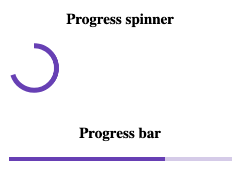
Circular and linear progress indicators from Angular Material
These indicators rely on shared mode and value characteristics. The mode specifies if the process duration is determinate, allowing for specific measurement, or remains indeterminate, being unpredictable or continuous during operation.
Use indeterminate mode as the appropriate response when waiting time lasts below the 10-second limit. For these shorter waiting periods, circular progress spinners demonstrate an edge over horizontal bars for standard feedback.
Frequently, you’ll see spinners embedded inside a button to signal it has been clicked and a process is now underway.

A spinner [mat-spinner] integrated inside a button [mat-button]
<button mat-raised-button color="primary">
	Submit
	<mat-icon>
		<mat-spinner color="accent" diameter="20"></mat-spinner>
	</mat-icon>
</button>
The spinner placed inside the mat-button acts as a mat-icon. Note: By default, mat-progress-spinner functions in indeterminate mode.
If the completion time is known or can be predicted, show the application’s progress within the progress bar or spinner directly. Use the component’s value attribute with a number to accurately reflect the continuous percentage completed. Here’s how this translates:
<mat-spinner [diameter]="50" mode="determinate" [value]="70"></mat-spinner>
<br />
<mat-progress-bar mode="determinate" [value]="70"></mat-progress-bar>
For a known duration, set the mode property on mat-progress-spinner or mat-progress-bar to 'determinate' and bind its value to a number that dynamically matches the operation’s advancement.
For operations taking longer than 10 seconds, it’s strongly suggested to choose determinate mode and visually illustrate dynamic progress to the end-user in place of generic feedback methods.
Enhance transparency further by pairing visuals with text details describing the immediate action - for example: uploading file data, storing submission, finishing order, waiting on server, and so forth. Supplying a concrete status leads to better psychological waiting experience, because users gain a clearer framework of timing beyond pure uncertainty and remain more engaged while they wait.
Don’t forget the UX improvements dialogs offer in conjunction with indicators: allowing cancelation grants users autonomy, minimizes anxiety during lengthy operations, and gives a sense of control with the option to reverse or restart.
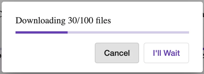
Linear progress bar displayed inside a modal dialog [mat-progress-bar within mat-dialog].
Interact with live examples of these indicators here (link).
Other Effective UI Methods
Loading Skeleton Screens
Placeholder or “ghost” elements have become prominent in high-traffic apps like Instagram and Slack to mimic final content.

Angular Material lacks built-in skeleton components; instead, incorporate open-source libraries, such as ngx-skeleton-loader, to recreate this pattern effectively.
You can even design custom skeletal placeholders by mixing a simple DIV with basic CSS, avoiding extra dependencies. See a simple example (stackblitz) that demonstrates this concept:
Use skeleton screens when exact timing data for process completion remains unavailable. These structured layout mockups do more than signify background activity: they offer a visual clue about the expected outcome. By previewing structure, they diminish uncertainty and create an impression of speed, effectively shortening perceived load times.
Optimistic Interactions
Some modern apps employ optimistic updates, responding immediately to the user’s input, regardless of whether the asynchronous backend call has completed yet. If an error occurs, the system gracefully presents a notification identifying the failure.
A well-known illustration is the StackOverflow voting mechanism: the arrow increments right away to signal success. When network calls succeed, all remains calm; when they don’t, a snackbar pops up explaining the setback.
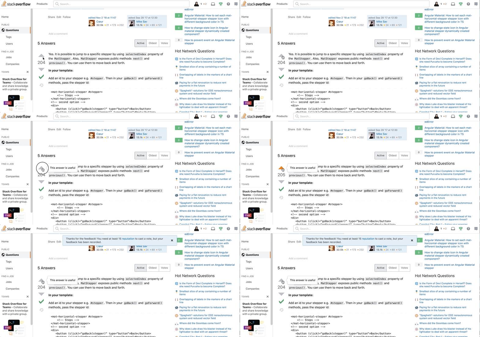
Notice in the example above: the vote total is instantly incremented for optimistic feedback, independent of the database confirmation.
Enhanced Loading Animations
Graphics hold strong attention, bringing warmth and relevance into the interface. Multiple applications use uniquely styled, brand-specific loading React animations, mainly circular spinners offering feedback for quick tasks of unpredictable length. Nevertheless, such undefined loops frustrate users during long operations. To optimize long waits, combine animations with more descriptive indicators: displaying current advancement or dynamic details increases context and perceived responsiveness.
Coding a unique spinner animation as shown in this stackblitz demo.
Check out Ngx-spinner, a library filled with numerous creative spinner designs you can incorporate directly.
Linear Stepper and Progress Bars Integration
Lengthy digital forms easily exhaust user patience, highlighting the need for status indication regarding their position and outstanding tasks.
Use Angular Material's stepper element to split those enormous forms into manageable chunks that indicate step count and completion flow.
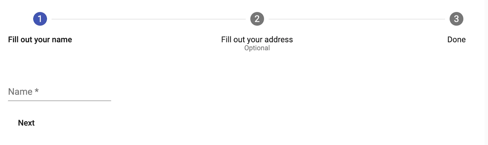
Visualization using the Stepper UI component within Angular Material
The stepper communicates remaining steps required for full submission. Ideally, keep steps nearly equivalent in length, balancing field count across segmented phases.
If unevenness is unavoidable and certain steps take longer than average, integrate a secondary progress bar inside the active step. This dual-signal approach (Stepper with Progress bar) offers a precise layout across forms, measuring fine-grain advancement within each stage.
I trust that clarifies these techniques!