
Styling the Component Host
Building components that must adapt to a wide range of contexts can be a challenge. We need to consider various requirements and their associated logic depending on where they're used. We must decide on the visual layout, the required elements, and the CSS strategy we'll employ. Often, the same component needs to appear in different views, maintaining its core functionality while presenting a distinct appearance. In these situations, the goal should be to build the component in a way that makes swapping out the UI simple, without disrupting the underlying logic.
Understanding the Problem
This might seem a bit vague, so let's use a concrete example. Imagine an application needs to display a list of people who have contributed to a project. These individuals should be shown as tiles in both a list-style layout and a grid-style layout.

Let's treat the person tile as the core of this problem. Its behavior is identical whether it appears in a list or grid. The data it displays comes from the same source, likely through an @Input property from a parent component. The actions it triggers, such as navigating to a detail page on click, remain the same as well.
The sole variation is in its presentation – a horizontal arrangement in lists versus a condensed, more compact design in grids.
I'm sure you've encountered similar scenarios in your own work. This isn't always about layout direction. The same issue arises when you need different color schemes, fonts, sizes, or element positioning.
Let me suggest some excellent Angular features that simplify designing such adaptable components. These techniques promote a flexible and robust component architecture. Such a structure makes adding new features easier and shifts more of the styling work to CSS, keeping TypeScript code leaner and less tied to UI details.
The Toolkit
Our focus will be on three built-in Angular techniques that each offer a way to directly style a component's host element:
- :host
- HostBinding
- :host-context
A Peek at View Encapsulation
These concepts, and even the core problem itself, might be confusing for those new to Angular and its default style encapsulation. If you're an experienced Angular developer, feel free to skip ahead. If not, a quick read will help clarify things.
The immediate question is: why use these specialized techniques when I could simply write standard CSS to target my tile differently based on a parent class? For instance, using a selector like this:
.list-view{
  .tile{
    // custom tile styles for the list view here
  }
}

.grid-view{
  .tile{
    // custom tile styles for the grid view here
  }
}
a basic CSS file
In a typical Angular app, you'd have two components for your views, such as list-view-component and grid-view-component. The tile would be a separate component called tile-component. To get a clearer picture, here’s how the HTML might be structured for this scenario:
<grid-view-component>
  <h1>Grid view</h1>
  <tile-component></tile-component>
  <tile-component></tile-component>
  ...
</grid-view-component>
Grid view markup
<list-view-component>
  <h1>List view</h1>
  <tile-component></tile-component>
  <tile-component></tile-component>
  ...
</list-view-component>
List view markup
Now, let's examine the component code to understand the styling challenge better. Consider this simple component setup:
@Component({
  selector: 'list-view',
  template: `
    <h1>List view</h1>
    <tile *ngFor="let person of persons" [person]="person"></tile>
  `,
  styles: [`
    h1 { color: white }   // this style will be applied
    tile {
      h2 { color: white } // this styles won't be applied
    }
  `]
})
export class ListViewComponent {
}
List View Component code
In this case, your styles for the list and grid components will apply only to their own elements. They won't affect the tile's styles at all. This strict isolation is how Angular styling works, which is exactly why we need special tools to manage such cross-component styling.
Why bother with style isolation at all? It might seem like a hindrance to newcomers. Consider a large, complex application where you’re adding a new feature and its associated styles. Without isolation, you risk accidentally overriding the styles of unrelated components with your new rules. Isolation provides a default safety boundary around each component, making the styles easier to manage and debug.
Without this encapsulation, developers are forced to rely on elaborate naming conventions to avoid collisions. Even then, there’s a risk of non-unique selectors clashing. For my money, Angular's view encapsulation is a powerful feature, and it's best to work with it. Outside of Angular, techniques like Shadow DOM can provide similar benefits. It's worth noting that other popular frameworks haven't adopted style isolation, which can be a major hurdle when building large applications with numerous components.
Demystifying Encapsulation
During the app bootstrap process, component styles are processed to ensure they're scoped correctly. After processing, these styles are combined and placed into a main stylesheet file.
So how is this isolation achieved? Angular assigns a unique attribute to each component's elements. It then uses this attribute in the CSS selector to scope the rules. Let's break it down with an example:
@Component({
  selector: 'tile',
  template: `<h2>{{person.name}}</h2>`,
  styles: [`h2 { color: white } `]
})
export class TileComponent {
  @Input() person: Person;
}
Tile Component TypeScript
This is a basic component that takes an input and displays a name in a header. It has a single CSS rule that sets the color of the <h4> element. How does Angular handle this at startup?
Each time you use the tile component, Angular automatically adds a custom attribute to it in the DOM:
<tile _ngcontent-c1></tile>
Tile Component rendered with ngcontent attribute
The styles are then injected into a global <style> tag in the page's <head>. However, because of the added ngcontent attribute, they are only applied to that specific component's elements:
h1[_ngcontent-c1]{
  color: white;
}
Encapsulated CSS rule with ngcontent attribute
This should clarify how view encapsulation works and why styling a child component's internals from its parent is not straightforward.
Using :host
The most straightforward method to apply styles directly to your component's host element is by using the :host pseudo-class selector. This approach relies purely on CSS capabilities and doesn't necessitate any additional TypeScript logic within the component class.
Its operation is elegantly simple. Remember how styles are isolated during startup? Angular applies a similar process to the host element. For example, when our tile-component is rendered:
<tile _nghost-c1=""></tile>
Tile Component in the DOM
If you define styles using the :host selector, they are applied to the component's own element:
[_nghost-c1] {
  // styles from :host will be placed here
}
How :host selector targets the component element
When is this useful? Primarily when you need to style the host element itself. Logically, it's the component's responsibility to style its own UI shell, so putting those styles in the parent's stylesheet isn't clean. Another common problem is the use of an unnecessary wrapper <div> inside a component's template just for styling purposes. This adds no semantic value and creates extra DOM nodes. This is a prime case for refactoring with the :host selector.
To make this concrete, let's keep our tile component and consider a basic version of it:
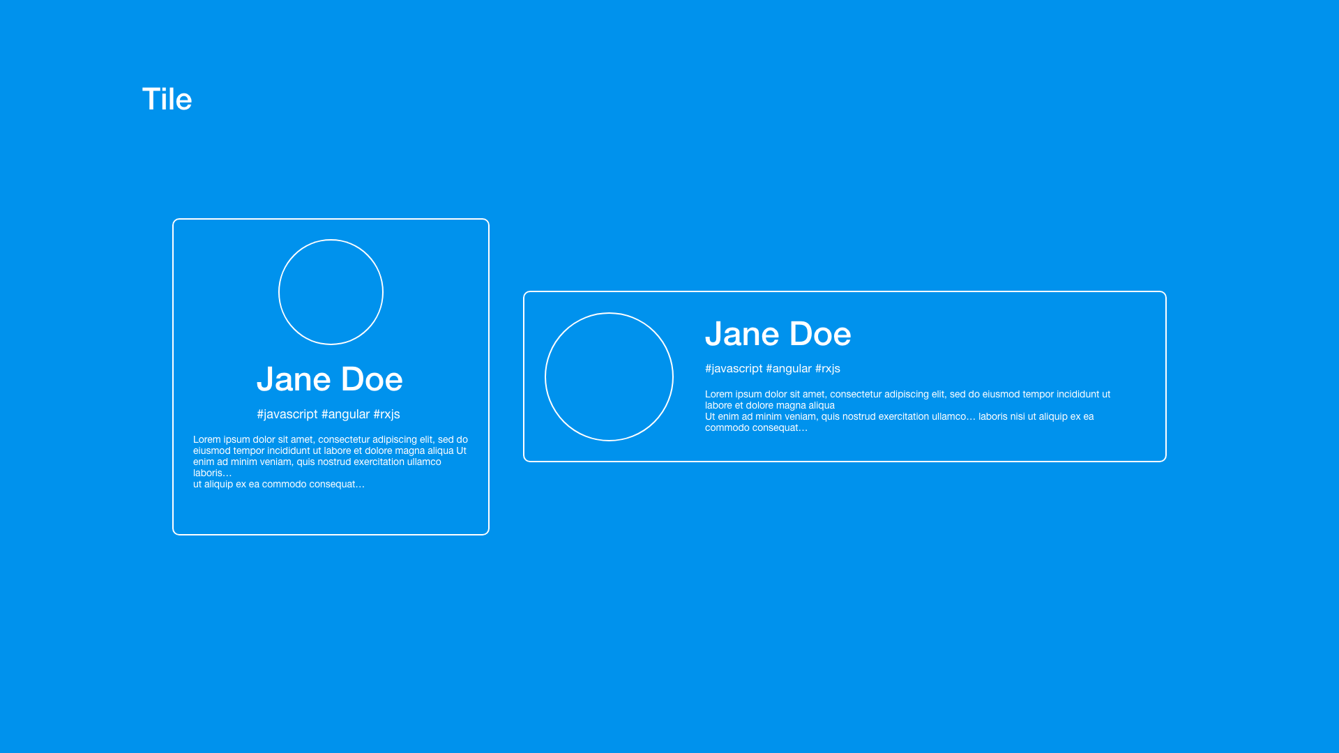
Imagine a component written like this, with its template and styles:
@Component({
  selector: 'tile',
  template: `
  	<div>
      <h2>{{person.name}}</h2>
    <div>`,
  styles: [`
    div {
      margin: 10px;
      background: #0092ED;
      h2 {
        color: white
      }
    }
  `]
})
export class TileComponent {...}
A basic Tile Component with a div wrapper
That inner <div> is doing no practical work. Let’s add another common anti-pattern to the example. Imagine the tile requires a border that, due to some constraint, can't be applied directly to the tile's root element. Instead, it gets applied from the parent component:
@Component({
  selector: 'list-view',
  template: `<tile>Hello</tile>`,
  styles: [`
    tile {
      border: 1px solid;
    }
  `]
})
export class ListViewComponent {...}
List View Component styling the tile component from outside
Now, let’s see how :host can clean all this up. We can move that border style into the tile's own stylesheet and eliminate the useless wrapper <div>, applying its styles directly to the host element:
@Component({
  selector: 'tile',
  template: `<h2>{{person.name}}</h2>`,
  styles: [`
    :host {
      border: 1px solid;
      background: #0092ED;
      h2 {
        color: white
      }
    }
  `]
})
export class TileComponent {...}
Refactored Tile Component using :host
The result is cleaner, more readable code that produces a simpler DOM structure and keeps the styling logic neatly contained.
This example demonstrates the power of `:host` for static, self-contained styling. However, what about scenarios where you need a more dynamic approach? That's where things get much more interesting.
:host & Dynamic Styling
There are situations where we find ourselves needing to adapt a component's look to fit our design requirements. When the component originates from our own codebase, it's comparatively easier to work with. However, consider a scenario where the element comes from an external UI library, like Material. In such cases, penetrating those pre-built components with our custom styles is far from trivial. Let's continue with our tile component example and suppose we want to enable customization of specific areas, making it more adaptable for diverse application designs.
To illustrate this technique, I will focus on altering the component's background. First, let's look at the problem:
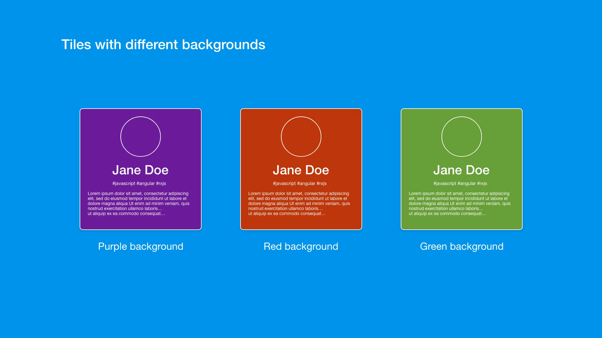
Several methods exist to override the default styling and bypass View Encapsulation to apply our custom background color. One approach is to place styles in the global stylesheet, which bypasses the encapsulation process. However, this isn't very clean from a maintainability perspective. We're manipulating styles for components we might not fully understand, potentially causing unforeseen consequences. Another option is the outdated shadow-piercing technique, which used to override encapsulation in Angular. In my view, this method is quite risky, so I won't delve into it further.
Finally, there's a more robust technique that leverages CSS variables. This allows us to provide custom values that penetrate the component's styles when necessary. The key advantage here is that the component's author explicitly defines where modifications are permitted, giving us confidence that changes won't break unrelated functionality or introduce side effects. I highly recommend this approach. It's not just beneficial for UI library development; it's also useful in standard projects.
Let's ensure we're aligned on CSS variables with a quick review:
Variables are meant to eliminate the repetition of values in our stylesheets. For example, if you find yourself constantly copying and pasting the same color values across your application's style rules, it's much better to define a variable. Give it a descriptive and meaningful name, and then refer to it by name whenever you need that value.
Consider this short example:
:root {
  --blue: #1e90ff;
  --white: #ffffff;
}

h1 {
  color: var(--blue);
}

p {
  color: var(--white);
  background: var(--blue);
}
CSS variables example
At the root scope, I defined two CSS variables representing two colors for my theme. This allows me to use the var() function, which pulls the value associated with the provided variable name. While there are many more advanced features of CSS variables, I'll keep the focus on this simple application to demonstrate its utility in our Angular context.
Let's say our tile's background should be transparent by default, but we want to allow consumers of this component to pass any color they like.
From the parent component's perspective, the HTML might look like this:
<tile>I'm default</tile>
<tile class="red">I'm custom red!</tile>
<tile class="green">I'm custom green!</tile>
tiles in the template
Now, how do we integrate this CSS variable technique into our Angular component? We need to accomplish two things. First, we must modify the tile component to use the CSS variable for its background color when one is provided. I'll take the final code for the tile component from the :host section and implement the CSS variable:
@Component({
  selector: 'tile',
  template: `<h2>{{person.name}}</h2>`,
  styles: [`
    :host {
      background: var(--tile-background);
      h2 {
        color: white
      }
    }
  `]
})
export class TileComponent {...}
Tile Component with CSS variable
As you can see, the change is minimal; I simply swapped the hardcoded background color value with the var() function. If we wanted a default color, we could pass it as a second argument to the var() function, but let's leave it as is.
The second step is to determine how to provide a value for --tile-background. I'll use simple CSS classes (red, green) to target the elements and assign the variable like this:
.red {
  --tile-background: #bf360c;
}

.green {
  --tile-background: #689f38;
}
providing CSS variable values to the tiles
This is quite straightforward. We simply set the variables in the desired locations. If they're present, they populate the background CSS property; if not, nothing occurs.
This is an excellent technique for enabling custom styling in a highly controlled and safe manner. As developers, we can dictate exactly what is customizable by exposing a precise API through CSS variables.
It's important to note that many popular Angular libraries adopt this strategy to facilitate customization of their components. A prime example is Taiga UI, which has truly mastered this technique.
Pretty dynamic styling, wouldn't you say? Well, it is, but what if I told you we can make it even more dynamic? By leveraging Angular properties, we can create and alter variables on the fly.
An impressive demonstration of this idea was shared by my colleague Alex:
Do you know you can create “demand” for #CSS variables on the fly? You can use it to make the EASIEST API for coloring lists inside components! Check out this BarChart demo on @StackBlitz ?https://t.co/ayzET7mLvZ
Isn’t that just awesome? ? pic.twitter.com/TSOJRT6hyD— Alex Inkin (@Waterplea) June 1, 2021
What makes the idea in the above snippet so brilliant? It demonstrates that variable names can be generated on demand based on any condition we desire. They could be generated for each item within a *ngFor loop, creating a unique variable for each. They could be generated when a specific condition is met, such as after a user interaction – the possibilities are extensive.
By adopting this technique, we can build intricate logic into the component. We only expose CSS variables that a parent component can supply if necessary. This approach is incredibly valuable and shines in well-architected component structures.
Let's move on to some other remarkable techniques:
HostBinding
HostBinding is a decorator in Angular designed to dynamically alter the host's DOM properties. While this decorator can set any DOM property, our focus here will be on changing the CSS class and a custom data attribute. That way, these properties are applied directly to the host element in the DOM.
When is this technique useful? It's particularly handy when you need to apply varying styles based on logical conditions.
Let's stick with our tile view example. Suppose we need a way to highlight certain tiles.
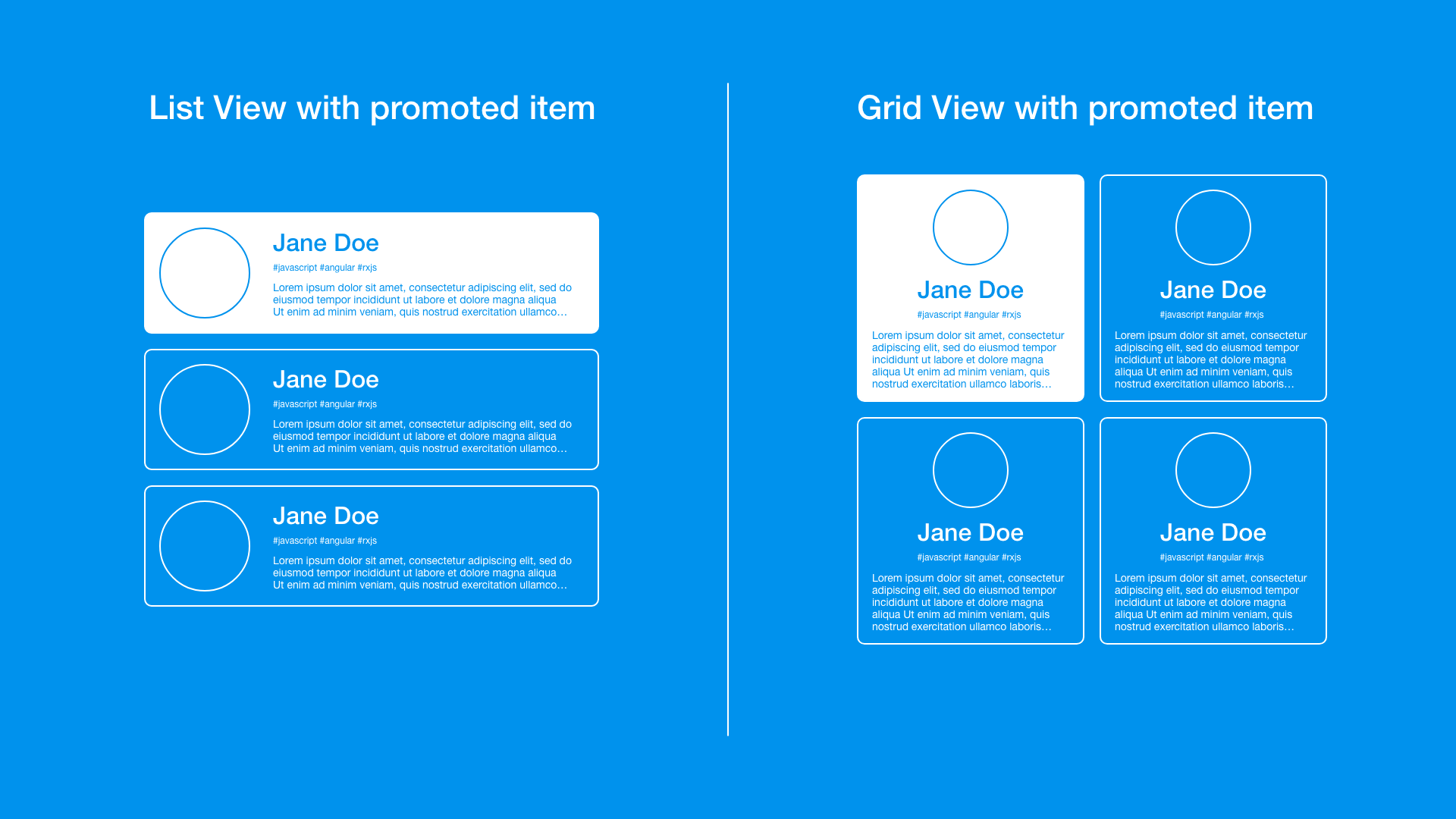
One approach is to utilize the HostBinding decorator to add a class when the item should be highlighted.
In our case, the HostBinding syntax appears as follows:
@HostBinding('class.highlighted') promoted: boolean;
HostBinding syntax
The highlighted class gets added to the host element when the promoted variable evaluates to true and removed when promoted is falsy.
Let's now combine this with the component code to observe the decorator in action:
@Component({
  selector: 'tile',
  template: `<h2>{{person.name}}</h2> `,
  styles: [`
    :host {
      background: #0092ED;
      h2 { color: white }
    }
    :host.highlighted {
      background: white;
      h2 { color: #0092ED }
    }
  `]
})
export class TileComponent {
  @Input() person: Person;

  @HostBinding('class.highlighted')
  get promoted() { return this.person.promoted }
}
Tile Component with @HostBinding
Rather than directly assigning a static property to HostBinding, I've used a getter function to retrieve the value of the promoted property from the person's data. This makes it more dynamic and responsive to data changes.
We have two style configurations: one with the default blue background and another that highlights the item with a white background.
This technique works well for boolean states, like highlighted versus not – providing two exclusive options. The class is toggled, which is quite straightforward. But what if we need to style the component according to a state that can have multiple exclusive values? For instance, consider our tile could be in an active, disabled, or simply a regular state. This is a common pattern, right?
We can also solve this problem using the HostBinding decorator. We just need to switch from setting a class to setting something else. Classes aren't the only target for CSS selection on a DOM element. HTML5 introduced data attributes specifically for associating custom data with an element. They were designed to allow arbitrary attributes. The syntax is straightforward: prefix your desired name with data-, and the element will recognize it as a standard data attribute. For example, data-parent="list" could be a custom data attribute named "parent" with a value of "list".
Let's skip the theory and see how this works in our scenario. Assume our tiles can exist in a few mutually exclusive states. The tile could be active, for instance, when selected by the user; it could be disabled if it's not available for selection; and finally, it can be in a neutral or regular state. Each state corresponds to a specific visual representation of the component, as illustrated below:
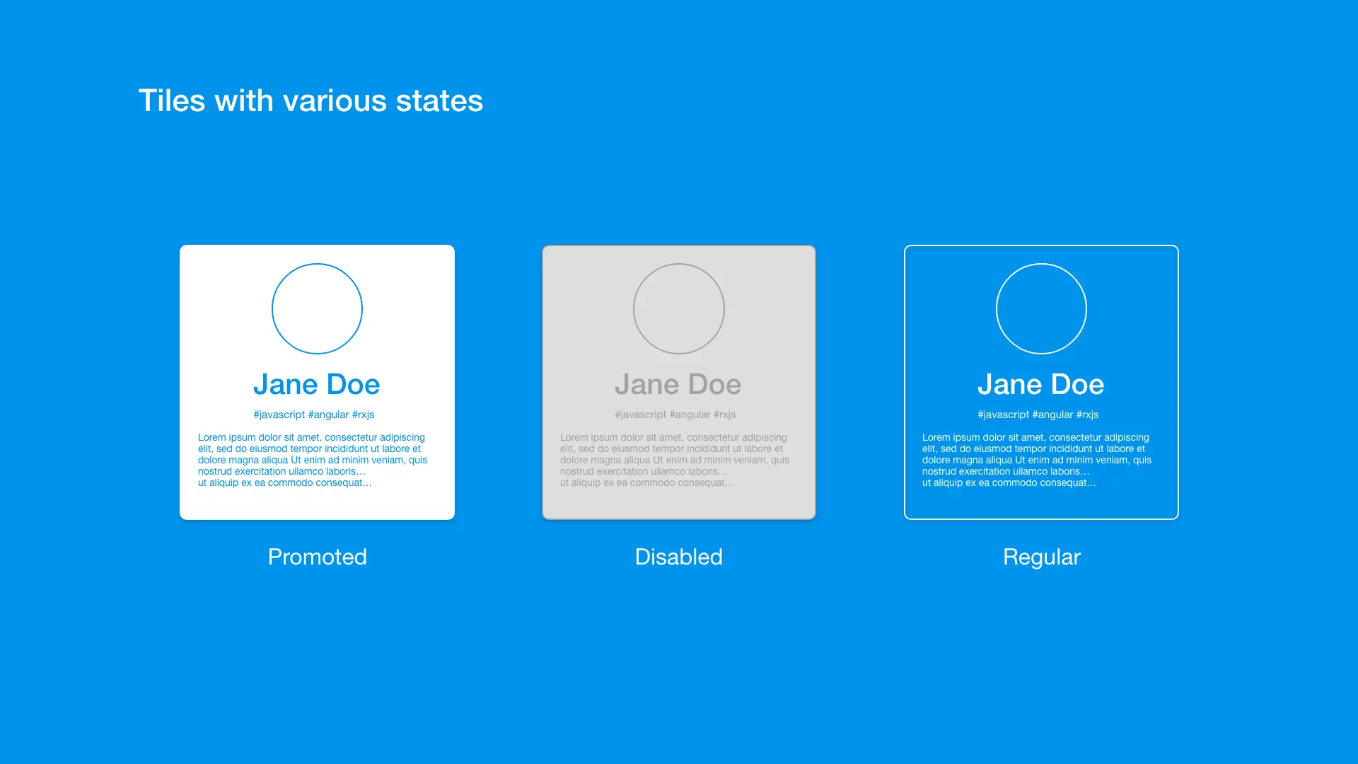
How could we implement this using a data attribute and the HostBinding technique? First, let's assign the data attribute within the component:
@HostBinding('attr.data-state')
state: 'active' | 'disabled' | 'regular' = 'regular';
HostBinding with multi states
The attribute is set on the host element via HostBinding. It takes a string value indicating the current state, with allowed values being: active, disabled, and regular.
In some scenarios, it would be beneficial to alter the state from an external source:
@Input()
@HostBinding('attr.data-state')
state: 'active' | 'disabled' | 'regular' = 'regular';
HostBinding with multi states
Now it employs an Input decorator so that it can be passed from the parent template based on some condition, or it can still be set within the tile component itself, as before.
Using an attribute for styling is easy; the example below demonstrates how to set the styling for tiles in the active state:
:host[data-state='active'] {
  background-color: white;
  color: #0092ed;
}
CSS with data-attribute selection
Using this same principle, we can define distinct styles for each component state. Here is the complete snippet with the full component:
@Component({
  selector: 'tile',
  template: `<h2>{{person.name}}</h2> `,
  styles: [`
    :host[data-state='regular'] {
      background: #0092ED;
      color: white;
    }
    :host[data-state='active'] {
      background-color: white;
      color: #0092ed;
    }
    :host[data-state='disabled'] {
      background-color: light-grey;
      color: dark-grey;
    }
  `]
})
export class TileComponent {
  @Input() person: Person;

  @Input()
  @HostBinding('attr.data-state')
  state: 'active' | 'disabled' | 'regular' = 'regular';
}
Tile Component with data-attribute
While these are elegant ways to manipulate host element properties with a bit of TypeScript and apply styles based on that, there are scenarios where we can rely solely on CSS syntax to define styles for various use cases.
:host-context
The final technique I'd like to present is another pseudo-class selector, known as :host-context. This unique selector helps us apply styles that only take effect in a certain context of use – based on where the component is located. To refresh your memory on the context, here's a visual:

Assume we already have our tile component, along with the list and grid view containers. Now we need to implement slightly different user interfaces depending on the context.
Tiles in a list view should display the avatar on the left, with personal information in a column to the right. Conversely, the same tile in a grid view should have its elements laid out vertically and centered.
We've already covered the HostBinding technique, which could be employed here to assign different classes to the tile's host element based on the view, potentially via an Input property. The tile could then manage its own styling.
This approach could resemble:
<tile [view]="'list'"></tile>
<tile [view]="'grid'"></tile>
Example of declaring view type in Tile Component
The point is, applying TypeScript logic here seems unnecessary. Our scenario revolves purely around UI and its context, so it would be ideal to stick with CSS for styling whenever possible.
Actually, we can achieve this entirely within CSS by using Angular's built-in selectors. This keeps our TypeScript class untouched and unaware of minor UI variations, offering a clean way to adjust the UI solely for the component's stylesheet.
What exactly do I mean by "context of use"? Let me illustrate:
<div class="list">
  <tile></tile>
</div>

<div class="grid">
  <tile></tile>
</div>
Example of list and grid views template
Tiles are situated within a container that has either the list class or the grid class. We can leverage this in the :host-context selector to apply different styles accordingly.
What's the syntax for the :host-context selector? Here is a brief snippet:
:host-context(.list) {
  // styles here are applied if element matches rule .list
}
:host-context(.grid) {
  // styles here are applied if element matches rule .grid
}
:host-context syntax
So, the :host-context selector takes another selector, such as a CSS class. It then checks whether the current element matches that selector; if it does, the styles are applied. Below is a full component example:
@Component({
  selector: 'tile',
  template: `
    <img [src]="person.avatar"/>
    <article>
      <h2>{{ person.name }}</h2>
      <p>{{ person.description }}</p>
    </article>
  `,
  styles: [`
      :host-context(.list) {
        display: flex;
        align-items: center;

        article{
          margin-left: 16px;
        }
      }

      :host-context(.grid) {
        display: flex;
        flex-direction: column;
        align-items: center;
        text-align: center;

        article{
          align-items: center;
        }
      }

      article {
        display: flex;
        flex-direction: column;
      }
  `]
})
export class TileComponent {
  @Input() person: Person;
}
Tile Component with host-context
Everything is configured within the styles without any Angular-specific logic. That's a very neat separation!
In the context of the .list class, the tile will have its display set to flex with a row layout. Meanwhile, under the .grid class, the content will be arranged in a column. The article element holding the personal data will also receive slight style adjustments depending on whether it's inside a .list or a .grid container.
Final Takeaways
These three approaches are worth mastering and applying in your daily work. Styling the host element directly gives you more control and often leads to cleaner, more maintainable component code.
Let’s recap the key points you should keep in mind.
:host pseudo-class — use it in your component styles to target the host element itself
- great for trimming extra wrapper elements from your markup (e.g., removing unnecessary containers)
- pair it with CSS custom properties to expose a clean styling API to consumers
HostBinding decorator — dynamically bind classes, styles, or attributes to the host element from your component class
- helps you avoid repeating logic in both HTML and CSS
- leverage data attributes to reflect state directly in the DOM for styling and testing
:host-context pseudo-class — apply conditional styles to the host element based on its surrounding context
- ideal for adapting a component’s appearance to different parts of the app without creating new component variants
One last piece of advice to carry with you:
Keep UI logic separate from business logic when designing components.
It’s not always feasible, but when it is, you end up with components that are straightforward to read and easy to extend. When business rules change, you update the TypeScript class without worrying about breaking the layout. When the look and feel changes, or the component needs to behave differently elsewhere, you can rely on the styling techniques discussed here and simply adjust the styles.
I hope this guide was helpful. If you’d like to dive deeper into any of the details, feel free to reach out on Twitter at @maciej_wwojcik.
You can also check out the full working examples in the resources below:
Thanks for reading!