Sass essentials before you start
Sass is a CSS preprocessor that goes beyond plain CSS, giving developers the ability to write styles that are cleaner, more modular, and easier to maintain over time. Angular Material is built on Sass under the hood, so a quick look at its core concepts is worth the time.

Nesting
With Sass nesting, you can structure CSS rules in a way that mirrors your HTML hierarchy directly. Child styles live inside their parent’s block, so you avoid repeating long selector chains and keep the stylesheet readable.
Docs: https://sass-lang.com/documentation/style-rules/declarations/#nesting
.header {
  width: 100vw;

  &__logo {
    margin-left: auto;
  }

  &--dark {
    background-color: #3a2125;
    color: white;
  }

  h1 {
    font-size: 2rem;
    line-height: 2.8rem;

    &:hover {
      text-decoration: underline;
    }
  }
}
Variables
Store reusable design values like colors, spacing, sizes, and other style-related tokens in named variables. This keeps your stylesheets easier to manage, and a single change propagates everywhere the variable is used.
Docs: https://sass-lang.com/documentation/variables/
$my-color: #12ea8c;
$selector: primary;

.card {
  $main-color: $my-color;
  background-color: $main-color;
  padding: 1rem;
}

// #{$variable} - string interpolation
.link-#{selector} {
  color: $my-color;
}
Maps
Maps give you a way to hold data as key-value pairs, much like JavaScript objects. They make it possible to organize collections of related values in a structured, maintainable format within your stylesheet.
Docs: https://sass-lang.com/documentation/values/maps/
$sizes: (
  sm: 10rem;
  md: 15rem;
  lg: 20rem;
  xl: 25rem;
);

@each $key, $value in $sizes {
  .card--#{$key} {
    width: $value;
  }
}

.user-card {
  width: map-get($sizes, md);
}
Lists
Lists are simple data structures for grouping multiple values together. SCSS lists are flexible: they can be comma-separated (1px, 2px, 3px) or space-separated (1px 2px 3px), depending on what fits the context.
Docs: https://sass-lang.com/documentation/values/lists/
$size-prefixes: sm, md, lg;

.panel-#{nth($size-prefixes,2)} {
  color: $primary-color;
  width: 15rem;
}
Functions
Functions in Sass let you run operations and return values directly inside your stylesheet. They handle dynamic styling by processing colors, numbers, strings, units, and data structures like maps and lists, and they support core programming concepts such as boolean logic and loops.
Docs: https://sass-lang.com/documentation/values/functions/
@function fade-out($color, $alpha: 0.5) {
  @if $alpha < 0 or $alpha > 1 {
    @error “Provide value between 0 and 1”;
  }

  @return rgba($color, $alpha);
}

@function sum($numbers...) {
  $sum: 0;
  @each $number in $numbers {
    $sum: $sum + $number;
  }
  @return $sum;
}

.card {
  background-color: fade-out($primary-color);
  border: solid 1px fade-out($accent-color, 0.3);
  width: sum(50px, $base-width, 10vw);
}
Mixins
A mixin is a reusable block of CSS that you define once and then apply wherever you need it. This cuts down on duplication and keeps your code more maintainable. Mixins shine when you need to reuse patterns, combine complex properties, or handle cross-browser quirks, and they can accept parameters to adjust their output.
Docs: https://sass-lang.com/documentation/values/mixins/
@mixin reset-list {
  margin: 0;
  padding: 0;
  list-style: none;
}

@mixin horizontal-list($primary-element-color: currentColor) {
  @include reset-list;
  display: flex;
  gap: 1rem;

  li.primary {
    color: $primary-element-color;
  }
}
Modules
Modules help you organize and manage styles more efficiently, especially in larger projects. Two key directives, @import and @use, both bring styles in from other files, but they behave quite differently.
The older @import directive pulls styles from one file into another. It has drawbacks, however: compilation is slower, and duplicated styles can become an issue because Sass code gets executed with every @import statement.
Docs: https://sass-lang.com/documentation/at-rules/import/
Introduced as a modern replacement, @use offers a cleaner approach to importing styles with namespacing. It prevents conflicts by requiring explicit references to any imported variables or mixins.
Docs: https://sass-lang.com/documentation/at-rules/use/
@import “./variables.scss”;
@use “./functions.scss”;
@use “./my-awesome-mixins.scss” as mixins;

.options-list {
  @include mixins.horizontal-list(functions.fade-out($primary-color));
}
Building a custom theme
The updated Angular Material API simplifies theming considerably. To get a working theme, the simplest approach is to include the theme mixin in styles that apply at the HTML level, so the theme cascades everywhere. The mixin takes a map that defines color, typography, and density, and in turn it generates a set of CSS variables that control how components look and how their layout is spaced.
@use “@angular/material” as mat;

html {
  @include mat.theme(
    (
      color: mat.$violet-palette,
      typography: Roboto,
      density: 0,
    )
  );
}
That said, there is much more room for customization. Let’s look at the additional options the theme mixin provides.
Colors
Colors set by the theme determine component color styles — for example, the fill color of checkboxes and icons or the outline color of inputs. Angular Material works with the following color roles:
- Primary — the main brand color used across the most prominent components. Angular Material applies a "base" primary color plus a set of tonal shades, including lighter and darker variants. Examples include buttons and active elements.
- Secondary (accent) — used for highlighting or emphasizing parts of the UI. It tends to be vivid and contrasting with the primary color, used deliberately so it does not overwhelm users. Examples include FAB buttons and the active tab indicator.
- Tertiary — a role for contrasting accents that help balance primary and secondary colors or draw extra attention to an element, such as an input field.
- Warn — communicates error states, like when a password entered in a field is incorrect.
Each role relies on a color palette, which is a set of similar colors arranged from dark (lowest index) to light (highest index). The Angular Material theme draws from these palettes to build a color scheme that reflects the app’s hierarchy, state, and brand.
To compose your theme, you can tap into prebuilt color palettes: red, green, blue, yellow, cyan, magenta, orange, chartreuse, spring-green, azure, violet, rose. Access them by using a variable named "${{palleteName}}-pallete" from @angular/material.
If you want something that fits your brand more closely, you can generate your own palette using this generator:
ng generate @angular/material:theme-colorWith the generated primary palette, you can start configuring colors like this:
@use “@angular/material” as mat;
@use “./theme-colors” as theme;

html {
  @include mat.theme(
    (
      color: theme.$primary-palette,
      typography: Roboto,
      density: 0,
    )
  );
}
You can also configure a separate tertiary color palette, giving distinct accent colors to certain components:
@use “@angular/material” as mat;
@use “./theme-colors” as theme;

html {
  @include mat.theme(
    (
      color: (
        primary: theme.$primary-palette,
        tertiary: theme.$tertiary-palette
      ),
      typography: Roboto,
      density: 0,
    )
  );
}
Typography

The typography system establishes a coherent set of font styles, keeping text consistent and visually polished throughout the app. The simplest route is defining just a font family:
@use “@angular/material” as mat;
@use “./theme-colors” as theme;

html {
  @include mat.theme(
    (
      color: theme.$primary-palette,
      typography: Poppins,
      density: 0,
    )
  );
}
Or you can assign distinct font families: one for plain text (used across most of the app) and another for brand text (used in headings and titles):
@use “@angular/material” as mat;
@use “./theme-colors” as theme;

html {
  @include mat.theme(
    (
      color: theme.$primary-palette,
      typography: (
        plain-family: Poppins,
        brand-family: Montserrat,
      ),
      density: 0,
    )
  );
}
If you need quality fonts, check out Google Fonts, which offers a broad selection and handy preview tools. Pick the fonts you want, then paste the generated embed code into the <head> tag of your index.html file.
Another adjustable aspect of typography is font weight. You can define specific weights for regular, medium, and bold text:
@use “@angular/material” as mat;
@use “./theme-colors” as theme;

html {
  @include mat.theme(
    (
      color: theme.$primary-palette,
      typography: (
        plain-family: Poppins,
        brand-family: Montserrat,
        bold-weight: 800,
        medium-weight: 500,
        regular-weight: 300,
      ),
      density: 0,
    )
  );
}
Density
The density value controls how much spacing appears within components — the padding around a button’s label or the height of form fields, for instance.
It accepts integers from 0 to -5. A value of 0 means default spacing, while -5 gives you the most compact layout. Each decrement (from -1 downward) shrinks the affected sizes by 4px, all the way down to the minimum size components need to render coherently, which usually results in less whitespace overall.
@use “@angular/material” as mat;
@use “./theme-colors” as theme;

html {
  @include mat.theme(
    (
      color: theme.$primary-palette,
      typography: Poppins,
      density: -5,
    )
  );
}

Context-specific theme
You are not limited to a single theme across your whole app. If you want a particular section to stand out and draw attention, you can apply a different theme just to that section.
@use “@angular/material” as mat;
@use “./theme-colors” as theme;

html {
  @include mat.theme(
    (
      color: theme.$primary-palette,
      typography: Poppins,
      density: 0,
    )
  );
}

.azure-section {
  @include mat.theme(
    (
      color: mat.$azure-palette,
      typography: Poppins,
      density: 0,
    )
  );
}
Dark mode
Dark mode is a common feature, and Angular Material makes it straightforward to implement. By default, it leans on the light-dark function, which lets you specify two colors for a property. The function returns one of those colors, depending on whether a light or dark color scheme is active. The scheme can come from developer configuration or from the user’s own preference, set via the operating system or browser settings.
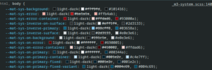
In addition, the color-scheme CSS property gives you the ability to override a user’s color scheme to light or dark. That flexibility makes it simpler to build interfaces that are both visually consistent and user-friendly.
@use “@angular/material” as mat;
@use “./theme-colors” as theme;

@mixin apply-dark-mode {
  color-scheme: dark;
}

html {
  @include mat.theme(
    (
      color: theme.$primary-palette,
      typography: Poppins,
      density: -2,
    )
  );
}

body {
  margin: 0;

  &.dark-mode {
    @include apply-dark-mode;
  }
}
Once those styles are in place, you can build a toggle that switches between light and dark modes by dynamically adding or removing the dark-mode class on the <body> element. For the best experience, the initial mode should follow what the user’s device settings report.
export type ColorMode = 'light' | 'dark';

export const PREFERRED_COLOR_MODE = new InjectionToken<Signal<ColorMode>>(
  'PREFERRED_COLOR_MODE',
  {
    providedIn: 'root',
    factory: () => {
      const destroyRef = inject(DestroyRef);
      const mediaQuery = window.matchMedia('(prefers-color-scheme: dark)');

      const colorMode = signal<ColorMode>(
        mediaQuery.matches ? 'dark' : 'light',
      );

      const preferredColorModeChangeListener = (event: MediaQueryListEvent): void => {
        event.matches ? colorMode.set('dark') : colorMode.set('light');
      };

      mediaQuery.addEventListener('change', preferredColorModeChangeListener);

      destroyRef.onDestroy(() =>
        mediaQuery.removeEventListener('change', colorSchemeChangeListener),
      );

      return colorMode;
    },
  },
);

// Renderer2 cannot be directly injected into singleton service
export const injectRenderer2 = (): Renderer2 =>
  inject(RendererFactory2).createRenderer(null, null);

@Injectable({ providedIn: 'root' })
export class DarkModeService {
  private readonly DARK_MODE_CLASS = 'dark-mode';

  private readonly _renderer = injectRenderer2();
  private readonly _document = inject(DOCUMENT);
  private readonly _preferredColorMode = inject(PREFERRED_COLOR_MODE);

  private readonly _mode = linkedSignal(() => this._preferredColorMode());
  readonly mode = this._mode.asReadonly();
  readonly isDarkMode = computed(() => this.mode() === 'dark');

  constructor() {
    effect(() => {
      this._applyDarkModeClass(this.isDarkMode());
    });
  }

  toggleDarkMode(): void {
    this._mode.update((mode) => (mode === 'light' ? 'dark' : 'light'));
  }

  setDarkMode(enabled: boolean): void {
    this._mode.set(enabled ? 'dark' : 'light');
  }

  private _applyDarkModeClass(enabled: boolean): void {
    if (enabled) {
      this._renderer.addClass(this._document.body, this.DARK_MODE_CLASS);
    } else {
      this._renderer.removeClass(this._document.body, this.DARK_MODE_CLASS);
    }
  }
}
If you would rather manage your own color choices for dark mode instead of relying on Angular Material’s defaults, you can define separate themes by setting the theme-type property in the color map, then apply those themes as needed.
@use “@angular/material” as mat;
@use “./light-theme” as light-theme;
@use “./dark-theme” as dark-theme;

@mixin apply-light-theme {
  @include mat.theme(
    (
      color: (
        primary: light-theme.$primary-palette,
        tertiary: light-theme.$tertiary-palette,
        theme-type: light
      ),
      typography: Poppins,
      density: 0,
    )
  );
}

@mixin apply-dark-theme {
  @include mat.theme(
    (
      color: (
        primary: dark-theme.$primary-palette,
        tertiary: dark-theme.$tertiary-palette,
        theme-type: dark
      ),
      typography: Poppins,
      density: 0,
    )
  );
}
System Variables
As highlighted earlier, the Material 3 implementation depends on design tokens—realized as CSS custom properties—to deliver highly detailed and adaptable styling. The theme mixin produces a large set of tokens. To view them, open your browser’s developer tools and inspect the root selectors. Every token begins with the prefix mat-sys to make them easy to identify. Below is a breakdown of what they represent.
Color Tokens
The theme mixin outputs an extensive collection of color-related tokens, including:
–mat-sys-primary— the most frequently applied color across components–mat-sys-surface— a subtle background color for low-emphasis areas–mat-sys-error— used to signal warnings or errors to the user-mat-sys-outline— intended for borders and divider lines- multiple alternate color variations
- several background surface shades
You can explore the full list in the official documentation. A useful guideline is to assign your selected color to an element and then use the corresponding mat-sys-on token for text, icons, or other foreground elements. This ensures proper contrast and readability. For instance, a primary button applies –mat-sys-primary to its background and –mat-sys-on-primary to its label.
Typography Tokens
Material Design defines five distinct typography categories:
- Body — suited for extended reading passages. It’s best to steer clear of decorative or expressive fonts here, as they tend to be less legible at smaller sizes
- Display — the largest text on screen, reserved for brief, impactful content like numerals or key phrases, especially on larger displays. A more expressive typeface, such as script or handwritten styles, works well in this role
- Headline — ideal for short, prominent text on smaller screens, these styles help emphasize primary content sections or important regions of a layout.
- Label — compact and functional, used for text within components or for small captions in the body. Buttons, for instance, commonly use the label large style
- Title — smaller than headlines, these styles suit medium-emphasis text that is concise, making them perfect for dividing secondary content areas
Each of these categories comes in three sizes: small, medium, and large. That yields 15 typography configurations in total, each accessible via the token –mat-sys-{{category}}-{{size}}. Furthermore, you can drill down into specific aspects of a font definition by adding suffixes like: font, line-height, size, tracking, or weight.
--mat-sys-body-medium: 400 0.875rem / 1.25rem Roboto, sans-serif;
--mat-sys-body-medium-font: Roboto, sans-serif;
--mat-sys-body-medium-line-height: 1.25rem;
--mat-sys-body-medium-size: 0.875rem;
--mat-sys-body-medium-tracking: 0.016rem;
--mat-sys-body-medium-weight: 400;
Elevation Tokens
Elevation is designed to create a sense of depth, helping to organize elements on the interface by:
- allowing surfaces to layer in front of or behind one another
- expressing spatial relationships between elements
- directing attention to the surfacewith the highest elevation
Previously, elevation was applied with the mat-elevation-z class. The new system defines six elevation levels as tokens, ranging from –mat-sys-level0 to –mat-sys-level5, each expressed as a CSS box-shadow value.
Working with System Variables
If you’ve worked with CSS custom properties before, you’ll find these tokens just as straightforward to use. They can be referenced anywhere in your stylesheet, making it easy to craft and adapt your design without extra overhead.
body {
  background-color: var(--mat-sys-surface);
  color: var(--mat-sys-on-surface);
}

h1 {
  font: var(--mat-sys-headline-large);
}

h2 {
  font: var(--mat-sys-headline-medium);
}
Token Customization
Angular Material components offer focused customization of individual tokens through the overrides mixins. This gives you the ability to fine-tune both system-level theme variables and component-specific tokens with precision.
This API validates token names during customization, helping catch typos early and providing a safeguard for backward compatibility if tokens are added, relocated, or renamed in future Angular Material releases.
Angular advises against—and does not officially support—overriding component styles outside of the theming APIs. The internal DOM structure and CSS classes of components are treated as private implementation details, subject to change at any time. Instead, CSS variables consumed by Angular Material components should be set and customized through the overrides API rather than being hardcoded manually.
System-Level Overrides
To modify any of the system tokens described earlier, you can redefine its value using the theme-overrides mixin:
@use “@angular/material” as mat;
@use “./theme-colors” as theme;

html {
  @include mat.theme(
    (
      color: theme.$primary-palette,
      typography: Poppins,
      density: 0,
    )
  );
}

.dark-container {
  @include mat.theme-overrides((
    primary-container: #001e2c,
    on-primary-container: #dbe3eb
  ));
}
Alternatively, you can set it directly within the theme mixin:
@use “@angular/material” as mat;
@use “./theme-colors” as theme;

html {
  @include mat.theme(
    (
      color: theme.$primary-palette,
      typography: Poppins,
      density: 0,
    ), $overrides: (
      primary-container: #001e2c,
    )
  );
}
Component-Level Overrides
Every Angular Material component ships with its own overrides mixin, which facilitates customization of tokenized properties such as color, typography, and density. For a full breakdown of each component’s overrides API—including the complete list of customizable tokens—refer to the component’s documentation page under the Styling section.
@use “@angular/material” as mat;

:root {
  @include mat.dialog-overrides((
    content-padding: 3rem
  ))
}

.uppercase-button {
  @include mat.button-overrides(
    (
      filled-label-text-transform: uppercase,
      outlined-label-text-transform: uppercase,
      protected-label-text-transform: uppercase,
      text-label-text-transform: uppercase,
    )
  )
}
Wrap-Up
This represents yet another breaking change for Angular Material, but in my view, the shift toward describing design systems with style tokens is a welcome evolution. It offers fine-grained command over the look and feel of your application, along with impressive adaptability. I trust this guide helps you smoothly transition to these changes or build a visually compelling design system from the ground up.