A modular package structure
Project organization is where we start. Taiga UI splits its functionality into several abstraction layers, each released as its own package.
@taiga-ui/cdk
This is our foundation package, loaded with Angular directives, services, tokens, base classes and utilities that aim to make working with Angular safer and more abstract. You could add this package to any Angular project, regardless of complexity, as an extra set of tools. It could even serve as the backbone for building your own component library.
Some examples of what is included:
- TuiDestroyService to handle "destroy$" subjects in your components more cleanly
- TuiFilterPipe and TuiMapperPipe for transforming values in templates without triggering extra ChangeDetection cycles
- the tuiPure decorator for memoizing getters or class methods
Our "cdk" is not the same as "@angular/cdk". They are not rivals; you can absolutely use them together, as ours is meant to be an addition, not a replacement.
@taiga-ui/core
This package contains the essential components for constructing a user interface plus some handy tools. Look here for root components, portals for dialogs and dropdowns, theming and animations. It serves as the base for all other UI packages, establishing the design and common styles.
@taiga-ui/kit
Here resides a vast collection of components for building any interface. It includes simple ones like avatar, tag and toggle, as well as more complex ones. A date input component, for example, is not a single unit but is cleverly composed of three basic components: a masked text field, a dropdown and a calendar.

@taiga-ui/addon-*
These addon packages are thematic sets built on top of the cdk, core, and kit. There are packages for specific purposes, such as charts, or the commerce package for dealing with currencies, money and card inputs. We also offer a documentation package that provides the tools to create a demo portal like our own (the link is below).
Our structure sees higher-level packages built upon the base ones:
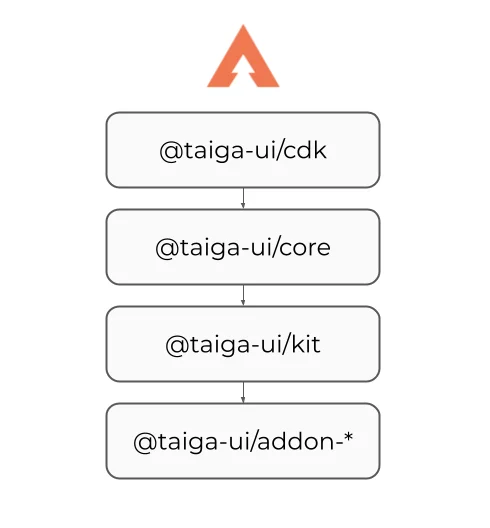
This naturally raises a question: will you need to install multiple packages just to use a couple of components? What about the bundle size?
We actually revised the structure of our libraries recently and adopted the Secondary Entry Points concept.
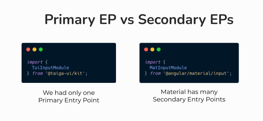
However, we still wanted to preserve the old API for imports from the package root. This is why we constructed it in a distinct way, where each deeper folder acts as a Secondary Entry Point for the folder above it.
Now, all our packages allow importing from both the Primary Entry Point and from any nested level.
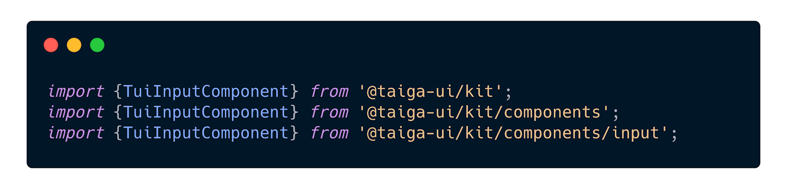
It's worth noting that importing from the root is usually enough, as the build tool can resolve the nested structure automatically. You don't need to manually manage import depth.
This organizational approach brings several advantages:
- The app bundle gets smaller—the whole library is tree-shakable
- Cyclic dependencies surface during the library build process
- The project achieves clearer structure, minimizing unnecessary coupling between entities
Practically, you can pull in one single entity and be certain that no dead code ends up in your final bundle. Duplication and unnecessary dependencies are avoided.
Strong customization options
The visual style and colors are driven entirely by CSS custom properties. This makes creating entirely new themes very straightforward, and they can even be swapped dynamically at runtime.
For now, we ship one main theme, but more are in the pipeline—both simple and experimental ones.
If you only need to tweak a specific component, you have options for that as well. You could theoretically adapt our kit to fit your company's design system in a matter of hours. Changing the CSS variables is safe as we are mindful not to introduce breaking changes to them, preventing layout shifts. Our own team uses a proprietary theme on top of the open-source codebase.
Designed to be agnostic
Our goal is to build components that any developer can quickly and easily tailor to specific needs.
Instead of predicting every possible use case, we avoid restricting appearance and lean on generics, so components aren't bound to a specific data model. Alex Inkin has elaborated on this in his article "Agnostic components in Angular".
That said, we still handle fundamental UX. For instance, if a user tabs into one of our text fields, a hint will automatically appear after a moment to ensure screen readers can parse it.
Built on solid engineering practices
We follow best practices and adhere closely to the Angular way of doing things.
We fully embrace Dependency Injection, all components use the OnPush change detection strategy, and the entire project is written in strict TypeScript mode (we care about typings). SSR compatibility is also a given—our components will work there without issue.
You won't be surprised by unexpected types coming out of our components or utilities. In development mode, our components will even output assertions if you feed them invalid data.
You can find more tips & tricks on my Twitter: @marsibarsi
Substantial component count
We are talking about 130+ components and over 100 directives, plus a generous set of tokens, utils and tools.
Currently, you can build most of your interface concepts with speed. And we are not finished—there are still new components on our roadmap, and we welcome your suggestions.
Getting started with Taiga
Head over to our official documentation site to get started. There, you can browse component demos, learn about the various packages, and find instructions for installation: taiga-ui.dev
If you'd like to follow our progress or show support, give us a star and keep an eye on Taiga UI on Github. You can ask questions, propose features, or contribute directly.
We are also present on the Angular discord server. Don't hesitate to reach out there!
More to come
Our intention is to keep sharing articles about how our libraries are organized and developed. These will give you deeper insight into how the UI kit functions internally and will highlight the patterns we apply for creating reusable Angular components—which are just as valuable for regular application development.
We're eager for your feedback on Taiga UI and want to know which components, tools or processes you'd like us to cover next.