Angular CDK Tooltip Directive
Not long ago, I shared a piece detailing how we incorporated Angular CDK into Nebular — the comprehensive component library we’re crafting at Akveo.
Throughout that process, we stumbled upon numerous fascinating challenges that Angular CDK elegantly resolved. Consequently, I’ve opted to launch a series of articles exploring various hurdles Angular CDK can assist you with.
To kick things off, let’s construct a tooltip directive. While it might appear straightforward, I’m convinced it brilliantly demonstrates several CDK features.

Table of contents
- Introduction
- Angular CDK Setup
- Building blocks
- Make tooltip floating
- Overlay Explained
- Position tooltip properly
- Results
Introduction
Let’s begin by considering what a tooltip accomplishes. Its primary role is to display a textual hint. Examine this scenario:
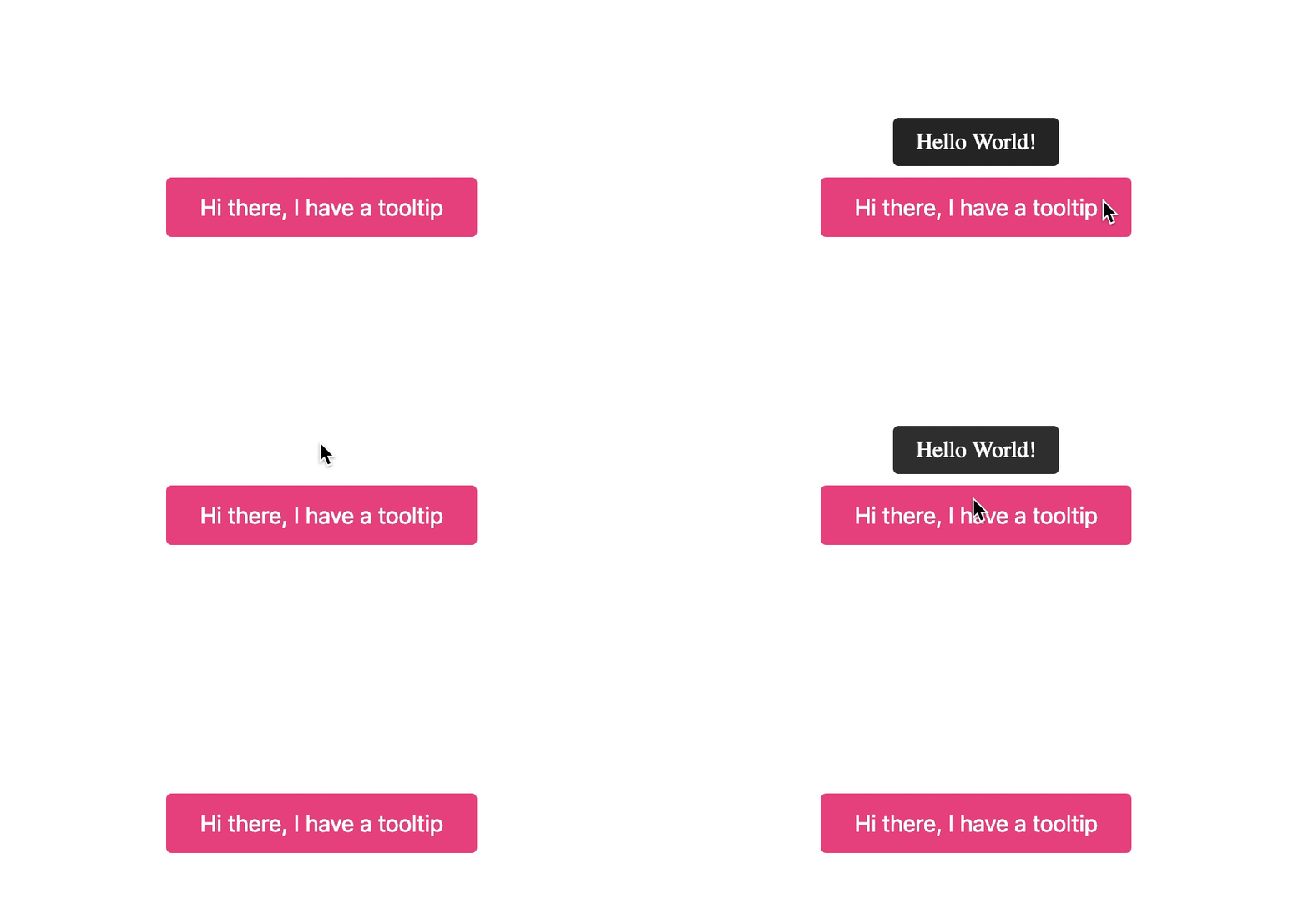
Here’s a sample of how it’s used:
<span awesomeTooltip="Tooltip text">This is an example</span>
Angular CDK Setup
Prior to getting started, the environment must be configured. Since our tooltip depends heavily on Angular CDK, that package needs to be installed initially:
npm install @angular/cdk
To leverage OverlayModule, it must be imported into AppModule:
import { OverlayModule } from '@angular/cdk/overlay';
@NgModule({
  imports: [ OverlayModule ],
})
export class AppModule {}
Additionally, overlay styles should be added to the global stylesheet:
@import '~@angular/cdk/overlay-prebuilt.css';
With everything configured, we’re ready to develop the tooltip directive!
Building blocks
Our tooltip will be implemented as an Angular directive:
@Directive({ selector: '[awesomeTooltip]' })
export class AwesomeTooltipDirective {

  @Input('awesomeTooltip') text = '';

  @HostListener('mouseenter')
  show() { }

  @HostListener('mouseout')
  hide() { }
}
This directive is responsible for managing the tooltip’s state. It subscribes to mouseenter and mouseout events, using them to trigger display and concealment.
Next, a component is needed to render the provided text:
@Component({
  selector: 'awesome-tooltip',
  template: `{{ text }}`,
})
export class AwesomeTooltipComponent {
  @Input() text = '';
}
Remember to register AwesomeTooltipComponent within entryComponents:
@NgModule({
  entryComponents: [AwesomeTooltipComponent],
})
export class AppModule {}
Because AwesomeTooltipComponent is instantiated at runtime, Angular’s compiler must be informed of its existence.
Logically, the subsequent step involves displaying AwesomeTooltipComponent with the given text input. Let’s proceed.
Make tooltip floating
As established, the tooltip must render above other components. Furthermore, it’s crucial to prevent clipping by parent styles (an overlow: hidden on a container can be troublesome). Thus, the optimal approach is to position the tooltip at the top of the document hierarchy. The CDK Overlay module is perfectly suited for this.
First, the overlay service is injected into the tooltip directive, and a new overlay is instantiated:
@Directive({ selector: '[awesomeTooltip]' })
export class AwesomeTooltipDirective implements OnInit {

  private overlayRef: OverlayRef;

  constructor(private overlay: Overlay) {}

  ngOnInit() {
    this.overlayRef = this.overlay.create({});
  }
}
Invoking this.overlay.create() produces an OverlayRef. Think of this as a remote control that lets us mount dynamically created components high in the document tree.
Upon creation, it establishes a div.cdk-overlay-container element, acting as the root container for all inserted components.
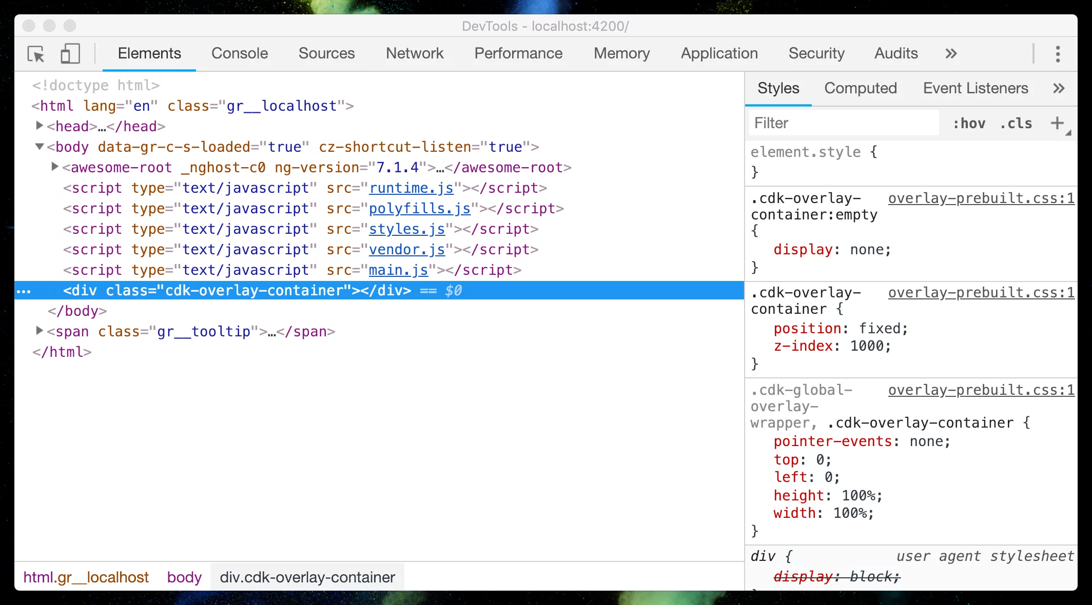
Let’s finalize the show and hide methods using CDK utilities to enable this functionality:
@Directive({ selector: '[awesomeTooltip]' })
export class AwesomeTooltipDirective implements OnInit {

  private overlayRef: OverlayRef;

  constructor(private overlay: Overlay) {}

  ngOnInit(): void {
    this.overlayRef = this.overlay.create({});
  }

  @HostListener('mouseenter')
  show() {
    // Create tooltip portal
    const tooltipPortal = new ComponentPortal(AwesomeTooltipComponent);

    // Attach tooltip portal to overlay
    const tooltipRef: ComponentRef<AwesomeTooltipComponent> = this.overlayRef.attach(tooltipPortal);

    // Pass content to tooltip component instance
    tooltipRef.instance.text = this.text;
  }

  @HostListener('mouseout')
  hide() {
    this.overlayRef.detach();
  }
}
Essentially, we’re creating an AwesomeTooltipComponent instance and inserting it into the overlayRef generated previously.
Finally, the text is assigned to the newly created tooltip component reference.
So what occurs within the show method? Initially, a tooltip portal is set up via new ComponentPortal(). Following that, it’s attached to the overlayRef, and the text is supplied to the resulting tooltip component.
It seems like magic, doesn’t it? Allow me to clarify.
Overlays Explained
Let’s examine OverlayRef first. It implements [PortalOutlet](https://material.angular.io/cdk/portal/overview#portals). Consider it a slot within your application that can be dynamically swapped with varying content.
PortalOutlet, in turn, doesn’t accept arbitrary content — only Portal instances. A Portal serves as a lightweight adapter that facilitates interaction with PortalOutlet.
That’s precisely our approach. We generated the tooltip portal:
const tooltipPortal = new ComponentPortal(AwesomeTooltipComponent);
And connected it to the previously instantiated PortalOutlet:
const tooltipRef: ComponentRef<AwesomeTooltipComponent> = this.overlayRef.attach(tooltipPortal);
Once the tooltip portal is attached to the OverlayRef, we obtain a ComponentRef pointing to the created AwesomeTooltipComponent. This reference grants access to AwesomeTooltipComponent, allowing us to set the tooltip text:
tooltipRef.instance.text = this.text;
The challenging portion is now behind us.
At this point, an overlay component is dynamically generated when hovering over text and removed upon mouse exit.
However, the tooltip currently appears in an incorrect location. Let’s position it precisely above the host element.
Tooltip Positioning
Given that the tooltip is detached from the document flow with position: absolute, exact coordinates relative to the host element are necessary. Fortunately, Angular CDK offers built-in support for this as well.
Positioning overlay components can be managed through the OverlayPositionBuilder abstraction:
@Directive({ selector: '[awesomeTooltip]' })
export class AwesomeTooltipDirective implements OnInit {

  constructor(private overlayPositionBuilder: OverlayPositionBuilder,
              private elementRef: ElementRef,
              private overlay: Overlay) {}

  ngOnInit() {
    const positionStrategy = this.overlayPositionBuilder
      // Create position attached to the elementRef
      .flexibleConnectedTo(this.elementRef)
      // Describe how to connect overlay to the elementRef
      // Means, attach overlay's center bottom point to the
      // top center point of the elementRef.
      .withPositions([{
        originX: 'center',
        originY: 'top',
        overlayX: 'center',
        overlayY: 'bottom',
      }]);
  }
}
OverlayPositionBuilder is responsible for determining how your overlay element aligns relative to the host.
We establish a fresh position strategy linked to the elementRef. This implies the overlay’s center-bottom point is anchored to the host element’s center-top point.
In practical terms, the component will be situated above the elementRef.
The final action is to associate this positioning strategy with the existing overlay:
@Directive({ selector: '[awesomeTooltip]' })
export class AwesomeTooltipDirective implements OnInit {

  constructor(private overlayPositionBuilder: OverlayPositionBuilder,
              private elementRef: ElementRef,
              private overlay: Overlay) {}

  ngOnInit() {
    const positionStrategy = this.overlayPositionBuilder
      .flexibleConnectedTo(this.elementRef)
      .withPositions([{
        originX: 'center',
        originY: 'top',
        overlayX: 'center',
        overlayY: 'bottom',
      }]);

    // Connect position strategy
    this.overlayRef = this.overlay.create({ positionStrategy });
  }
}
Now, we possess a completely operational tooltip, correctly placed above the host component.
Results
We’ve succeeded! A live demonstration of the tooltip directive is available below.
I’ve also uploaded the source code for this example tooltip on my GitHub — feel free to check it out if you only need a ready-made implementation.
Recap
In summary, we’ve crafted an Angular Tooltip Directive with the Angular CDK OverlayModule. This has equipped us to handle dynamic component rendering effectively and prepares us for forthcoming tasks!
As you might observe, there’s potential for additional material: animations, customization, and more. Nevertheless, these subjects fall outside Angular CDK’s purview, so I’ve chosen to concentrate solely on its features.
One crucial aspect remains unaddressed — repositioning the tooltip during page scroll. Hopefully, we can explore this in subsequent posts.
Follow along, and please reach out if you have specific CDK topics you’d like covered!
Resources
For deeper insights into Angular CDK portals and overlays, consult the official docs: