Among the pieces I've authored, Angular: MatPaginator Custom Styling has become one of my most-viewed contributions, drawing around 17K page views. That post walked through the process of revamping Angular Material’s paginator—positioned on a mat-table—via a custom directive to elevate its visual appeal.
Time has prompted a refresh of that original guide, driven by a couple of major shifts. The initial edition targeted Angular v14, yet since then, the Angular Material MDC components have rolled out as a significant upgrade, creating notable headaches for devs migrating their builds, alongside various incremental Angular refinements. Beyond that, my earlier code tapped into certain private methods exposed by the MatPaginator component. The GIF below previews the polished end result we’ll construct here. For the complete implementation, check out the GitHub repository linked.
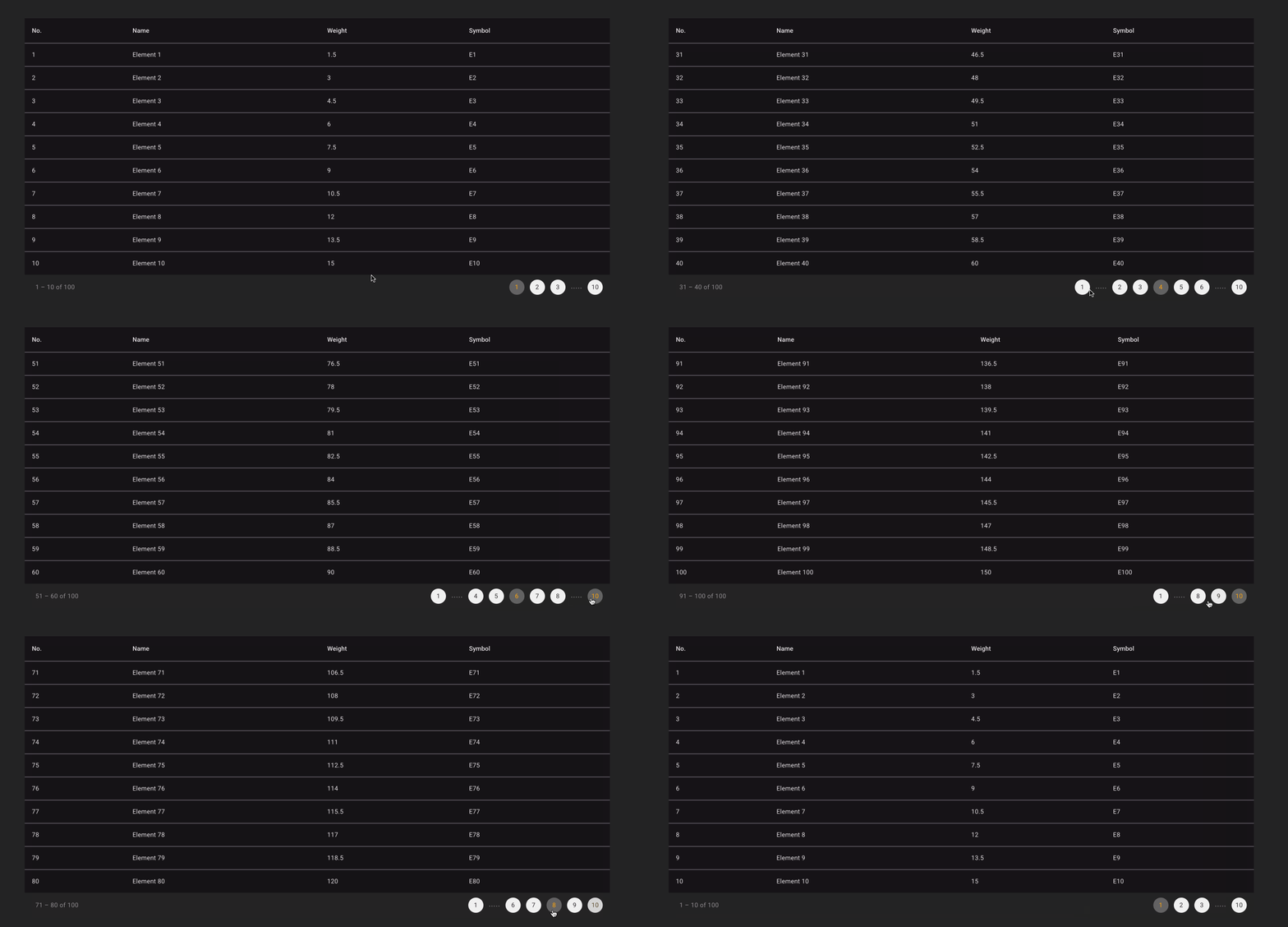
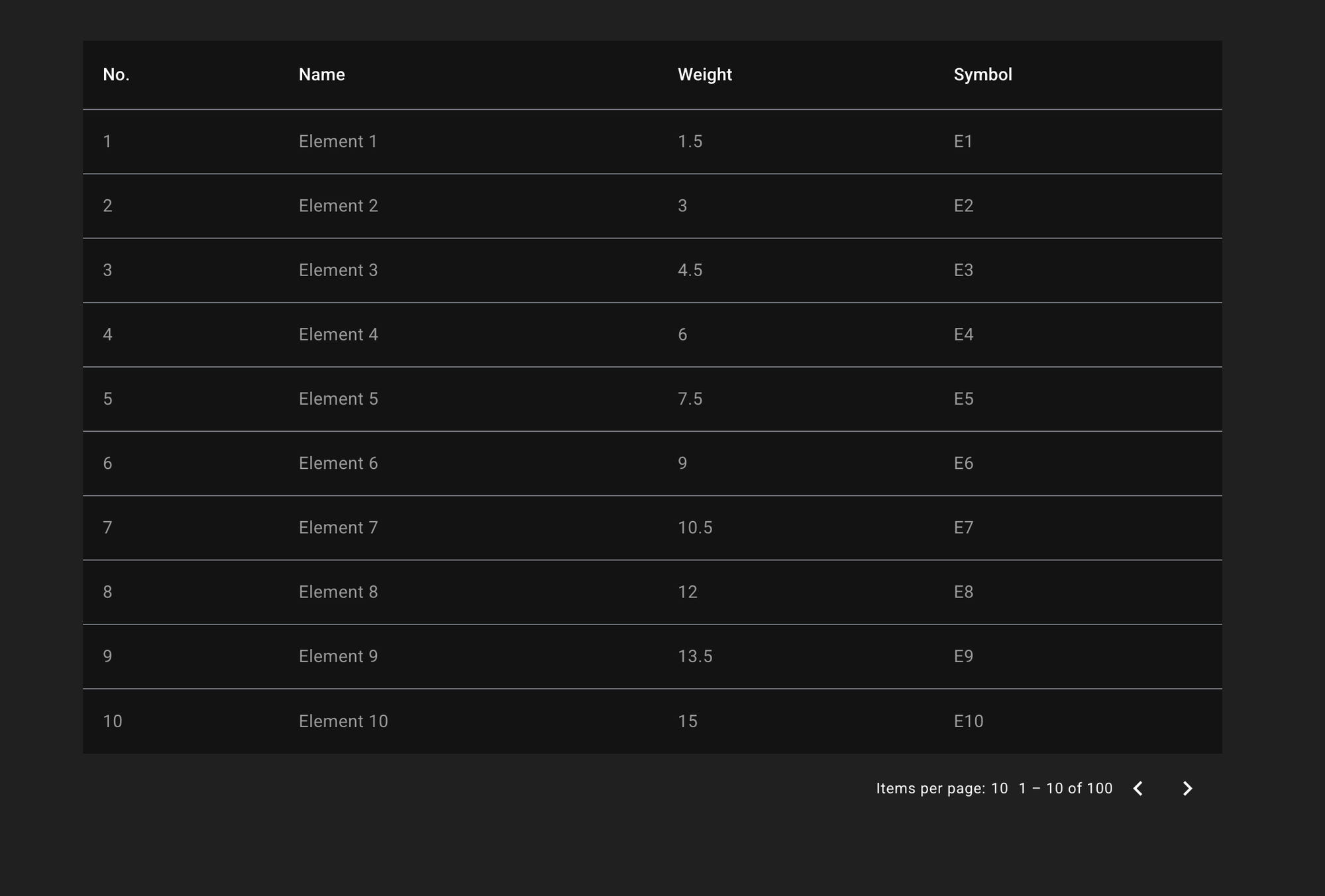
Let me begin by laying out the complete code snippet first—you can always refer back to it as we proceed—and afterward, I’ll break down the trickier or less apparent details. Perhaps you already have a table component rendering your data, similar to the one below:
import { afterNextRender, Component, viewChild } from '@angular/core';
import { MatPaginator, MatPaginatorModule } from '@angular/material/paginator';
import { MatTableDataSource, MatTableModule } from '@angular/material/table';

type Data = { position: number; name: string; weight: number; symbol: string };

@Component({
  selector: 'app-test-table',
  imports: [MatTableModule, MatPaginatorModule, BubblePaginationDirective],
  template: `
    <table mat-table [dataSource]="dataSource">
      <!-- Position Column -->
      <ng-container matColumnDef="position">
        <th mat-header-cell *matHeaderCellDef>No.</th>
        <td mat-cell *matCellDef="let element">{{ element.position }}</td>
      </ng-container>

      <!-- ... more columns ... -->

      <tr mat-header-row *matHeaderRowDef="displayedColumns"></tr>
      <tr mat-row *matRowDef="let row; columns: displayedColumns"></tr>
    </table>

    <mat-paginator [length]="dataSource.data.length" [pageSize]="10" />
  `,
})
export class TestTableComponent {
  readonly dataSource = new MatTableDataSource<Data>([]);
  readonly paginator = viewChild(MatPaginator);

  readonly displayedColumns: string[] = ['position', 'name', 'weight', 'symbol'];

  constructor() {
    const data: Data[] = [];
    Array.from({ length: 100 }, (_, k) => k + 1).forEach(v => {
      data.push({ position: v, name: `Element ${v}`, weight: v * 1.5, symbol: `E${v}` });
    });

    this.dataSource.data = data;

    afterNextRender(() => {
      const paginator = this.paginator();

      if (paginator) {
        this.dataSource.paginator = paginator;
      }
    });
  }
}
Once you apply this basic setup, the table renders in the manner shown below:
The goal here is to build a directive that we can drop onto the mat-paginator, and it will restyle our paginated table to match the bubble design. Here’s how we’d apply that directive:
<mat-paginator
  [appBubblePagination]="dataSource.data.length"
  (page)="onPageChange($event)"
  [length]="dataSource.data.length"
  [pageSize]="15">
</mat-paginator>
Below you'll find the complete directive implementation, followed by a breakdown of each of its key parts.
import { Directive, ElementRef, Renderer2, afterRenderEffect, inject, input, untracked } from '@angular/core';
import { MatPaginator } from '@angular/material/paginator';

/**
 * Works from angular-material version 15. since all classes got the new prefix 'mdc-'
 */
@Directive({
  selector: '[appBubblePagination]',
})
export class BubblePaginationDirective {
  private readonly matPag = inject(MatPaginator, {
    optional: true,
    self: true,
    host: true,
  });
  private readonly elementRef = inject(ElementRef);
  private readonly ren = inject(Renderer2);

  /**
   * whether we want to display first/last button and dots
   */
  readonly showFirstButton = input(true);
  readonly showLastButton = input(true);

  /**
   * total number of items in pagination
   * needed to calculate how many buttons to render
   * when page size changes
   */
  readonly paginationSize = input(0, {
    alias: 'appBubblePagination',
  });

  /**
   * how many buttons to display before and after
   * the selected button
   */
  readonly renderButtonsNumber = input(2);

  /**
   * references to DOM elements
   */
  private dotsEndRef!: HTMLElement;
  private dotsStartRef!: HTMLElement;
  private bubbleContainerRef!: HTMLElement;

  /**
   * ref to rendered buttons on UI that we can remove them size changes
   */
  private buttonsRef: HTMLElement[] = [];

  readonly buildButtonsEffect = afterRenderEffect(() => {
    // rebuild buttons when pagination size change
    this.paginationSize();

    untracked(() => {
      // remove buttons before creating new ones
      this.removeButtons();

      // set some default styles to mat pagination
      this.styleDefaultPagination();

      // create bubble container
      this.createBubbleDivRef();

      // create all buttons
      this.buildButtons();

      // switch back to page 0
      this.switchPage(0);
    });
  });

  /**
   * change the active button style to the current one and display/hide additional buttons
   * based on the navigated index
   */
  private changeActiveButtonStyles(previousIndex: number, newIndex: number) {
    const previouslyActive = this.buttonsRef[previousIndex];
    const currentActive = this.buttonsRef[newIndex];

    if (!previouslyActive && !currentActive) {
      return;
    }

    // remove active style from previously active button
    if (previouslyActive) {
      this.ren.removeClass(previouslyActive, 'g-bubble__active');
    }

    // add active style to new active button
    this.ren.addClass(currentActive, 'g-bubble__active');

    // hide all buttons
    this.buttonsRef.forEach(button => this.ren.setStyle(button, 'display', 'none'));

    // show N previous buttons and X next buttons
    const renderElements = this.renderButtonsNumber();
    const endDots = newIndex < this.buttonsRef.length - renderElements - 1;
    const startDots = newIndex - renderElements > 0;

    const firstButton = this.buttonsRef[0];
    const lastButton = this.buttonsRef[this.buttonsRef.length - 1];

    // last bubble and dots
    if (this.showLastButton()) {
      this.ren.setStyle(this.dotsEndRef, 'display', endDots ? 'block' : 'none');
      this.ren.setStyle(lastButton, 'display', endDots ? 'flex' : 'none');
    }

    // first bubble and dots
    if (this.showFirstButton()) {
      this.ren.setStyle(this.dotsStartRef, 'display', startDots ? 'block' : 'none');
      this.ren.setStyle(firstButton, 'display', startDots ? 'flex' : 'none');
    }

    // resolve starting and ending index to show buttons
    const startingIndex = startDots ? newIndex - renderElements : 0;

    const endingIndex = endDots ? newIndex + renderElements : this.buttonsRef.length - 1;

    // display starting buttons
    for (let i = startingIndex; i <= endingIndex; i++) {
      const button = this.buttonsRef[i];
      this.ren.setStyle(button, 'display', 'flex');
    }
  }

  /**
   * Removes or change styling of some html elements
   */
  private styleDefaultPagination() {
    const nativeElement = this.elementRef.nativeElement;
    const itemsPerPage = nativeElement.querySelector('.mat-mdc-paginator-page-size');
    const howManyDisplayedEl = nativeElement.querySelector('.mat-mdc-paginator-range-label');
    const previousButton = nativeElement.querySelector('button.mat-mdc-paginator-navigation-previous');
    const nextButtonDefault = nativeElement.querySelector('button.mat-mdc-paginator-navigation-next');

    // remove 'items per page'
    if (itemsPerPage) {
      this.ren.setStyle(itemsPerPage, 'display', 'none');
    }

    // style text of how many elements are currently displayed
    if (howManyDisplayedEl) {
      this.ren.setStyle(howManyDisplayedEl, 'position', 'absolute');
      this.ren.setStyle(howManyDisplayedEl, 'color', '#919191');
      this.ren.setStyle(howManyDisplayedEl, 'font-size', '14px');
      this.ren.setStyle(howManyDisplayedEl, 'left', '-0');
    }

    // check whether to remove left & right default arrows
    this.ren.setStyle(previousButton, 'display', 'none');
    this.ren.setStyle(nextButtonDefault, 'display', 'none');
  }

  /**
   * creates `bubbleContainerRef` where all buttons will be rendered
   */
  private createBubbleDivRef(): void {
    const actionContainer = this.elementRef.nativeElement.querySelector('div.mat-mdc-paginator-range-actions');
    const nextButtonDefault = this.elementRef.nativeElement.querySelector('button.mat-mdc-paginator-navigation-next');

    // create a HTML element where all bubbles will be rendered
    this.bubbleContainerRef = this.ren.createElement('div') as HTMLElement;
    this.ren.addClass(this.bubbleContainerRef, 'g-bubble-container');

    // render element before the 'next button' is displayed
    this.ren.insertBefore(actionContainer, this.bubbleContainerRef, nextButtonDefault);
  }

  /**
   * helper function that builds all button and add dots
   * between the first button, the rest and the last button
   *
   * end result: (1) .... (4) (5) (6) ... (25)
   */
  private buildButtons(): void {
    if (!this.matPag) {
      return;
    }

    const neededButtons = Math.ceil(this.matPag.length / this.matPag.pageSize);

    // if there is only one page, do not render buttons
    if (neededButtons === 0 || neededButtons === 1) {
      this.ren.setStyle(this.elementRef.nativeElement, 'display', 'none');
      return;
    }

    // set back from hidden to block
    this.ren.setStyle(this.elementRef.nativeElement, 'display', 'block');

    // create first button
    this.buttonsRef = [this.createButton(0)];

    // add dots (....) to UI
    this.dotsStartRef = this.createDotsElement();

    // create all buttons needed for navigation (except the first & last one)
    for (let index = 1; index < neededButtons - 1; index++) {
      this.buttonsRef = [...this.buttonsRef, this.createButton(index)];
    }

    // add dots (....) to UI
    this.dotsEndRef = this.createDotsElement();

    // create last button to UI after the dots (....)
    this.buttonsRef = [...this.buttonsRef, this.createButton(neededButtons - 1)];
  }

  /**
   * Remove all buttons from DOM
   */
  private removeButtons(): void {
    this.buttonsRef.forEach(button => {
      this.ren.removeChild(this.bubbleContainerRef, button);
    });

    // remove dots
    if (this.dotsStartRef) {
      this.ren.removeChild(this.bubbleContainerRef, this.dotsStartRef);
    }
    if (this.dotsEndRef) {
      this.ren.removeChild(this.bubbleContainerRef, this.dotsEndRef);
    }

    // Empty state array
    this.buttonsRef.length = 0;
  }

  /**
   * create button HTML element
   */
  private createButton(i: number): HTMLElement {
    const bubbleButton = this.ren.createElement('div');
    const text = this.ren.createText(String(i + 1));

    // add class & text
    this.ren.addClass(bubbleButton, 'g-bubble');
    this.ren.setStyle(bubbleButton, 'margin-right', '8px');
    this.ren.appendChild(bubbleButton, text);

    // react on click
    this.ren.listen(bubbleButton, 'click', () => {
      this.switchPage(i);
    });

    // render on UI
    this.ren.appendChild(this.bubbleContainerRef, bubbleButton);

    // set style to hidden by default
    this.ren.setStyle(bubbleButton, 'display', 'none');

    return bubbleButton;
  }

  /**
   * helper function to create dots (....) on DOM indicating that there are
   * many more bubbles until the last one
   */
  private createDotsElement(): HTMLElement {
    const dotsEl = this.ren.createElement('span');
    const dotsText = this.ren.createText('.....');

    // add class
    this.ren.setStyle(dotsEl, 'font-size', '18px');
    this.ren.setStyle(dotsEl, 'margin-right', '8px');
    this.ren.setStyle(dotsEl, 'padding-top', '6px');
    this.ren.setStyle(dotsEl, 'color', '#919191');

    // append text to element
    this.ren.appendChild(dotsEl, dotsText);

    // render dots to UI
    this.ren.appendChild(this.bubbleContainerRef, dotsEl);

    // set style none by default
    this.ren.setStyle(dotsEl, 'display', 'none');

    return dotsEl;
  }

  /**
   * Helper function to switch page
   */
  private switchPage(i: number): void {
    if (!this.matPag) {
      return;
    }

    const previousPageIndex = this.matPag.pageIndex;

    // switch page index of mat paginator
    this.matPag.pageIndex = i;

    // change active button styles
    this.changeActiveButtonStyles(previousPageIndex, this.matPag.pageIndex);

    // need to trigger page event manually, because we are changing pageIndex programmatically
    this.matPag.page.emit({
      pageIndex: i,
      pageSize: this.matPag.pageSize,
      length: this.matPag.length,
      previousPageIndex: previousPageIndex,
    });
  }
}
Injecting Dependencies
inject(MatPaginator, { optional: true, self: true, host: true })
inject(ElementRef)
inject(Renderer2)
MatPaginator- itspageIndex,pageSize, and thepagestream are what we subscribe toElementRef- we use this to reach into the paginator's inner DOMRenderer2- handles element creation, style/class assignment, and event binding in a way that's SSR-friendly, bypassing direct DOM manipulation
Input / Output Bindings
showFirstButton = input(true);&showLastButton = input(true);- toggles the visibility of the quick-jump buttons at the table's extremitiesrenderButtonsNumber = input(2);- controls how many neighbor buttons appear on either side of the active page, say index6herepaginationSize- this binding tracks mutations in the table's row count, such as after a filter or a fresh data load, triggering a re-render of the page bubbles accordingly
Core Logic Execution
The directive's source spans roughly 300 lines, yet its essential behavior lives in a single effect called buildButtonsEffect, which handles:
readonly buildButtonsEffect = afterRenderEffect(() => {
  // rebuild buttons when pagination size change
  this.paginationSize();

  untracked(() => {
    // remove buttons before creating new ones
    this.removeButtons();

    // set some default styles to mat pagination
    this.styleDefaultPagination();

    // create bubble container
    this.createBubbleDivRef();

    // create all buttons
    this.buildButtons();

    // switch back to page 0
    this.switchPage(0);
  });
});
The effect mechanism stands out because it automatically triggers again whenever the length (or size) of your data changes. Say you’re working with a single table that relies on server-side filtering—each time fresh data arrives, the bubbles get recalculated, all thanks to the paginationSize signal input. Here’s a quick rundown of what’s happening:
paginationSize- tracks page size adjustments (from new data) to refresh the bubblesremoveButtons()– wipes out previous custom DOM elements (in case of reruns)styleDefaultPagination()– conceals selected Material defaults and shifts label positionscreateBubbleDivRef()– sets up a container dedicated to housing our bubblesbuildButtons()– generates bubbles and dots based on the total length and current page sizeswitchPage(0)– resets to page 0 to maintain consistent behavior
It’s natural to wonder why afterRenderEffect gets the nod over effect here. The distinction boils down to execution context: afterRenderEffect operates exclusively in the browser, while effect also runs during server-side rendering. In an SSR-enabled app, that could introduce potential glitches. For a more detailed dive, my article on afterRenderEffect, afterNextRender, afterEveryRender & Renderer2 has you covered.
Core Logic Execution - Switching Page Manually
Since the custom bubbles sit outside Angular Material’s built-in controls, clicking a bubble won’t trigger anything in MatPaginator by default. To make the table—and any subscribers to matPag.page—respond, we must manually bridge that click to the paginator, which is exactly why the switchPage() function exists.
private createButton(index: number): HTMLElement {
  // our unique bubble showing a specific page - 1, 2, etc.
  const bubbleButton = this.ren.createElement('div');

  // ... some code ...

  this.ren.listen(bubbleButton, 'click', () => {
    this.switchPage(index);
  });

  // ... some code ...
}

private switchPage(index: number): void {
  if (!this.matPag) {
    return;
  }

  const previousPageIndex = this.matPag.pageIndex;

  // switch page index of mat paginator
  this.matPag.pageIndex = index;

  // change active button styles
  this.changeActiveButtonStyles(previousPageIndex, this.matPag.pageIndex);

  // trigger page event manually, we are changing pageIndex programmatically
  this.matPag.page.emit({
    pageIndex: index,
    pageSize: this.matPag.pageSize,
    length: this.matPag.length,
    previousPageIndex: previousPageIndex,
  });
}
The core behavior hinges on this.matPag.pageIndex = index;, which keeps the paginator’s state aligned with the selected bubble. Omitting that line will break the whole pagination mechanism.
Because we’re setting the index programmatically as described above, this.matPag.page won’t fire on its own when you move through table items. To compensate, we have to trigger that event manually as well.
Paginator Style Updates
In styleDefaultPagination, the paginator’s internal DOM elements are modified directly to achieve the new look. Is that the recommended approach? Far from it. The technique depends on rigid class selectors, such as button.mat-mdc-paginator-navigation-next, making it brittle—those internal names can shift with each Material release.
A precedent exists: Material v15 brought in the MDC components and broke countless projects that relied on ::ng-deep. Our strategy is a similar workaround, though it’s still the most viable option for this scenario. That said, you should acknowledge the inherent risk.
Custom Styles
With the logic settled, cosmetic tweaks are needed to make the controls resemble bubbles. This portion is primarily CSS—or SCSS—and can be adapted to match your design system. In this demo, each bubble acts as a flex container with centered text, hover feedback, and an active state marking the current page.
/* Custom paginator styles */
.g-bubble-container {
  display: flex;
  gap: 4px;
}

.g-bubble {
  background-color: #f0f0f0;
  border-radius: 50%;
  width: 34px;
  height: 34px;
  display: flex;
  align-items: center;
  justify-content: center;
  color: #2e2e2e;
  font-size: 14px;
  cursor: pointer;
  transition: 0.3s;

  &:hover {
    background-color: #636363;
    color: orange;
  }
}

.g-bubble__active {
  background-color: #636363;
  color: orange;
}

mat-paginator {
  background: transparent !important;
  /* need mat-paginator range to align with other mat-table elements */
  position: relative;
}

/* override alignment for the labels that shows "x of y" */
.mat-mdc-paginator-range-label {
  margin: 0 !important;
}
Things to Keep in Mind
A handful of nuances are worth remembering:
- Renderer2 constraints — pseudo-classes like
::beforeand::aftercannot be applied directly from the directive; stick to SCSS files for visual styling - Gluing into Angular Material internals — as noted,
mat-mdc-selectors may shift across future Material releases, which is one of the inherent downsides of this approach - Accessibility — since the bubbles are custom clickable
divelements, consider addingrole="button"andtabindex="0"to let keyboard users reach them; you can also capturekeydownevents and trigger clicks with the space or enter keys - SSR / Hydration: if Angular SSR is in play, the directive is still safe because
Renderer2works with SSR and bubble rendering happens only on the client usingafterRenderEffect - Active state caveat — when new data is loaded and bubble logic executes again, pagination resets to the first page, so no active state was implemented in this version
- The
[appBubblePaginationLength]input is essential for passing the table's length; if skipped,afterRenderEffectwon't react to new data and the buttons won't rebuild
Summary
After reading this article, you'll have a solid, MDC-compatible paginator. The aim wasn't to swap out Angular Material, but to demonstrate how directives combined with Renderer2 can extend an existing Material component, avoiding the need to build a custom paginator from scratch.
There's certainly room for enhancements—this remains a fairly basic directive—so any feedback is welcomed in the comments. I hope you enjoyed this walkthrough; find more posts on my dev.to profile, connect via LinkedIn, or browse my Personal Website.